The Bezold Effect: The Optical Illusion That Quietly Breaks Your Color Palettes
by ColorSift Editorial Team
You've finalized a UI theme. Every color is carefully balanced. The blues are cool and confident, the accent orange pops without screaming, and the grays sit quietly in the background like they should. Then a stakeholder asks you to swap the background from dark navy to white.
Suddenly, every other color in the interface looks wrong. The blues seem washed out. The accent orange feels garish. The grays look vaguely purple. You haven't touched those colors. Their hex values haven't changed. But your eyes insist they have.
This isn't a bug in your monitor or a failure of your taste. It's the Bezold Effect, a 150-year-old optical phenomenon named after a textile researcher who noticed that changing a single thread color in a rug pattern could make every surrounding color appear to shift. Unlike simultaneous contrast, which deals with edges between two colors, the Bezold Effect operates on entire compositions. It quietly reshapes how you perceive every color in a pattern the moment one element changes.
It's one of the most practically disruptive illusions in color theory, and most designers have never heard its name. This article covers what causes it, where it strikes hardest, and how to stop fighting it and start designing with it.
Wilhelm von Bezold and the Rug That Changed Color Theory
Wilhelm von Bezold was a 19th-century German meteorologist and physics professor who moonlighted in textile pattern design. It's an unusual combination, but it gave him a uniquely analytical eye for how color behaved in woven fabrics.
His key observation came while designing rug and tapestry patterns. He realized he could make an entire composition appear to shift toward warm or cool simply by swapping the single color used for thin outlines or interwoven threads. He didn't touch the larger fill colors. He changed only the fine lines running between them. And yet the whole piece looked different.
This was distinct from what was already understood. Michel Eugène Chevreul had documented simultaneous contrast decades earlier: colors appearing different where they share an edge. Bezold's finding was more holistic. The entire field of color seemed to average together, not just the borders.
Here's the effect in plain language: when small, repeating areas of one color are interspersed with larger areas of other colors, the small color "spreads" its influence across the whole pattern. It pulls every neighboring color toward it perceptually. Swap gold thread outlines for silver in a floral rug, and the reds, greens, and blues of the flowers all shift appearance, even though only the thread changed.
Bezold published his findings in 1874 in Die Farbenlehre. Despite being over 150 years old, the effect remains dramatically underrepresented in modern design education compared to concepts like complementary color, color temperature, or even Chevreul's contrast work.
The Science: Why Your Brain Averages Colors It Shouldn't
The Bezold Effect is driven by what vision scientists call "assimilation" or "color spreading." It's the opposite of contrast. Where contrast causes adjacent colors to push apart perceptually, assimilation causes adjacent colors to pull toward each other. Your visual system blends or averages them.
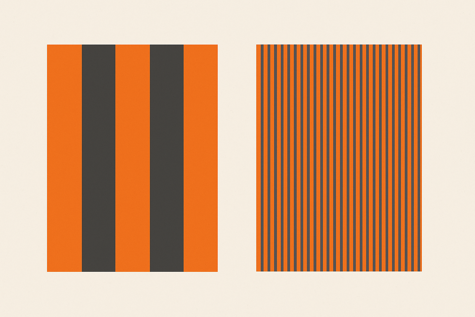
The conditions that trigger assimilation over contrast are specific. Assimilation tends to dominate when the interspersed color elements are thin, small, or high-frequency: fine stripes, outlines, small dots, thin UI borders. Contrast dominates with large, bold areas of color meeting at clear edges.
The neural explanation comes down to lateral interactions in the retina and early visual cortex. When color signals are too fine-grained for the visual system to fully separate, the brain essentially acts as a low-pass filter. It smears the colors together into a perceptual average. Your brain is doing efficient signal processing, and fine detail gets sacrificed.
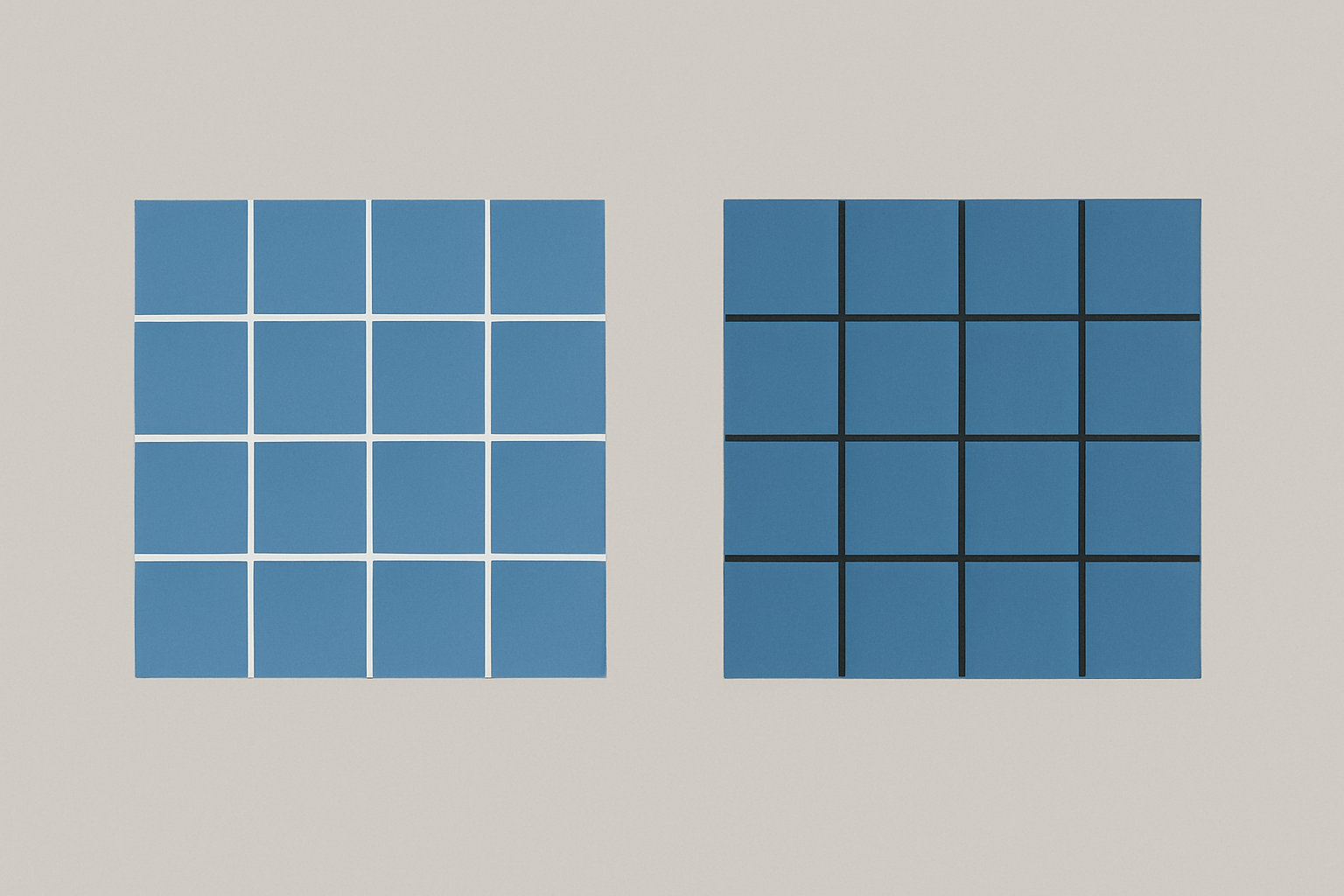
Try this thought experiment. Picture a field of medium-blue squares separated by thin white grid lines. Now picture the same blue squares separated by thin black grid lines. The blue squares are identical in both versions. But the white-grid version looks noticeably lighter and cooler, while the black-grid version looks deeper and more saturated. That's assimilation in action.
Here's a simple rule of thumb to keep these straight: contrast pushes colors apart at bold boundaries. Assimilation pulls colors together across fine patterns. The Bezold Effect is assimilation operating across an entire composition.
Where It Strikes: Three Design Disciplines That Get Blindsided
Textile and Pattern Design
This is where it all started, and it's still where the effect hits hardest. Changing a single accent thread or outline color in a repeating pattern doesn't just change the outlines. It visually shifts every petal, leaf, and background area. Fabric designers and wallpaper makers have dealt with this for centuries, often intuitively. But digital pattern designers, who tend to think in exact hex values, get caught off guard constantly.
UI and Interface Design
Theme switching and accent color changes are prime triggers. A design system's neutral grays, whites, and background colors can all appear to shift temperature or brightness when a primary brand color changes, even though only one CSS variable was updated. Dark mode and light mode transitions are the most dramatic example: the dominant surrounding color (the background) shifts from near-white to near-black, and suddenly every other color in the system looks different.
Data Visualization and Cartography
The Bezold Effect can compromise readability in heatmaps, choropleth maps, and dense chart patterns. When a legend color or background shade changes, the data-encoding colors can appear to shift. This can mislead readers about the actual values being represented. A chart that reads correctly on a white dashboard may subtly misrepresent data on a dark-themed dashboard. For data visualization, this isn't just an aesthetic problem. It's an accuracy problem.
Illustration and Digital Art
Illustrators who work with fine linework or hatching are especially susceptible. Changing the line color in a cross-hatched illustration can make every fill color appear to shift hue and value. The finer the lines, the stronger the assimilation.
Case Study: The Dark Mode Problem Nobody Talks About
Starting around 2019, the industry shifted hard toward dark mode support. Apple introduced system-wide dark mode in iOS 13 and macOS Mojave. Google pushed dark themes across Android and its apps. And designers everywhere ran into the same frustrating problem: carefully chosen color palettes "broke" when placed on dark backgrounds, even when contrast ratios technically passed accessibility checks.
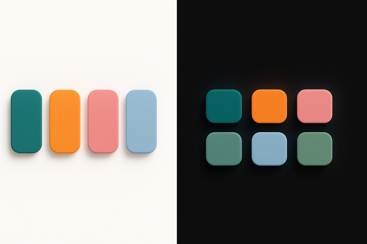
Here's a specific, relatable example. Picture a dashboard UI with data cards. On a white background, a set of category colors (soft teal, warm amber, muted rose) looks balanced and harmonious. Switch the same cards to a near-black background, and the teal looks more electric. The amber looks muddy. The rose looks almost red. No hex values changed.
This is the Bezold Effect in full force. The dominant dark background is assimilating into every smaller color area, pulling them all toward darkness and shifting their apparent hue and saturation in non-uniform ways. Different hues respond differently to value shifts in human perception. Blues tend to gain apparent saturation against dark backgrounds. Yellows and ambers lose vibrancy. Warm colors can shift hue dramatically.
Notice how major design systems addressed this. Material Design 3 doesn't use the same palette for light and dark themes. It generates separate tonal palettes with adjusted hues, saturations, and lightness values for each context. Apple's Human Interface Guidelines recommend the same approach: create distinct color sets for light and dark appearances. They are essentially compensating for the Bezold Effect without ever naming it.
The lesson is clear. A single set of hex values cannot produce a single consistent perceptual experience across radically different background contexts. The math of the pixels doesn't change. The perception does.
How to Design With the Bezold Effect (Instead of Against It)
Once you understand assimilation, you can use it deliberately. Here are five practical strategies.
1. Always audition colors in context, never in isolation. A swatch on a neutral artboard tells you almost nothing about how it will look interspersed with other colors in a fine pattern. Build rough compositions early and test color changes in situ. If your workflow involves picking colors from a swatch panel and only seeing them in context later, you're setting yourself up for Bezold surprises.
2. Pay special attention to the "thin" and "small" elements. Borders, dividers, grid lines, outlines, icon strokes, and small text are the vectors through which assimilation spreads. When these change, expect the entire composition to shift. Audit these elements first when a palette feels off.
3. Use the effect intentionally to unify a palette. The Bezold Effect can be a tool, not a trap. Adding a subtle tinted overlay, a thin colored border, or a colored grid line across a composition can pull disparate colors into perceived harmony. The assimilation acts as visual glue. This is why a slight warm wash over a photograph can make clashing outfit colors look cohesive.
4. Build separate palettes for radically different contexts. Light and dark themes need different palettes. Print and screen need different palettes. Large-scale applications (billboards) and small-scale applications (app icons) need different palettes. Accept that perceptual color is contextual. A single set of hex values will not produce a single consistent experience across all viewing conditions.
5. When debugging a palette that feels "off," isolate the most pervasive thin or repeating element and temporarily neutralize it. Set it to 50% gray. If the rest of the palette suddenly looks right again, you've found your Bezold culprit. This simple test can save hours of chasing phantom color problems.
The Bezold Effect vs. Simultaneous Contrast: A Quick Clarification
If you're familiar with color theory, you might be wondering how the Bezold Effect and simultaneous contrast differ. The short answer: they are essentially opposites operating under different spatial conditions.
Simultaneous contrast involves large, bold areas of color meeting at a clear edge. The colors push each other apart. A gray square on a red background looks greenish. The same gray on a blue background looks yellowish. It's about edges and differences.
The Bezold Effect (assimilation) involves small, fine, or interspersed areas of color. The colors pull toward each other. A gray field crossed by thin red lines looks pinkish. The same gray crossed by thin blue lines looks cooler. It's about patterns and averaging.
In any real design, both effects are happening simultaneously at different scales. Contrast dominates at bold boundaries. Assimilation dominates in fine textures. Understanding which one is active in a given area of your design is the key to predicting what your viewer will actually see.
The practical implication: if you're working with fine patterns, dense grids, or thin UI elements, assimilation (and therefore the Bezold Effect) is likely the dominant force. If you're working with large color blocks and bold divisions, simultaneous contrast takes over. Most interfaces contain both, which is why color perception in complex layouts can feel so unpredictable.
Look at the Smallest Color in the Room
Let's return to where we started. A stakeholder asks you to swap a background color, and your entire palette falls apart. Now you have a name for it. You understand the perceptual mechanics behind it. And you have a toolkit for anticipating and leveraging it.
The Bezold Effect isn't a flaw in human vision. It's a feature of how our brains efficiently process the overwhelming complexity of color in fine patterns. The designers who struggle with it are the ones who treat color as a fixed property of pixels. The ones who master it understand that color is always a relationship, and that the thinnest, most easily overlooked element in your composition might be the one quietly rewriting every color around it.
The next time a palette breaks and you can't figure out why, look at the smallest color in the room.