From Saffron to Synthetic: How the Color Yellow Rewrote the History of Trade, Power, and Poison
by ColorSift Editorial Team
Yellow is the color of the sun, the divine, and the sacred. It is also the color of cowardice, caution tape, and cheap packaging. No other hue carries such a violently split personality. Red is passion. Blue is calm. Green is nature. But yellow? Yellow is everything and its opposite, all at once.
Here's a fact that sharpens the paradox: in 19th-century Europe, a fashionable yellow wallpaper could kill you. Not metaphorically. Arsenic-laced pigments outgassed in damp rooms, slowly poisoning the families who slept surrounded by cheerful floral patterns.
That lethal wallpaper wasn't an accident. It was the predictable result of a cycle that has repeated for thousands of years. Yellow starts as something precious and rare. Then chemistry replicates it. Then someone discovers the replica is dangerous. Then culture absorbs the fallout, and yellow picks up yet another contradictory meaning. Designers today inherit every layer of that history, whether they know it or not.
The Color of Gods and Emperors: Yellow Before It Was Common
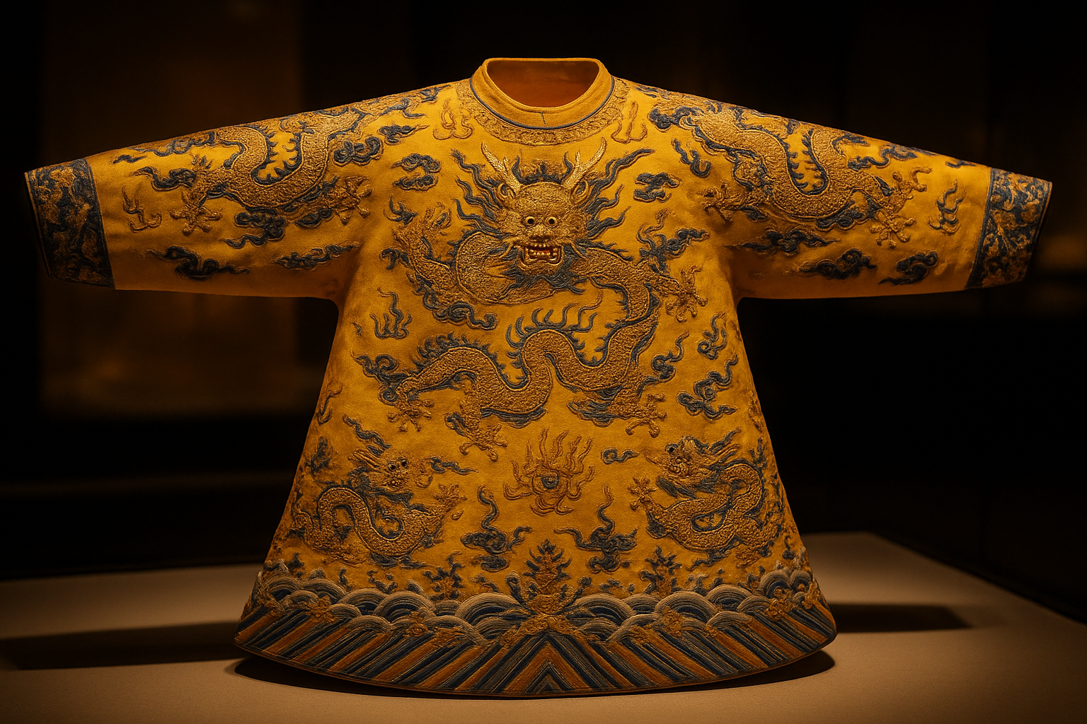
In Tang and Ming Dynasty China, a specific shade of imperial yellow, 明黄 (míng huáng), was legally reserved for the Emperor. This wasn't a suggestion. Wearing it without permission was a capital offense. Yellow's value wasn't enforced by fashion. It was enforced by the executioner's blade.
Halfway across the world, Hinduism wrapped yellow in a different kind of authority. The color peeta, a deep saffron-yellow, belongs to the sun god Surya and to the pursuit of knowledge itself. Ascetics wear it. Deities are depicted in it. The Brahmin thread ceremony and festival garments connect yellow directly to spiritual elevation.
And the physical source of that color tells you everything about why it carried such weight. Saffron, at various points in history, was worth more than gold by weight. Each crocus flower yields only three tiny stigmas. You need roughly 75,000 flowers to produce a single pound of saffron. That scarcity made yellow pigment genuinely inaccessible to common people, and inaccessibility is what gave it its sacred charge.
Even within a single culture, yellow could mean two completely different things. Romans used yellow ochre freely in fresco painting. It was abundant, earthy, democratic. But saffron dye in Roman textiles? That was aristocratic luxury. Same color family. Entirely different social signal. The material source, not the hue, determined the meaning.
The Saffron Road: How Yellow Changed Meaning as It Traveled
Saffron moved along the Silk Road from Persia and Kashmir into Europe, carrying sacred associations with it like invisible cargo. But meaning doesn't survive transport intact. As availability increased, the aura diminished. A color that once signified the divine gradually became just another commodity.
Medieval European dyers faced a practical problem that accelerated this shift. Cheap yellow dyes from weld (Reseda luteola) and onion skins were easy to produce, but they faded fast. Permanence was status. A yellow that lasted was a yellow worth wearing. A yellow that washed out in three months was a yellow for peasants.
Then came the deliberate weaponization of yellow's declining prestige. In several German city-states during the Medieval and Renaissance periods, sumptuary laws required Jews to wear yellow badges or pointed yellow hats. This was a calculated inversion. The authorities took a color already sliding from sacred to common and forced it onto a marginalized group, turning yellow into a mark of exclusion. This is one of the most critical turning points in yellow's cultural biography, and its echoes persisted for centuries.
The spice and dye trades had split yellow into two tiers: the gleaming, expensive, divine yellow of courts and temples, and the cheap, fugitive, degraded yellow of everyday cloth. One color. Two reputations. Both real.
The Poison Cabinet: Chrome Yellow, Arsenic, and the Victorian Death Palette
The early 1800s brought a chemical revolution. The discovery of chrome yellow (lead chromate, PbCrO₄) made a brilliant, stable, affordable yellow available to everyone for the first time. Wallpaper manufacturers, coachbuilders, and artists rushed to use it. The color of emperors was suddenly the color of middle-class parlors.
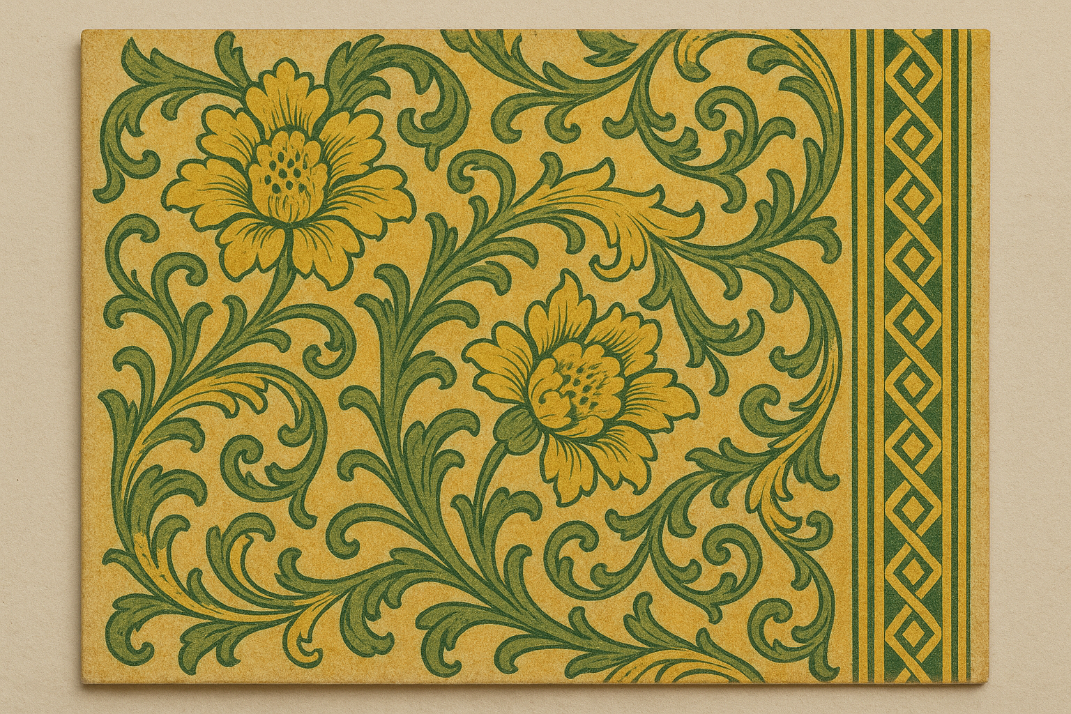
The chemistry, however, was brutal. Chrome yellow is deeply toxic. In the damp conditions common to Victorian homes, mold growing on arsenic-based green wallpapers like Scheele's Green and Emerald Green could convert the pigment into trimethylarsine, a volatile and poisonous gas. Similar outgassing concerns applied to chrome yellow pigments. Entire families sickened. Children died. The culprit was their cheerful wallpaper.
The most famous case involves Napoleon Bonaparte on St. Helena. The persistent theory that arsenic-rich green wallpaper in his damp cottage contributed to his deterioration and death has been debated by historians and chemists for decades. Hair samples analyzed in the 20th century showed elevated arsenic levels. Whether the wallpaper was the primary cause remains contested, but the story perfectly captures the era's poisonous relationship with artificial color.
The deeper consequence was sociological. Synthetic pigments democratized color, but they severed yellow's connection to its material origin. Yellow no longer came from the sun-soaked stamens of a crocus. It came from a laboratory reaction involving lead. The magic was gone, replaced by industrial abundance and invisible danger.
Van Gogh's Yellow: Cadmium, Madness, and the Art of Seeing Too Much
Vincent van Gogh's obsessive use of yellow, particularly in the Sunflowers series (1888–1889) and The Bedroom, was made possible entirely by newly available synthetic pigments. Cadmium yellow. Chrome yellow. Zinc yellow. Without the Industrial Revolution's chemistry, his palette was physically impossible. The most luminous paintings in Western art history are products of the same toxic innovation that killed Victorian families.
And those paintings are already fading. Researchers at the Antwerp Royal Museum of Fine Arts and KIK-IRPA have documented that Van Gogh's chrome yellows have darkened significantly over time. A photochemical reduction reaction gradually converts the bright lead chromate into brownish compounds. The vivid yellows you see in museums today are not what Van Gogh painted. They are already a ghost of his original vision.
The madness connection adds another layer. Van Gogh's lead and heavy metal exposure through his painting materials is a documented factor in medical literature examining his mental deterioration. He was known to chew his brushes and may have ingested pigment directly. Cadmium and lead are both potent neurotoxins.
Think about what that means narratively. Van Gogh used a poisonous, unstable yellow to paint some of the most joyful images in Western art. The tension between the pigment's toxicity and its expressed emotion is a perfect microcosm of everything yellow has always been: dangerous beauty, precarious radiance.
And here's the curatorial irony. Museums now display these paintings under UV-filtered glass to slow the very chemical processes Van Gogh unknowingly set in motion. We are preserving the memory of a yellow that no longer exists.
Yellow's Cultural Disgrace: Cowardice, Journalism, and the Color of Warning
By the 19th century, yellow in the West had accumulated associations that would have been unthinkable to a Tang Dynasty emperor. Illness (jaundice). Cowardice ("yellow-bellied," a phrase with murky origins but firm cultural grip). Sensationalism ("yellow journalism," coined during the 1890s Hearst vs. Pulitzer newspaper wars, named after the Yellow Kid comic strip).
The "Yellow Peril" propaganda of the late 19th and early 20th centuries represented one of the most grotesque political deployments of color in modern history. Yellow was weaponized as a color of fear and otherness directed at Asian peoples, a racist framework that stained the color with associations it never carried in the cultures being targeted.
Then came the 20th-century pivot to pure function. Yellow's high visibility on the color spectrum, peaking around 570 nanometers where the human eye is most sensitive, made it the natural choice for caution signs, school buses (standardized in the U.S. in 1939), and taxi cabs. The color went from sacred to industrial safety infrastructure in roughly a thousand years.
The psychological consequence for design was severe. By the time Modernist designers began formalizing color theory, yellow had accumulated centuries of contradictory baggage. It was simultaneously the most visible color and the least trustworthy.
Yellow in Brand and UI Design: Why the History Still Haunts Every Hex Code
McDonald's, IKEA, Snapchat, and the Post-it note all rely on yellow's attention-grabbing visibility. But each brand navigates the "cheap vs. cheerful" tension differently through saturation, context, and pairing. McDonald's pairs golden yellow with red for warmth and appetite. IKEA uses a bold, flat yellow against blue for Scandinavian optimism. Snapchat's bright yellow feels youthful precisely because it avoids the warm, golden associations that connote tradition.

In digital interfaces, yellow creates a specific technical headache. WCAG accessibility standards require a 4.5:1 contrast ratio for normal text. Yellow on white almost never passes that threshold. Yellow's historical role as decoration rather than information carrier has a literal technical consequence in modern UI design. Designers who want to use yellow for text or interactive elements must darken it so far toward amber or gold that it arguably stops being yellow at all.
Cultural context still matters in 2026. In China, yellow retains strong positive associations rooted in the imperial tradition. In Brazil, yellow combined with green carries political and national weight that a global brand must navigate with care. Yellow is never context-free.
Here's the inheritance every designer carries. When you reach for yellow to convey "optimism" or "energy," you are unconsciously channeling the color's solar, divine history. When a client rejects yellow as "cheap" or "aggressive," they are responding to centuries of democratization and stigma. Naming that history out loud makes the creative conversation more precise and more productive.
The Wavelength That Remembers Everything
Yellow isn't polarizing because people disagree about it. It's polarizing because it has genuinely been all of these things: imperial robes and warning signs, crocus stamens and lead chromate, Van Gogh's sunlight and Napoleon's wallpaper. The color carries its entire biography in its wavelength.
So here's a challenge for your next project. The next time you reach for yellow, or push back against it, pause long enough to ask which yellow you're actually responding to. The sacred one? The poisonous one? The industrial one? The stigmatized one?
Because the answer will tell you exactly what to do with it.