Why Renaissance Painters Were Obsessed With Ultramarine — and Clients Paid More for It Than Gold
by ColorSift Editorial Team
Imagine standing in a Renaissance apothecary in 15th-century Florence. A merchant places a small pouch of brilliant blue powder on one side of a brass scale. On the other side, an equal weight of gold. The blue wins. That powder was ultramarine, a pigment ground from lapis lazuli stone mined from a single mountain range in what is now Afghanistan. Ounce for ounce, it was more precious than gold for nearly 500 years.
This isn't art history trivia. It's the origin story of one of the most powerful color associations in human culture. The reason blue dominates corporate logos, luxury branding, and religious iconography today traces directly back to a time when the color itself was a status symbol. Painters and patrons negotiated its use in legal contracts. It was reserved for the most sacred figures in Western art. For designers who choose colors every day, understanding why blue carries this cultural weight is essential context that separates intentional design from decoration.
From Afghan Mines to Florentine Studios: The Journey of a Pigment
Lapis lazuli was mined almost exclusively from the Sar-e-Sang mines in Badakhshan, northeastern Afghanistan. These same mines had supplied the ancient Egyptians and Sumerians thousands of years earlier. When European demand surged during the medieval period, the raw stone traveled thousands of miles along the Silk Road through Persia, the Levant, and into Venice, which served as the primary entry point for the pigment into European art markets. Each step of the journey added cost and risk.
The name itself tells the story. "Ultramarine" comes from the Latin ultramarinus, meaning "beyond the sea," because it arrived from beyond the known Mediterranean world.
Getting usable pigment from raw lapis was agonizingly complex. Workers ground the stone into powder, then kneaded it repeatedly with pine resin, wax, and lye over the course of days. Only about 3 to 5 percent of the raw stone yielded usable pigment. The first extraction produced the most vivid blue, while each subsequent pull grew progressively grayer, producing lower grades worth a fraction of the original.
By the time the pigment reached a painter's workshop, its price in 15th-century Florence could reach 8 florins per ounce. That was roughly equivalent to the monthly salary of a skilled craftsman. Sometimes it literally exceeded the price of gold leaf.
The Color of Heaven: How Scarcity Made Blue Sacred
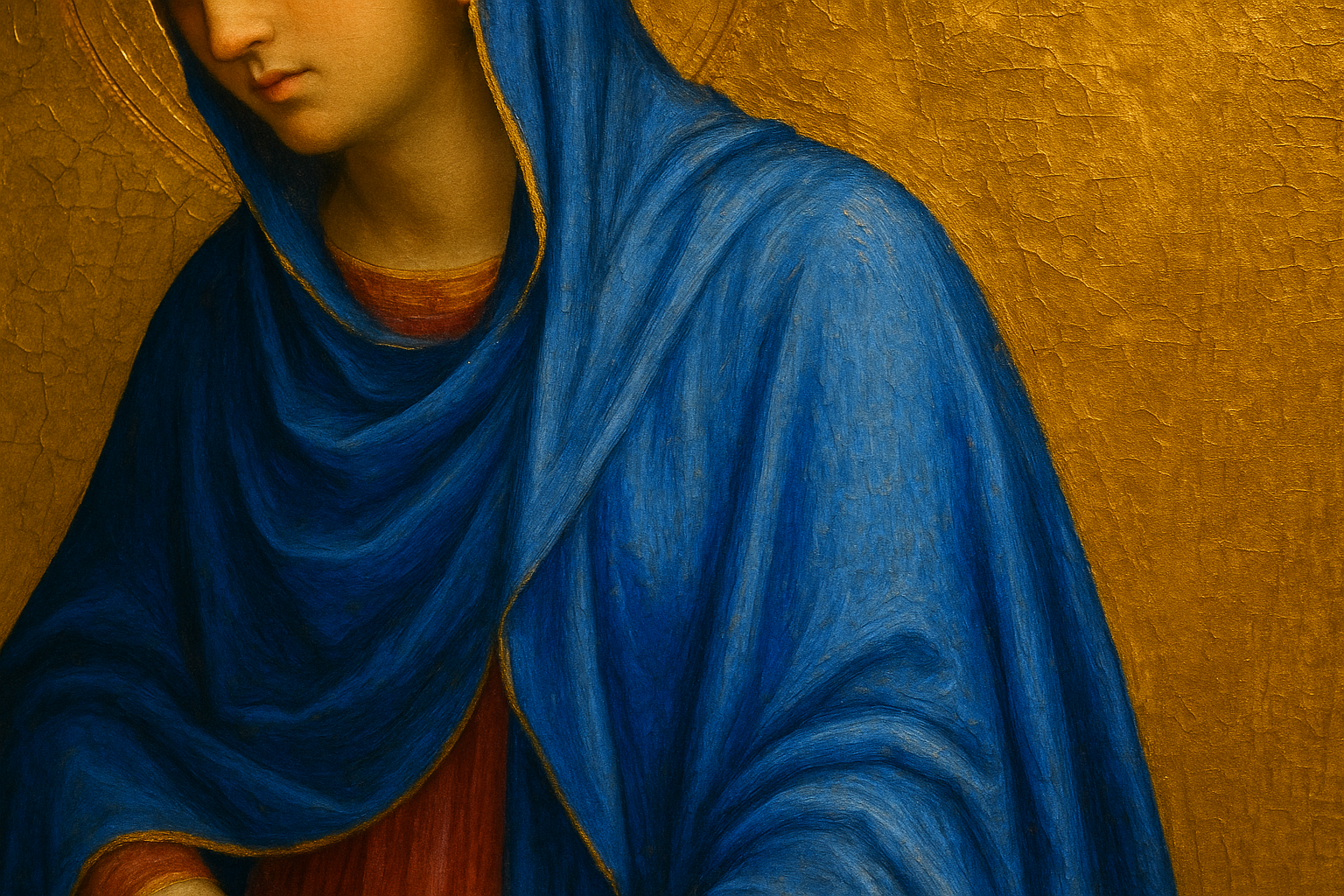
Because ultramarine cost so much, its use became inherently meaningful. Painters reserved it for the most important figures in a composition, most notably the Virgin Mary. Her iconic blue mantle wasn't a random aesthetic choice. It was a deliberate economic and theological statement.
This created a feedback loop. Blue became associated with divinity because painters used it on sacred figures. And painters used it on sacred figures because it was rare and precious. The material value of the pigment literally transferred onto the spiritual meaning of the imagery.
Here's something that surprises most people: before ultramarine's dominance in European art, blue was not universally considered a noble color. Ancient Romans associated it with barbarians. It held relatively low status in classical color hierarchies. The economics of ultramarine helped elevate blue's cultural standing across centuries, a shift driven by trade routes and theology rather than any inherent property of the color itself.
The association extended beyond religion to royalty. Blue became linked with authority, purity, and heaven. This is the deep root of phrases like "royal blue" and "blue blood," and the reason blue was adopted by French and English monarchies as a symbol of power. A color that Romans once dismissed became, through sheer economic force, the most prestigious hue in European culture.
Written in the Contract: When Patrons Dictated the Paint
Renaissance art commissions were not casual arrangements. They were legal contracts, and the use of ultramarine was frequently the most contentious negotiation point. Patrons specified exactly how much ultramarine a painter was required to use, in which areas, and of what grade.
Consider a famous example: the 1485 contract for Domenico Ghirlandaio's Adoration of the Magi specified that the background must be painted in ultramarine costing at least four florins per ounce, while other blues of lesser quality could fill less prominent areas.
Some contracts went even further, requiring that the patron supply the ultramarine directly to the painter rather than giving cash. The reason? To prevent artists from substituting cheaper pigments like azurite or smalt and pocketing the difference. This apparently happened often enough to warrant contractual safeguards. You can almost hear the exasperated patrons drafting these clauses.
The amount of ultramarine in a painting served as a visible marker of the patron's wealth and piety. A lavishly blue altarpiece communicated to the entire congregation that the donor was both rich and devout. The pigment was as much a status symbol for the buyer as an artistic tool for the painter.
This system reveals something profound about art and design: material constraints don't just limit creativity. They shape meaning. The scarcity of ultramarine didn't simply restrict painters. It created an entire semiotic system where the quantity and quality of blue in a work carried social, economic, and spiritual information that every viewer in a Renaissance church could read.
Vermeer's Addiction and Raphael's Strategic Brilliance
Johannes Vermeer is perhaps the most dramatic case of ultramarine obsession. He used the pigment lavishly, applying it to shadows, underpainting, and areas where cheaper pigments would have sufficed perfectly well. His Girl with a Pearl Earring and The Milkmaid showcase this extravagant approach. Some art historians believe his chronic debt was directly related to his pigment spending.
Technical analysis of Vermeer's paintings shows that he often applied ultramarine in multiple layers, building up a luminous depth that no other blue pigment could achieve. He understood intuitively what modern color science confirms: ultramarine's unique crystalline structure reflects light in a way that creates an almost glowing quality. He was chasing a visual effect that only this specific, ruinously expensive material could produce.
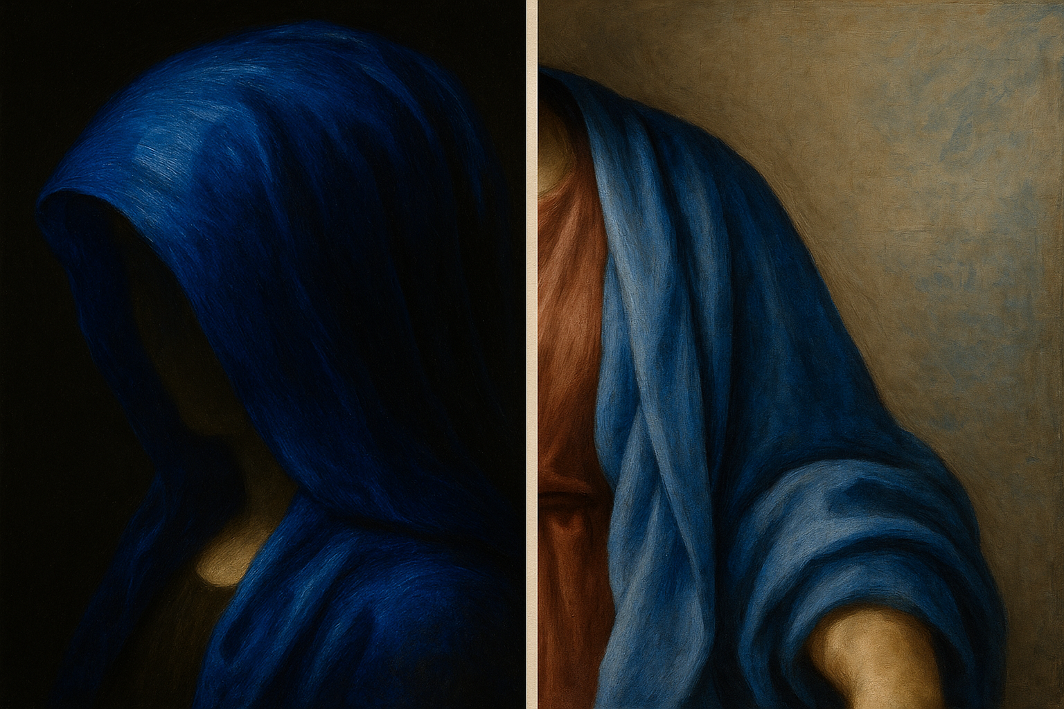
Raphael, by contrast, demonstrated strategic restraint. In the Sistine Madonna, he used ultramarine for the Virgin's robes but carefully deployed azurite and other less expensive blues in supporting areas. This created a hierarchy of color that mirrors the hierarchy of sacred figures. Every stroke of ultramarine was a calculated investment.
Then there's Michelangelo. Painting the Sistine Chapel ceiling, he reportedly complained about the cost and difficulty of working with ultramarine in fresco technique, where the pigment had to be applied to wet plaster and could easily be wasted. His disputes with Pope Julius II about materials budgets would feel familiar to any modern designer arguing with a client about scope and resources. Some things never change.
These three artists represent three distinct relationships with the same material: Vermeer the addict, Raphael the strategist, Michelangelo the reluctant pragmatist. Each approach produced masterpieces, but each was fundamentally shaped by the economics of blue.
1826: The Year Blue Became Democratic
In 1826, French chemist Jean-Baptiste Guimet successfully synthesized ultramarine in a laboratory, winning a prize offered by the Société d'Encouragement pour l'Industrie Nationale. Almost overnight, a pigment that had cost more than gold became available for a fraction of the price.
The impact on art was immediate and revolutionary. The Impressionists, who came of age in the era of cheap synthetic ultramarine, used blue with an abandon that would have bankrupted any Renaissance master. Monet's water lilies, Renoir's skies, and Cézanne's landscapes are drenched in blues that would have been financially impossible just decades earlier. An entire art movement was enabled, in part, by a chemistry breakthrough.
Yves Klein took this democratization to its philosophical extreme in the 1960s, creating International Klein Blue (IKB), a deep, matte ultramarine that he used to cover entire canvases. Klein's work is essentially a meditation on what happens when a color is freed from its economic constraints: it becomes pure experience, pure sensation.
The synthetic version was chemically identical to the natural pigment, which raises a fascinating question that resonates with modern design. Does the origin of a material matter if the result is visually indistinguishable? For Renaissance patrons, the answer was emphatically yes. The value lived in authenticity and rarity, not just appearance.
This moment of democratization has parallels throughout design history:
Each time a scarce resource becomes abundant, the meaning attached to it shifts. But it rarely disappears entirely.
The Long Shadow: Why Blue Still Means Trust, Luxury, and Authority
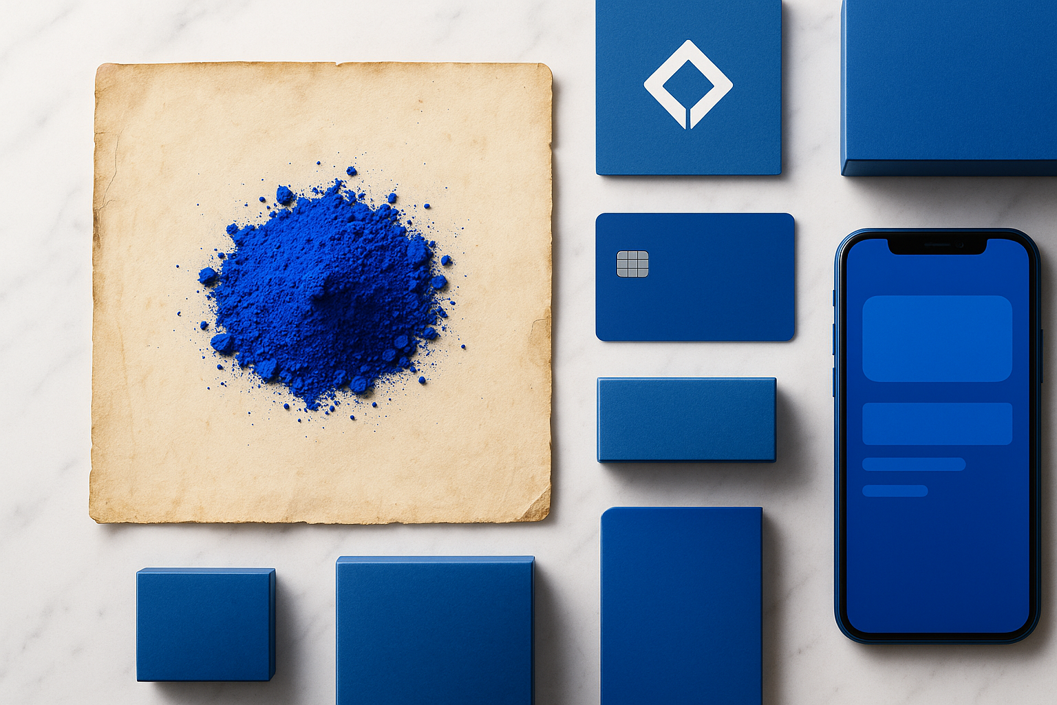
The cultural associations forged during centuries of ultramarine's scarcity persist in modern branding and design. Blue is the dominant color in corporate identity, used by Facebook, IBM, Samsung, PayPal, Ford, and countless financial institutions. This isn't coincidence. Research consistently shows that blue evokes trust, stability, and competence, associations that trace back to its long history as the color of heaven, royalty, and immense material value.
When Tiffany & Co. chose its iconic robin's-egg blue in 1837, just eleven years after synthetic ultramarine was invented, the company was consciously tapping into centuries of blue-as-luxury association while benefiting from the newly affordable pigment technology that made consistent brand color possible at scale.
The lesson for modern designers is not that blue is inherently trustworthy. It's that centuries of economic and cultural history made it so. Color meaning is not innate. It is constructed through material reality, trade networks, theological decisions, and contractual negotiations. Understanding this history gives you the ability to use color with intention rather than instinct alone.
Modern parallels abound. Just as Renaissance patrons paid premiums for authentic ultramarine, today's consumers pay premiums for specific material qualities: matte black finishes, sustainable packaging materials, hand-mixed paint colors. The principle that material scarcity creates perceived value hasn't changed in 600 years.
Back to the Apothecary's Scale
Let's return to that brass scale in the Florentine apothecary. The story of ultramarine is ultimately a story about how material constraints create meaning, and how that meaning can outlast the constraints that created it by centuries.
Synthetic ultramarine eliminated the scarcity that made blue precious. But it couldn't erase 500 years of cultural conditioning. Every time a designer reaches for blue to signal trust, every time a luxury brand wraps itself in deep azure, every time a user interface uses blue for a primary action button, they are drawing on a legacy that stretches from Afghan mountainsides through Venetian trade ports to Florentine contract negotiations. Whether they know it or not.
The takeaway for designers is both humbling and empowering. The colors you use are never neutral. They carry histories, economies, and theologies in every pixel and every brushstroke. The best designers don't just choose colors that look good. They choose colors whose stories align with the stories they're trying to tell.
That little pouch of blue powder was never just a pigment. It was a currency, a prayer, a contract clause, and a status symbol. And six centuries later, it still is.