Why Operating Rooms Are Painted Sage Green: The Psychophysiology of Color in Life-or-Death Environments
by ColorSift Editorial Team
A surgeon in the 1920s is halfway through a long abdominal procedure. She looks up from a field of deep red tissue to check a monitor mounted on the white wall across the room. And there it is: a phantom teal-green blotch, floating in her vision like a stain on the air. She blinks. It doesn't go away. This isn't a hallucination. It's a well-documented optical phenomenon called a negative afterimage, and for decades it plagued surgeons working in brilliant white operating theaters.
The solution wasn't pharmacological or technological. It was a can of sage green paint.
That single design decision, born from human physiology rather than aesthetics, quietly revolutionized surgical environments. It also opened the door to a deeper question: What if color isn't about mood or brand or beauty, but about how our bodies physically function under pressure? This article traces the surprising science behind the green operating room and follows that thread into air traffic control towers, nuclear control rooms, and neonatal ICUs, environments where the wrong color choice isn't a design flaw. It's a safety hazard.
The Ghost on the White Wall: How Afterimages Nearly Compromised Surgery
Here's what happens inside your eye when you stare at something red for a long time. The red-sensitive cones in your retina fire continuously, burning through their photopigment. They fatigue. When you shift your gaze to a neutral white surface, those exhausted red cones temporarily underperform while your green and blue cones keep firing at full strength. The result? Your brain perceives the complementary color, a ghostly cyan or teal, projected onto whatever you're looking at.
This is the negative afterimage. It's predictable, reproducible, and rooted in basic retinal chemistry.
Now put that phenomenon in an early 20th-century operating room. Walls, floors, drapes, gowns, everything was white. The logic made sense at the time: white signaled sterility. But surgeons who spent hours staring at red tissue and blood found themselves haunted by distracting colored spots every time they glanced away from the operative field. These phantom images interfered with visual acuity during the most critical moments of a procedure.
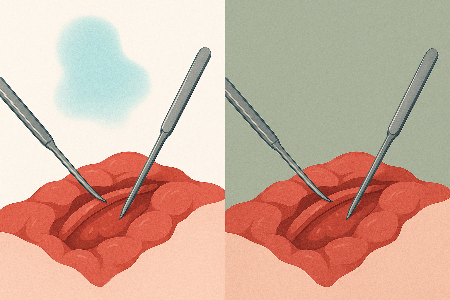
The turning point came in 1914, when surgeon Harry Sherman began advocating for green operating environments. His reasoning was elegant. Green is the complementary color to red. By painting walls and draping surfaces in sage green, the afterimage would land on a surface that essentially absorbed it, rendering the phantom invisible. The afterimage still formed on the retina, but against a green background, it blended in rather than screaming for attention.
By the 1950s and 1960s, hospitals had widely adopted sage green and blue-green tones for walls, drapes, and surgical scrubs. The shift wasn't gradual. It was decisive, because the science was undeniable.
Here's the misconception worth correcting: most people assume hospital green is about cleanliness or calm. Ask anyone why scrubs are green, and they'll probably say something about soothing colors. The real reason is retinal physiology. That distinction matters enormously for how we think about color in design.
Color as Physiology, Not Psychology: Reframing the Conversation
Pop color psychology tells us that blue is calming, red is exciting, and yellow is cheerful. You've seen these claims in countless blog posts and branding guides. And while there's a kernel of truth to some of them, this framing misses something critical. It treats color as an emotional input when, in many contexts, color is a physiological one.
Psychophysiology studies how color physically affects the nervous system, visual processing, pupil dilation, and cognitive performance. These are measurable, replicable effects that go well beyond subjective feeling.
Consider Ewald Hering's opponent-process theory of color vision. Hering proposed in the 19th century that human color perception operates along three channels: red-green, blue-yellow, and light-dark. Modern neuroscience has confirmed that retinal ganglion cells and cells in the lateral geniculate nucleus do indeed process color in these opponent pairs. This means complementary color relationships aren't just aesthetic harmony on a color wheel. They're wired into the architecture of human vision.
Research backs this up with hard numbers:
- Specific wavelengths of light measurably affect cortisol levels and heart rate variability. A 2019 study published in Scientific Reports found that exposure to short-wavelength blue light significantly suppressed melatonin production and increased alertness markers compared to longer-wavelength light.
- Sustained attention tasks performed under different ambient light colors show measurable differences in error rates and reaction times.
- Circadian rhythm disruption from inappropriate light color exposure has been linked to increased rates of medical errors during night shifts.
This is the overlooked foundation of color theory. Design education teaches students about color wheels and complementary pairs, but it rarely teaches why those relationships exist in the body's own hardware. The operating room is proof that ignoring this dimension has consequences.
Beyond the OR: Color Decisions in Other Life-or-Death Environments
The operating room isn't the only place where color choices carry life-or-death weight. Across a surprising range of high-stakes environments, color decisions follow the same principle: physiology first, aesthetics never.
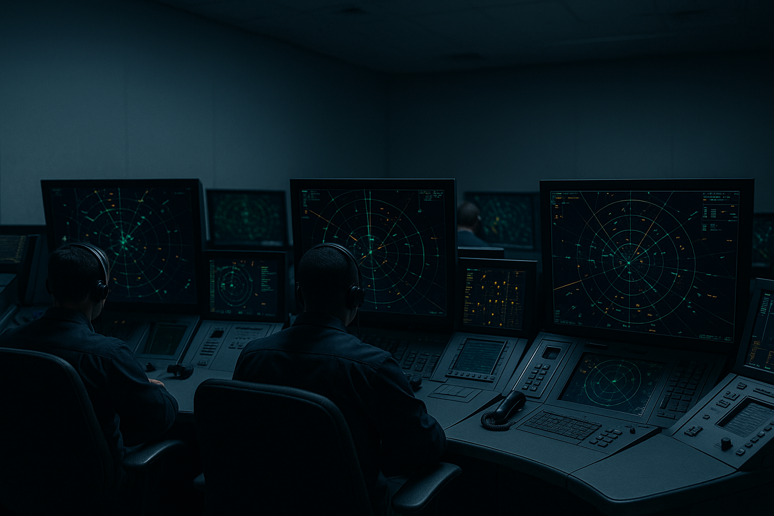
Air Traffic Control Towers
If you've ever seen the inside of an ATC facility, you know it looks nothing like a modern tech office. The displays use dark backgrounds with specific green, amber, and cyan elements. This isn't a stylistic choice. It's optimized for sustained visual attention, minimal glare, and rapid target discrimination.
FAA Human Factors guidelines specify color usage with clinical precision. Each hue serves a cognitive function: green for tracked aircraft, amber for alerts, red for conflicts. The muted, low-saturation environment of the tower itself is designed to preserve dark adaptation and reduce eye strain during shifts that can stretch for hours. Extraneous color is treated like noise, something to be eliminated.
Nuclear Power Plant Control Rooms
The color discipline in nuclear facilities is even more severe. Design guidelines under NUREG-0700, the Nuclear Regulatory Commission's Human-System Interface Design Review Guidelines, prescribe a restrained palette where each color has a strict functional meaning. Red means danger or stop. Yellow means caution. Green means normal or safe. That's it.
Extraneous color is deliberately suppressed to prevent what engineers call "color noise," the visual equivalent of static that makes it harder to spot the one indicator that actually matters. This concept ties directly to alarm fatigue, which we'll return to shortly.
Neonatal Intensive Care Units
NICUs present a unique challenge: the patients can't tell you what they need. Research over the past two decades has shown that ambient light color significantly affects premature infants. Studies, including a notable 2014 paper in the Journal of Perinatology, found that cycled lighting (warm tones simulating daytime, dim blue-shifted tones for night) supports circadian development, promotes weight gain, and reduces hospital stays.
The color environment in a NICU is designed for the most vulnerable patients on earth. Getting it wrong doesn't just affect mood. It affects survival.
Submarines and Spacecraft
NASA and naval engineers face a different problem: long-duration confinement in windowless environments. Interior color selection balances visual monotony against overstimulation, with specific hues chosen to support psychological endurance and spatial orientation. On the International Space Station, for instance, different modules use subtly different color schemes partly to help astronauts maintain a sense of location and direction in a place where "up" doesn't exist.
The Cost of Getting It Wrong: When Color Becomes a Safety Hazard
In a retail app, a misused color might lower conversion by 2%. In an operating room or control tower, it can cost a life. That stakes difference should change how seriously designers take color's physiological dimension.
Alarm fatigue is one of the clearest examples of color failure. In hospital settings, when too many colors compete for attention, critical warnings get missed. A 2015 study published in PLOS ONE found that clinical staff exposed to high volumes of color-coded alerts became desensitized, responding more slowly to genuine emergencies. Medical device interfaces with excessive color variation have been directly linked to adverse patient events.
The most famous case study is Three Mile Island. The 1979 nuclear accident was partly attributed to poor control room design, including confusing indicator colors and layouts. Operators couldn't quickly distinguish between normal and abnormal conditions because the visual environment failed to prioritize information. Post-incident redesigns emphasized strict color discipline as a safety intervention. The lesson: when everything is highlighted, nothing is.
These failures have fueled the growth of neuroaesthetics and human factors engineering, disciplines where color decisions are subjected to empirical testing rather than stakeholder preference or design trends. In these fields, a color choice gets justified the same way a structural engineering choice does: with data.
What Designers Can Learn from Surgeons and Air Traffic Controllers
Most design education treats color as expressive and emotional. The operating room teaches us that color is also structural and physiological. Both dimensions should inform design decisions, whether you're designing a surgical suite or a reading app.
Here are three practical lenses to apply:
- Viewing duration. How long will someone stare at your interface? A billboard seen for three seconds has different physiological demands than a dashboard monitored for eight hours. Prolonged exposure to high-saturation colors causes measurable cone fatigue. If your product is used for hours at a stretch, you need to think about this.
- Ambient context. What colors surround the designed object? A screen viewed in a dim room behaves differently than one used outdoors. The operating room lesson is precisely this: the color of the environment matters as much as the color of the focal point.
- Physiological load. Will your color scheme cause fatigue, afterimages, or reduced contrast sensitivity over time? High-contrast complementary pairs can vibrate visually when placed adjacent to each other, a phenomenon called simultaneous contrast. It's not just ugly. It physically strains the visual system.

The challenge is to test color choices with the same rigor applied in high-stakes environments. That doesn't mean every project needs an fMRI study. But it does mean measuring eye strain, task completion accuracy, and sustained attention under realistic conditions, not just running A/B tests on click-through rates.
Reframe "color harmony" for a moment. It isn't an abstract aesthetic ideal. It's a physiological compatibility problem. Are the colors in your design working with or against the user's visual system? That question changes everything about how you evaluate a palette.
The Invisible Design Decision
Return to the surgeon and the phantom teal ghost on the white wall. That simple, almost absurd problem, solved not by technology but by understanding how human eyes actually work, contains a lesson that extends far beyond medicine.
Color is not decoration. It is not merely emotional shorthand. It is a physiological input that interacts with the hardware of human perception in predictable, measurable ways.
The sage green wall in the operating room is a reminder that the most profound design decisions are often invisible. Not because they lack ambition, but because they work so well that no one notices them. The scrubs look green. The walls look green. Nobody thinks about why, and that's exactly the point.
Designers who internalize this principle don't just make things that look good. They make things that work with the body, not against it. In the highest-stakes environments on earth, that difference is the one that matters most. And in the quieter, everyday environments where most of us actually work, it still matters more than we think.