Why Hospital Scrubs Turned Teal: The Surprising Science of Complementary Afterimages in Life-or-Death Design
by ColorSift Editorial Team
A surgeon in 1914 San Francisco stands over an open abdomen, her gloved hands steady in a field of deep red tissue. She has been staring at blood and muscle for forty minutes. She glances up at her colleague's white gown to ask for a clamp, and there it is: a shimmering, phantom green stain spreading across the white fabric like a bruise made of light. She blinks. It persists. It drifts when her eyes move.
This isn't a hallucination. It's a predictable neurological phenomenon called a complementary afterimage, and for decades it plagued operating rooms around the world. The solution, one of the most elegant and underappreciated examples of applied color theory in history, would eventually change the look of modern medicine entirely. This is the story of why surgeons stopped wearing white, why operating rooms turned blue-green, and what that shift reveals about the hidden, high-stakes power of complementary color relationships.
The Ghost on the White Gown: What Afterimages Are and Why They Matter
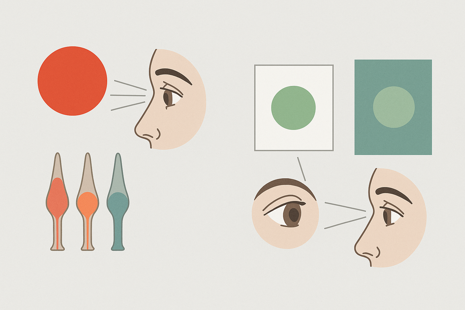
Here's what's happening inside your eye when you stare at a single color for too long. Your retina contains three types of cone cells, each tuned to a different part of the visible spectrum: red, green, and blue. When you fix your gaze on a saturated red for an extended period, the red-sensitive cones fire continuously and gradually fatigue. They become less responsive. When you then shift your gaze to a neutral white surface, the green and blue cones, still fresh, dominate your perception. Your brain generates a phantom image in the complementary color. Red produces green. Blue produces orange. Yellow produces violet.
This is the complementary afterimage, and it's not subtle.
In a surgical environment, the conditions for afterimages are almost absurdly perfect. Surgeons stare at deep red blood and pink tissue for minutes or hours at a time, under intense focused lighting, with extreme concentration. Every time they glance away from the wound to look at an instrument tray, a colleague's gown, or the drapes surrounding the surgical field, green-cyan phantoms bloom across every white surface in sight. These ghosts can linger for several seconds. They shift with eye movement. They overlay real visual information with false color data.
In any other context, this would be a mildly interesting optical illusion. In surgery, it's a real problem. Afterimages can momentarily obscure fine details, create false color impressions when the surgeon looks back at tissue, and contribute to cumulative eye strain over long procedures. When your job requires distinguishing a healthy artery from a damaged one by subtle differences in color, a green phantom drifting across your visual field is more than an annoyance. It's a hazard.
The science behind this phenomenon was well understood even in the 19th century. Ewald Hering's opponent-process theory of color vision, published in 1878, provided the framework: human color perception is organized into opposing pairs (red vs. green, blue vs. yellow, black vs. white), and fatigue in one channel produces a rebound signal in the opposing channel. Afterimages always appear in complementary pairs. It's not a bug in human vision. It's a fundamental feature of how the system works.
A Century in White: The Antiseptic Origins of the All-White Operating Room
To understand why this problem persisted for so long, you have to understand why operating rooms were white in the first place.
From the late 1800s through the mid-1900s, the surgical environment was a temple of whiteness. White gowns. White caps. White walls. White sheets. White tile floors. This wasn't an aesthetic choice. It was a direct legacy of Joseph Lister's antiseptic revolution and the broader acceptance of germ theory. White symbolized sterility, cleanliness, and scientific rigor. It also made contamination, such as blood or other fluids, immediately visible on any surface. In an era when infection control was still a relatively new concept, that visibility felt like a practical advantage.
The problem was that all that white created the worst possible canvas for complementary afterimages.
Every surface in the room functioned as a projection screen for green phantoms. The white gowns, the white drapes, the white walls. Under the powerful surgical lamps of the era, these surfaces also produced significant glare, compounding the eye fatigue that was already being caused by the afterimages themselves. It was a double assault on the surgeon's visual system: fatigue from the color afterimages and fatigue from the brightness of the environment.
Surgeons and nurses reported these problems for years. Green spots. Persistent eye strain. Headaches. Difficulty refocusing on the surgical field after looking away. But these complaints were often dismissed as minor inconveniences, simply the cost of doing the job. White meant clean. Clean meant safe. And nobody was eager to question that equation.
The Pioneers Who Pushed for Change
The shift away from white didn't happen in a single dramatic moment. It was a slow, grinding campaign against institutional inertia.
One of the earliest documented experiments came in 1914, when a surgeon in San Francisco began using green operating drapes instead of white ones. The logic was sound, even elegant: if the afterimage of red is green, then placing green surfaces in the surgeon's peripheral vision doesn't eliminate the afterimage. Instead, it absorbs it. The green phantom lands on a green surface and effectively vanishes, rather than screaming for attention against a white background.
But adoption was painfully slow. White was synonymous with "medical." Switching to colored fabrics felt counterintuitive, even unsanitary, to many practitioners. There was a deep psychological resistance: if a hospital didn't look white, did it look clean?
The movement gained real momentum in the 1950s and 1960s, as more surgeons experimented with colored drapes and gowns and reported measurable improvements in visual comfort and reduced eye strain. The change spread in stages. First came green drapes around the immediate surgical field. Then green gowns replaced white ones. Then the walls of operating rooms themselves were repainted in blue-green tones.
By the 1970s and 1980s, the blue-green surgical scrub had become standard worldwide. And the specific shade that the medical world settled on was not arbitrary. It's a desaturated teal, a muted blue-green that sits close to the precise complementary of the red-pink spectrum of blood and oxygenated tissue. It was chosen to neutralize afterimages without creating a visually oppressive environment of its own.
The Color Science Behind the Teal Scrub
Let's get more specific about why this particular shade works.
On a standard color wheel, red and cyan-green sit directly opposite each other. The blue-green of surgical scrubs, roughly complementary to the red-orange of oxygenated blood, represents a real spectral relationship. This wasn't a vague "green feels calming" decision. It was a targeted response to a specific wavelength problem.
Two distinct color phenomena are at play in the operating room, and the teal environment addresses both of them:
- Successive contrast is the afterimage effect from prolonged staring. When the surgeon looks away from the red surgical field, fatigued red cones produce a green phantom. On a teal surface, that phantom blends in and disappears.
- Simultaneous contrast is the real-time influence that adjacent colors exert on each other. When green drapes border the surgical field, they actually enhance the surgeon's perception of reds and pinks within the wound. The complementary background makes the reds more visually distinct, not less.
This second point is crucial and often overlooked. The teal environment doesn't just prevent a visual nuisance. It actively sharpens the surgeon's ability to perceive subtle color differences in tissue. Distinguishing healthy tissue from necrotic tissue, arteries from veins, active bleeding from normal coloring: these discriminations depend on the surgeon's ability to perceive fine gradations of red and pink. A complementary green background heightens that sensitivity.
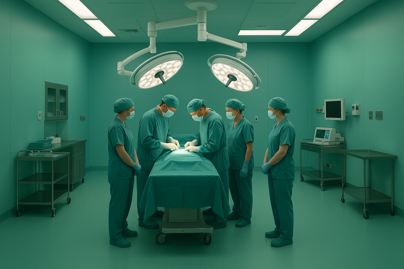
{{image-2}}
There's also a reason the shade is desaturated, a grayish, muted teal rather than a vivid, punchy green. A highly saturated green would create its own afterimage problems. Stare at vivid green long enough, and you'll see red phantoms when you look away. The muted quality of surgical teal represents a careful balance: enough green to absorb red afterimages, but not so much that it generates new ones. It also reduces overall visual fatigue by keeping the environment's contrast levels moderate.
Beyond Scrubs: How Hospital Color Design Affects Performance, Anxiety, and Healing
The scrub color story was just the beginning. It served as an early, compelling proof of concept: environmental color has measurable effects on human performance and wellbeing. Modern healthcare design has taken that lesson and run with it.
Research on surgeon and staff performance has found that blue-green environments reduce reported eye strain and fatigue during long procedures. In contrast, warm or overly stimulating color environments correlate with higher stress markers in clinical staff. A 2019 study published in the Journal of Perianesthesia Nursing found that environmental color modifications in pre-operative areas significantly affected patient anxiety scores.
On the patient side, the evidence is equally compelling. Research on pre-operative and recovery areas shows that cool blue-green and soft warm palettes can reduce self-reported anxiety compared to stark white or institutional gray environments. The work of Faber Birren, one of the 20th century's most influential color consultants, helped establish many of the principles that modern hospital designers still follow. His research in the 1950s and 1960s on institutional color directly influenced how hospitals, schools, and factories approached environmental design.
Today, evidence-based design frameworks used by firms like Perkins&Will and HKS Architects treat color as a functional variable, not a decorative afterthought. Color choices in patient rooms, corridors, and waiting areas are informed by research on physiological and psychological responses.
The principle extends to lighting as well. The shift toward tunable LED surgical lighting, which allows surgeons to adjust color temperature in real time to optimize tissue visibility, is a direct descendant of the same thinking that changed scrub color. If the color of surfaces matters, the color of the light hitting those surfaces matters just as much.
The Bigger Lesson: When Color Decisions Have Stakes Beyond Aesthetics
Most discussions of complementary colors focus on making designs look balanced or vibrant. The surgical scrub story is a powerful reminder that complementary color relationships are rooted in the neuroscience of human vision. They have consequences whether or not anyone is consciously thinking about design.
This principle shows up in surprising places:
- Cockpit instrument design. Aviation engineers carefully select instrument panel colors and lighting to avoid afterimage interference for pilots during long flights, especially during night operations.
- Air traffic control environments. The muted, dark color schemes of ATC facilities are designed to minimize visual fatigue and maximize the readability of radar displays over multi-hour shifts.
- Industrial safety signage. The reason warning signs pair red with yellow or orange with black isn't random. These are high-contrast opponent-color pairings that exploit the same perceptual channels Hering described in 1878.
- Sports equipment. Tennis balls switched from white to optic yellow in 1972 specifically because the yellow was more visible against varied court and background colors on television. The International Tennis Federation made the change based on visibility research, not aesthetics.
For anyone who works with color professionally, the lesson is worth internalizing. Understanding color science, not just color aesthetics, gives you predictive power. When you know why your eye responds the way it does to specific color relationships, you can anticipate problems before they appear and design solutions that work at the level of neurology, not just taste.
Conclusion: The Colors That Disappear
Return for a moment to that surgeon in the white operating room, blinking away green phantoms that float across every surface like uninvited guests.
Now contrast that image with a modern OR. Every surface is calibrated to a muted teal. The scrubs, the drapes, the walls. The green ghosts still form in the surgeon's visual system, because that's simply how cone cells work. But now those ghosts land silently on green fabric and vanish. No distraction. No false color data. No visual noise.
No one in that room is thinking about color theory. That's exactly the point.
The best applications of color science are the ones that disappear into the environment, solving problems so completely that the problems themselves are forgotten. The shift from white to teal scrubs is one of the most elegant design solutions of the 20th century, born not from aesthetics but from the physics of light, the biology of cone cells, and the simple, urgent need for a surgeon to see clearly.
For anyone who works with color, it's a humbling and inspiring reminder. Complementary colors aren't just a design principle. They're a fact of human perception. And when the stakes are high enough, that fact demands respect.