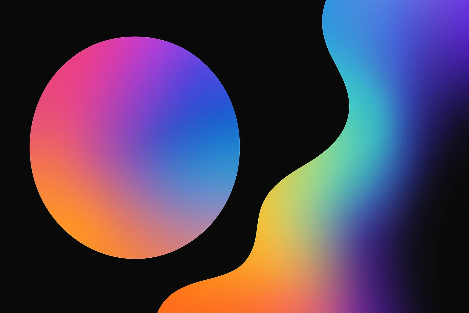
The Whimsical World of Color Gradients: Creating Dynamic Designs
by ColorSift Editorial Team
Introduction
Color gradients—ever found yourself mesmerized by their endless possibilities? They blend hues in a way that feels almost magical, creating vibrant, dynamic visuals that captivate the eye. Perfect for modern digital designers, this guide will open the door to the enchanting world of gradients and how they can bring depth and interest to your work.
So, What Exactly Are Color Gradients?
Gradients are those smooth transitions between colors that can add so much flair to a design. They're like the secret sauce in many digital compositions. You might encounter them in various forms:
- Linear Gradients: Picture a straight line where shades shift seamlessly from one end to another.
- Radial Gradients: Starting from a central point, colors fade outward.
- Angular Gradients: Think of these as gradients that wrap around in a circular pattern.
Colors can affect our emotions. Want a calm and serene vibe? Go for blues and greens. Looking for something energetic? Reds and yellows might do the trick.
A Stroll Down Memory Lane: Gradients Through History
Once upon a time, gradients were painstakingly created by hand. In art, the Renaissance saw artists blending pigments to achieve lifelike depth. Fast forward to the digital age, and the technology revolutionized how gradients were used in design.
Every generation has its design trends. Remember the 80s and 90s with their wild neon gradients? Or the subtle ones that defined the minimalistic style of the early 2000s?
Your Guide to Crafting Gorgeous Gradients
Choosing colors can be daunting. Should you go for contrast or a smooth blend? Tools like Adobe Illustrator and Figma make this easy, offering intuitive controls to find the perfect color balance.
Here are a few tips:
- Balance Intensity: Too much can overwhelm; too little might go unnoticed.
- Try Different Software: Everything from Photoshop to Canva has gradient features.
Putting Gradients to Work in Your Designs
So, you've crafted a beautiful gradient. Now what? Whether it's for web, print, or social media, make sure you use them wisely:
- Websites: Enhance backgrounds or create eye-catching banners.
- Print Media: Subtle gradients can add a touch of elegance to brochures or business cards.
- Social Media: Bright, bold gradients attract attention.
But beware, overusing gradients can cheapen your design. Always aim for harmony.
Feast Your Eyes: Color Schemes and Palettes
Let’s get visual with some popular color schemes:
Curious about more combinations? Tools like Adobe Color and Coolors are treasure troves for designers.
Want a unique touch? Don’t shy away from experimenting. Mix those colors and see what new gradients you can come up with.
What's Next for Gradients?
As trends evolve, so do gradient styles. Today, you might see gradients influencing everything from logos to user interface designs.
The future? It might involve AI, offering new ways to generate gradient patterns. Staying updated is key. Grab inspiration from design blogs or join communities where you can share ideas and stay in sync with the latest trends.
Wrapping Up
We've covered a lot, haven’t we? From ancient techniques to the latest design software, gradients have the potential to transform the ordinary into extraordinary. So, what are you waiting for? Start experimenting—and watch your designs come alive with color, depth, and personality.