The Color of Calm: How Headspace, Calm, and the Wellness App Wave Engineered Tranquility Through Hue
by ColorSift Editorial Team
Open a meditation app right now. Before you tap a single breathing exercise, before you queue a sleep story, before you log a single mood, something has already happened to you. The color has gone to work.
The mental wellness app market, valued at over $6 billion in 2026, runs on an unlikely raw material: a narrow, deliberately constrained palette of muted oranges, dusty slate blues, and gradient-washed purples that no single company invented but that the entire industry has quietly converged on. This is not a coincidence. It is a design argument, one built on sleep science, pharmaceutical psychology, biophilic instinct, and a very precise understanding of what a frightened, overstimulated person needs to see in the first three seconds after they open an app.
This piece traces how that color language was engineered, what it borrows from, who built it best, and what happens to the rare challenger brave enough to break from it entirely.
A Category Built on First Impressions: Why Color Does the Heavy Lifting in Wellness
Unlike fitness or productivity apps, mental wellness apps must earn emotional trust before the user has taken any action. Color is the first and fastest trust signal available.
Think about the anxiety paradox here. The people most likely to download a meditation app are also the most likely to be in a heightened state of nervous system arousal. Jarring or high-contrast visuals can functionally undermine the product's purpose before it begins. A person reaching for Calm at 2 a.m. during a panic attack does not need the visual energy of a Nike Training Club workout screen.
Research on chromotherapy and autonomic response, including mid-2020s studies on screen-based color exposure and cortisol levels, shows that warm, low-saturation tones can measurably reduce self-reported anxiety within seconds of visual exposure. This is not a subtle effect. It is a rapid physiological response, mediated through the retina and processed faster than any conscious evaluation of the app's content or credibility.
The category's color language is therefore not decorative. It is a clinical pre-intervention, a pharmacological primer delivered through light.
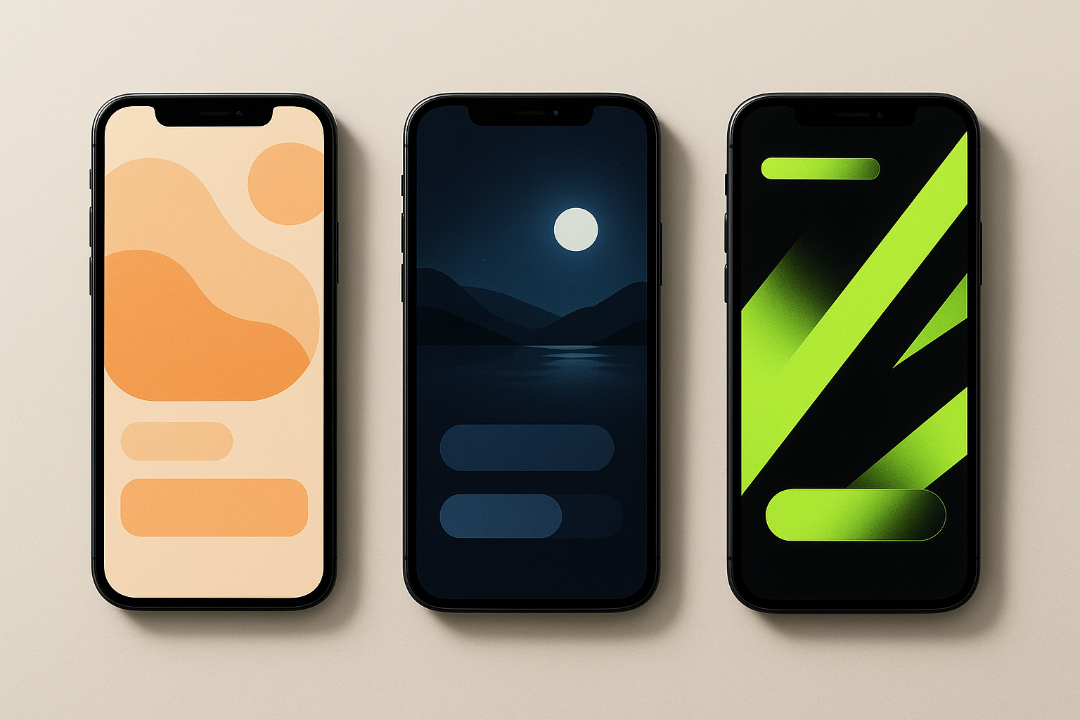
Headspace's Muted Orange and the Art of Warmth Without Alarm
Headspace's signature tangerine-adjacent orange is a masterclass in restraint. It reads as warm, human, and approachable while being deliberately de-saturated enough to avoid the urgency and aggression that pure orange carries in warning signs, traffic cones, and fast-food branding. Think about how different that Headspace orange feels from a Fanta logo or a construction barrier. Same color family. Completely different nervous system response.
The rounded, yolk-like blob characters that populate Headspace's visual world reinforce the color's emotional message: softness, containment, and a sense that nothing here has hard edges or sharp consequences. Every visual element works in concert. Nothing pokes.
Headspace's background palette leans heavily on warm off-whites and pale yellowed creams, which in color psychology literature are associated with safety, nurturing environments, and pre-sleep states. That last association is no accident. Much of meditation practice targets the transition into sleep.
The 2023 Headspace rebrand deepened the orange but simultaneously softened its contexts: more gradient, more atmospheric blur, less flat-graphic precision. The shift signaled a move from "app utility" to "emotional environment." Headspace stopped looking like a tool and started looking like a place.
Here's the detail worth studying. Headspace's onboarding flow uses the orange almost sparingly at first, letting neutral space dominate, then gradually introduces color warmth as the user moves deeper. It is a deliberate chromatic reward loop that mirrors the emotional arc of a session itself. You arrive in a neutral, low-stimulus space. As you engage, warmth appears. The color teaches you that going deeper feels good.
Calm's Midnight Blues and the Borrowed Grammar of Sleep Science
Where Headspace chose warmth, Calm chose depth. Its deep teal-to-midnight-blue gradient reads immediately as nocturnal, aquatic, and vast, three psychological registers that correlate with reduced arousal and a sense of being held by something larger than oneself.
Calm's palette borrows directly from the science of circadian lighting. Blue-shifted light at high intensity signals wakefulness, but deep, low-luminance blues at low contrast function as a visual analog to the evening sky. They physiologically cue the body toward rest. The distinction matters: it is not blue itself that calms, but a specific kind of blue at a specific luminance and saturation. Calm nails this.
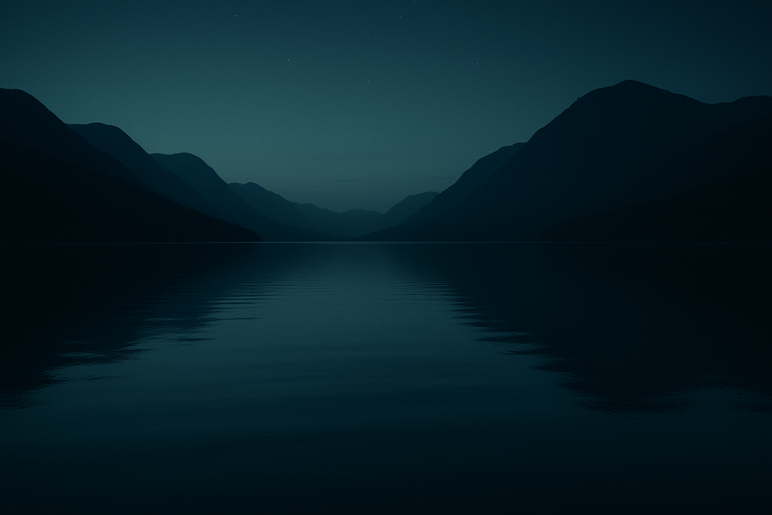
The starfield and moonlit lake imagery Calm uses as default backgrounds are not just pretty. They are biophilic design in action. These natural landscape proxies activate the restorative attention systems that psychologists Rachel and Stephen Kaplan described in their Attention Restoration Theory. Natural scenes, even digital reproductions of them, allow the brain to shift from directed attention (effortful, draining) to fascination (effortless, restorative).
Calm's typography and UI chrome are almost entirely absorbed into the blue field, creating a sense that the interface itself is dissolving. Rather than sitting on top of the background, the buttons and text feel like they belong to it. This mirrors the goal of the practice: ego dissolution, reduction of analytical self-monitoring. The app does not want you to feel like you are using an app. It wants you to feel like you are staring at a lake.
The Purple Gradient Moment: How a Third Hue Colonized the Category
By 2022 to 2024, a new chromatic shorthand emerged across the wellness app space: the lavender-to-violet gradient. It appeared in Insight Timer, Ten Percent Happier, Balance, and a wave of 2025 and 2026 challengers including Rosebud, Oura's mindfulness layer, and Apple's own Mental Wellness widgets in watchOS.
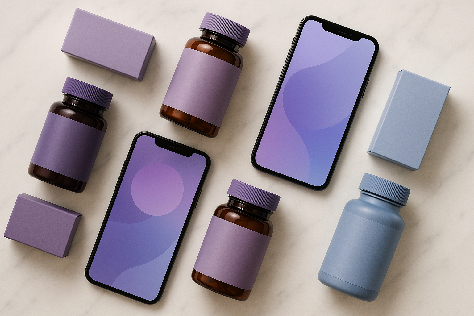
Purple carries a specific cultural and pharmacological resonance in this category. It has been the dominant hue of pharmaceutical packaging for sleep aids, melatonin especially, for over a decade. Users arrive with a pre-loaded association: purple means "this is something that helps me sleep or calm down." The apps did not have to build that meaning from scratch. They inherited it from the supplement aisle.
The gradient form, rather than flat purple, does additional work. Gradients signal softness, transition, and temporal movement. Dawn. Dusk. The space between one state and another. All of this is conceptually aligned with the transitional states meditation and sleep apps are designed to facilitate.
The convergence on purple also represents a market positioning move. Apps using it are often signaling: "We are neither the playful warmth of Headspace nor the austere depth of Calm. We are something more spiritual, more premium, more biohacking-adjacent."
But here's the risk. By 2026, the purple gradient has become so ubiquitous in the wellness space that it now reads as a category default rather than a brand differentiator. It is a cautionary tale in how quickly a distinctive color choice becomes wallpaper.
Biophilic Design and Pharmaceutical Packaging: The Hidden Sources Wellness Apps Borrow From
The wellness app color vocabulary did not emerge from graphic design tradition alone. It has two powerful, largely uncredited source libraries: biophilic design and pharmaceutical packaging psychology.
Biophilic design is the discipline of using natural forms and colors to support human physiological wellbeing. The specific hues dominating wellness apps, sage greens, stone grays, sky blues, dawn oranges, map almost perfectly onto what biophilic research identifies as the "restorative landscape palette." These are the colors of horizon lines, forest edges, still water, and overcast sky. They trigger the parasympathetic nervous system. They tell your body: you are in a safe, natural environment. Relax.
On the pharmaceutical side, the parallels are striking. Melatonin and anti-anxiety supplement packaging has used muted purples, soft blues, and warm ambers as primary signifiers for over 15 years. Apps like Calm and Headspace exist in the same mental pharmacy as these products. Their color choices may be subconsciously leveraging a pre-loaded consumer association between these hues and "this product reduces my anxiety."
UX researchers working in mental health digital products have identified what they call the "safe container" design imperative. The interface must visually communicate that it is a bounded, low-threat, non-judgmental space. Low-saturation palettes, rounded forms, and soft gradients are all architectural elements of that container. Strip any one of them away, and the container starts to feel less secure.
The Challengers Who Broke the Rules, and What Happened
A handful of 2024 to 2026 entrants deliberately rejected the muted wellness palette. Sam Harris's Waking Up leaned into stark charcoal-and-white minimalism, positioning itself as the "intellectual's meditation app" through a color language borrowed from premium editorial design rather than spa branding.
Waking Up's near-monochrome palette is a brand argument in itself. It says: "We are not selling you a feeling through visual manipulation. We are offering you a philosophical practice." The approach aligns with its content but narrows its addressable market to users already somewhat skeptical of wellness aesthetics. It is design for a self-selected audience.
Newer 2026 entrants targeting Gen Z wellness users have begun experimenting with bolder, more chromatic palettes. Apps like Sona and the redesigned Finch use deeper, richer jewel tones and even near-neon accents. The bet is that the muted palette now reads as "millennial" and dated to younger users who grew up on highly saturated, high-contrast social media visuals.
The counter-evidence, though, is consistent. Every time a wellness app moves significantly toward higher saturation or higher contrast, user review data tends to surface complaints about the app feeling "stressful," "busy," or "too much." This suggests the muted palette is not just a trend but a functional requirement for this use case.
The core tension the challengers expose is this: in wellness, distinctive brand color and functionally calming color may be in fundamental conflict. You can be memorable, or you can be immediately soothing, but doing both simultaneously is an extraordinarily difficult design problem.
What This Means for Designers: Building Trust Before the First Tap
Here is the actionable thesis for designers working in health, wellness, or any emotionally sensitive consumer app category: color is not decoration. It is infrastructure. In this category specifically, it must do clinical-grade emotional work before any interaction has occurred.
The muted wellness palette is now a category signal as much as a brand signal. Designers must make a deliberate, strategic decision about whether to use it (and buy into its trust associations) or reject it (and explain to users through other means that they are in a safe space).
Gradient use in wellness UI deserves particular attention. The specific direction, color temperature, and luminance trajectory of a gradient communicates temporal and emotional movement:
- Dawn gradients (cool to warm, bottom to top) signal awakening, energy, and possibility.
- Dusk gradients (warm to deep, top to bottom) signal descent, rest, and surrender.
Choosing correctly for your app's primary use moment matters enormously. A morning meditation app and a sleep app should not use the same gradient direction, even if they use similar hues.
The pharmaceutical resonance of certain hues, specifically lavender, muted amber, and slate blue, is a double-edged sword. It grants instant category credibility but also risks making an app feel medicalized or clinical when it should feel welcoming and human.
And for future-proofing: as the wellness color vocabulary becomes increasingly saturated in the market sense, the most durable differentiator will be texture, motion, and the behavior of color over time. The way a palette shifts from onboarding to in-session to post-session is the next frontier of emotional design in this category. Static palettes served the first decade of wellness apps well. The next decade belongs to palettes that breathe.
The Feeling You Don't Notice
The color of calm is not a single hue. It is a careful, evidence-backed argument rendered in muted oranges, deep blues, and gradient purples, built from sleep science, pharmaceutical psychology, and biophilic design research. Headspace, Calm, and an entire industry of followers deploy it to answer a single question before the user has done anything at all: Am I safe here?
The thing that makes it work so well is how invisible the argument is. Users experience it as a feeling, not a decision. That invisibility is the point, and it is what makes this particular category of color design so instructive for anyone building products that need to earn emotional trust quickly.
In 2026, as the wellness app market continues to mature and fragment, the designers who understand that their palette is a clinical instrument, not a mood board, will be the ones who build the spaces where people actually come to breathe.