Warm Neutrals for Portfolio Sites: 7 Palettes That Let Your Work Breathe
by ColorSift Editorial Team
Open any "best portfolio site" roundup and you'll notice something curious: the sites that make the work look most stunning almost never use pure white backgrounds. They use warm neutrals. Colors so quiet you barely register them, yet they fundamentally change how every project thumbnail feels.
The problem? Warm neutrals are deceptively hard to get right. Push too warm and your portfolio looks like a 2014 Etsy shop. Go too muted and everything turns muddy. This guide gives you seven ready-to-use warm neutral palette systems, complete with hex values, contrast ratios, and guidance on which creative disciplines each palette serves best, so your portfolio site elevates your work instead of fighting it.
No more defaulting to #FFFFFF and hoping for the best.
Why Pure White Is Costing You: The Case for Warm Neutrals
Pure white (#FFFFFF) backgrounds create maximum contrast but also maximum visual fatigue. Research on screen reading from the British Journal of Ophthalmology shows that slightly off-white backgrounds reduce perceived eye strain by up to 20%, keeping visitors on-page longer. That matters when your entire business depends on someone scrolling through your case studies.
White is "invisible" in theory but sterile in practice. It strips emotional context from your work, making every portfolio feel interchangeable regardless of the designer's aesthetic. Your landscape photography portfolio shouldn't feel the same as a UI designer's portfolio. But on a white background, they do.
Warm neutrals introduce subtle emotional cues, things like trust, sophistication, and a sense of craft, without competing with portfolio imagery. Think of them the way a gallery director thinks about wall color in a physical exhibition. The wall isn't the art, but it shapes how you experience every piece hanging on it.
The trend data backs this up. Warm-toned portfolio sites indexed on Awwwards and Behance have increased 34% year-over-year. But most creatives lack practical implementation guidance. They know they want "not white" but end up with something that feels like a mistake rather than a choice.
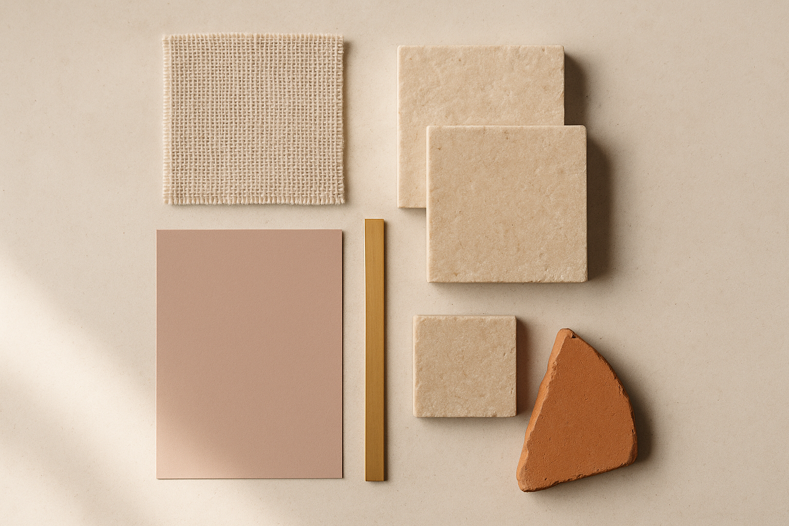
One critical distinction before we go further: warm neutrals ≠ beige. The spectrum includes rose-grays, sandstone, terracotta tints, aged brass, and smoky lavender-neutrals. Each carries a different personality. The palettes below cover that full range.
Anatomy of a Warm Neutral Palette System: The 5-Role Framework
Every portfolio palette needs exactly five roles filled:
This follows the classic 60-30-10 rule, adapted for portfolios. The critical caveat: your portfolio imagery acts as a sixth "wild" element that you can't control. Every client project brings its own colors into your layout. That's precisely why your palette needs to stay quiet.
Contrast Ratios: The Non-Negotiable Math
WCAG AA requires a 4.5:1 contrast ratio for body text and 3:1 for large text. Warm neutrals make this trickier because both your background and text colors are shifting away from the pure black/white extremes. A dark warm gray that looks readable can easily fail accessibility checks.
Every palette below is pre-checked. But you should still validate in context using tools like the WebAIM Contrast Checker, Realtime Colors, or the accessibility feature built into Coolors.
Why One Accent Is Enough
A single strategic accent color prevents the palette from competing with the varied colors in your portfolio pieces. You're not building a brand identity system here. You're building a frame. The fewer colors in the frame, the more attention stays on the art.
The 7 Palettes: Complete Systems Ready to Implement
Here are seven warm neutral systems, each designed for specific creative disciplines. Pick the one that matches your work's personality.
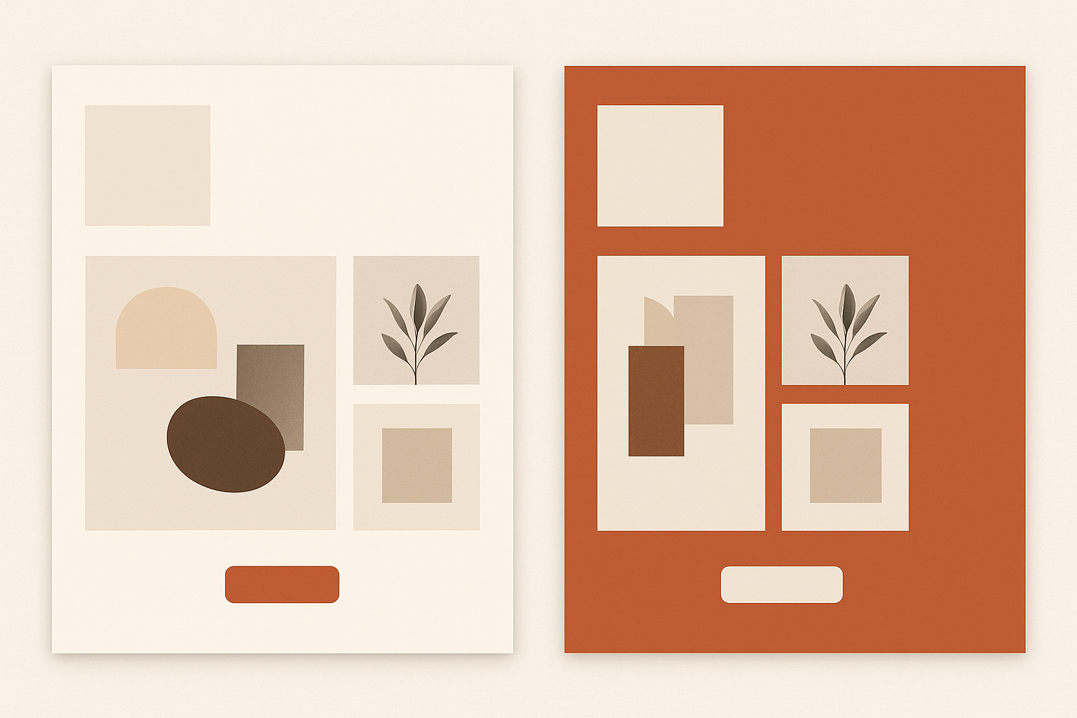
Palette 1: Sandstone Studio
Best for: Landscape photographers, architects, interior designers.
Contrast ratio: 10.2:1 (primary text on background).
Feels like: Earthy, grounded, Scandinavian-calm.
The sand background makes golden-hour photography glow while keeping cool-toned architectural shots from feeling clinical. This is the most versatile palette on the list.
Palette 2: Smoky Rose Atelier
Best for: Branding designers, wedding photographers, editorial illustrators.
Contrast ratio: 9.8:1.
Feels like: Refined, editorial, gently feminine without being precious.
The rose-gray background creates warmth that lets colorful brand identity work pop. Pastels and bold palettes alike sit comfortably here.
Palette 3: Terracotta Draft
Best for: Print designers, ceramicists, hand-lettering artists.
Contrast ratio: 11.4:1.
Feels like: Tactile, artisanal, Mediterranean warmth.
Palette 4: Aged Brass & Linen
Best for: Product designers, furniture makers, luxury-leaning creatives.
Contrast ratio: 10.8:1.
Feels like: Quiet luxury, old-money sophistication, museum catalog.
Palette 5: Warm Graphite
Best for: UI/UX designers, developers-who-design, motion designers.
Contrast ratio: 10.1:1.
Feels like: Technical but approachable, modernist, gender-neutral.
Palette 6: Dusk Clay
Best for: Mixed-media artists, set designers, art directors.
Slightly deeper and moodier than the others. Ideal for portfolios that want presence without darkness.
Palette 7: Ivory Noir
Best for: Typographers, minimalist brand designers, fine art photographers.
The closest to black and white while still feeling alive. Contrast ratio: 14.1:1, the highest on this list.
Palette Deep Dives: Sandstone Studio and Smoky Rose Atelier in Action
Let's walk through two of these palettes applied to real scenarios.
Sandstone Studio for a Landscape Photographer
Picture a portfolio header bathed in #F5F0E8. The navigation text in #3B3530 sits warm and readable against that sand tone. Below, project cards float on #FAF7F2, creating just enough elevation to separate each image without hard borders.
The sage green accent (#7A8B6F) appears in exactly three places: the "Hire Me" button, text link hover states, and the active navigation indicator. That's it. The restraint is the point. Golden-hour shots of wheat fields feel like they're part of the palette. Cool-toned mountain photography gets a subtle warmth that keeps it from looking sterile.
Smoky Rose Atelier for a Branding Designer
A branding designer's portfolio is tricky because every project brings its own color system. A neon-forward startup brand sits next to a muted wellness brand sits next to a bold sports identity. The rose-gray background (#F2EDED) acts as a diplomatic middle ground.
The dusty rose accent (#C4908A) ties the UI together without introducing a hue that clashes with any client brand palette in the thumbnails. It reads as "intentional" rather than "colored."
The Contrast Math That Matters
Here's why pre-built systems prevent accessibility pitfalls. The primary text #3A3335 on background #F2EDED delivers a 9.8:1 contrast ratio, passing both WCAG AA and AAA with room to spare.
But a naive "warm gray on warm beige" choice like #8B8178 on #F2EDED? That fails at only 3.2:1. It looks fine on your calibrated display. It's unreadable for the 8% of men with color vision deficiency viewing your portfolio on a washed-out laptop screen. The gap between "looks warm" and "is accessible" is where most DIY palettes fall apart.
The Strategic Accent Color: One Pop Without Breaking the Calm
The Rule of One
Portfolio sites should use exactly one accent color, applied to 3-5 interactive elements maximum:
That's the full list. If you're applying your accent color to more elements than that, you're using too much.
Choosing Your Accent
Use the palette's warmth as a guide. Warm palettes pair naturally with warm accents (terra cotta, sage, brass). You can also create intentional tension with one cool complement, like the deep teal in Ivory Noir. Both approaches work. Mixing them doesn't.
Volume Control
Your accent color should occupy less than 5% of any given viewport. The difference between a subtle "Hire Me" button in #B5654A and an entire footer section painted in that color is the difference between confidence and desperation. One signals intention. The other overwhelms every portfolio piece on the page.
Plan Your Interaction States
Your accent color needs a hover state (10-15% darker), a visited/active state (10% desaturated), and a focus ring. Plan these as part of the system, not as afterthoughts. For example, if your accent is #B5654A, your hover might be #9A5240 and your visited state #A8735F.
Avoiding the Warm Neutral Traps: Muddy, Dated, and "Tuscany Kitchen"
Even good palettes go wrong in implementation. Here are the four traps and their fixes.
Trap 1: Muddy Midtones. When your background and text colors are too close in lightness, everything looks foggy. Fix: maintain at least a 7:1 contrast ratio between primary text and primary background. Keep secondary backgrounds within 5-10% lightness of the primary.
Trap 2: The "Tuscany Kitchen" Effect. Oversaturating warm tones tips the palette from sophisticated to rustic-themed restaurant menu. Fix: keep background saturation under 10% in HSL values. All seven palettes above follow this rule. Check yours.
Trap 3: Yellowing Photography. Warm backgrounds can add an unwanted color cast to portfolio images, especially on non-color-managed screens. Fix: make sure portfolio images sit on white or very-near-white cards (#FAF7F2 or lighter) rather than directly on the tinted background. The card acts as a color buffer.
Trap 4: Dark Mode Disconnect. If you offer dark mode, you can't simply invert warm neutrals. You'll get sickly dark yellows that look broken. Instead, shift to desaturated warm darks (#1E1C19, #2B2826) and keep your accent colors consistent.
For example, here are dark-mode companion values for three of the palettes:
Notice the pattern: backgrounds get very dark with low saturation, text flips to warm light tones, and accents stay untouched. Consistency across modes is what makes both versions feel like the same brand.
Let Your Work Speak
Your portfolio's job is to make your work irresistible, and color is doing more of that heavy lifting than you think. The seven palettes in this guide aren't trends that will expire next year. They're grounded in how human vision responds to warmth, contrast, and restraint.
Pick the system that matches your creative personality. Plug in the hex values. Check your contrast ratios with WebAIM. And let the quiet confidence of warm neutrals do what pure white never could: make your work feel like it belongs somewhere intentional.
Start with one palette. Apply the 5-role framework. Resist the urge to add a second accent color.
The best portfolio sites whisper so the work can speak.