How Tokyo 2020 Rewrote the Color Language of Global Sport
by ColorSift Editorial Team
Most viewers tuning into the Tokyo 2020 Opening Ceremony in August 2021 expected the visual grammar they'd come to associate with the Olympics. Saturated reds. Olympic blues. Explosive gold. The familiar language of competitive spectacle rendered in high-chroma primaries.
Instead, they got something quieter, older, and stranger.
The broadcast palette felt almost restrained. A deep indigo that seemed to absorb light rather than throw it. A crimson that looked like it had been mixed from ground lacquer. A muted pine green borrowed not from a stadium seat but from a Zen garden. This was not an accident. It was the result of years of deliberate, contested, and culturally loaded design decisions by the Tokyo Organising Committee and the creative direction team.
Here's the thing worth understanding: Tokyo 2020 is perhaps the first major Olympic identity to treat color not as decoration or branding shorthand, but as an argument. An argument about what Japan is, what the Olympics can say, and whether a global event can carry genuine cultural specificity without becoming a museum exhibit. With LA 2028 now less than two years away and its own identity already generating fierce debate, the conversation Tokyo started is far from over.
The Olympic Color Tradition Tokyo Was Quietly Rejecting
Olympic identities from Atlanta 1996 through Rio 2016 largely leaned on high-saturation primaries, explosive gradients, and the five-ring palette as a visual anchor. Color functioned as a competitive energy signal. Loud, fast, unmistakable.
The precedents tell a clear story. Beijing 2008 delivered red-and-gold imperial confidence, a palette that announced China's arrival on the world stage with zero ambiguity. London 2012, designed by Wolff Olins, deliberately broke with convention through its acid-bright identity and jagged letterforms, but it still operated within a Western graphic language of bold contrasts and pop-art energy. Rio 2016 leaned into tropical vibrancy, with its flowing human figures rendered in greens, yellows, and blues that practically vibrated off billboards.
The implicit rule connecting all of these: Olympic color systems prioritize immediate global legibility. Colors that "read" in a tenth of a second on a broadcast flag or a stadium banner. Tokyo's team chose to slow that read down.
This wasn't just an aesthetic preference. The choice of palette sends a signal about whose visual culture gets to define a global event. Tokyo's organizers were acutely aware of that political dimension, especially after the logo plagiarism controversy of 2015 forced a complete identity redesign. The original emblem by Kenjiro Sano was scrapped amid accusations of copying, and the entire visual identity had to be rebuilt from scratch through a public competition. The stakes were enormous. The replacement identity needed to be defensibly original, culturally grounded, and bold enough to withstand global scrutiny.
The Palette as Argument: Ai-Indigo, Kurenai-Crimson, and Matsuba-Green
The three core colors of Tokyo 2020 are best understood not as hex codes but as historical objects.
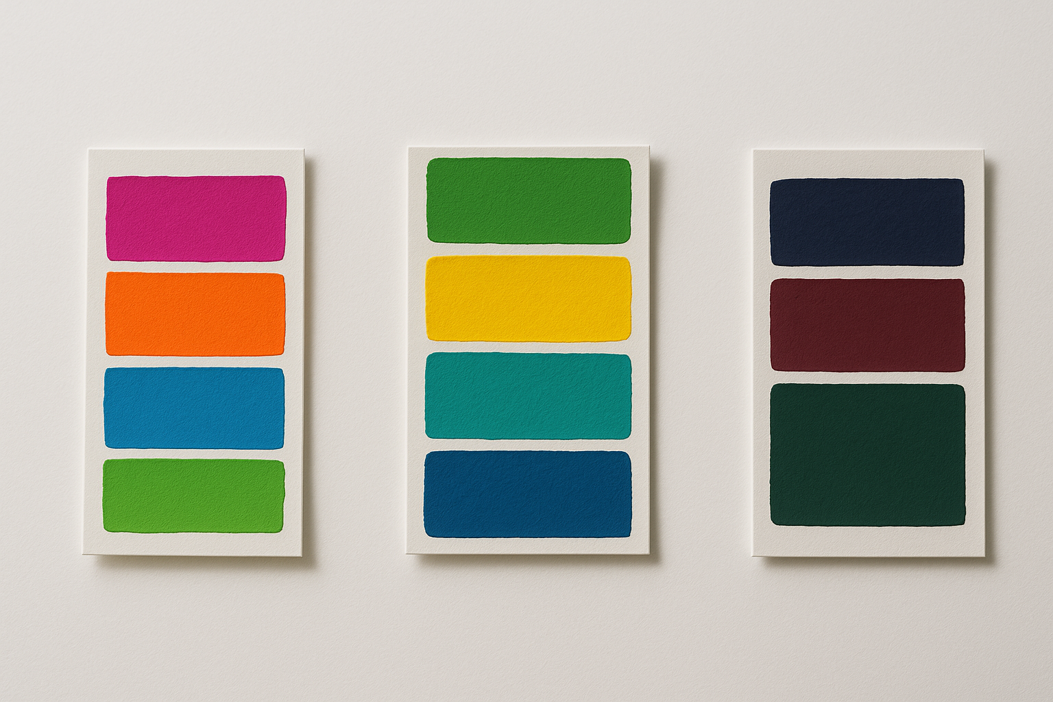
Ai (藍) indigo derives from the fermented dye plant Polygonum tinctorium, cultivated in Japan for centuries. Kurenai (紅) crimson is linked to safflower pigment used in Heian-period court textiles, a color once reserved for the highest aristocratic ranks. Matsuba (松葉) green references the needle color of Japanese black pine. All three are documented in the Nippon Traditional Colors reference system, a codified catalog of historically named Japanese pigments.
The organizing committee's design brief explicitly cited the Edo period as a reference era. This was a time when Japan developed highly codified, named color systems precisely because sumptuary laws restricted who could wear certain colors. Color functioned as cultural grammar, not just visual choice. A specific shade of purple could mark your social class. The wrong indigo could get you fined.
The tension the team had to manage was real. These are colors that carry enormous meaning to a Japanese audience. Ai-indigo is practically synonymous with craftsmanship and working-class dignity in the mingei folk-art tradition. But that meaning is nearly invisible to an international viewer who simply sees a dark blue.
The secondary and supporting palette was structured to bridge this gap. Warm whites and metallic golds appeared in broadcast and print contexts, giving the restrained primaries enough contrast to function as wayfinding and branding signals. And one notable absence spoke volumes: the palette pointedly avoids the red-and-white of the Japanese national flag. This was a strategic decision to separate "Japanese cultural identity" from "Japanese national identity," especially sensitive given the context of a postponed Games under intense global scrutiny.
The Ichimatsu Pattern: When a Graphic Device Does the Color's Work
The ichimatsu (市松) checkered pattern takes its name from the 18th-century Kabuki actor Sanogawa Ichimatsu, who made the pattern famous through his stage costumes. Designer Asao Tokolo, who won the redesign competition in 2016, used a geometrically refined version of this pattern as the identity's central visual device.
The functional genius of the choice is worth appreciating. The checkerboard operates as a color-mixing engine. By varying the two colors within the grid, the same pattern could express different cultural registers, from formal to festive, from restrained to vibrant, without changing the underlying system. This gave the identity enormous flexibility across applications.
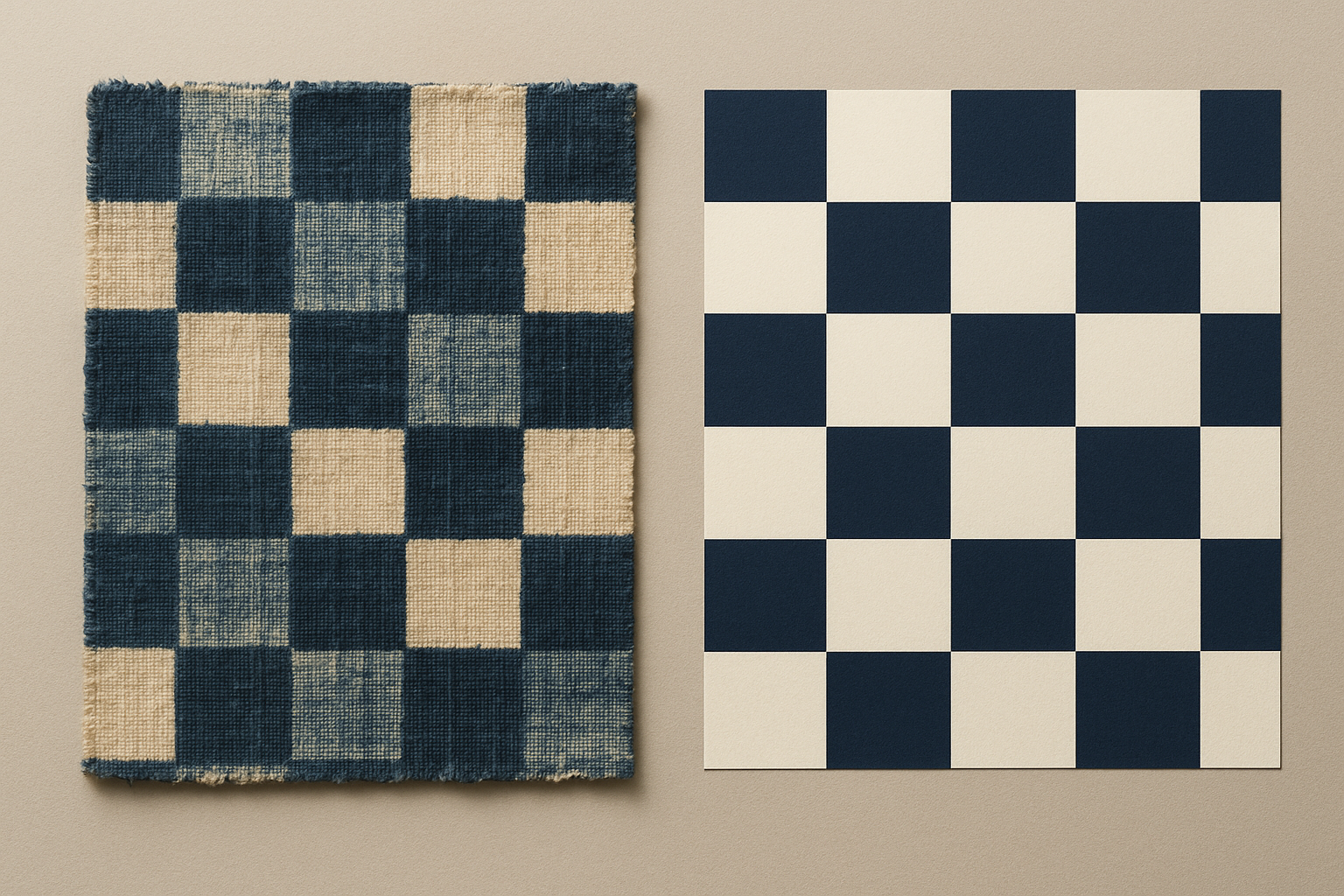
Consider how it worked in practice. The ichimatsu pattern appeared in the athlete entry ceremony staging, the medal ribbon design, the official poster series, and the broadcast lower-thirds. The same geometric logic held across wildly different applications and media. A pattern that read as dignified and ceremonial on a medal ribbon could feel dynamic and contemporary in a motion graphic, all without breaking the visual system.
The modernization challenge was significant. The team had to make a pre-Edo pattern feel contemporary without stripping out its historical legibility. Their solution was precision. The pattern's proportions were mathematically regularized, giving it an almost digital quality that made it feel at home on screens and in motion graphics. Three varieties of rectangle, arranged in rotational symmetry, produced a form that was simultaneously ancient and algorithmic.
Stress Testing the System: Where the Palette Held and Where It Cracked
Every identity system meets reality eventually, and Tokyo 2020's met it under unusually difficult circumstances.
Wayfinding inside venues posed significant challenges. The restrained palette made directional signage harder to parse, since color-coding urgency and hierarchy is a critical safety and flow-management function. The team introduced a higher-contrast secondary system for operational wayfinding that sat adjacent to, but slightly outside, the core identity palette. Function won over aesthetics, as it should.
Broadcast environments added another layer of complexity. The deep ai-indigo reads very differently under tungsten sports lighting versus daylight. The early weeks of broadcast showed visible inconsistency in how kurenai-crimson was reproduced across different broadcasters' color pipelines. Some networks' coverage made the palette look muddy rather than refined. Color management across a global broadcast chain is notoriously difficult, and a palette built on subtle tonal distinctions is far less forgiving than one built on saturated primaries.
Merchandise and retail told a more encouraging story. The pandemic-driven absence of international spectators meant the merchandise system never fully tested itself against the broadest possible global audience. But the licensed products that did circulate showed the palette translating surprisingly well into tactile materials: fabric, ceramic, paper. Its craft-material origins gave it a warmth and specificity that high-saturation palettes often lack in physical goods.
Digital and social media revealed the identity's most visible failure mode. At app-icon scale or in social media thumbnail environments, the ichimatsu pattern and the low-contrast palette collapsed into visual noise. The digital team compensated with simplified, higher-contrast versions of the emblem, but the core tension remained. A system designed for depth doesn't always survive compression.
Cultural Depth vs. Instant Visual Punch: The Central Tension Every Brand Designer Faces
Step back from the specifics of Tokyo 2020 and you'll see the core design argument it embodies: the trade-off between a color system with semantic richness (one that rewards knowledge and time) versus one with immediate perceptual impact (one that works for everyone instantly).
Most major event identities resolve this tension by choosing impact. Tokyo chose depth.
This is the same tension faced by any brand designer working with a client whose identity is deeply rooted in a specific cultural context. Luxury goods houses built on craft heritage. Regional food brands trying to go national. Cultural institutions trying to broaden their audience without alienating their core. The question is always the same: how much meaning can you encode in a color before the encoding becomes invisible to the people you most need to reach?
The critical reception split along predictable lines. International design press, including Dezeen, It's Nice That, and Brand New, largely celebrated the identity's intellectual rigor. Sports marketing professionals raised legitimate concerns about the system's ability to generate the kind of immediate visual excitement that sponsors and broadcasters depend on. Both responses were correct. They were simply measuring different things.
The COVID-19 postponement to 2021, and the subsequent ban on spectators, actually changed how the identity was experienced. Without the crowd, the merchandise, the street-level city dressing, and the tourism economy that normally amplifies an Olympic identity, the color system was experienced almost entirely through broadcast and digital. Exactly the environments where it was weakest.
The Downstream Effect: How Tokyo Changed the Conversation for Paris, LA, and Beyond
Paris 2024's visual identity can be read as a direct dialogue with Tokyo. Built around a bold wordmark combining the Olympic flame with Marianne's face, and anchored by a palette of deep Prussian blue, warm gold, and a distinctly French red, Paris was graphically confident and nationally assertive. Almost a course-correction toward legibility. Where Tokyo's system was texturally derived and historically rooted, Paris prioritized instant recognition.
LA 2028 took the opposite lesson from Tokyo. The LA28 identity, designed by Pentagram, introduced a variable logo system where the "A" changes across 30+ artist-designed variants. Its palette of bright LA sunshine yellow, sky blue, and white signals a total break with both the restrained Tokyo approach and the national-symbol approach of Paris. As of mid-2026, the LA28 identity is generating intense debate among designers about whether variability undermines coherence. That debate was framed, in part, by the unity of Tokyo's system.
The broader permission Tokyo granted matters more than any single palette choice. Tokyo 2020 showed subsequent organizing committees that identity decisions can require explanation, that audiences and press will engage with the reasoning behind a design, not just its immediate surface. That's a meaningful shift in what "good" Olympic design is allowed to be.
This influence extends beyond the Olympics. Qatar 2022's Arabic calligraphy-derived FIFA World Cup identity, the joint 2026 FIFA World Cup branding for the US, Canada, and Mexico, and how cultural institutions globally are now framing their use of culturally specific color systems in public communications all carry traces of the conversation Tokyo started.
The Braver Choice
Return to that opening image. A global audience tuned in expecting a familiar visual grammar and found something older and quieter instead.
Tokyo 2020's color system is not a design success story in the conventional sense. It didn't achieve instant universal legibility. It struggled in several key application environments. Its most sophisticated meanings were invisible to the majority of its audience.
And yet it may be the most consequential Olympic identity of the past two decades, precisely because it demonstrated that a color system can carry a genuine cultural argument. The choice of ai-indigo over Olympic blue is a statement about whose aesthetic history gets to define a global moment.
For designers working on any high-stakes identity project in 2026, whether for a cultural institution, a major event, or a brand navigating between its heritage and a global audience, the Tokyo case offers an uncomfortable but important lesson: depth and immediate impact are not always reconcilable. Sometimes the braver choice is to design for the audience who will stay long enough to understand what you're saying.