The Long Shadow of Technicolor: How a 1930s Film Process Still Defines How We Dream in Color
by ColorSift Editorial Team
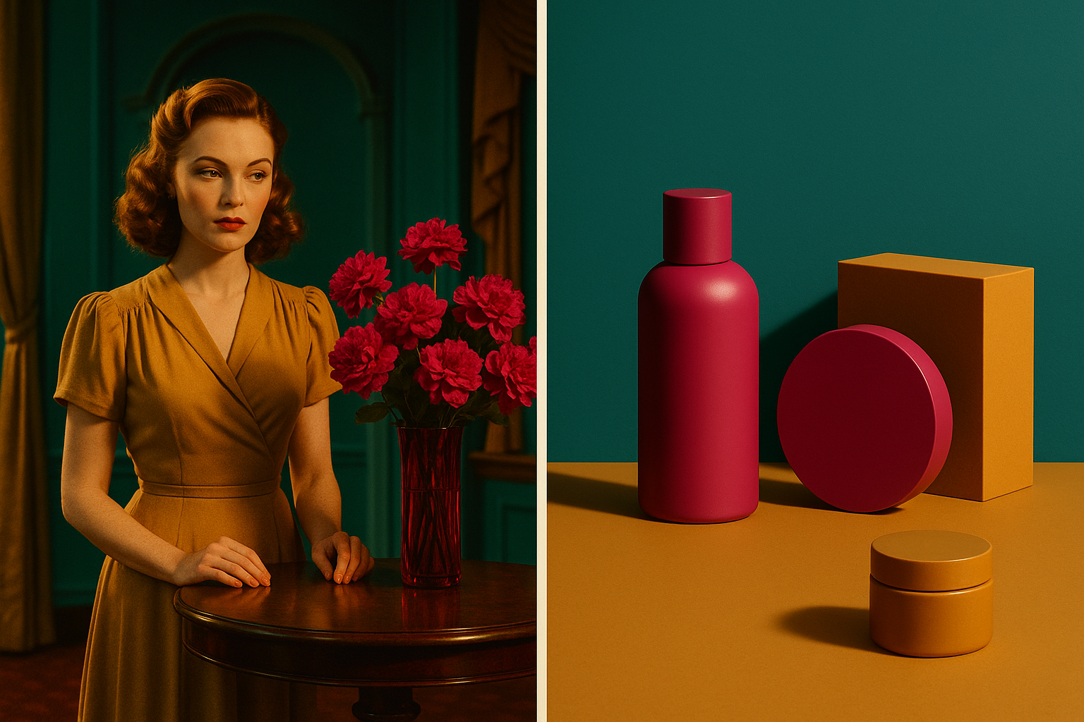
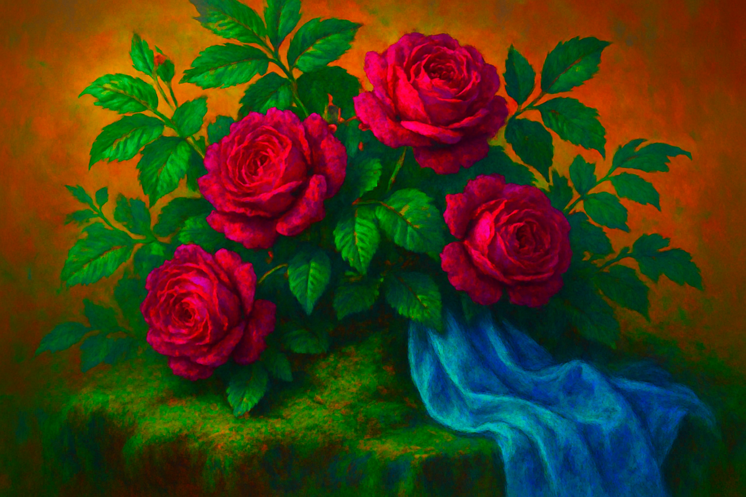
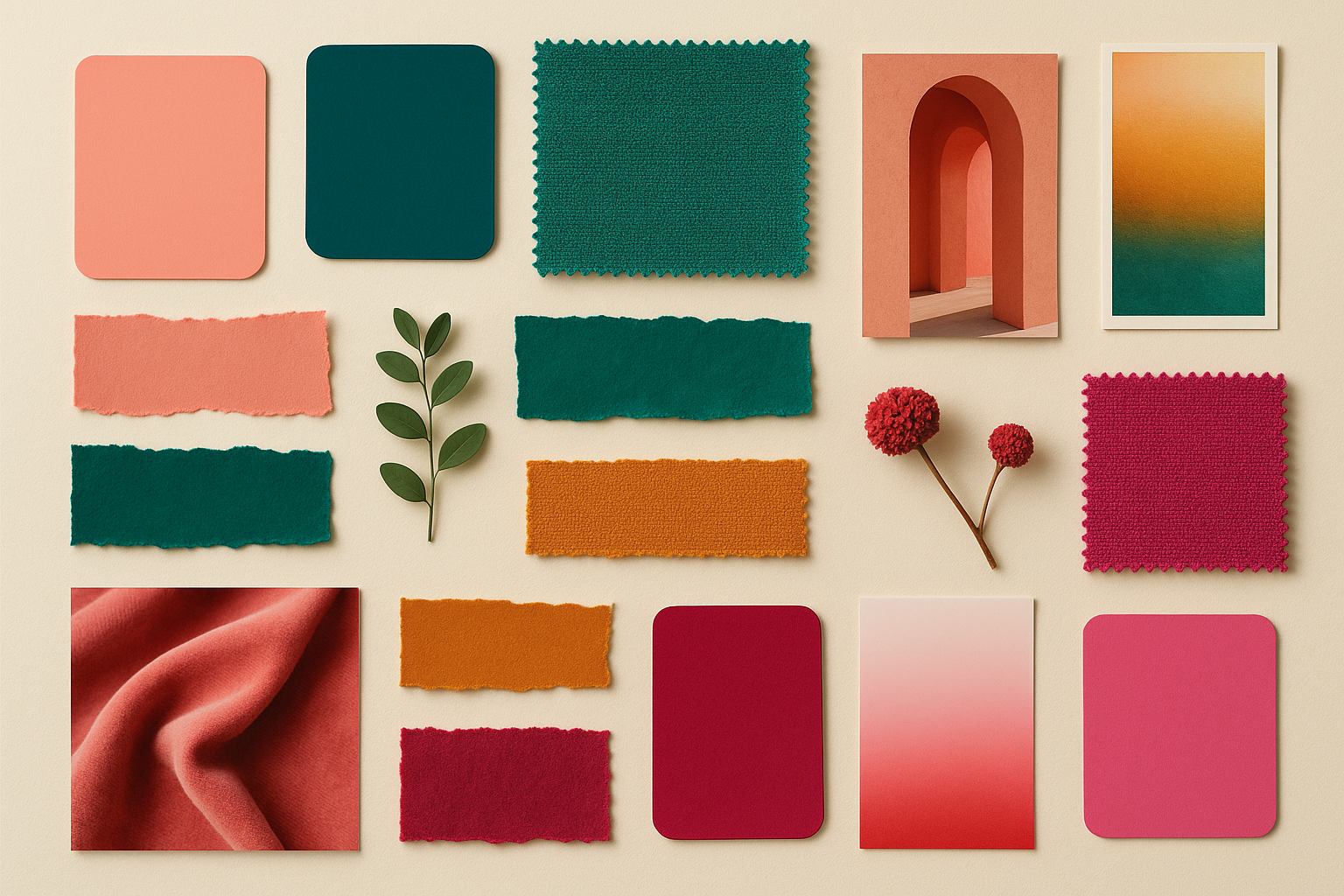
When most people close their eyes and picture a fairy tale, the colors they see are chemically impossible. That rich, almost electric emerald green. That warm magenta that no flower holds for more than a few hours. That teal so deep it feels like it belongs underwater, in a kingdom that doesn't exist. These colors weren't invented by an artist. They were accidents of chemistry, produced by a dye-transfer film process patented nearly a century ago. And they still run your visual imagination like background software you never installed.
Technicolor's three-strip process, the technology behind The Wizard of Oz and Gone with the Wind, physically could not reproduce certain colors. The dyes were biased. The lighting was extreme. What survived those constraints, those triumphant teals and aggressive greens and warm, slightly orange magentas, became, through sheer repetition and cultural weight, the color language of joy, danger, and wonder for an entire civilization.
Here's the argument: Technicolor didn't document the world. It rewired how we learned to feel color. And that rewiring is still running in 2026's most viral brand campaigns, in Disney's live-action blockbusters, in the UI gradients on apps you open before you're fully awake. By the time you finish reading, you'll see those colors differently. And you'll use them more deliberately.
A Machine That Could Only See in Dreams: The Chemistry Behind the Palette
The three-strip Technicolor process worked like this: a special camera exposed three separate strips of black-and-white film simultaneously, each filtered through red, green, or blue light. Later, in a lab, technicians combined those strips through dye-transfer printing, layering cyan, magenta, and yellow inks onto a single piece of film. The process was physically laborious, brutally expensive, and chemically opinionated.
That last part matters most. The dye-transfer inks had a natural bias. Cyan dyes pulled toward teal. Magenta dyes leaned warm, slightly orange. Yellow dyes came out lush and almost golden. These weren't neutral representations of reality. They were interpretations with a distinct personality.
On set, the constraints multiplied. Technicolor cameras required extraordinarily bright lighting, often two to three times more intense than standard black-and-white shoots. That lighting washed out mid-tones and forced costume designers and art directors to compensate with maximally saturated fabrics and paints. Nobody planned this amplification. It was chemical triage.
Then there was the Technicolor Color Advisory Service, a largely forgotten body that employed consultants to dictate what colors actors could wear, what colors sets could be painted, and how color should be "emotionally managed" on screen. The most famous of these consultants, Natalie Kalmus, held enormous influence over productions for decades. This wasn't art direction in the modern sense. It was a team of technicians solving a technical problem and accidentally inventing an emotional language.
The result? A palette so consistent across so many beloved films that audiences' brains began filing it not as "the limit of 1940s technology" but as "what heightened reality looks like."
The Canon That Built the Dream: Key Films and the Emotions They Color-Coded
A handful of films burned the Technicolor palette into permanent cultural memory.
Start with The Wizard of Oz (1939). The shift from sepia-toned Kansas to full Technicolor Munchkinland at the farmhouse door is perhaps the single most emotionally loaded color transition in cinema history. In one cut, that teal-and-magenta spectrum became permanently bonded to the concept of "another world." Every fantasy film since has been, to some degree, responding to that moment.
Gone with the Wind, released the same year, used deep crimson and amber to color-code passion and destruction. The burning of Atlanta sequence established warm orange-red as cinematic shorthand for both danger and spectacle. Watch any contemporary action film's explosion scenes. The palette is still there.
In the 1940s, Powell and Pressburger pushed Technicolor toward the deliberately surreal. Black Narcissus (1947) and The Red Shoes (1948) used color as emotional exaggeration, not realism. Their conscious decision to treat saturated color as the language of intensity, rather than accuracy, helped legitimize an approach that designers still lean on today.
Meanwhile, Disney's animated features of the same era, Snow White, Fantasia, Bambi, translated the live-action Technicolor palette into cel animation. This ensured the palette reached children at the most impressionable possible stage. It embedded those colors not just in cinematic memory but in the earliest visual experiences of multiple generations.
By the early 1950s, a feedback loop had closed. Audiences didn't just associate this palette with films they loved. They associated it with the act of feeling things deeply. The colors had become an emotional trigger, not a visual description.
Why Those Colors Feel "Safe": The Neuroscience and Psychology of Nostalgic Hues
Research into color memory and emotional association offers a clear explanation for why this palette persists. Colors first encountered in highly emotionally charged contexts, childhood wonder, communal viewing in dark theaters, moments of awe, gain a disproportionate emotional "weight" that persists into adulthood. Psychologists sometimes call this chromatic anchoring.
The specific Technicolor hues hit a precise sweet spot. They are saturated enough to signal "this is not ordinary life" but warm enough, especially in the magenta-amber range, to avoid triggering threat responses. In a precise psychological sense, these are the colors of controlled fantasy. Exciting, but safe.
There's also the concept of cinematic color memory. Unlike real-world color, which we experience in shifting light and constant motion, film color is encountered in dark rooms, in a state of emotional openness, with music reinforcing the mood. This creates unusually strong encoding. The colors don't just remind us of films. They carry the emotional state of watching.
And the transmission hasn't stopped. People who never saw a three-strip Technicolor film in its original theatrical run have still absorbed the palette through Disney+, streaming classics, and the deliberate nostalgia of contemporary filmmakers. The emotional coding is being actively re-inherited by Gen Z and Gen Alpha audiences right now, in 2026.
Here's the provocation: if designers and brand strategists understand this mechanism, they can use it with surgical precision. If they don't, they risk producing work that feels nostalgic without knowing why, or that triggers the right emotion in the wrong context.
Case Study: Disney's Live-Action Remakes as a Technicolor Archaeology Project
Disney's live-action remake era, from Cinderella in 2015 through the current slate in 2026, is not primarily a storytelling project. It is a color archaeology project. Each film is, at some level, an attempt to recover and re-administer the emotional hit of the original animated Technicolor palette using photorealistic tools.
Consider the 2015 Cinderella. The powder blue of Lily James's gown is almost aggressively saturated. It's a blue that exists nowhere in nature but sits squarely in the Technicolor tradition. The production team achieved it through a combination of practical dye work on the physical costume and digital grading specifically calibrated to mimic dye-transfer's characteristic "bloom." The film was a critical and commercial success. The color did real emotional work.
Now consider the counter-examples. The 2019 The Lion King and 2023 The Little Mermaid both chose photorealistic color grading. Both were widely criticized for feeling "flat" or "cold" despite massive budgets. This is not a coincidence. Stripping out the Technicolor palette removed the emotional shorthand those stories depend on.
The 2025 Snow White represented a deliberate course-correction. Its production design consciously returned to the heightened, almost painterly color saturation of the 1937 original. The marketing leaned heavily into warm magentas and emerald greens. Whether or not critics praised the film as a whole, its visual strategy acknowledged something the previous remakes had ignored: audiences don't just want the story. They want the feeling the original color palette gave them.
Disney's oscillation between photorealism and heightened color is a real-time experiment. The evidence increasingly suggests that the palette is the product.
Beyond Film: How Brand Design and UI Art Are Mining the Technicolor Archive
The same chromatic anchoring that makes Technicolor hues resonate in cinema makes them extraordinarily effective in branding, particularly for brands that want to signal warmth, authenticity, or wonder without stating it explicitly.
Airbnb's 2026 campaign imagery is a strong example. Its visual language, warm coral-pinks, deep teals, lush saturated greens in natural settings, reads as a direct invocation of Technicolor's travel-poster aesthetic. The colors say "somewhere magical" using a visual grammar audiences have been fluent in since childhood.
In UI design, the shift between 2024 and 2026 away from flat, desaturated "clean" interfaces toward gradient-rich, saturated color schemes tracks directly with a broader nostalgia wave. Spotify's evolving brand identity, Apple Music's visual language, and several fintech apps targeting millennial and Gen Z users have all moved toward warmth and emotional texture. Technicolor's palette is the unconscious reference library designers are drawing from.
In fashion, brands like Jacquemus and Reformation have used hyper-saturated, Technicolor-adjacent color in their campaign photography. They're not trying to look retro. They're borrowing the emotional register of mid-century optimism and applying it to contemporary products.
But there's a risk. Brands that grab the hues without understanding the emotional logic behind them often produce work that feels "nostalgic" in a hollow or manipulative way. The difference between emotional resonance and aesthetic pastiche is whether the color usage does structural emotional work or just wears a costume.
The Intentional vs. the Accidental: A Framework for Using Technicolor's Legacy Deliberately
Now that you understand the mechanism, how do you use it with intention? The distinction that matters is between "nostalgic color" (surface-level invocation of retro aesthetics) and "emotionally architected color" (using the psychological weight of specific hues to do specific narrative or brand work).
Know the emotional contract. Technicolor hues carry a specific promise: wonder, safety, heightened experience. Using them in contexts that contradict that promise, say, a brand associated with anxiety, scarcity, or urgency, creates cognitive dissonance rather than resonance. The palette only works when the surrounding narrative earns it.
Treat constraint as a creative engine. One of Technicolor's most instructive lessons is that its power came partly from limitation. The palette was not infinite. It was specific, repeatable, and recognizable because the chemistry forced it to be. Contemporary designers working with unlimited color options might deliberately constrain their palettes to achieve similar coherence and emotional clarity.
Calibrate for your generation. The emotional charge of Technicolor hues is not universal across all demographics. It is strongest in audiences who were exposed to the source material, or its direct descendants, at emotionally formative moments. Understand your audience's visual references before invoking a palette built on those references.
The most powerful uses of Technicolor's legacy in 2026 are not the most explicit ones. They are the ones where the palette is so fully integrated into the work's emotional logic that viewers feel something without knowing why. Which is, arguably, exactly how those original dye-transfer films worked on their first audiences.
Standing in the Shadow, or Casting It
Those chemically impossible colors, the teals that nature never quite produces, the magentas that exist in roses only fleetingly, the greens that seem lit from within, were accidents. They emerged from the physical limits of dye-transfer printing, from the overcorrections of set designers working under brutal arc lights, from a Color Advisory Service that was managing a technical problem and accidentally invented an emotional language.
That language has now outlived the technology that created it by decades. It runs in the background of our visual culture like a legacy operating system: invisible, unacknowledged, but shaping every color decision that reaches for wonder, warmth, or the feeling that something important is happening.
The argument is a simple one. Designers, filmmakers, and brand strategists who understand where that palette came from, who understand that they are not just choosing colors but activating emotional memory encoded by millions of hours of collective viewing, will always use it more powerfully than those who simply reach for it because it "feels right."
Technicolor's shadow is long. The question is whether you're standing in it accidentally, or casting it deliberately.