How Stripe's Color System Teaches You What to Ignore: A Masterclass in Functional Hierarchy
by ColorSift Editorial Team
Open Stripe's dashboard and try to remember what color it is. Not their marketing site with its famous gradient, the actual product. The place where millions of businesses manage billions of dollars. You'll struggle, because the answer is essentially: gray. A very deliberate, very sophisticated gray.
While design Twitter endlessly dissects Stripe's landing page animations and gradient meshes, the real design lesson lives in the product UI that most people never screenshot. It's a system built not to impress, but to disappear, so that the only things you actually notice are the things that matter. In an era where every AI dashboard and SaaS tool competes for attention with color, Stripe's product palette is a quiet argument that the best color system is one that teaches your eyes what to ignore.
This is a deep case study of how that system works, why it works, and what every designer building data-heavy interfaces in 2026 can steal from it.
The Most Admired Design System Nobody Talks About
Stripe's marketing pages are legendary. The animated WebGL backgrounds. The gradient meshes that launched a thousand Figma tutorials. The "Stripe aesthetic" has become shorthand for premium web design. But here's the thing: almost nobody analyzes the product itself.
The dashboard that developers and finance teams use every day is built on a completely different philosophy. It's not flashy. It's not Instagrammable. And that's precisely why it works.
Stripe's product color system is optimized for one thing: functional hierarchy. Every color choice answers a single question: "Does this help the user find what matters right now?" If the answer is no, the color doesn't exist.
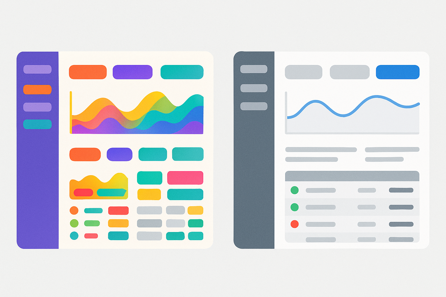
This approach runs counter to the prevailing trend in 2026, where expressive, personality-driven UI palettes dominate. Look at the latest wave of AI tools and SaaS products. Many use color decoratively, treating hue as branding rather than information. Stripe does the opposite. Color isn't identity. Color is instruction.
We'll examine Stripe's approach through three lenses: the gray foundation, strategic accent deployment, and cross-mode consistency.
The Gray Foundation: How Stripe Makes 90% of the Interface Disappear
Pull up Stripe's dashboard. The overwhelming majority of what you see is rendered in a narrow band of cool grays and near-whites. Navigation chrome, table borders, section dividers, secondary labels: they all live at roughly the same low-contrast level. The result is a "canvas of calm" where structural elements fade into texture.
There's a concept I call "visual humidity." When too many elements compete at similar prominence levels, the interface feels dense and muggy. Everything sticks to your attention. Stripe avoids this by keeping most structural elements at whisper-volume, so informational elements can speak at normal volume and still be heard clearly.
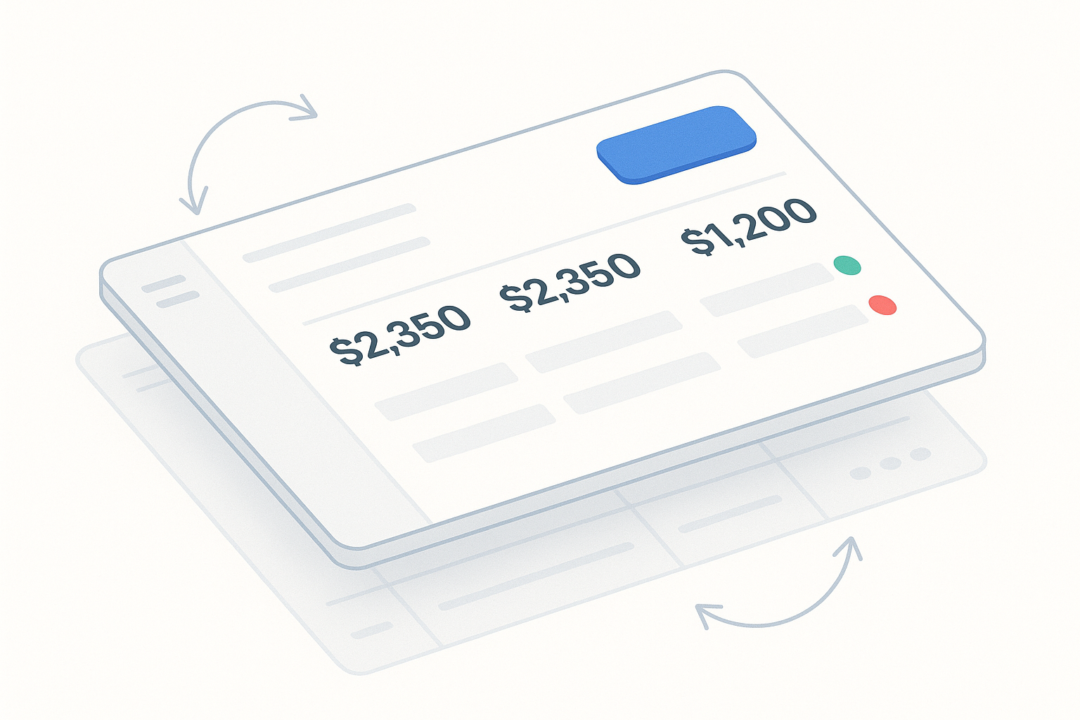
Consider a specific example: the Payments overview page. Table headers, row dividers, pagination controls, and sidebar navigation all recede into a unified gray layer. Meanwhile, payment amounts, status indicators, and action buttons exist on a distinctly higher contrast tier. Two layers. One quiet, one clear. That's it.
Typography reinforces this ruthlessly. Secondary text isn't just smaller. It's lighter in color weight. This double-demotion pushes it firmly below the reading threshold unless you're specifically looking for it. You don't read "Last updated 3 minutes ago" unless you want to. But you always see "$4,250.00 Succeeded."
The genius is in what you don't notice. Stripe's designers spent enormous effort making things invisible. That's harder than making things beautiful.
Strategic Accent Deployment: The Three-Color Rule in Practice
Now look at what does carry color in Stripe's product. The functional accent palette reduces to essentially three roles:
- Blue for interactive and actionable elements
- Red for errors and destructive states
- Green for success confirmations
That's nearly it. There's no orange for warnings (they use muted yellow sparingly). No purple for tags. No teal for secondary actions. This chromatic austerity means that when color does appear, it carries unambiguous meaning.
Stripe's blue deserves special attention. It's not a vibrant brand blue but a slightly muted, medium-saturation blue that reads as "clickable" without reading as "loud." Compare this to dashboards that use saturated brand colors for primary actions. When you have dozens of interactive elements on screen, saturated blue creates visual noise. Stripe's muted blue stays functional across density.
The status badge system is equally disciplined. Payment status indicators (Succeeded, Pending, Failed, Refunded) use color as a redundant signal layered on top of text labels and icons. Color is never the sole differentiator. A colorblind user reads "Succeeded" in text. A sighted user also sees green. Both arrive at the same understanding through different channels. This is accessibility by design, not accessibility as afterthought.
Think of it as a "color budget." Stripe treats color like a limited resource. Each additional hue introduced into the system reduces the signal power of every existing hue. By keeping the budget extremely tight, each color retains maximum communicative force. Add a fifth status color and the other four get weaker. Add a sixth and the system starts to collapse. Stripe refuses to spend.
Case Study: The Transaction Detail Page, Hierarchy in a Single View
The transaction detail page is where Stripe's philosophy crystallizes into a single screen. Let's walk through the visual hierarchy layer by layer.
Layer 1: The headline. The page title and transaction amount sit at the top in high-contrast, large type. Your eyes land here first. This is the "what" of the page.
Layer 2: The status badge. A small colored indicator confirms the state. Succeeded in green. Failed in red. This is the "how" of the page.
Layer 3: The metadata grid. Customer email, payment method, date, and description appear in medium gray, structured but recessive. You can find this information easily, but it doesn't compete with Layers 1 and 2.
Layer 4: The deep reference data. Payment method fingerprint, API request ID, risk score. These live at the lowest contrast level. You'd only read them if you're debugging or auditing.
Layer 5: The timeline. An event log at the bottom uses vertical rhythm and restrained color to make a potentially overwhelming audit trail scannable. Timestamps in light gray. Event descriptions in medium gray. Only state-change events receive a colored dot indicator.
Here's the subtle but critical detail: Stripe distinguishes between "data you need to verify" (payment amount, status, customer email) and "data you might need to reference" (fingerprint, request ID) purely through contrast and spatial positioning. No color coding needed. Position and weight do the work.
This connects to a broader principle. In complex data interfaces, hierarchy isn't about making important things louder. It's about making unimportant things quieter. Most of the design work on this page is demotion, not promotion. Stripe designed the quiet parts first.
Light Mode, Dark Mode, and the Algebra of Contrast Ratios
Stripe's color system translates across light and dark modes, but not through simple inversion. The trick is maintaining the same relative contrast relationships between hierarchy tiers. The functional meaning of each color is preserved even as the absolute values shift.
This is where most teams struggle. Colors that provide clear hierarchy in light mode often collapse into visual mud in dark mode. The reason? Designers map colors 1:1 instead of mapping relationships. If your light gray sidebar is #F6F8FA in light mode and you just invert it to a dark value, you might accidentally give it the same perceived weight as your content area. The hierarchy breaks.
Stripe's system works because it encodes relative contrast ratios, not fixed hex values. Think of it like music: transposing a melody to a different key changes every note, but the intervals between notes stay the same. The tune is recognizable because the relationships are preserved.
Accent colors shift subtly between modes too. Blues become slightly more saturated in dark mode to maintain perceived vibrancy against dark backgrounds. Reds and greens are tuned to preserve their WCAG contrast ratios without looking neon. It's careful calibration, not mechanical inversion.
Accessibility emerges as a structural principle here, not a checklist item. Stripe's muted palette means they rarely run into contrast failures because the system is designed around minimum viable contrast at every tier. The restraint that makes the UI "boring" also makes it inherently accessible.
Here's your practical test: if your color system breaks when you toggle dark mode, it was never a system. It was a collection of individual color choices. True systems encode relationships, not values.
What Stripe's Restraint Teaches Us About the 2026 Dashboard Explosion
This matters more now than ever. 2026 has brought an explosion of AI-powered dashboards, analytics tools, and agent interfaces. Many of these products are data-dense and use color liberally: gradient charts, multi-hued status systems, color-coded categories. The result is interfaces that look visually rich but feel hierarchically flat. Everything is important, which means nothing is.
Stripe's approach grows more relevant as interfaces grow more complex. When you're stacking AI chat panels alongside data tables alongside real-time metrics, the need for ruthless visual hierarchy increases. More information demands more discipline, not more color.
Here are three things you can apply to your next project immediately:
- Audit your interface for color noise. Count every distinct hue in your product. Write down what each one communicates. If two hues communicate the same thing, eliminate one. If a hue communicates nothing, eliminate it entirely.
- Establish a contrast tier system before choosing specific colors. Define 4-5 levels of visual prominence (headline, primary content, secondary content, structural, invisible). Assign contrast ranges to each tier. Then pick colors that fit within those ranges.
- Test your hierarchy by squinting. Literally squint at your screen. If everything blurs into the same level of prominence, your system isn't working. You should still see the top two tiers clearly when your vision is fuzzy.
A fair counterargument: Stripe's approach works beautifully for financial data interfaces where trust and clarity are paramount. Products with different emotional registers, like creative tools, social platforms, or consumer apps, may justifiably use color more expressively. But even in those contexts, the principle of functional hierarchy applies. Expression and hierarchy aren't enemies. You just need to know which one you're serving with each color choice.
The Design Is What Disappears
Stripe's product color system isn't a secret. It's hiding in plain sight, which is exactly the point. The most important thing it does is convince your eyes that most of the interface isn't worth looking at, so the few things that are worth looking at become unmissable.
That's not a limitation of the design. That's the entire design.
In a landscape where AI tools and complex dashboards multiply faster than the design systems that support them, Stripe's approach stands as a reminder that color is not decoration. It's information architecture rendered in hue and contrast.
The next time you're choosing colors for a dashboard, don't start by asking "what should stand out?" Start by asking: "what should disappear?"
The answer to that question is your real color system.