Simultaneous Contrast Is Lying to Your Eyes: A Designer's Field Guide to the Most Deceptive Optical Illusion
by ColorSift Editorial Team
You're in a client review meeting. The client points at the screen and says, "That grey looks too blue." You open the color picker, confirm it's a perfectly neutral #808080, and politely explain that it's a true grey.
But here's the twist: the client is right.
Not about the hex value, but about what their eyes are actually perceiving. The grey genuinely appears blue because it's sitting next to a warm orange hero image. Welcome to simultaneous contrast, the optical illusion that has been sabotaging your design decisions every single day. And you probably don't even notice it happening.
This isn't a fun perceptual trick you glance at in a psych textbook. It's the reason your button color looks "off" when you move it between pages. It's the reason your carefully chosen neutral background suddenly feels warm or cool depending on the content sitting on top of it. It's the reason side-by-side color comparison, the most intuitive way to judge color, is fundamentally unreliable.
This article is your field guide to understanding, anticipating, and outsmarting it.
The Grey Square That Broke Color Theory 101
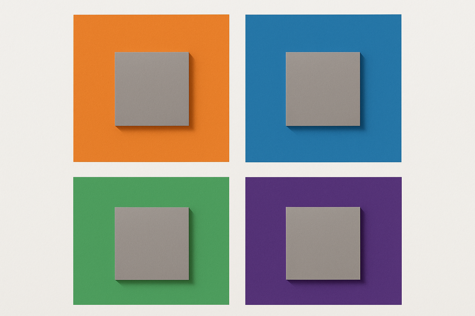
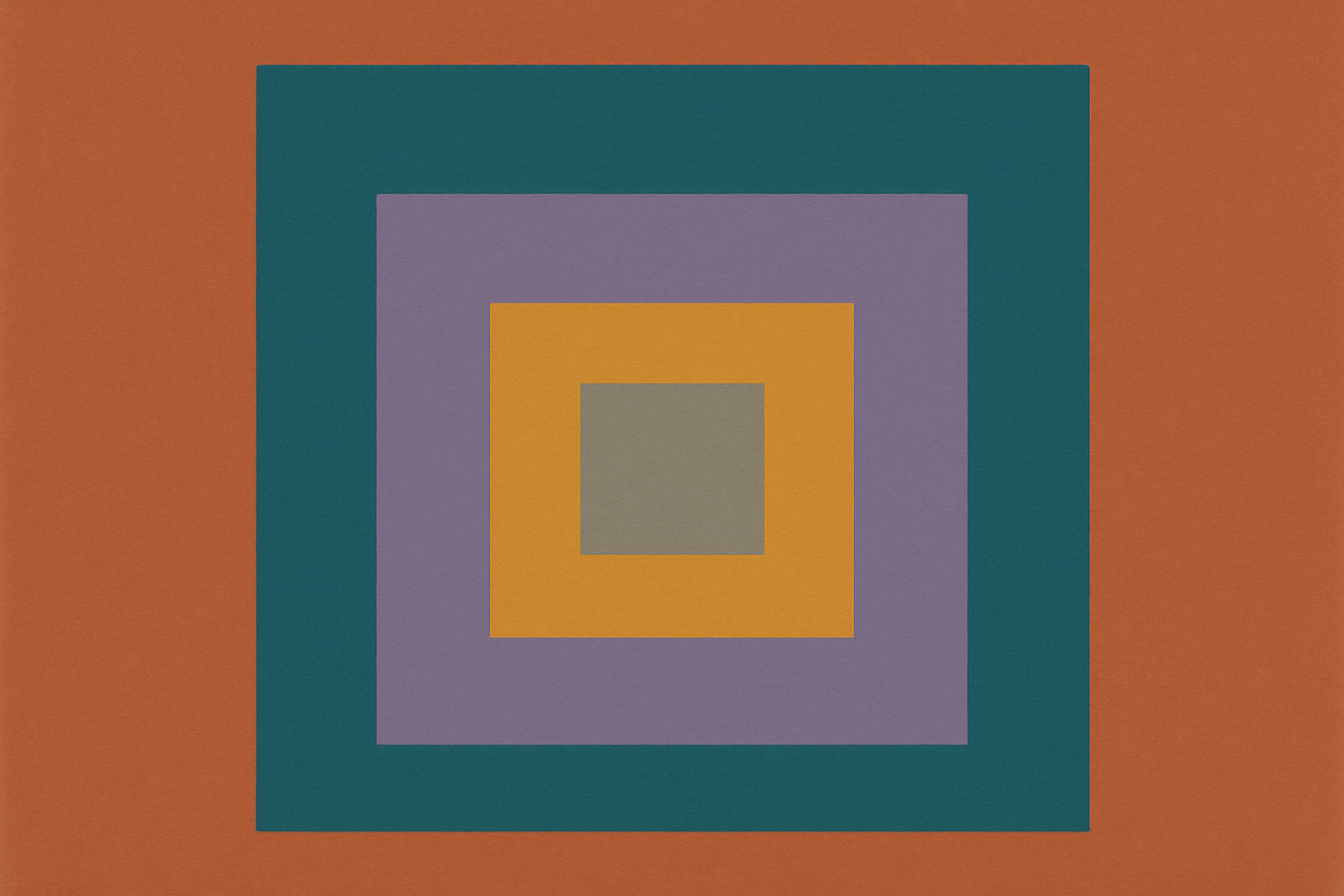
Most designers have seen the Adelson checker shadow illusion at least once. Two squares on a checkerboard, one in shadow and one in light, appear to be drastically different values of grey. They're identical. It's a gut-punch the first time you see it, and it should permanently change how you think about color.
Josef Albers spent decades making similar points, most famously in his 1963 book Interaction of Color. His exercises demonstrated, over and over, that a single color could be made to look like two completely different colors depending on what surrounded it. And two different colors could be made to look identical. Context was everything.
This is simultaneous contrast. Your visual system doesn't perceive absolute color. It perceives relative color based on surrounding context.
There are two main flavors, and both show up in your work constantly:
Both happen at the same time in real design work. They stack.
Why does this happen? Evolution. Your visual system evolved to identify objects under wildly varying lighting conditions: noon sun, overcast sky, candlelight, fluorescent office lighting. To pull this off, the brain computes color relative to its context rather than in absolute terms. This is a feature, not a bug. It lets you recognize a red apple whether you see it under blue sky or warm incandescent light.
But it wreaks havoc when you're trying to make precise color judgments on a screen.
Most resources stop here, with the grey-square demo and a shrug. The real story is what happens when this illusion collides with the daily reality of designing interfaces, brands, and layouts.
Why "That Grey Looks Too Blue" Is Both Right and Wrong
Let's return to that client review and unpack it fully.
Your client is staring at a card component sitting on top of a warm-toned lifestyle photograph. The card background is #808080, a perfectly neutral grey. But the client sees blue. They're not wrong. Their visual system is exaggerating the difference between the warm surround and the neutral target by pushing perception toward the complement of the surrounding hue. Warm orange surround? The eye generates a cool blue shift in the adjacent grey.
This happens with predictable specificity:
The hex value is "correct." The perceptual experience is "incorrect." And in design, perception is reality. Nobody using your product opens a color picker to verify whether the grey is truly neutral. They just see blue-grey. That's the color.
Here's the mental model that will save you: There is no such thing as a color in isolation in a shipped design. Every color is a color-in-context. Hex values are a starting point, not a destination. The "true" color of an element is the color it appears to be in its final environment.
This reframes client feedback entirely. Instead of dismissing perceptual complaints as "wrong," treat them as signal. The client is reporting their genuine visual experience. The fix isn't education. It's adjusting the color to appear correct in context, even if that means the hex value looks "wrong" in a vacuum.
The Page-to-Page Problem: Why Your Button Looks Different Everywhere
Here's a scenario that will feel painfully familiar.
A designer defines a primary CTA button color, let's say a vibrant blue (#2563EB), in a design system. On the marketing landing page, which features a dark, rich hero image with deep purples, the button looks vivid and electric. It pops off the screen. Stakeholders love it.
Then the same button appears on the settings page: mostly white space, light grey dividers, sparse layout. The button looks... duller. Flatter. Almost muted. The product manager pings the design channel: "Did someone change the button color on settings?"
Nobody changed anything. The hex code is identical. The perceptual experience is dramatically different.
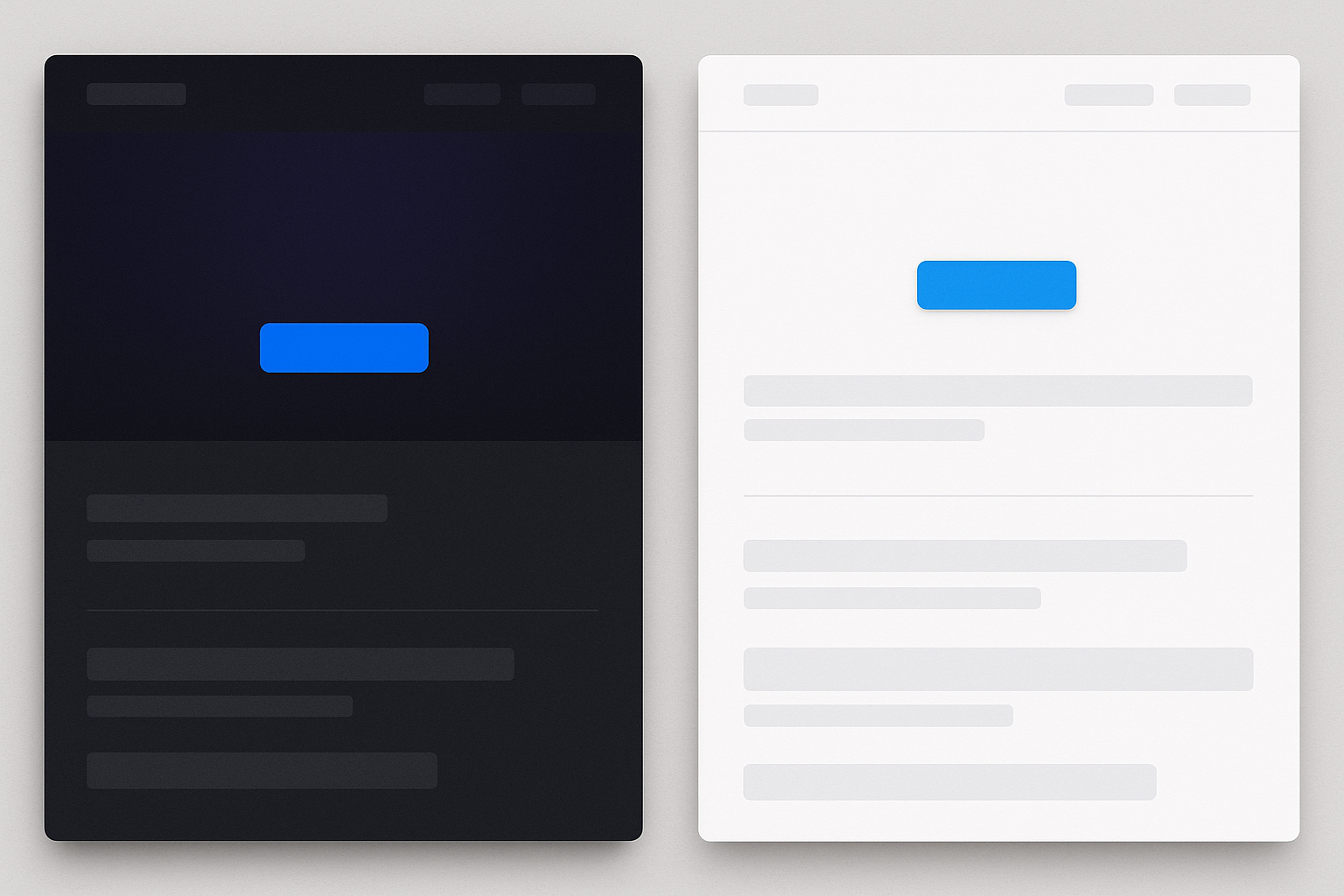
Two forces are at work here. The dark, saturated marketing page provides high luminance contrast that makes the button appear more vivid. It also chromatically interacts with the blue, intensifying it. The sparse settings page offers less surrounding context and less contrast, so the same blue feels less energetic. Less alive.
This has serious implications for design systems. A single defined token value doesn't guarantee perceptual consistency across contexts. This is one of the hidden costs of design-system thinking that treats color as a static property rather than a relational one. Your token --color-primary-blue is a number. What the user sees is a perceptual event, and that event changes from page to page.
The problem goes deeper. Designers often judge colors by placing swatches side by side in a style guide or a Figma frame. But side-by-side comparison amplifies simultaneous contrast rather than eliminating it. You're adding context, not removing it. The two swatches push each other apart perceptually, making differences appear larger (or smaller) than they'll appear in production. This is the fundamental trap.
A Brief History of Artists Who Already Knew This
Designers didn't discover this problem. Artists have been wrestling with it, and exploiting it, for centuries.
Josef Albers' Interaction of Color was essentially an entire book about simultaneous contrast. His students at Yale spent semesters learning to make one color "look like two" or two colors "look like one" through nothing but context manipulation. No Photoshop tricks, no blending modes. Just colored paper, placed side by side, behaving in ways that defied the students' expectations.
The Impressionists weaponized simultaneous contrast on purpose. Claude Monet and Camille Pissarro placed complementary colors in small strokes side by side, knowing the viewer's eye would intensify both hues at their borders. That shimmering, luminous quality you see in Impressionist paintings? It's partly a simultaneous contrast effect, engineered deliberately. They were hacking the viewer's visual system with oil paint.
But the real origin story belongs to Michel Eugène Chevreul, a 19th-century French chemist. Chevreul was brought in to investigate complaints about dull colors in tapestries produced at the Gobelins Manufactory in Paris. The weavers insisted their dyes were pure and vibrant. Chevreul discovered the "dullness" wasn't in the dyes at all. It was in the adjacent thread colors suppressing perceived saturation through simultaneous contrast. His 1839 treatise, The Law of Simultaneous Colour Contrast, influenced Delacroix, the Impressionists, the Neo-Impressionists, and the entire trajectory of modern color theory.
The lesson these artists and scientists all landed on is one many modern designers haven't fully absorbed: you cannot evaluate a color without evaluating its neighborhood. This isn't new wisdom. It's old wisdom that keeps getting rediscovered every time someone opens a color picker and assumes the number tells the whole story.
The Designer's Survival Kit: Practical Workarounds for Daily Work
You can't turn off simultaneous contrast. But you can work around it. Here are five techniques you can start using today.
1. Isolation Testing
When evaluating a color choice, temporarily place the element on a neutral, middle-grey background (#808080 or your system's N50 equivalent) with no other chromatic content visible. This minimizes simultaneous contrast and gets you closer to the "true" appearance of the color. In Figma, create a dedicated isolation artboard for exactly this purpose. Make it part of your file template.
2. The Squint Test
Squinting blurs fine detail and collapses your perception toward broad color and luminance relationships. It's a fast, no-tool way to check if an element reads as the hue and value you intend. Squinting de-emphasizes edges, which is exactly where simultaneous contrast is strongest. Painters have used this technique for centuries. It still works.
3. Luminance-Matched Surrounds
When you must compare two colors side by side, place them on backgrounds of matched luminance (brightness). This neutralizes the achromatic component of simultaneous contrast and lets you focus on hue and saturation differences more accurately. It won't eliminate chromatic contrast entirely, but it removes one major variable.
4. Check in Final Context, Always
Never sign off on a color based on a swatch, a style guide tile, or a component in isolation. Always evaluate it in the actual page or screen where it will live, with real content, real images, and realistic surrounding elements. This is the single highest-leverage habit you can build. It takes two minutes and catches problems that hours of swatch-staring will miss.
5. Adjust for Perception, Not Specification
If a grey needs to read as perfectly neutral next to a warm-toned photograph, you may need to push the hex value slightly warm to counteract the cool shift the viewer will perceive. Design for the eye, not the color picker. When you do this, document the rationale. Add a comment in your design file: "Shifted 3° warm to compensate for simultaneous contrast against hero image." Future designers will thank you for explaining the intentional deviation from the token value.
Rethinking "Color Accuracy" in a World Where Context Is King
The design industry's emphasis on precise hex values, token systems, and "source of truth" color definitions is valuable for consistency. But it can create a false sense of certainty. Color is not a property of a pixel. It's a perceptual event that happens in the viewer's brain, and it is always context-dependent.
This matters for accessibility work too. WCAG contrast ratios are calculated as mathematical relationships between foreground and background luminance. They don't account for simultaneous contrast effects from surrounding elements. A text/background pair that passes 4.5:1 may still feel low-contrast if surrounded by high-saturation, high-luminance content that fatigues the eye. The math passes. The experience fails.
Here's the reframe worth carrying with you: instead of asking "Is this the right color?" ask "Does this color behave correctly in this context?" That small shift in framing transforms color from a static specification problem into a dynamic, perceptual-design problem. Which is what it always was.
Your Eyes Are Always Being Lied To
Let's return to that client review one last time.
The client says the grey looks blue. This time, instead of pulling up the color picker to prove the grey is neutral, you nod. You understand that the grey does look blue in this context, because simultaneous contrast is doing exactly what the human visual system was built to do. The fix isn't to argue about hex values. It's to nudge the grey a hair warm so it reads as neutral in its actual home.
Simultaneous contrast isn't a quirky optical illusion to admire in a textbook and then forget. It's an invisible force acting on every single color decision in every design you ship. You can't turn it off. But once you learn to see it, you can design with it instead of against it.
Your eyes are always being lied to. The question is whether you're in on the con.