Simultaneous Contrast Is Lying to Your Eyes Right Now: The Color Theory Principle Every Designer Underestimates
by ColorSift Editorial Team
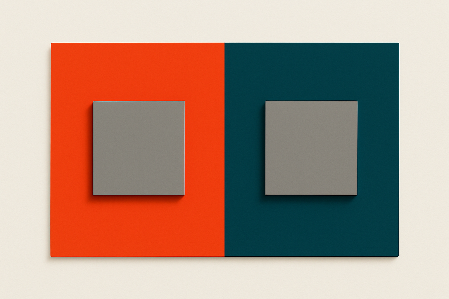
Look at the gray toolbar at the top of your design tool. Now look at the same gray hex value sitting on a white card, then on a deep navy hero section. They're the same gray. Your eyes are telling you they're not. You're being lied to, and the liar is a phenomenon called simultaneous contrast.
In 2026's component-driven design landscape, a single color token can appear in hundreds of contexts. Your neutral gray shows up on cards, modals, tooltips, hero banners, sidebars, and dozens of other surfaces. Simultaneous contrast means that color is quietly shapeshifting in every single one of those contexts. The hex value hasn't changed. Your perception of it has.
This isn't a new discovery. A French chemist figured it out in 1839 while trying to fix "dull" tapestries at a Parisian manufactory. But the modern implications for UI design, accessibility compliance, and client communication are vastly underappreciated. By the end of this article, you'll understand why your eyes deceive you, how a 19th-century textile lab explains your Figma frustrations, and what practical steps you can take to design around it.
The Problem Chevreul Discovered Your Figma Bug in 1839
In the 1820s, Michel Eugène Chevreul took a job as director of dyeing at the Gobelins Manufactory in Paris. The weavers had a persistent complaint: their blacks looked faded, their colors appeared muddy, and their tapestries lacked the vibrancy of earlier work. They blamed the dyes. Chevreul ran lab tests and proved the dyes were chemically identical to prior batches.
The problem wasn't the dye. It was the neighbors.
Chevreul realized that colors placed side by side mutually alter each other's appearance, pushing perception toward the complementary hue of the adjacent color. A black thread next to a vivid red appeared to take on a greenish cast. A deep blue next to a warm yellow made the yellow look more orange. The threads hadn't changed. The relationships between them had.
He published his findings in 1839 as De la loi du contraste simultané des couleurs ("The Law of Simultaneous Contrast of Colors"). The treatise had enormous influence. It shaped how the Impressionists painted, particularly Monet and Seurat, whose pointillism relied directly on Chevreul's principles. It influenced industrial textile design across Europe. And it became foundational to the Bauhaus movement and Josef Albers' legendary Interaction of Color (1963).
Here's the parallel that matters: Chevreul's weavers are today's designers. The "dye" (your hex value) hasn't changed. But the perceptual context, the surrounding UI, the background color, the adjacent components, has shifted. And your eye insists the color is different.
What Your Visual System Is Actually Doing (And Why You Can't Turn It Off)
The neuroscience is elegant and frustrating in equal measure. Simultaneous contrast is driven by lateral inhibition in your retina and visual cortex. Neighboring photoreceptors suppress each other, exaggerating differences at boundaries. This is a feature of your visual system, not a bug. It helps you detect edges and identify objects in complex environments. It kept your ancestors alive. It also makes your Figma files lie to you.
There are three distinct forms of simultaneous contrast:
- Brightness contrast: A mid-gray looks darker on a white background and lighter on a black background. The surrounding luminance shifts your perception of the gray's value.
- Hue contrast: A neutral gray placed on a vivid orange background takes on a cool, bluish cast. The eye "pushes" the gray toward the complementary hue of the surround.
- Saturation contrast: A muted color looks even duller next to a vivid one. Place that same muted color next to something even more muted, and it suddenly appears more vibrant.
Here's the critical part: this is involuntary. You cannot override it by knowing about it. Even Chevreul himself couldn't "unsee" the effect after discovering it. You can stare at those two identical gray squares and intellectually know they're the same value, and your brain will still perceive them differently.
Josef Albers put it plainly: "In visual perception, a color is almost never seen as it really is, as it physically is." This isn't an edge case. It is the default state of how you see color.
The Five UI Traps: Where Simultaneous Contrast Haunts Modern Product Design
Knowing the theory is useful. Knowing where it bites you is essential.
Trap 1: The "Blue Gray" on Cards. You use a neutral gray (#9E9E9E) as secondary text on a warm-toned card background, maybe a cream or soft peach. The gray appears to shift cool and bluish. A designer or client flags it as "off-brand." Someone nudges the gray warmer, creating an actual color inconsistency in your token system. The original hex was correct. The fix introduced the real problem.
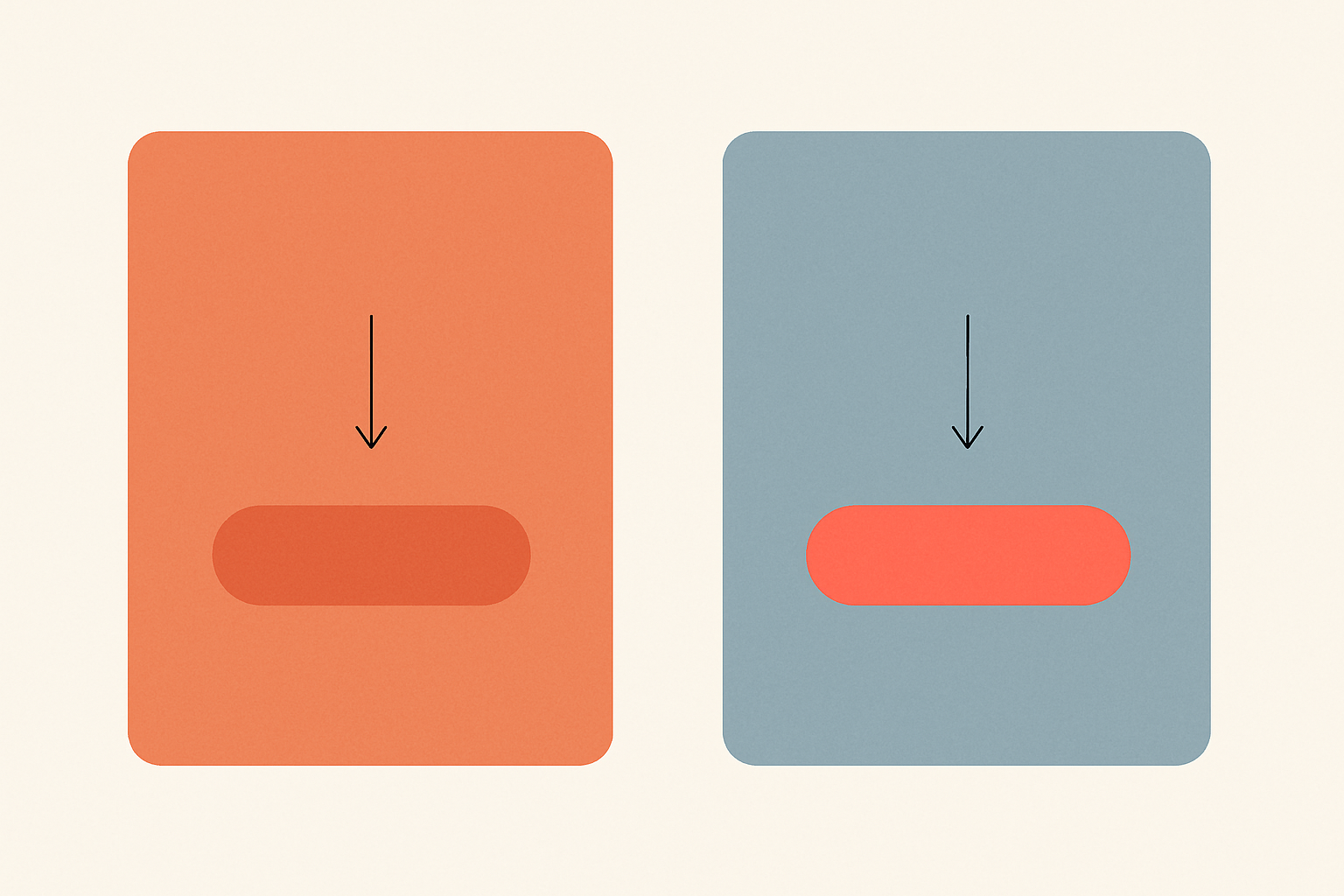
Trap 2: The Logo That "Looks Different" on the Hero Banner. Your brand's coral red sits on a saturated dark blue hero section. Hue contrast pushes the coral toward orange. The client says, "The logo color looks wrong here." They're not wrong about what they see. They're wrong about the cause.
Trap 3: Dark Mode Saturation Surprise. Colors that look balanced in light mode can appear significantly more saturated against dark (#121212) backgrounds. Brightness contrast amplifies chroma perception. This is precisely why Material Design 3 and Apple's Human Interface Guidelines specify separate dark-mode color tokens rather than reusing light-mode values. If you're just flipping backgrounds and keeping the same palette, you're fighting physics.
Trap 4: Accessibility Swatch Testing in Isolation. You check a color combination for WCAG contrast against a clean white background, nothing else on screen. It passes at 4.5:1. But in the live product, that text sits next to a high-saturation sidebar that shifts the perceived brightness of the background. The mathematical contrast hasn't changed. The subjective readability has. Context matters beyond the ratio.
Trap 5: Component Library Drift. In a design system with hundreds of components, the same gray token rendered on cards, modals, tooltips, sidebars, and banners, each with different surrounding colors, will look like five different grays. Teams start creating ad-hoc "corrective" tokens ("gray-card-warm," "gray-modal-cool"), and the system quietly bloats into something nobody can maintain.
Why Google Material Design Had to Invent "Tonal Palettes"
Google's evolution from Material Design 2 to Material Design 3 is, in part, a story about confronting simultaneous contrast at system scale.
MD2 worked well in controlled contexts. A fixed color scheme with specific surface values produced predictable results. But as theming expanded and Dynamic Color (introduced in 2021, refined through 2026) let wallpaper-derived palettes drive the entire UI, the old approach broke down. A single accent color looked stable on Material's default gray surfaces. That same accent on a user-generated teal surface? Completely different perception.
MD3's tonal palette system addresses this directly. From a single seed color, the system generates an entire spectrum of tones across multiple hue families. Backgrounds, surfaces, containers, and text colors all derive from harmonically related tones. This design reduces the perceptual "push" between adjacent colors because the relationships are controlled. A surface and its text aren't arbitrary pairings; they're tonal relatives that maintain stable perceived contrast across contexts.
The practical lesson is significant. Google didn't pick colors that look good in isolation. They engineered relationships between surface layers so that perceived color would remain stable as components moved between different contexts. This is simultaneous-contrast-aware design at system scale.
Apple takes a similar approach with their adaptive color system for iOS and macOS. System colors automatically adjust tint and saturation depending on the background trait. A single hex value is insufficient, and Apple's engineers know it.
Thought Experiments You Can Try Right Now
These aren't party tricks. They're calibration exercises for your design intuition.
Experiment 1: The Figma Test. Create a medium gray rectangle (#808080). Duplicate it. Place one copy on a #FF6600 (vivid orange) background and the other on a #0055FF (vivid blue) background. Look at them side by side. The gray on orange will appear to shift cool and bluish. The gray on blue will appear warm and yellowish. Now eyedropper both grays. Identical. Same hex. Different perception.
Experiment 2: The Client Presentation Test. Take your brand's primary color and place it on three different backgrounds you commonly use: white, dark navy, and a light warm gray. Screenshot all three. Place the screenshots side by side. Notice how the "same" brand color appears to be three distinct hues. This is exactly what your client sees when they say, "Something's off."
Experiment 3: The Accessibility Gut Check. Take a text/background pair that barely passes WCAG AA at 4.5:1. Surround it with a large, highly saturated element, a bright green sidebar, for instance. Then swap the sidebar for a neutral gray. Notice whether your subjective sense of readability changes, even though the mathematical contrast ratio is identical in both scenarios. This is why context matters beyond the numbers.
The goal of each experiment is the same: train yourself to distrust your first color impression and reach for the eyedropper before reaching for a new hex value.
Practical Takeaways: Designing Around the Lie
1. Always test colors in context, never in isolation. Build a "color stress test" artboard in your design file that places every key color on every major background surface in your system. Make this a gate in your design review process. If you only evaluate swatches on a white canvas, you're evaluating fiction.
2. Use the eyedropper as a reality check. When a color "looks wrong," pick it before changing it. If the hex is correct, the problem is contextual. The fix is environmental (adjust the surround, add a border, modify the container), not a new color value.
3. Embrace intentional optical correction. Sometimes the right design choice is to adjust a color's actual value so it looks perceptually correct in a specific context. Typographers do this with optical sizing, adjusting letterforms so they appear consistent at different scales. Color designers should do the same with contextual adjustments. Document these overrides explicitly in your design system as "optical correction tokens" so future designers understand why #808080 became #837E7A on the warm card.
4. Educate clients and stakeholders before the big review. Before the hero-banner meeting, show the client the simultaneous contrast illusion. Name the phenomenon. Give them the vocabulary. This transforms "the color is wrong" from a blame conversation into a shared problem-solving conversation. A two-minute demo with gray squares saves you hours of revision cycles.
5. Use the effect intentionally. Simultaneous contrast isn't only a hazard. It's a tool. Want a CTA button to appear more vibrant without increasing its actual saturation? Place it on a desaturated or complementary-hued background. Chevreul's weavers eventually used contrast to make their work more luminous, not less. You can do the same with your interfaces.
The Thread and the Whole Cloth
Chevreul's weavers at the Gobelins Manufactory were convinced their dyes were defective. They spent months blaming suppliers, questioning chemistry, demanding reformulations. The real issue was invisible, hiding in the relationship between colors, not in the colors themselves.
In 2026, designers face the same invisible problem at dramatically larger scale. Every component in a design system is a thread, and every thread is being perceptually altered by its neighbors. A card. A modal. A sidebar. A hero section. Each one changes how you see the colors inside it.
The designers who understand simultaneous contrast will make better color choices. They'll build more resilient design systems. They'll have more productive conversations with clients who say "that blue looks purple." And they'll develop a deeper humility about the limits of their own perception.
The first step to seeing color accurately is accepting that you never do.