The Science of Simultaneous Contrast: Why Your Colors Are Lying to You
by ColorSift Editorial Team
You spend hours perfecting a brand's signature orange. You test it against the style guide. You sign off. Then the live product page goes up, and that bright, confident orange looks muddy and brown. The hex code hasn't changed by a single digit. So what went wrong?
Nothing, actually. Your color is exactly what you specified. The problem is everything around it.
This is simultaneous contrast at work, a perceptual phenomenon that operates below your conscious awareness. It reframes color from a fixed property of light into something far messier: a negotiation between your eye, your brain, and every other color on the screen. In 2026, with glassmorphism, layered dark-mode UIs, and gradient-heavy brand systems dominating visual culture, this misunderstood force is causing real, costly design failures. And the worst part? Your color picker can't catch it. Your contrast checker can't flag it. Only your understanding of the science can fix it.
Here's both the science behind why this happens and the practical vocabulary to diagnose it.
The Illusion You Can't Unsee: What Simultaneous Contrast Actually Is
Simultaneous contrast is the phenomenon where the same objective color appears perceptually different, shifting in hue, lightness, or saturation, depending solely on the colors that surround it.
The classic demonstration is simple. Take two identical neutral gray squares. Place one on a black background and the other on a white background. The gray on black looks noticeably lighter. The gray on white looks darker. They are the exact same gray. Same hex. Same RGB values. Different perception.
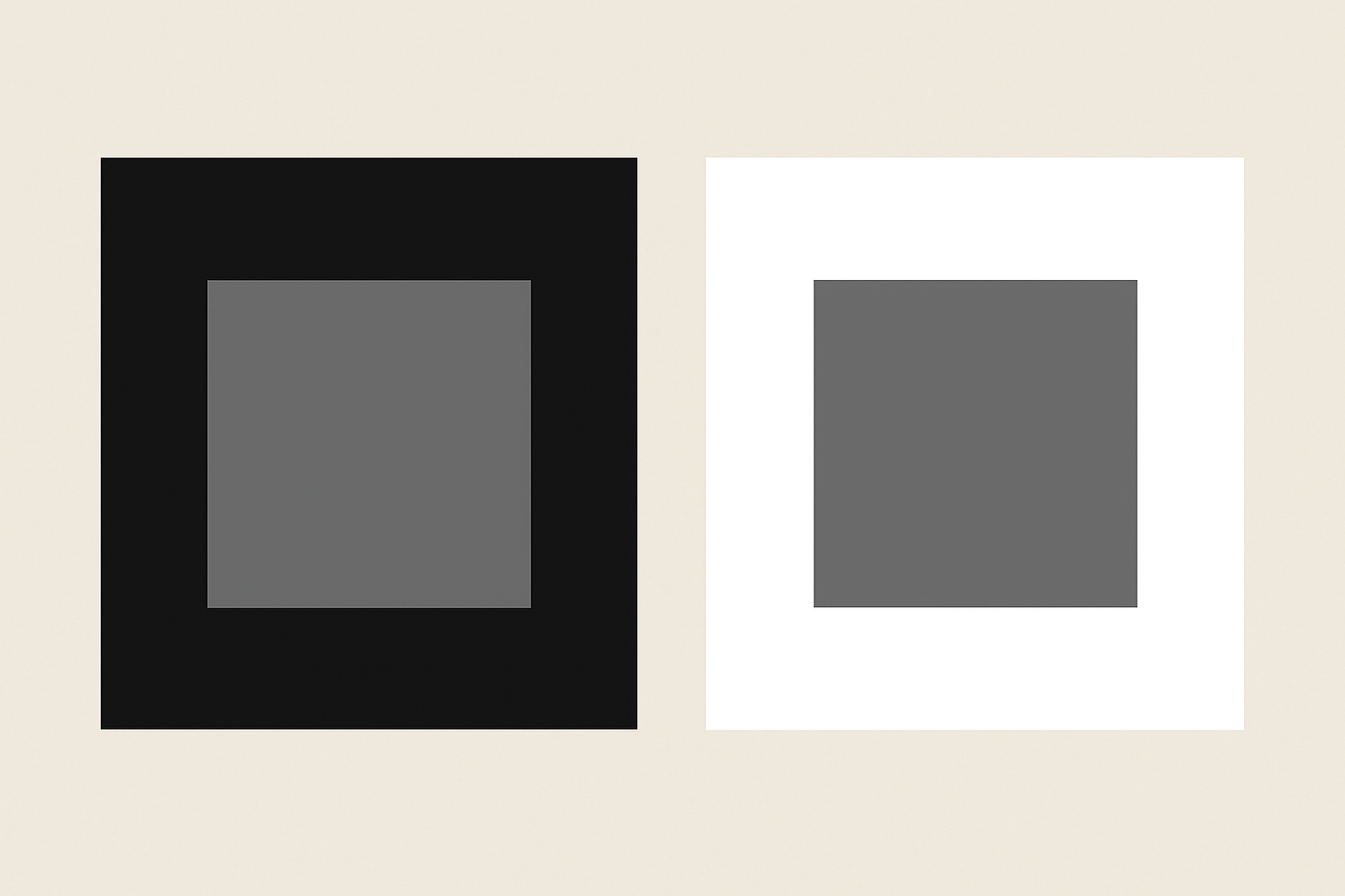
What you see and what is actually there are genuinely different things.
It's worth distinguishing this from related effects. Successive contrast produces afterimages when you stare at a color and then look away. The Bezold effect causes small color elements to appear to "spread" into surrounding areas. Simultaneous contrast is its own specific mechanism, driven by lateral inhibition in your visual system, which we'll get to shortly.
Here's the core argument that drives everything else in this article: color is not a property of an object. It is a construction of context. Designers who treat hex codes as ground truth are building on sand.
Two Centuries of Evidence: Chevreul, Albers, and the History of Seeing Wrong
This isn't a new discovery. Michel Eugène Chevreul identified the problem in 1839 while working at the Gobelins tapestry manufactory in Paris. Dyers kept complaining that their colors looked impure. Chevreul investigated and found that the dyes were fine. The problem was adjacency: neighboring thread colors were poisoning each other's perceived hue. His resulting treatise, De la loi du contraste simultané des couleurs, became the first systematic scientific account of the effect.
The French Impressionists ran with it. Seurat and Signac weaponized Chevreul's findings in Pointillism, deliberately placing complementary colors side by side to create optical vibration and perceived luminosity that no single pigment could produce. They weren't mixing paint on a palette. They were mixing light in your brain.
Then came Josef Albers. His 1963 book Interaction of Color launched a pedagogical revolution. Albers taught artists to actively distrust their own perception. His famous exercises asked students to make one color look like two different colors, and two different colors look like one. The lesson was always the same: context is the master variable.
The throughline from Chevreul to Albers to today is direct. What was once a craft problem for tapestry weavers and a philosophical puzzle for Bauhaus teachers is now a live engineering problem for interface designers shipping products to billions of screens.
Worth noting: Edwin Land's Retinex theory (1977) later provided the neuroscientific bridge between these historical observations and a mechanistic explanation of how the brain actually constructs color from context. Which brings us to the machinery itself.
Inside the Visual Cortex: The Neuroscience of Why Your Brain Edits Colors
Your eye is not a camera. It is a contrast-detection machine, optimized to find edges and differences rather than record absolute luminance values.
Here's how it works. Retinal ganglion cells don't just fire in response to the light hitting them. They are actively suppressed by the firing of neighboring cells. When a cell is stimulated, it inhibits its neighbors. This means bright surroundings literally dampen the neural signal for a darker center region. This process, called lateral inhibition, is the engine of simultaneous contrast.
The retina and primary visual cortex (V1) organize this through center-surround receptive fields. Each cell responds to a small spot of light at its center, but its response is modulated by what's happening in the ring around it. This architecture is built for detecting boundaries, not for faithful color reproduction.
Color information itself travels through opponent channels: red-green, blue-yellow, and light-dark. Simultaneous contrast operates independently along each channel. That's why a gray square can look both slightly warmer AND slightly lighter depending on its surround. Multiple channels are being pushed simultaneously.
Why did we evolve this way? Color constancy. Your brain discounts ambient illumination so you can see a banana as yellow whether in morning sun or afternoon shadow. Simultaneous contrast is a side-effect of this otherwise brilliant adaptation. The system isn't broken. It's doing exactly what millions of years of evolution designed it to do.
The takeaway for designers: any design system built without accounting for context is fighting neurobiology.
Case Study: The Brand Color That Broke in the Wild
Consider a brand with a carefully calibrated, energetic mid-tone green as its signature color. On white backgrounds in print and on the website hero section, it reads as vivid and fresh. The brand launches a dark-mode app. The same green, same hex code, now sits on deep charcoal card backgrounds. It suddenly appears yellowed and sickly.
Same color. Catastrophically different perception.
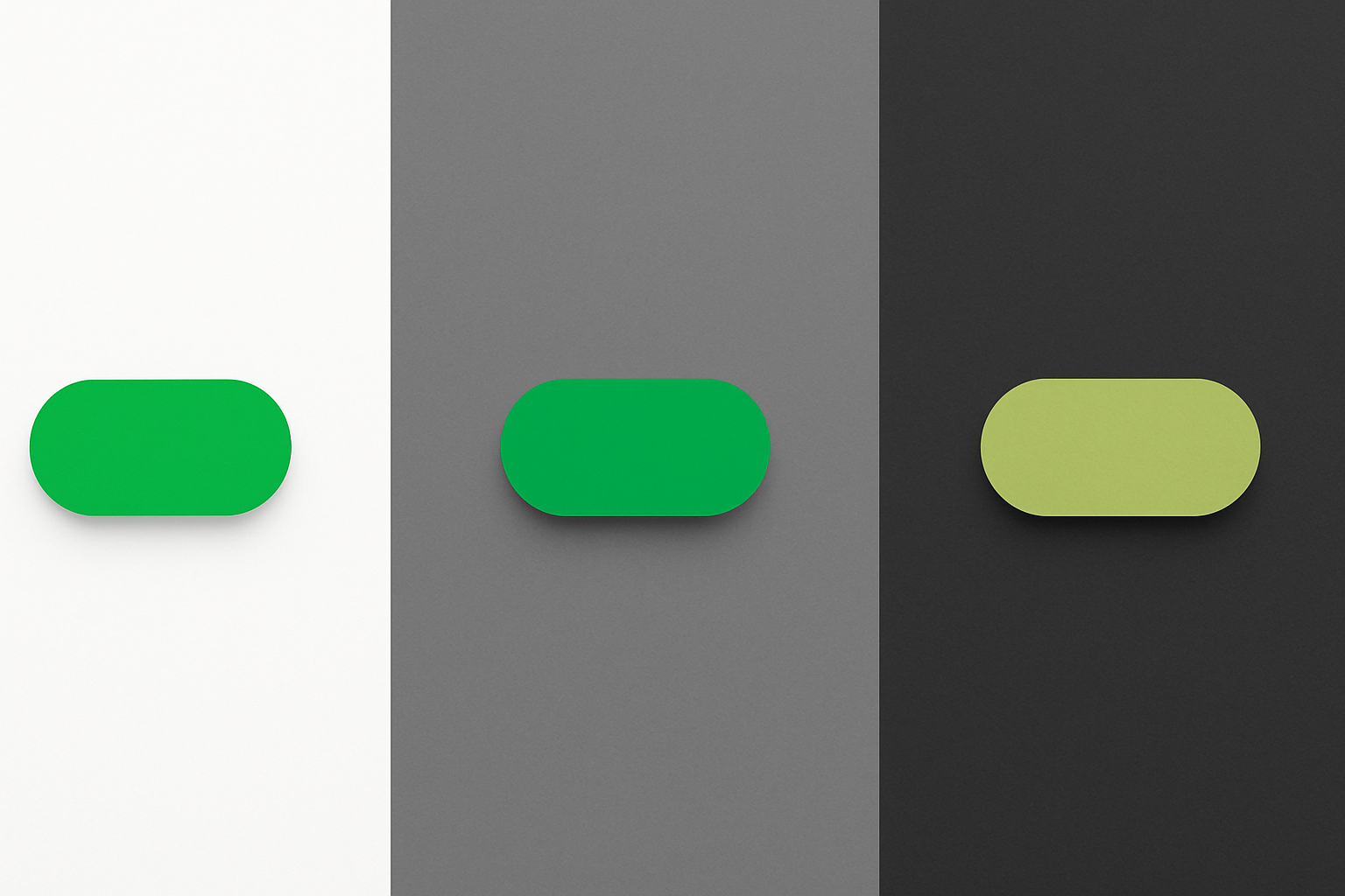
Here's the diagnosis using simultaneous contrast mechanics. The dark surround triggers lightness contrast, making the green look lighter and stripping away its depth. Meanwhile, the warm-neutral undertones of the charcoal trigger a simultaneous hue shift, pushing the green toward yellow on the opponent color axis. Two channels shifting at once. The result looks nothing like the brand.
The instinctive fix most designers reach for, simply darkening or saturating the color in dark mode, often overcorrects. It creates a different perceptual problem on mid-tone backgrounds or inside glassmorphic overlays, where the darkened green now looks heavy and artificial.
The real solution is a conceptual shift. Instead of one brand green, a design system needs what you might call a "contextual color token." At minimum, you need a light-context value and a dark-context value, calibrated not for hex similarity but for perceptual equivalence. The goal isn't that the hex codes match. The goal is that the colors feel the same to a human eye in their respective contexts.
2026's Design Trends Are Making This Worse
Several dominant trends in 2026 are amplifying simultaneous contrast problems in ways that flat mockups can never reveal.
Glassmorphism's simultaneous contrast trap. Frosted glass overlays place a semi-transparent color layer over constantly shifting background content. The perceived hue of a glassmorphic panel changes in real-time as the user scrolls. A design that looked correct on a static Figma frame becomes optically unstable in production. The "surround" is literally moving.
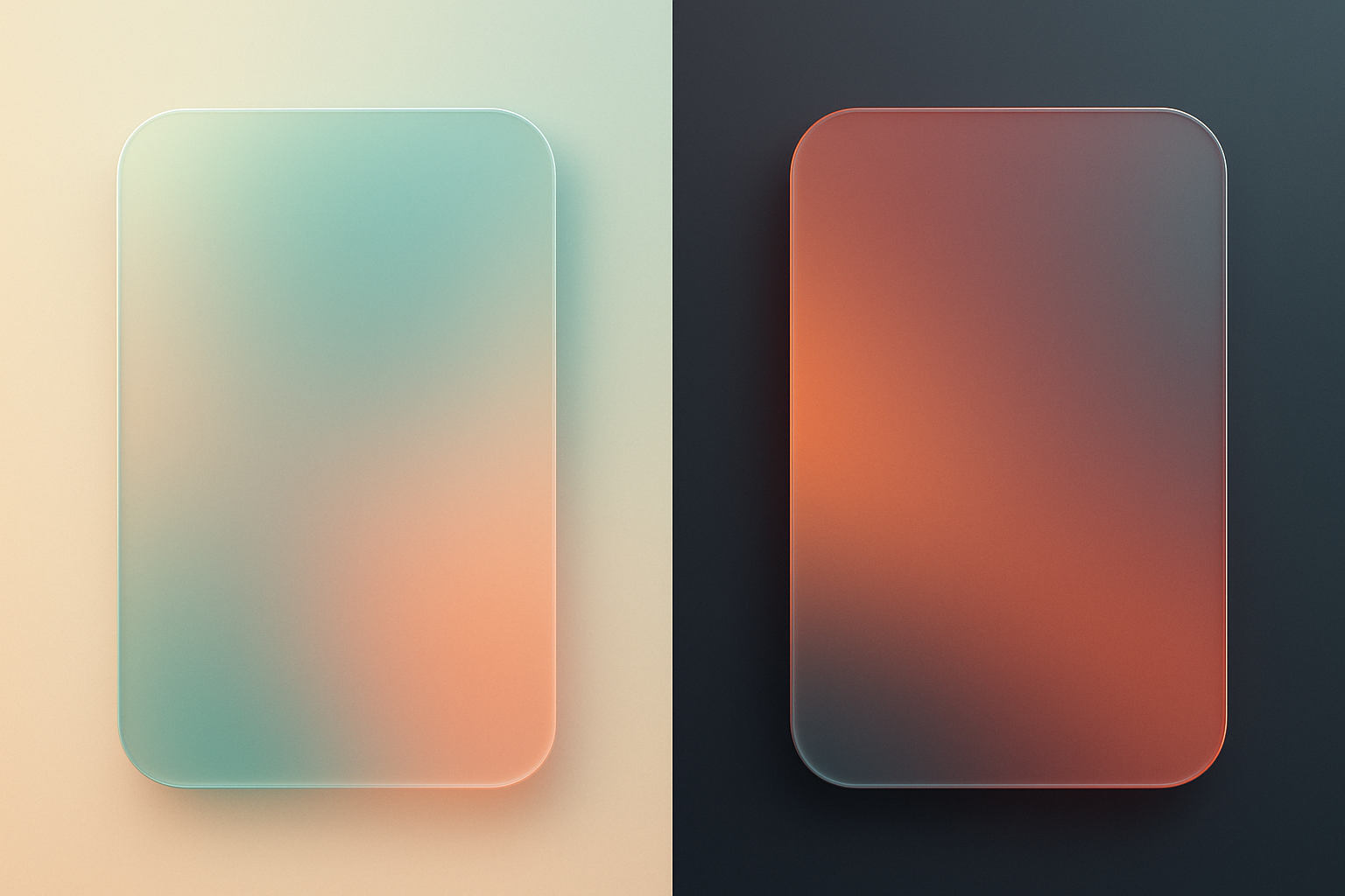
Layered dark modes and the charcoal gradient problem. Modern dark mode systems use multiple elevation layers: charcoal, near-black, true-black, each with subtle color temperature differences. A brand color sitting on a cool-dark card next to a warm-dark sidebar creates a hue shift that no flat mockup will reveal. The same blue button reads cooler in one panel and warmer in the other.
Gradient-heavy brand systems. When a color exists inside a gradient, every pixel of the gradient is a different "surround" for every neighboring color. Predictable perceived hue becomes essentially impossible without deliberate perceptual calibration at multiple points along the gradient arc.
AI-generated UI components. A growing share of UI elements in 2026 are being generated or composed by AI layout tools. These tools optimize for hex-code contrast ratios and WCAG compliance, but they are completely blind to simultaneous contrast effects. This creates a new class of failure that passes every automated check but still fails real users perceptually.
A Practical Framework: Designing for Perceptual Stability
The fundamental mindset shift is this: stop specifying colors and start specifying perceptual targets. The question isn't "what is the RGB value of our brand blue?" It's "what should our brand blue feel like, and in what contexts will it need to achieve that feeling?"
Here's how to put that into practice.
Perceptual color testing. Before approving any color for a design system, create mockups that place it in its worst-case simultaneous contrast scenarios. Put it against its complementary hue. Put it against maximum lightness contrast. Put it against the near-neutrals it will actually sit beside in production. If it breaks in any of these conditions, you have work to do.
Use perceptually uniform color spaces. OKLCH and CIECAM02 are built to approximate how humans perceive color change. They are dramatically better tools for specifying contextual color tokens than sRGB, because equal numerical steps in these spaces correspond to roughly equal perceptual steps. When you adjust a color in OKLCH, the change you see on screen more closely matches the mathematical change you made.
Simple rules of thumb for practitioners:
- Any color that will appear on more than two distinct background types needs at least two contextual tokens.
- Test colors against their actual complements and near-neutrals, not just black and white.
- Simultaneous contrast effects are strongest at medium saturation. Highly saturated and very desaturated colors are more perceptually stable.
Where to go deeper. Josef Albers' Interaction of Color remains the essential primary text. The OKLCH color space documentation provides the technical framework. And perceptual contrast tools emerging from the accessibility community are beginning to address what WCAG alone cannot.
The Color You Pick Is Not the Color They See
Let's return to that designer whose perfect orange turned muddy in production. Now you have the vocabulary to explain exactly what happened. Lateral inhibition dampened the lightness signal. Hue-opponent channels shifted the perceived warmth. The brain, doing exactly what it evolved to do, constructed a color from context rather than reading it from a wavelength.
Color is not a thing you pick. It is a relationship you design. The hex code is a starting point, not an answer.
As interfaces become more layered, more dynamic, and more context-dependent, the gap between the color a designer intends and the color a user perceives will only grow wider for those who don't understand simultaneous contrast. For those who do, it becomes a genuine craft advantage.
So here's a challenge. Before you approve your next color token, put it on the background it will actually live on. See what it becomes. That moment of surprise isn't a bug in your process. It's simultaneous contrast introducing itself.