Seasons of Color: Designing with Seasonal Palettes
by ColorSift Editorial Team
Seasons of Color: Designing with Seasonal Palettes
Design is an art—an art deeply intertwined with the world around us, and nothing reflects this connection more than the colors of the seasons. From the vibrant hues of a sunny summer day to the calming tones of a wintry morning, seasonal color palettes offer a canvas of emotions and moods waiting to be captured. Let's explore how each season's palette can enhance your design projects.
Understanding the Psychology of Color
Color isn't just about aesthetics; it speaks a language of emotion and perception. Ever felt calm surrounded by blues or energized by bright yellows? That's the magic of color psychology. By tuning into the natural color trends of each season, you can evoke specific feelings and set the mood.
- Spring often introduces a sense of freshness with pastels that feel gentle and new.
- Summer brings energy; bold colors mirror the vibrancy of sun-filled days.
- Autumn invites warmth with earthy hues, stirring nostalgia.
- Winter offers tranquility, with cool tones that align with peace and reflection.
So, next time you're planning a design, what mood are you aiming to capture?
Spring: Embracing Freshness and Rebirth
Spring is synonymous with rebirth. Think of soft pinks, gentle greens, and pastel yellows.
To bring spring into your designs:
- Use subtle pastels for a fresh, inviting look.
- Draw inspiration from blossoming flowers; think of tulips and cherry blossoms.
Here's an example of a successful spring-inspired design: A wedding invitation adorned with floral patterns and soft hues that communicate tenderness and new beginnings.
Summer: Infusing Energy and Vibrancy
Summer is all about high spirits and lively energy. Imagine turquoise skies and bright yellow beaches.
Design tips for summer:
- Opt for bold, vibrant colors like bright oranges and electric blues.
- Create dynamic designs using contrasting bright colors.
In fashion and digital media, these colors capture the essence of a bustling music festival or a beach party.
Autumn: Capturing Warmth and Coziness
Autumn wraps us in a cozy embrace with its warm, earthy tones. From deep reds to rusty oranges, the season is inviting and comforting.
- Use these palettes to create a sense of warmth and nostalgia.
- Think of homey designs that invite someone to stay awhile, like earthy-themed interiors or fall market flyers.
Winter: Embracing Coolness and Calm
Winter brings a certain calm. Blues, whites, and silver create serene and elegant visions.
To incorporate winter themes:
- Utilize cool hues to evoke tranquility.
- Infuse metallics for a touch of holiday sparkle.
Consider a winter gala invite using silvery whites and icy blues to evoke elegance and sophistication.
Practical Tips for Choosing Seasonal Palettes
Now, let's dive into some practical techniques:
- Know Your Audience: Different seasons appeal to different groups. Kids might love summer splashes, while professionals might resonate with winter's elegance.
- Blend with Intent: Use color wheels and tools to find complementary colors that create harmony.
Resources like Adobe Color or Coolors can offer inspiration and precision in palette selection.
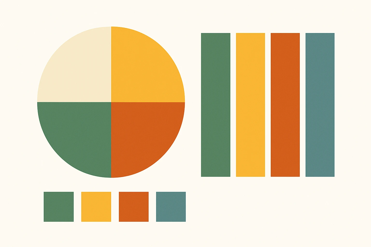
Showcase: Seasonal Color Schemes in Action
Explore these palettes:
While trends in fashion, architecture, and digital media change, the emotional impact of seasonal colors remains timeless.
Conclusion
Bringing seasonal palettes into your projects isn't just about appearance. It's about connection—connecting your design with the emotions and spirit of the times.
So next time you're about to start a project, think about the seasons, and let them guide your creativity. Happy designing!