Chromatic Nostalgia: How to Build Retro-Inspired Color Palettes That Feel Vintage Without Looking Dated
by ColorSift Editorial Team
A color doesn't have a decade stamped on it. There's no timestamp embedded in burnt orange, no expiration date on electric cyan. And yet, the moment you see a faded amber-and-avocado palette, your brain whispers "1970s" before you've finished processing the image.
How does that happen? The answer is surprisingly physical. Our brains encode color memories partly through the medium that delivered them. Kodachrome film, CRT monitors, low-quality offset printing. These technologies didn't just display colors. They distorted them in specific, repeatable ways. So when we say "retro color," we're really describing a simulation of a technological artifact, not a direct copy of pigments that existed in a particular era.
This distinction matters enormously right now. Nostalgia-coded design is one of the most commercially potent aesthetics of the mid-2020s. Spotify's decade-playlist campaigns. The explosion of Y2K-inflected CPG branding. The resurgence of 80s neon in app UI. But the execution gap between "intentionally vintage" and "accidentally cheap" is razor thin.
Here's what we'll cover: three decades (70s, 80s, 90s), their palette "essence," how to adapt each for modern screens and accessibility, and why typography and layout seal the deal.
Why Retro Color Works (And Why It So Often Fails)
Decade palettes are simulations. Kodachrome's color shifts, CRT phosphor glow, CMYK dot-gain on cheap paper stock. These are the artifacts our brains associate with eras, and they're all products of technology, not intention.
Most retro attempts fail because designers copy surface colors wholesale without understanding why those colors looked that way. The result? Palettes that read as Halloween-costume versions of a decade rather than genuine evocations. It's the difference between wearing a character and becoming one.
There's also a modern context problem. A 1980s neon that looked electric on a CRT monitor can look garish or genuinely inaccessible on a 2026 OLED display pushing 500 nits. Retro palettes must be translated, not transplanted.
Consider your audience, too. People who lived a decade carry emotional memory. People who romanticize it second-hand carry aesthetic memory. These groups respond to different fidelity levels. The person who remembers their grandmother's kitchen wants accurate avocado green. The 22-year-old scrolling TikTok wants the vibe of avocado green.
The framework we'll use throughout: Identify the Artifact → Extract the Essence → Adapt for Modern Context → Anchor with Contemporary Design Language. Four steps. Every decade.
The 1970s: Decoding Kodachrome's Warm, Washed-Out World
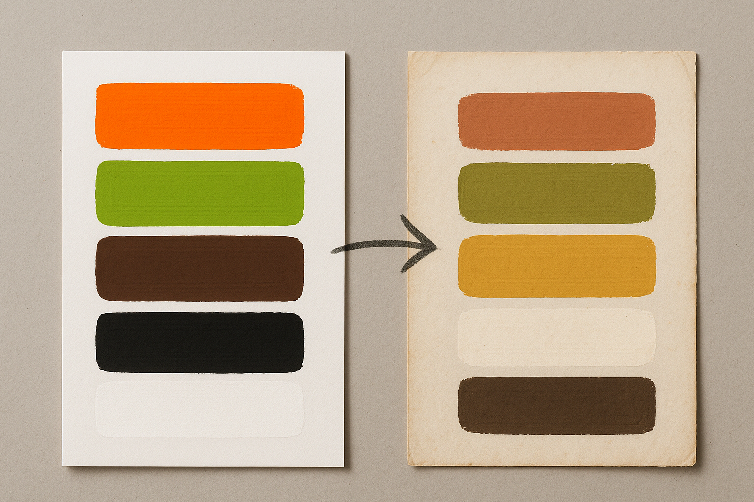
The artifact: Kodachrome film had a signature look. Warm magenta-shifted shadows, a compressed highlight range, and a tendency to shift greens toward olive and yellows toward amber. Meanwhile, the era's offset printing used heavy paper stock that absorbed ink differently, warming and desaturating everything on contact.
The essence: The 70s aren't "orange and brown." They're heat-shifted, low-contrast warmth. Everything pulls toward a narrow warm band of the spectrum. Shadows never go truly black. They go dark sienna or umber instead.
Modern adaptation moves: Pull true blacks toward warm dark browns. Replace any pure white with aged cream (the #F5EFE0 range). Reduce saturation of all hues by 20-35%. Add a subtle warm yellow overlay at low opacity across the palette to simulate film base warmth. These shifts are small individually, but together they recreate the Kodachrome feeling without looking like a direct Instagram filter.
Pairing notes: 70s palettes work best with serif typefaces that have organic stroke variation. Think variable optical-size serifs, not geometric slabs. Loose leading. Plenty of breathing room. The decade was pre-grid-system in its aesthetic DNA, so let your layouts breathe.
The 1980s: Taming Neon Without Killing the Energy
The artifact: Designers constantly conflate two distinct 80s sub-aesthetics. Early-80s Memphis Design was geometric, primary-colored, bold against black and white. Mid-to-late 80s neon/synthwave was hot pink, electric blue, violet, acid green, all against black or deep purple. Both emerged from the CRT monitor's ability to emit light rather than reflect it.
The essence: Self-illuminated contrast. The 80s palette reads as electric because colors appear to glow from within. The key quality is the specific combination of high-chroma colors against near-black backgrounds that simulates light emission.
The accessibility crisis: Hot pink (#FF1493) against black passes contrast ratios. But electric cyan (#00FFFF) against white does not. Modern screens at high brightness make oversaturated 80s hues genuinely uncomfortable to read. The adaptation challenge is preserving the perception of luminosity while pulling back actual saturation.
Modern pairing: 80s palettes demand geometric sans-serifs, tight tracking, and bold hierarchical contrast in type size. Neon-inspired UI works best in dark mode, where the luminosity illusion holds. Avoid using these palettes on full-page light backgrounds. It destroys the decade's core visual logic entirely.
The 1990s: The Decade That Hated Color (And Why That's the Point)
The artifact: Two poles defined the 90s. The grunge/alternative aesthetic embraced deliberate anti-design: muddy jewel tones, xeroxed texture, intentional ugliness. The early web/Y2K aesthetic went the opposite direction: saturated primaries, busy gradients, early digital artifacts. Both reflected a rejection of the polished excess of the 80s.
Grunge-90s essence: Deliberate desaturation and democratic ugliness. Colors were chosen to look reproduced badly, like a photocopied zine or a sixth-generation VHS dub. The palette intentionally communicated anti-establishment authenticity.
Y2K-90s essence (a distinct beast): Hyper-digital, translucent metallics, iridescent surfaces, bubblegum brights with chrome. This is the aesthetic that has most strongly resurged in 2025-2026 CPG and fashion branding, from Rhode Skin's packaging to the current wave of iridescent supplement bottles on grocery shelves.
The modern adaptation challenge for grunge: Intentional ugliness must be controlled ugliness. Random grunging looks amateur. Deliberate grunging, with specific texture overlays, precise xerox-effect filters, and calibrated grain, reads as art direction. Look at how Liquid Death applies this sensibility: their muted, aggressive palette feels deliberately lo-fi, never accidentally sloppy.
Case Study: A Modern Brand That Gets It Right
Ghia, the non-alcoholic apéritif brand, executes 70s warmth with genuine craft. Their packaging and digital presence deploy a palette rooted in dusty terracotta, harvest gold, and warm cream. But look closer and you'll see the four-step framework in action.
What they got right:
- Neutral handling. Their "black" is a deep warm brown, never true black. This single decision keeps every piece of collateral feeling analog and warm.
- Saturation calibration. The terracotta reads rich on screen but sits about 25% below where a naive "70s orange" would land. It feels vintage without vibrating against its neighbors.
- Typography reinforcement. They pair an elegant serif wordmark with clean, modern body copy. The serif signals the decade. The body text signals "we know what year it is."
- Cream instead of white. Every background surface uses a warm off-white, replicating that ink-on-heavy-stock feeling of 70s print without ever actually mimicking old paper.
Contrast this with a common failure: brands that grab mid-century brown-orange and pair it with pure white backgrounds and geometric sans-serif type. The orange screams 1973, but the white and the type scream 2018 corporate startup. The signals clash. The viewer reads "confused," not "retro."
Three transferable rules: First, always shift your darkest swatch warm, not neutral. Second, match at least one non-color element (type, texture, layout) to the decade signal. Third, include one deliberately modern element so the retro reads as a choice.
The Modern Anchors: Typography, Texture, and Layout as Palette Partners
Even a perfectly adapted retro palette will fail if paired with mismatched typographic or layout sensibilities. The decade signal is a holistic system. Color is the loudest voice, but it's singing in a choir.
Typography as decade reinforcement: Optical-size-variable serifs for 70s warmth. Tight geometric grotesques for 80s energy. Distressed or mixed-weight grotesques for 90s grunge. Rounded display sans-serifs for Y2K. Crucially, pair these display choices with modern body text to keep readability contemporary.
Texture as time-stamp: One well-chosen texture overlay can do more work than ten palette adjustments. Subtle halftone grain maps to the 70s. Scan-line or pixelated patterns belong to the 80s. Xerox noise and high-contrast grain signal 90s grunge. Holographic or iridescent gradients evoke Y2K. One texture layer, used subtly, is almost always the right answer. Two or more layers usually means you're overworking it.
Layout and whitespace: 70s palettes want organic, open layouts with generous margins. 80s palettes want dense, bold, asymmetric grids. 90s grunge wants deliberately broken or collage-like structure. Y2K wants chrome-bordered, symmetrical, widget-like containers. Mismatching layout to palette breaks the decade illusion faster than a wrong color choice.
The "one modern element" rule: Always include at least one deliberately contemporary element. A current typeface. A clean system UI component. A minimalist icon set. This signals to the viewer that the retro is intentional, not accidental. It's the difference between costume and character.
Accessibility and the Retro Palette Problem
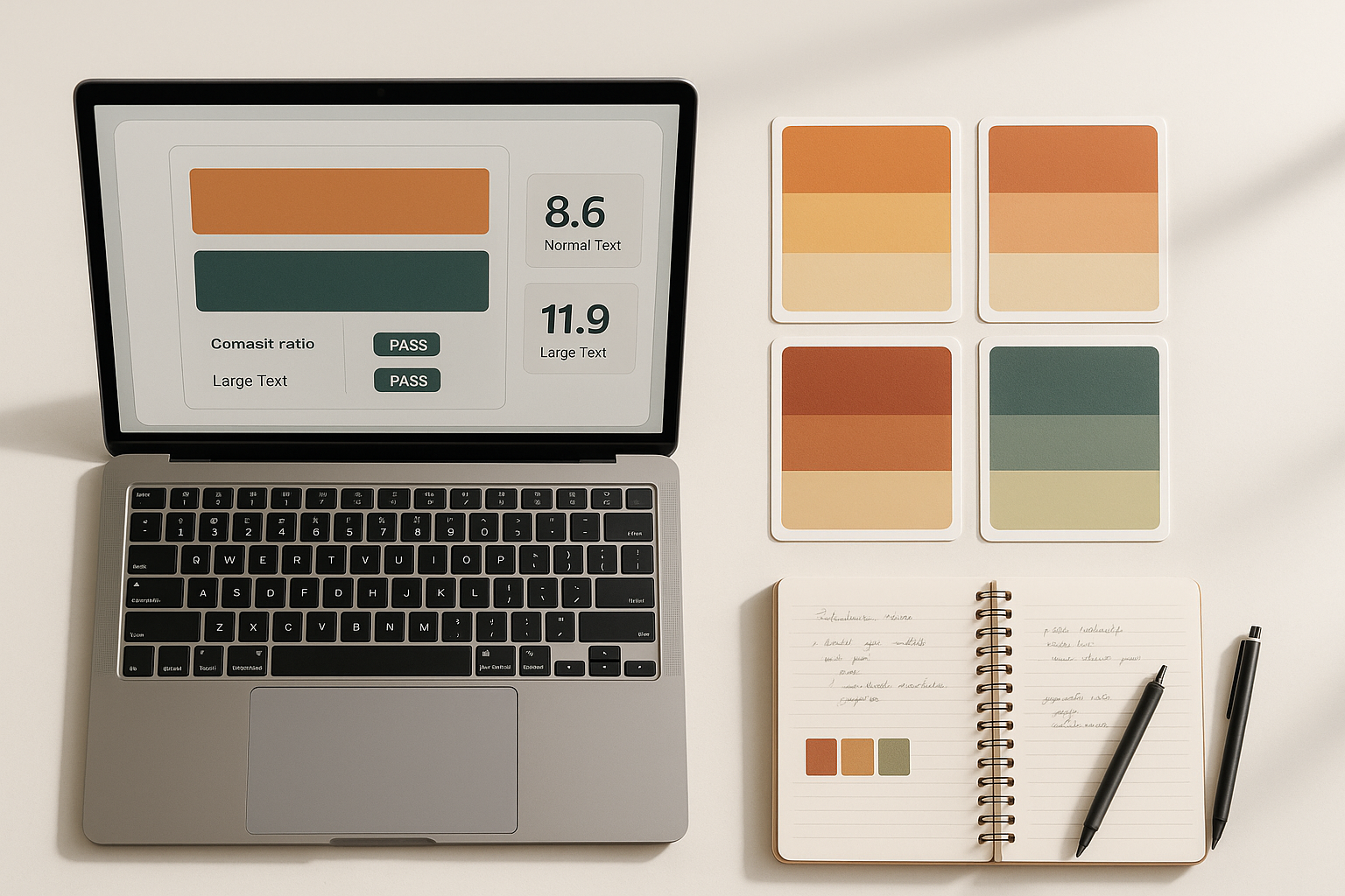
Here's the core tension: many authentic retro palette qualities directly conflict with WCAG 2.2 accessibility standards and the APCA guidelines increasingly adopted in 2025-2026. Low contrast (70s), extreme saturation (80s), muddy mid-tones (90s grunge). All problems.
Decade-specific fixes:
- 70s: Cream-on-cream combinations fail text contrast. Fix: deepen your "dark" swatch by 30% value while keeping its warm hue intact. Your umber should be dark umber for body copy.
- 80s: Neon-on-neon combinations cause halation and fail contrast. Fix: always pair bright swatches against near-black, never against each other or white.
- 90s grunge: Muddy mid-tones create ambiguous contrast zones. Fix: treat all mid-tone text as decorative only. Reserve your darkest swatch for any real body copy.
When a retro palette genuinely cannot meet contrast requirements for functional text, use it decoratively. Backgrounds, illustrations, borders, accents. Maintain a separate accessible typographic system in neutral tones. This is not a compromise. It's how most successful retro branding actually works. Ghia does this. Spotify's throwback campaigns do this. The retro palette carries the mood. The readable text carries the information.
Tools for 2026: Colour Contrast Analyser supports both WCAG and APCA. Adobe's built-in accessibility checker catches contrast issues early. Figma plugins like Contrast and Stark let you test entire frames. Build your retro palette with a built-in "safe zone," a subset of swatches explicitly cleared for text use, and document it in your design system.
Colors Remember What We Forget
Colors don't have birth certificates. But they carry decade DNA because they're memories of technologies, not just hues. When you understand that, the whole project of retro palette design shifts. You stop copying colors and start simulating artifacts.
The designers who execute this trend with nuance work through the framework: Identify the Artifact, Extract the Essence, Adapt for Modern Context, Anchor with Contemporary Design Language. They don't grab a palette from a Pinterest mood board and call it done.
Here's a forward-looking thought: as AI-generated imagery and synthetic media become the dominant visual formats of the late 2020s, the "technological artifact" signatures of our era are already forming. The slight uncanny valley of early AI imagery. The compression artifacts of social video. The flat-lit uniformity of phone cameras. What will 2040s designers reach for when they want to evoke this decade?
Pick one decade. Run a project palette through the full framework. Share the results. This isn't a one-time trick. It's an ongoing practice of visual archaeology, and the more you train your eye to see the technology behind the color, the sharper your retro work becomes.