How the Red Sole Became Worth $700: The Color Trademark Wars Reshaping Brand Identity
by ColorSift Editorial Team
A woman flips a pair of Christian Louboutin pumps upside down, and there it is: a flash of lacquered red that instantly signals $700 worth of luxury. That red isn't just paint. It's legally protected intellectual property, upheld by courts on two continents. This single shade (Pantone 18-1663 TPX) has been at the center of landmark lawsuits, international trade disputes, and a fundamental question reshaping branding in 2026: Can anyone truly own a color?
From Tiffany's robin-egg blue to T-Mobile's magenta cease-and-desist campaigns against insurance startups, color trademarks have become one of the most valuable and contentious assets in the modern economy. For designers, the stakes are personal. The palette you choose for a client's brand could land you in a courtroom. This is the story of how a few ounces of pigment became worth billions.
A Brief History of Owning the Invisible
Color seems like it should belong to everyone. It's a property of light, a feature of the natural world. So how did we arrive at a legal system where a corporation can claim exclusive rights to a shade?
The foundation sits in the Lanham Act of 1946, which established the modern U.S. trademark framework. Originally, trademarks meant words, logos, and symbols. But the law's language was broad enough to evolve. Over the decades, courts expanded protection to non-traditional marks: sounds (think NBC's chimes), shapes (the Coca-Cola bottle), and eventually colors.
The watershed moment came in 1995 with Qualitex Co. v. Jacobson Products Co. The case involved, of all things, a greenish-gold dry cleaning press pad. The U.S. Supreme Court ruled unanimously that a single color could function as a trademark, provided it had acquired what the law calls "secondary meaning." In plain language, secondary meaning works like this: a color starts as merely decorative. Lots of companies could use greenish-gold on a press pad. But when one company uses that color consistently, exclusively, and backs it with sustained marketing, the color crosses a threshold. Consumers stop seeing "greenish-gold" and start seeing "that's a Qualitex product." The color becomes the brand in the consumer's mind.
There's a critical limitation, though. The "functionality doctrine" prevents anyone from trademarking a color that serves a practical purpose. You can't trademark green for lawn care equipment, because green is functional in that context (it signals nature, blends with grass, and conveys the category itself). The color must be arbitrary relative to the product.
After Qualitex, the floodgates opened:
- Owens Corning had actually registered pink for fiberglass insulation back in 1985, pre-dating the Supreme Court ruling.
- UPS formalized its claim to "Pullman Brown" in the 1990s.
- Tiffany & Co. registered its custom blue (No. 1837, a nod to the founding year).
- John Deere locked down its signature green-and-yellow combination.
Each registration represented the same principle: decades of use, billions in marketing, and a consumer base that instinctively linked the color to the company.
The Red Sole Wars: The Case That Changed Everything
Christian Louboutin's origin story has become fashion legend. In 1993, he was examining a prototype shoe in his Paris studio. Something was missing. He noticed an assistant painting her nails with red polish, grabbed the bottle, and brushed it across the sole. The red sole was born.
Through the 2000s, that red sole became one of the most recognizable status symbols in fashion. Celebrities wore them on red carpets. The sole appeared in rap lyrics, TV shows, and countless Instagram posts. Louboutin registered the red sole as a trademark with the U.S. Patent and Trademark Office.
Then, in 2011, Yves Saint Laurent released an all-red shoe. Red upper, red sole. Louboutin sued.

The initial district court ruling sent shockwaves through the fashion industry. Judge Victor Marrero suggested that single colors simply couldn't be trademarked in the fashion world, where color is an essential element of creative expression. His reasoning threatened to invalidate Louboutin's trademark entirely.
The 2012 appeal reversed course. The Second Circuit Court upheld Louboutin's trademark but carved out a crucial limitation: the red sole is only protected when it contrasts with the upper portion of the shoe. An all-red shoe? Fair game. This "contrast doctrine" became a defining precedent, one that fashion lawyers still reference daily.
The battle didn't stop in America. Louboutin fought a parallel war in Europe. In 2018, the Court of Justice of the European Union ruled that the red sole could qualify as a valid trademark because it wasn't the "shape" of the product. It was a color applied to a specific position. This distinction mattered enormously under EU law, which generally prohibits trademarking shapes.
Why does a shoe case matter to anyone outside fashion? Because it established that color trademarks in fashion are viable but deeply context-dependent. It opened the door for a wave of filings across luxury goods, sportswear, and accessories. If a red sole could be protected, what about a signature lining color, a distinctive zipper shade, or a branded stitching hue?
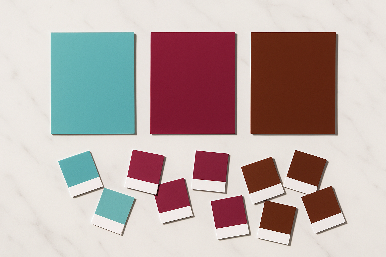
The Corporate Rainbow: Empires Built on a Single Shade
Louboutin isn't alone. Several global brands have staked their identities on color with remarkable success.
Tiffany Blue (Pantone 1837) dates back to 1837, when Charles Lewis Tiffany selected the shade for the cover of the company's annual catalogue. The little blue box became synonymous with engagement, luxury, and aspiration. Now owned by LVMH, Tiffany aggressively protects its color. Wedding planners and cake designers who use the shade to imply affiliation with the brand have received legal notices. The protection extends beyond jewelry into adjacent luxury markets.
UPS Pullman Brown is a fascinating case of turning a liability into an asset. Brown wasn't exactly a glamorous choice for a delivery company. But UPS leaned into it, built an entire campaign around the question "What can Brown do for you?" and transformed the shade into a trademark so strong that competitors in logistics effectively cannot use brown on delivery vehicles or uniforms.
T-Mobile Magenta may be the most aggressively defended color mark of the 2020s. T-Mobile has sent cease-and-desist letters to Lemonade Insurance, Aio Wireless, and multiple small businesses for using magenta in telecommunications or adjacent industries. The chilling effect on startups is real. Founders have reported abandoning brand colors after receiving letters from T-Mobile's legal team, even when the shade in question was arguably distinct.
The pattern across all these brands is consistent. They didn't just pick a color. They invested decades and billions of dollars building the consumer association, which is precisely what trademark law demands for protection. The color alone isn't enough. The meaning behind it is everything.
The New Frontier: Color Wars in Tech and Digital Spaces
Physical products are one thing. But what happens when the battlefield moves to pixels?
As digital-first brands have multiplied, fights over UI accent colors, app icon shades, and brand gradients have intensified. Spotify's specific green, Slack's aubergine, and Netflix's red have all become de facto brand identifiers, though not all are formally trademarked. The question is: when does a familiar app icon color cross the line into protectable territory?
One of the most-watched disputes in 2025 and into 2026 involves Meta's enforcement around its blue branding. As competitors in social media and AI adopt similar blue palettes, Meta faces a difficult question: can you enforce a color trademark when the shade is nearly universal in your category? Blue dominates tech because it signals trust and accessibility. That very ubiquity could undermine any single company's claim.
Meanwhile, the AI and fintech startup space has seen a surge of cease-and-desist activity around specific purples and teals. Dozens of companies have converged on similar palettes because those colors signal "innovation" and "trustworthiness" to consumers. When everyone reaches for the same shade, the friction is inevitable.
Digital color raises a novel legal wrinkle, too. Unlike physical products, digital colors render differently across screens. A trademarked Pantone shade in print has a fixed, verifiable reference point. But in an RGB/HEX world, the same hex code can appear noticeably different on an iPhone, a Dell monitor, and a Samsung tablet. Courts are still working out how to handle this inconsistency.
The regulatory landscape is shifting as well. The EUIPO updated its guidelines on non-traditional trademarks in 2025, attempting to harmonize EU and U.S. approaches. But friction remains, particularly around how precisely a color must be defined in a trademark application and whether digital-only uses merit the same protection as physical ones.
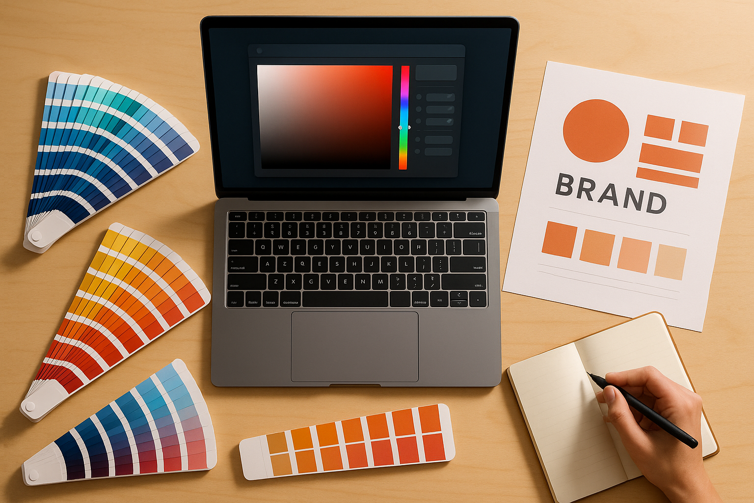
What Designers Need to Know: Navigating the Legal Minefield
If you're a designer or brand strategist, here's the practical reality: color trademarks are narrow but potent. They generally apply within a specific industry or product category. Tiffany can't stop every use of robin-egg blue on the planet. But it can stop uses in jewelry, luxury goods, and closely adjacent markets.
The highest-risk industries for color enforcement include:
- Luxury fashion (post-Louboutin, every major house is watching)
- Telecommunications (T-Mobile's magenta campaign set the tone)
- Logistics and delivery (UPS brown is effectively off-limits)
- Financial services (several banks hold color marks)
- SaaS and tech (a growing and volatile area)
For due diligence, start with the USPTO's TESS database and the EUIPO's TMview tool. Search by Pantone reference, description, and industry classification. Third-party monitoring services like Corsearch and CompuMark can flag potential conflicts early. Always specify the exact Pantone (or equivalent) reference in your brand guidelines. Vague color descriptions won't protect you, and they won't help you avoid someone else's mark either.
What actually happens if your client receives a color-related cease-and-desist letter? Most disputes resolve through rebranding or negotiation, not courtroom battles. But the cost of a forced rebrand, especially for a startup that has already printed packaging, launched a website, and built brand recognition, can be devastating. Prevention is far cheaper than remediation.
The strategic takeaway: push clients toward distinctive, ownable colors rather than defaulting to "safe" industry-standard palettes. And bring up the trademark conversation early in the branding process, not after the business cards are printed.
The Philosophy of Color Ownership: Where Law, Culture, and Creativity Collide
Step back from the legal briefs for a moment and consider the deeper tension. Color is a finite resource in the visual spectrum. Unlike a word mark (you can always invent a new word), there are only so many distinguishable shades. As more are claimed by corporations, the available palette for new brands genuinely shrinks. Legal scholars call this "color depletion," and it's a real concern.
The counterargument is strong, though. Trademark offices and courts have built in safeguards. Protection is narrow (specific industry, specific context), and the bar for proving secondary meaning is extremely high. In practice, only a handful of colors have achieved true trademark status. The vast majority of the spectrum remains available to everyone.
But the cultural question lingers. When Louboutin's red sole or Tiffany's blue box transcend commerce and enter cultural iconography, the line between brand asset and shared cultural symbol blurs. Who "owns" a red sole that appears in a painting, a fashion editorial, or a meme? The legal answer (trademark holders do, within limits) doesn't always satisfy the cultural one.
Designers sit at the center of this tension. As creators working at the intersection of aesthetics and commerce, you feel both the value and the constraint of color ownership. The best brand identities don't just pick a color. They build meaning around it. Louboutin didn't trademark "red." He trademarked a red sole on a contrasting shoe, backed by decades of cultural investment. That specificity is the lesson.
Choose Wisely
Return, for a moment, to the image of the red sole. Christian Louboutin's flash of lacquer wasn't just a design choice. It was the planting of a flag on a piece of the visible spectrum. In 2026, that flag is worth more than ever.
As color trademarks multiply and enforcement intensifies across industries from luxury goods to AI startups, the lesson for designers and brand builders is clear: color isn't just aesthetic. It's legal territory, economic asset, and cultural signal all at once. The brands that understand this, that invest not just in choosing a color but in owning the meaning behind it, will be the ones whose identities endure.
The rest may find themselves on the wrong end of a cease-and-desist letter, forced to repaint their entire brand.
Choose wisely. And maybe check the trademark database before you fall in love with that perfect shade of magenta.