Earthy Minimalism Is Over: The Neo-Chromatic Palette Takeover in SaaS Design
by ColorSift Editorial Team
Open your browser and pull up the landing pages of the hottest developer tools from 2021. Notion, Linear, Superhuman. You'll remember a sea of off-whites, warm grays, and desaturated sage greens. Now visit those same products today. Linear's homepage pulses with electric violet-to-cyan gradients. Raycast bathes its UI in hot pink and deep indigo. Arc Browser launches you into a world of tangerine, cobalt, and magenta.
Something fundamental has shifted.
After nearly five years of what critics have called "blanding," the mass convergence of B2B SaaS brands toward identical muted, earthy, "safe" palettes, a counter-movement is here. It's impossible to ignore. We're calling it the Neo-Chromatic Palette Takeover: a deliberate, industry-wide embrace of high-saturation gradients, unexpected chromatic pairings, and unapologetic vibrancy in interfaces that were once allergic to color.
This article examines why the shift is happening now, breaks down how the leading SaaS products are pulling it off, and provides five original neo-chromatic palettes you can use in your own dashboards and marketing pages, without sacrificing readability or accessibility.
The Earthy Minimalism Era: How We Got Here (2020–2024)
To understand where we're going, you need to understand where we've been. The muted palette trend didn't appear out of nowhere. It was a direct reaction to the hyper-bright Material Design era, filtered through the emotional reality of 2020.
COVID changed the way people thought about digital spaces. Suddenly, your screen was your entire world: your office, your social life, your grocery store. Brands like Notion, Figma (pre-rebrand), and early Webflow leaned into warm neutrals and desaturated earth tones because they signaled calm, groundedness, and "digital wellness." The logic was sound. If your users are staring at your product for twelve hours a day, the last thing you want is to assault their retinas.
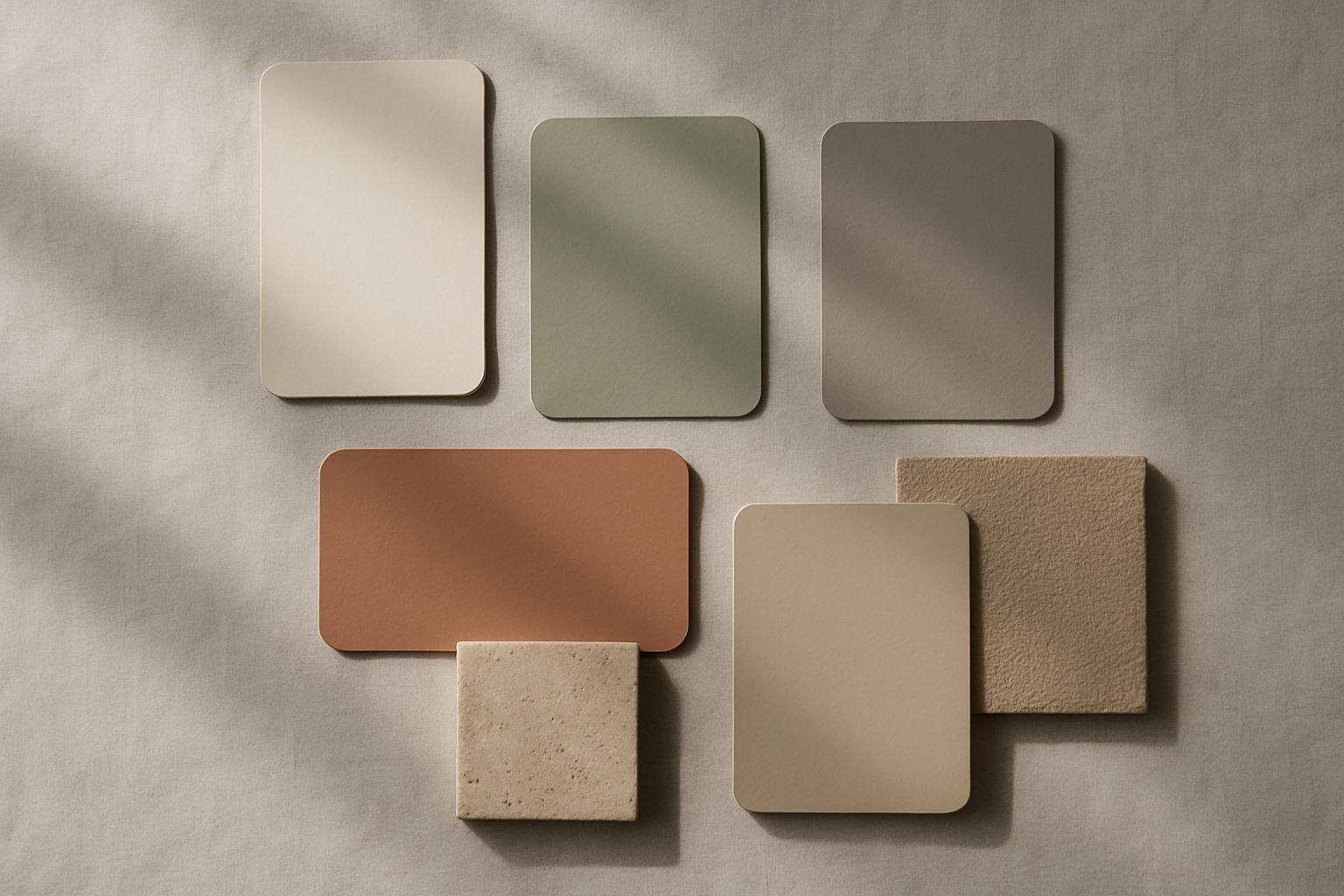
The palette anatomy of this era was remarkably consistent across hundreds of products:
These colors signaled "trustworthy" and "premium." And for a while, they worked. The problem was scale. When every SaaS brand adopted the same sans-serif font, the same soft beige/sage/terracotta palette, and the same abstract blob illustrations, individual brand identity evaporated. Design critics gave it a name: blanding.
By late 2023, the tipping point arrived. Design Twitter and Dribbble were flooded with nearly identical SaaS landing pages. Industry voices like Tobias van Schneider and the team at Untitled UI began openly questioning whether the trend had run its course. The answer, as it turned out, was a resounding yes.
What Is Neo-Chromatic Design? Defining the New Aesthetic
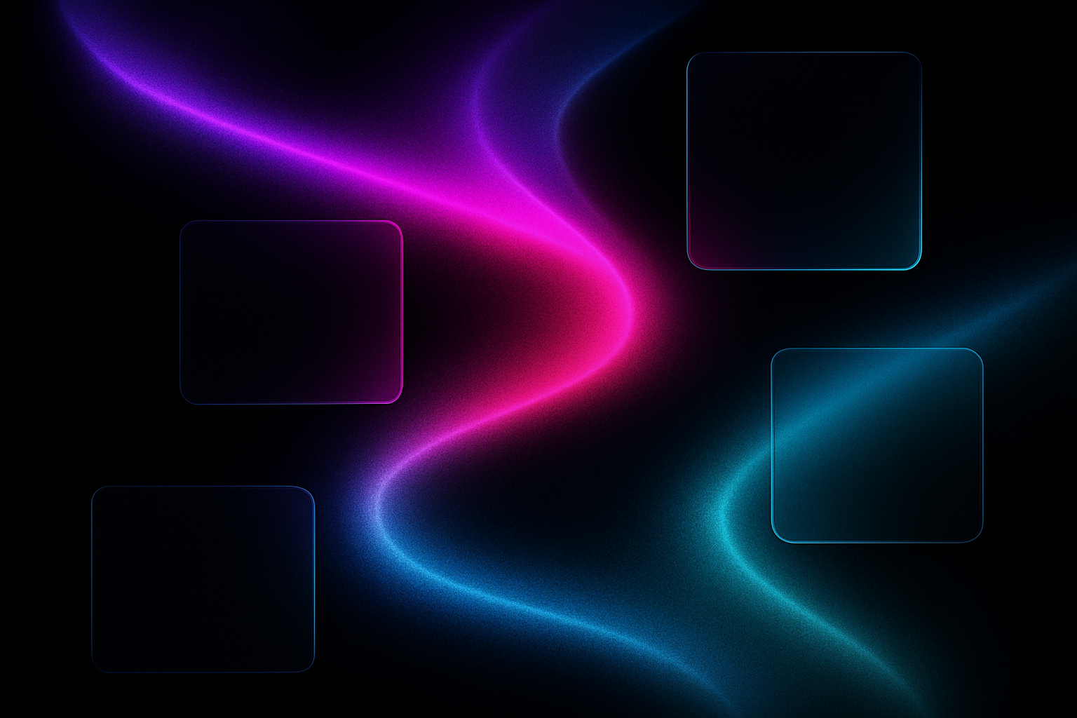
Neo-chromatic design is the deliberate use of high-saturation, multi-hue gradients, unexpected color pairings (think electric violet + acid green, or hot coral + deep navy), and luminous accent colors in interfaces previously dominated by neutral palettes.
But here's the important distinction: this isn't Material Design's flat primaries from 2014, and it's not the Instagram-gradient wave of 2016. Neo-chromatic palettes are more sophisticated. They combine warm and cool hues in a single gradient. They use dark, near-black backgrounds as a stage for color. They lean on mesh gradients and glassmorphism effects to create depth without clutter.
So what's driving the shift?
Gen Z is now the workforce. The generation that grew up on TikTok, neon aesthetics, and Y2K revivals is now making purchasing decisions for developer tools and SaaS platforms. Their tolerance for beige is, to put it mildly, low.
Creative fatigue is real. Designers who spent four years building the same warm-neutral landing page are itching for something different. The "dopamine dressing" movement in fashion, where people started wearing bold, saturated colors as a post-pandemic mood booster, has a direct parallel in digital design.
Competition demands differentiation. When your product page looks like every other product page, you've lost before the user even scrolls.
Here's what makes neo-chromatic truly interesting, though: it's not anti-minimalism. It's chromatic minimalism. The layouts remain clean and spacious. The typography stays sharp and restrained. It's the color system that has been liberated. Structure stays disciplined. Color goes wild.
Case Studies: Four SaaS Products Leading the Shift
Linear: The Poster Child
Linear's homepage is probably the single most referenced example of neo-chromatic SaaS design. The hero section uses a violet-to-teal gradient (approximately #8B5CF6 to #06B6D4) over a deep, nearly black background. What makes it work is how Linear maintains hierarchy through luminance contrast rather than hue contrast. The brightest point in the gradient draws your eye to the headline. Secondary elements sit at lower luminance levels. The color is loud, but the information architecture is crystal clear.
Raycast: Neon on Dark
Raycast, the launcher app beloved by developers, built its entire brand identity around hot pink (#FF6363), deep purple (#7B61FF), and electric blue. Their marketing pages use these saturated colors as focal points against near-black UI chrome. The effect is "neon on dark," and it feels premium rather than garish. The secret? Restraint. Raycast doesn't splash color everywhere. It uses it at specific moments: a button, a hover state, a section divider. The dark canvas does the heavy lifting.
Arc Browser: Color as UX
The Browser Company took a different approach with Arc. Their per-profile color theming makes color a functional layer, not just decoration. Each Space gets its own hue. Each profile has its own identity. On the marketing side, Arc's palette of tangerine, cobalt, and fuchsia is playful and confident. But the real innovation is using neo-chromatic color as a UX mechanism. You don't just see the colors. You use them to navigate.
Clerk: From Boring to Bold
Clerk is an authentication platform. On paper, it's infrastructure, the kind of product that historically wrapped itself in safe blues and corporate grays. Their rebrand flipped that assumption. Bold violet-magenta gradients with lime accents replaced the old palette. The message was clear: "We're not boring, and neither is your auth layer." For a developer-focused tool, this kind of visual confidence signals innovation and energy.
The common thread across all four: dark mode as the default canvas, gradients over flat color, and intentional restraint. Bold color used surgically, not everywhere.
The Psychology and Strategy Behind the Shift
This isn't just about aesthetics. There's hard strategy behind the neo-chromatic movement.
Differentiation is survival. When 200 SaaS landing pages look identical, the one with an electric violet hero gradient captures attention and scroll depth. A/B testing principles consistently show that visual distinctiveness correlates with higher engagement. If your competitor's page is warm beige and yours is a deep navy canvas with a cyan-to-magenta gradient, guess which one the user remembers?
Dark mode created the perfect canvas. The near-universal adoption of dark mode in developer and productivity tools gave designers something they didn't have before: a black stage that makes saturated colors pop without overwhelming the eye. This solved the readability problem that previously held bold palettes back. On a white background, a hot pink button screams. On a dark background, it glows.
Emotional branding has reached B2B. The old assumption was that "serious software = serious (muted) colors." Neo-chromatic brands are proving that vibrancy signals confidence, modernity, and energy, qualities that resonate with a younger generation of B2B buyers and developers who grew up selecting apps partly based on how good they look.
The Figma rebrand was the inflection point. When the most influential design tool in the world shifted from muted pastels to a saturated, high-energy palette in 2024, it gave implicit permission for the entire SaaS design ecosystem to follow. If Figma says bold color is okay, it's okay. That single rebrand accelerated the trend by at least a year.
5 Neo-Chromatic Palettes for SaaS Dashboards and Marketing Pages
Enough theory. Here are five original palettes, each designed with a specific SaaS context in mind. Every palette includes a dark background base, gradient accent colors, a text hierarchy system, and semantic colors for success/error states.
Palette 1: Midnight Aurora
Best for developer tool dashboards. The deep navy base provides a quiet stage for the violet-to-cyan gradient, which works beautifully on chart accents, active states, and navigation highlights. The lime success color offers clear semantic distinction without clashing.
Palette 2: Solar Flare
Best for marketing and landing page heroes. The warm-black base keeps the energy grounded, while the coral-to-amber gradient brings heat and movement to hero sections. The teal accent provides a cool counterpoint for CTAs and interactive elements.
Palette 3: Electric Garden
Best for onboarding and activation flows. The dark forest base feels organic, while the magenta-to-lime gradient creates an energetic, almost bioluminescent quality that's perfect for progress indicators and celebration states.
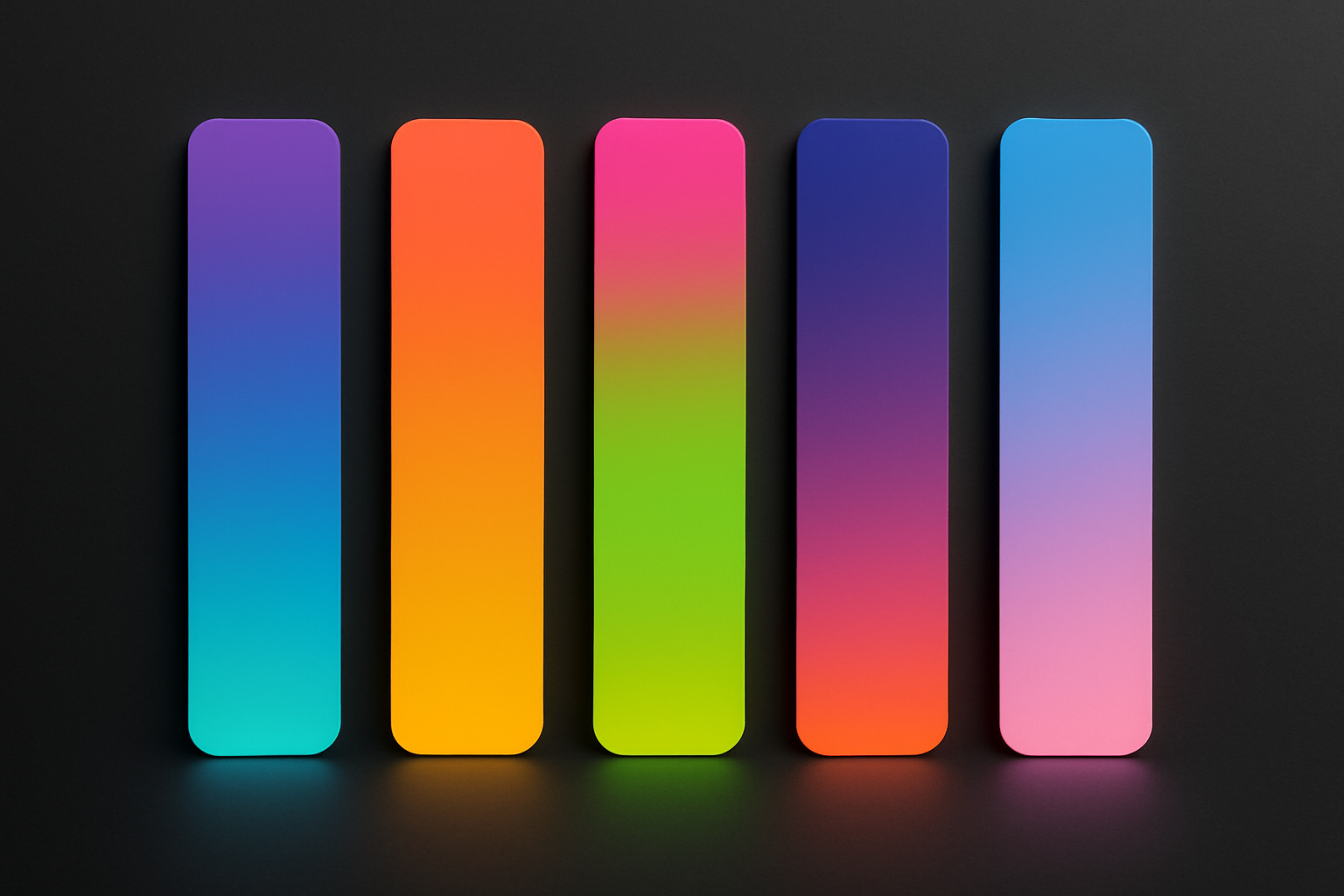
Palette 4: Deep Spectrum
Best for data visualization and analytics dashboards. The multi-stop gradient from indigo through pink to orange provides a rich range of distinguishable hues for chart series. The cool gray text keeps dense data readable against the charcoal base.
Palette 5: Neon Frost
Best for pricing pages and comparison tables. The blue-to-pink gradient draws attention to featured tiers, while the frosted glass surfaces (rgba(255, 255, 255, 0.06)) create layered card effects that feel modern and premium against the cool dark base.
Maintaining Readability and Accessibility in a Bold Palette
Here's the uncomfortable truth: the number one risk of neo-chromatic design is sacrificing WCAG contrast ratios for aesthetic impact. A gorgeous gradient means nothing if your users can't read the text on top of it.
The practical framework is simple. Use high-saturation colors for non-text elements: backgrounds, borders, decorative gradients, iconography. Maintain a 4.5:1 minimum contrast ratio for all body text. For large headings (18px+ bold), you can work with 3:1. No exceptions.
Follow the "gradient as texture, not text background" rule. Never place body copy directly on a gradient. Use gradients for hero sections, card accents, and decorative elements. Then anchor your text on solid dark or light surfaces adjacent to the gradient. This single rule will prevent 90% of readability problems.
Recommended tools for validation:
Build a desaturation fallback. For each neo-chromatic palette, design a "reduced motion / high contrast" mode that maps vibrant accents to their desaturated equivalents. This ensures the design degrades gracefully for users who need it. Your color system should have a 1:1 mapping between the vibrant version and the accessible version.
Test in context, not in isolation. A palette swatch on Dribbble looks nothing like a full dashboard mockup with real data, varying screen sizes, and twelve hours of continuous use. Always validate neo-chromatic palettes inside realistic UI frames. Check for eye strain. Check on low-quality monitors. Check in bright sunlight on a laptop screen. The palette that survives all of those tests is the one worth shipping.
Go Chromatic
The earthy minimalism era served its purpose. It brought calm and consistency to a SaaS landscape that desperately needed it. But design trends are cyclical, and the pendulum has swung.
The Neo-Chromatic Palette Takeover isn't a return to the chaotic color of the early web. It's a more mature, intentional embrace of vibrancy that leverages dark mode canvases, sophisticated gradient techniques, and a deep understanding of contrast and hierarchy. Products like Linear, Raycast, Arc, and Clerk aren't just following a trend. They're proving that bold color is a strategic advantage in a market drowning in sameness.
The five palettes in this article are your starting point, not your ceiling. Take them, remix them, and push your SaaS product's visual identity beyond the beige. The brands that win the next era of SaaS design won't be the ones playing it safe with warm gray. They'll be the ones who had the confidence to go chromatic.