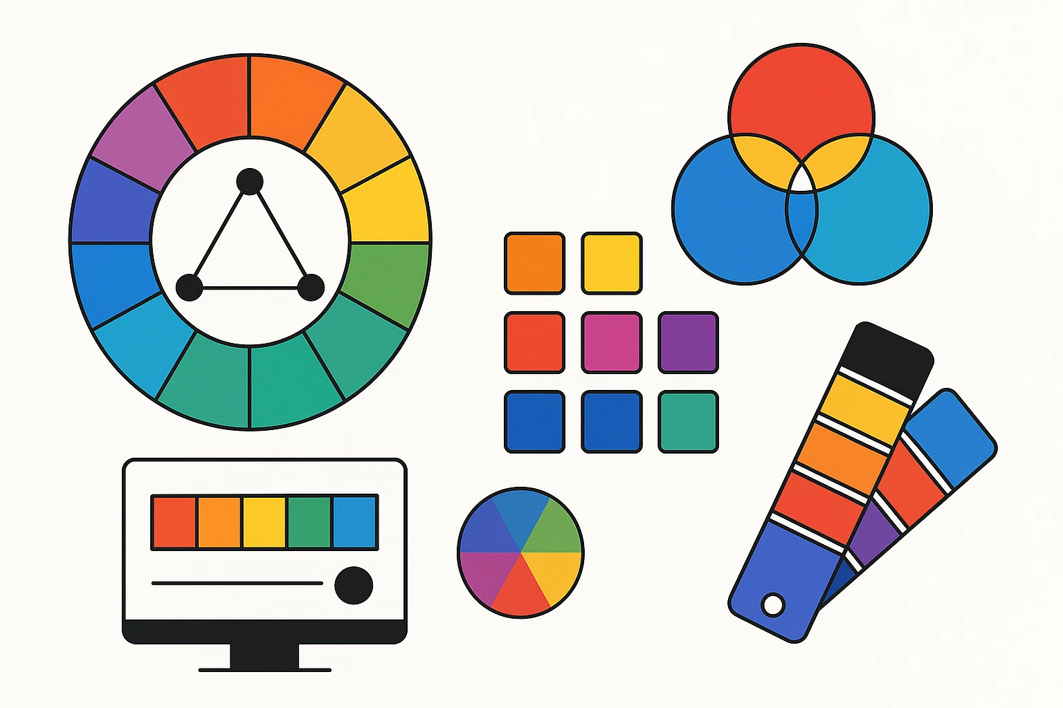
Navigating the World of Color Harmony: Tips for Designers
by ColorSift Editorial Team
Color harmony is a game-changer for designers. It’s the secret sauce that pulls everything together, turning a good design into an eye-catching masterpiece. But what is color harmony? How does it play into our psychological perceptions, and why is it so crucial for visual appeal? It’s time to untangle these colorful threads.
Understanding Color Harmony
Color harmony isn’t just about throwing colors together and hoping they look good. It’s a careful balance that captures attention and conveys emotion. Think of it as the rhythm in a piece of music — without it, things might sound off-key.
Colors can evoke emotions. Red can incite passion or urgency, while blue tends to calm us down. This interplay between color and emotion makes harmony push the right buttons.
Exploring Color Schemes
Monochromatic Schemes: Simplistic Elegance
Monochromatic schemes are like your favorite minimalist playlist. They use variations of a single hue — perfect for a sophisticated look. Pros? They’re easy on the eyes. Cons? They can get a bit too safe.
Complementary Schemes: Opposites Attract
Here’s where the color wheel becomes your best friend. Complementary schemes are about color opposites. They pop, creating dynamic and vibrant designs. But be cautious; too much contrast can be overwhelming.
Analogous Schemes: Natural Unity
Analogy is the name of the game. These schemes use neighboring colors for a serene look. Picture a sunset’s smooth transition from orange to purple. Beautiful, right?
Triadic Schemes: The Art of Balance
Triadic palettes are all about balance. They use three evenly spaced colors, offering a vivid contrast while preserving harmony. Picture a bold, colorful statement that still feels right.
Tetradic Schemes: Versatility Unleashed
If options are your thing, look at tetradic schemes. They play with two complementary pairs, providing versatility. But remember, they require careful handling to avoid chromatic chaos.
Practical Tips for Achieving Color Harmony
Use the Color Wheel Like a Pro
The color wheel is more than just a decorator’s tool. It’s essential gear for any designer. Let it guide your creative path.
Experiment with Different Palettes
Feel like Picasso for a day! Play around, mix things up, and see what works. Sometimes the best ideas come from happy accidents.
Utilize Online Tools
Tools like Adobe Color and Coolors make experimenting easy. Add them to your digital toolbox!
Seek Inspiration from Nature and Art
Nature’s palettes work wonders. Ever notice how a forest blends greens, browns, and blues effortlessly? Artists like Van Gogh and Monet have done the same with paint. Learn from the masters.
Case Studies: Successful Use of Color Harmony
Look at the bold colors in Coca-Cola’s branding or the calm depth of Samsung’s designs. Successful brands know their colors. By examining these famous designs, we see why color harmony is crucial.
Designers like Saul Bass and Paula Scher provide lessons in the use of color and balance—true inspiration.
Common Mistakes to Avoid
- Overly Saturated Colors: Eye-catching doesn’t have to mean overwhelming.
- Ignoring Color Contrast: Balance is essential.
- Neglecting Your Audience’s Perception: Know what story your colors tell.
- Failing to Test Combinations: Always give them a trial run.
Showcasing Color Schemes and Palettes
Let’s dive into some color schemes and showcase their applications. It’s time to get inspired.
Using tools and resources like those mentioned above, you can create and share your palettes, bringing more creativity into the community.
Mastering color harmony transforms your designs. When you understand how to use color schemes, you aren’t just throwing colors together. You're crafting a symphony of hues — a visual melody that speaks to your audience. Dive in, experiment, and see what wonders you can create.