Dopamine Palettes Are Fading: The Muted, Desaturated Color Shift Taking Over App Design in 2026
by ColorSift Editorial Team
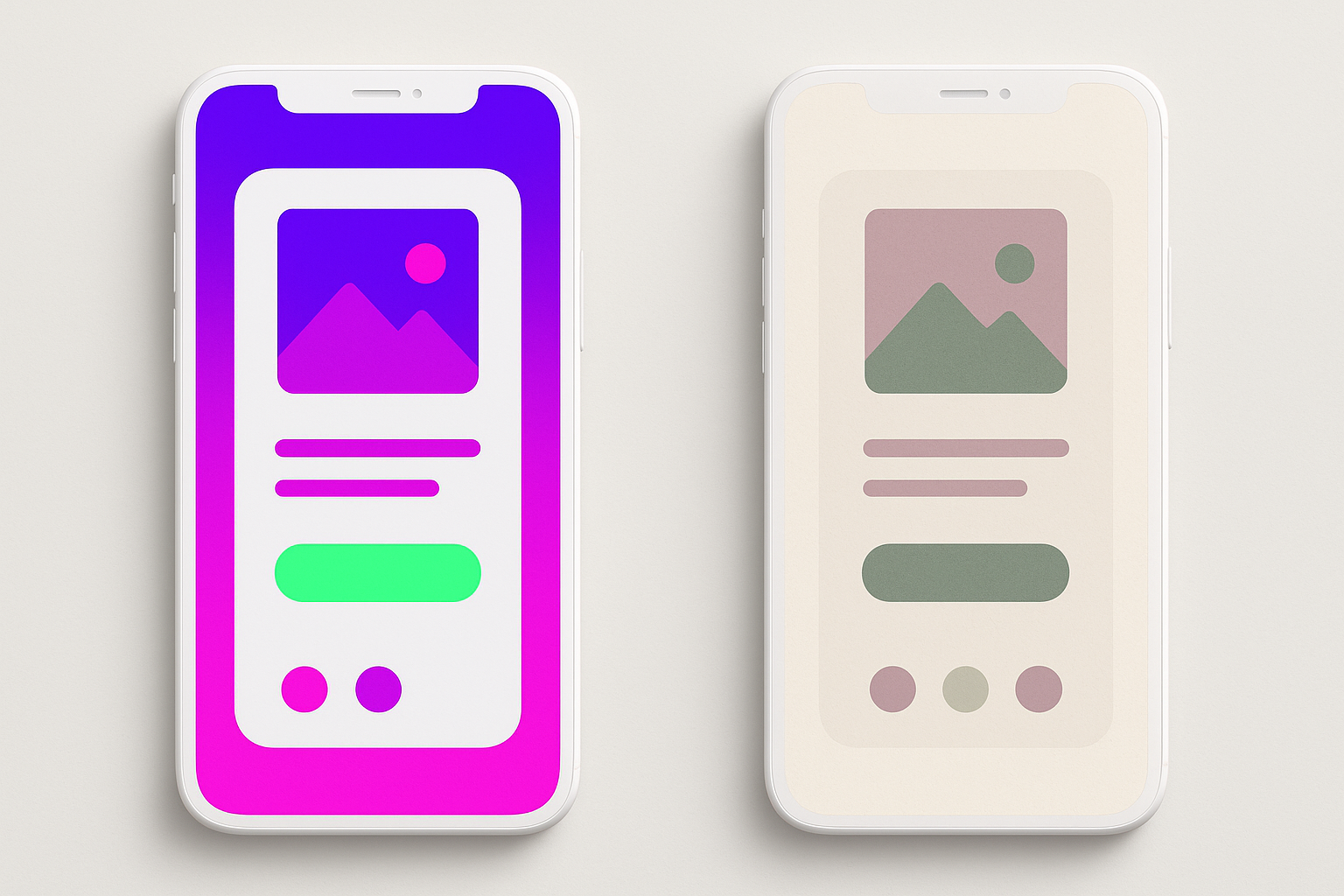
Open any app you downloaded in 2023 and compare it to the version on your phone right now. Notice something? The electric purples have softened to lavender chalk. The neon greens have cooled into sage. The hot pinks? Gone, replaced by dusty rose and clay.
After three years of hyper-saturated "dopamine color" dominating everything from fintech dashboards to DTC candy packaging, the pendulum is swinging hard in the opposite direction. In Q1 2026 alone, at least a dozen major apps and brands shipped redesigns built on deliberately muted, desaturated, almost analog-feeling palettes. This isn't a subtle drift. It's a full aesthetic correction, and it's happening faster than most designers realize.
This piece catalogs the shift, unpacks why it's happening now, profiles the brands leading the charge, and gives you three trend-forward muted palettes you can adapt for your own projects today.
The Dopamine Color Era: A Brief, Blinding Retrospective (2023–2025)
Let's rewind. "Dopamine color" refers to the hyper-saturated, high-contrast, almost fluorescent palettes that became ubiquitous across app design, brand identity, and social media starting around 2022. The trend was fueled by post-pandemic exuberance and TikTok's visual culture, where the loudest thumbnail won the scroll.
At its peak, the exemplars were everywhere. Spotify Wrapped escalated its palette each December, pushing further into neon territory every year. Figma's brand evolution leaned into vivid, layered gradients. A wave of fintech apps, from Revolut to Cash App, embraced electric gradient backgrounds that practically vibrated on screen. DTC brands like Liquid Death and Starface adopted maximum-saturation packaging as a core identity pillar.
The cultural logic was self-reinforcing. Dopamine dressing in fashion crossed over into UI. Attention-economy pressures rewarded the loudest visual signals. Gen Z's embrace of maximalism created a feedback loop: bright got brighter, saturated got more saturated, and contrast ratios climbed until interfaces looked like rave posters.
The signal that the trend had peaked arrived in late 2025, when dopamine palettes trickled into enterprise SaaS, healthcare apps, and even government digital services. When your state's DMV portal starts using electric gradients, you know a trend has reached terminal saturation. That's the unmistakable sign of exhaustion.
The 2026 Correction: What Muted Actually Looks Like
So what exactly replaced all that neon energy? The new aesthetic is specific, and it's worth defining precisely.
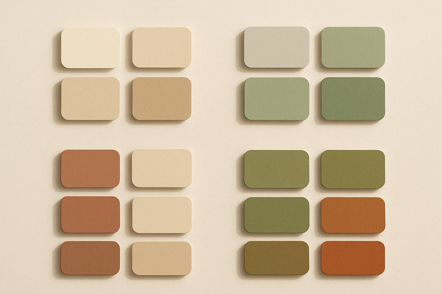
We're seeing chalky pastels, desaturated earth tones, and reduced contrast ratios between primary and accent colors. Grain and texture overlays evoke analog media. Off-whites and warm grays have replaced pure white backgrounds. The overall effect feels like looking at a screen through a sheet of tracing paper, or like someone turned the saturation slider down 40% and added a warm photo filter.
The shift is measurable at the pixel level. Where a 2024 app might use #7B2FFF (a saturated violet with an HSL saturation near 100%), the 2026 equivalent sits closer to #9B8EC4, a dusty mauve with saturation dropped below 30%. Backgrounds that were once #FFFFFF are now #F5F0E8 or #EAEDF0. The entire tonal range has compressed and warmed.
The color shift isn't arriving alone. Muted palettes are appearing alongside serif type revivals, increased whitespace, and editorial-style grids. The color change is one layer of a broader "quiet design" movement that treats restraint as a form of sophistication.
Cultural Drivers: Why Now?
Aesthetic trends don't emerge from nowhere. Several converging forces are pushing the palette toward muted.
Screen fatigue and the demand for "soft UI." Average daily screen time plateaued in 2025, and UX research increasingly links high-saturation interfaces with user fatigue and reduced session quality. A 2025 study from the Nielsen Norman Group noted that users rated lower-contrast, warmer interfaces as "more trustworthy" and "less exhausting." Designers are responding with palettes that feel less visually aggressive.
The anti-digital aesthetic. Brands are signaling authenticity and calm by borrowing visual codes from offline media. Think newsprint, linen, uncoated paper stock textures. This is "digital detox" branding: the interface tells you, through its color and texture, that it's not trying to hijack your attention.
The film photography revival. The explosion of analog cameras among Gen Z, Fujifilm reported record Instax sales in 2025, has reintroduced desaturated, warm-shifted color grading into the mainstream visual vocabulary. Apps like Dispo and editing presets mimicking Kodak Portra 400 film stock have primed audiences for muted palettes. When your Instagram feed is already filtered to look like a 1998 disposable camera, your apps start to feel garish by comparison.
Broader cultural mood. In a year of economic uncertainty and geopolitical tension, the emotional register of color is shifting from "stimulation" to "comfort." This mirrors fashion's simultaneous pivot toward quiet luxury and soft tailoring. Color psychology isn't pseudoscience here; it's market positioning.
Sustainability signaling. Muted, earthy palettes implicitly connote environmental consciousness. DTC brands repositioning around sustainability are adopting these palettes as part of a holistic brand narrative. Clay, sage, and stone read as "we care about the planet" in ways that electric magenta simply cannot.
Brand Profiles: Who's Leading the Muted Shift
Four brands illustrate the trend from different angles.
Notion's Early 2026 Brand Refresh
The productivity platform softened its formerly crisp black-and-white identity into warm ivory backgrounds, clay accents, and desaturated illustration styles. Their design team explicitly described the goal as "making the tool feel less like software and more like a studio." The shift is subtle but pervasive: every icon, every default template background, every onboarding screen now sits in a warmer, quieter register. It's Notion saying, "We're not a tech tool. We're a creative space."
Are.na's Continued Influence
The bookmarking and research platform has championed muted, intellectual aesthetics for years. What's changed in 2026 is its influence. Are.na's visual language is now directly cited by designers at much larger companies as a reference point. Its palette of stone gray, pale sage, and cream has become a de facto mood board for the trend. Are.na didn't follow the muted shift. The muted shift followed Are.na.
Aesop (Digital)
The skincare brand's app and e-commerce redesign in early 2026 doubled down on desaturated terracotta, parchment, and forest-at-dusk greens. The result creates a seamless bridge between their physical retail experience, all those beautiful warm-toned stores, and their digital presence. Every screen feels like you're browsing inside one of their shops. The palette does the heavy lifting.
Letterboxd's 2026 Update
The film social network shifted from its signature saturated green-and-orange to a more filmic, desaturated palette that echoes actual celluloid color science. It's a meta-commentary that perfectly fits its audience: a movie logging app that now literally looks like it was color-graded. The greens are cooler, the oranges are burnt, and the overall effect recalls a Kodachrome slide projected on a slightly aged screen.
Three Trend-Forward Muted Palettes You Can Use Right Now
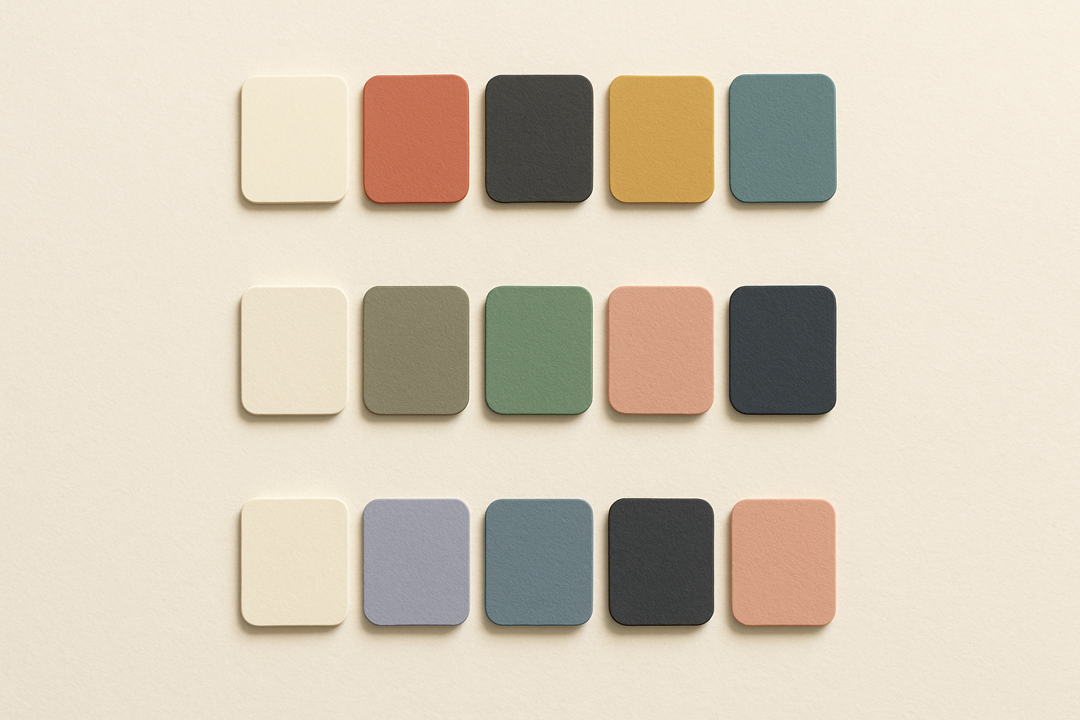
Here are three ready-to-use palettes, each with hex codes, pairing suggestions, accessibility notes, and a description of its emotional register.
Palette 1: Darkroom Warm
Inspired by the film photography revival. This palette feels nostalgic, tactile, and quietly confident.
Suggested pairings: Use Warm Ivory (#F5F0E8) as your background and Soft Charcoal (#4A4543) for body text; this pairing hits a WCAG AA contrast ratio of approximately 9.5:1. Faded Terracotta (#C4937A) works beautifully as a secondary accent for borders and dividers. Reserve Desaturated Teal (#7A9E9F) for interactive elements and CTAs, but test it carefully against light backgrounds as it hovers near the AA threshold. Muted Gold (#C9B88C) shines in decorative elements and highlights.
Emotional register: Warm, analog, contemplative. Best suited for editorial platforms, portfolios, and lifestyle brands.
Palette 2: Studio Mineral
Inspired by ceramics and natural materials. This palette feels grounded, honest, and artisanal.
Suggested pairings: Chalk White (#EDE8E0) as background with Deep Slate (#5C5C5C) for text delivers strong contrast at roughly 5.7:1, clearing WCAG AA for normal text. Stone Gray (#A8A29E) is excellent for secondary text and UI chrome but falls below AA thresholds on light backgrounds, so use it only for large text or decorative purposes. Clay Pink (#D4B5A0) paired with Deep Slate makes an appealing card or section background. Sage Green (#B2BDA0) serves as a subtle accent for tags, badges, and secondary buttons.
Emotional register: Grounded, tactile, calm. Ideal for productivity tools, DTC brands, and wellness apps.
Palette 3: Overcast Digital
Inspired by the anti-digital aesthetic. This palette feels cool, cerebral, and quietly modern.
Suggested pairings: Cool Off-White (#EAEDF0) as background with Graphite (#5A5D6A) for body text gives you approximately 5.3:1 contrast, meeting WCAG AA. Muted Lavender (#B0A8C0) and Pale Denim (#8E9BB0) work as accent and secondary colors but require careful contrast testing when used for text. Dusty Blush (#C9ACAC) adds warmth to an otherwise cool palette, excellent for hover states and selected elements. The overall cool temperature makes this palette feel distinctly digital but in a restrained, sophisticated way.
Emotional register: Cool, intellectual, composed. Works well for SaaS products, creative tools, and media platforms.
How to Adopt Muted Palettes Without Losing Brand Energy
Here's the biggest risk of the muted shift: creating interfaces that feel flat, lifeless, or indistinguishable from every other brand chasing the same trend. Desaturation requires more nuanced design work, not less. If you just drain the color from your existing palette, you'll end up with something that looks washed out rather than intentional.
Four tactics to get it right:
Use texture as a substitute for chromatic contrast. Grain overlays, paper textures, and subtle noise add visual richness without cranking up saturation. A flat, muted-sage card feels bland. The same card with a 3% noise overlay and a faint paper texture feels handmade. Texture is the secret weapon of this entire aesthetic movement.
Lean on one "whisper accent." Keep the palette muted but allow a single slightly-more-saturated accent color for CTAs and key interactive elements. This ensures usability doesn't suffer. Your primary buttons still need to pop; they just don't need to scream. Think of it as the one person in the room speaking at normal volume while everyone else whispers.
Pair muted color with expressive typography. When the palette is quiet, the type system can do more emotional heavy lifting. Consider serif fonts, variable weight contrasts, and generous sizing. A muted palette with a bold, beautiful serif headline creates tension and interest that compensates for the reduced chromatic energy.
Test for accessibility rigorously. This is non-negotiable. Lower-saturation palettes can easily fail WCAG AA contrast requirements, especially for body text and interactive elements. Build contrast checking into your design tokens workflow from the start. Don't wait until QA to discover that your beautiful dusty-rose-on-cream text is illegible for 15% of your users.
The Quietest Palette in the Room
Color trends are cyclical, but they're never arbitrary. The move from dopamine-bright to deliberately muted in 2026 isn't just an aesthetic preference. It's a cultural response to screen fatigue, a longing for analog warmth, and a maturing digital design discipline that's learning to communicate through subtlety rather than volume.
The dopamine era served its purpose. It was joyful, attention-grabbing, and unapologetically bold. But like any trend pushed to maximum saturation (pun intended), it created the conditions for its own correction.
For designers, the takeaway isn't to abandon vibrant color forever. It's to recognize that we're in a moment where restraint reads as confidence, and muted reads as modern. The three palettes in this piece are a starting point, not a prescription. Adapt them, test them, and most importantly, understand the cultural current they're riding.
The next swing will come. It always does. But right now, the quietest palette in the room is the one turning heads.