How the MTA's Subway Map Colors Became New York's Secret Wayfinding Language
by ColorSift Editorial Team
A first-time visitor stands on the platform at Times Square–42nd Street, overwhelmed by tunnels branching in every direction. She doesn't speak English. She can't read the signage. But she follows a red circle to the 1 train and emerges exactly where she needs to be. That red bullet just did what billions of dollars in translation technology still struggles to do: it communicated instantly, across every language barrier.
New York's MTA subway color system is arguably the most successful public color language ever deployed in a single city. Born from a contentious redesign in 1972, refined through decades of bureaucratic compromise and happy accident, these colors now do far more than guide 3.6 million daily riders underground. They've seeped into the city's DNA, showing up in real estate ads, restaurant logos, neighborhood identities, and the mental maps of anyone who's ever lived in or loved New York.
Yet the actual color choices, why that specific shade of orange for the B/D/F/M or heritage green for the 4/5/6, are rarely examined. This is the story of how a handful of carefully (and sometimes arbitrarily) chosen hues became one of the longest-running, most widely recognized design systems on Earth. And what their unlikely success can teach designers in 2026 as cities from Bangkok to São Paulo rethink their own transit wayfinding.
Before the Bullets: New York's Subway Color Chaos (Pre-1972)
To understand why the MTA's color system matters, you need to understand the mess it replaced.
Three independent subway systems, the IRT, BMT, and IND, merged under city control in 1940. But nobody unified their visual identities. Each network kept its own signage conventions, typefaces, and ad hoc color usage. The result was a disorienting patchwork. Station names were inconsistent. Signs were hand-painted, often by maintenance crews with no design training. Some stations had ceramic tile mosaics from the early 1900s sitting alongside hastily stenciled directional arrows from the 1950s.
A 1966 study found that nearly 40% of riders had gotten lost at least once in the prior year. Forty percent. On a system they used daily.
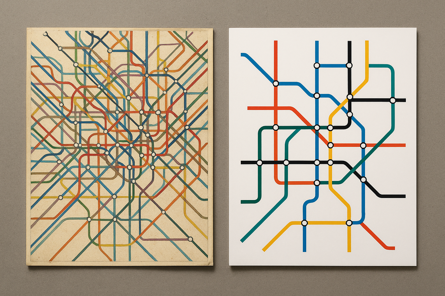
The breaking point came when the newly formed Metropolitan Transportation Authority hired Unimark International, a Milan-rooted design firm with a radical modernist streak. A young Italian-born designer named Massimo Vignelli got the assignment: rationalize the entire system. His proposition was simple and audacious. Treat the subway map not as geography but as a diagram. Strip away the messy surface streets. Reduce the system to colored lines on a clean grid. And assign each trunk line a single, distinct color.
Everything that followed, the colored bullets, the cultural absorption, the design legacy, started here.
Vignelli's Palette: The Logic Behind the Original 1972 Color Assignments
Vignelli's core insight was this: color should encode trunk lines (shared tunnel routes), not individual services. Riders didn't need to know the difference between the D and the F in the abstract. They needed to know which physical corridor they were entering. Color was the fastest way to signal that.
The palette decisions were deliberate. Vignelli chose colors that maximized perceptual distance from one another. The IND Sixth Avenue trunk got bright orange because it needed to stand apart from the IRT Lexington Avenue's hunter green and the BMT Broadway's sunny yellow, all three of which converge in Midtown Manhattan. Red went to the IRT Broadway–Seventh Avenue line. Blue claimed the IND Eighth Avenue corridor. Each color had to be instantly distinguishable from its neighbors on the map and, critically, on signage deep underground.
That underground environment imposed real constraints. Vignelli and his team tested color swatches under the fluorescent lighting that bathed every station. Fluorescent light skews color perception, washing out cool tones and flattening subtle differences. Warm colors like orange and red held up better than cool blues and greens under those conditions, which influenced the final assignments.
But the map itself sparked a war. Vignelli's 1972 diagram rendered Central Park as a perfect square and compressed Brooklyn into a fraction of its real size. The color system earned praise. The geography earned fury. New Yorkers who needed to navigate above ground felt betrayed by a map that treated their city as an abstraction. This tension between diagrammatic purity and real-world usability would shape the system's evolution for decades.
From Diagram to Icon: How the Colored Bullet Became the Standard (1979–2000s)
In 1979, the MTA made a critical decision. They commissioned a new, geographically accurate map from Michael Hertz Associates, but they kept Vignelli's color-coded trunk line system. The geography came back. The colors stayed.
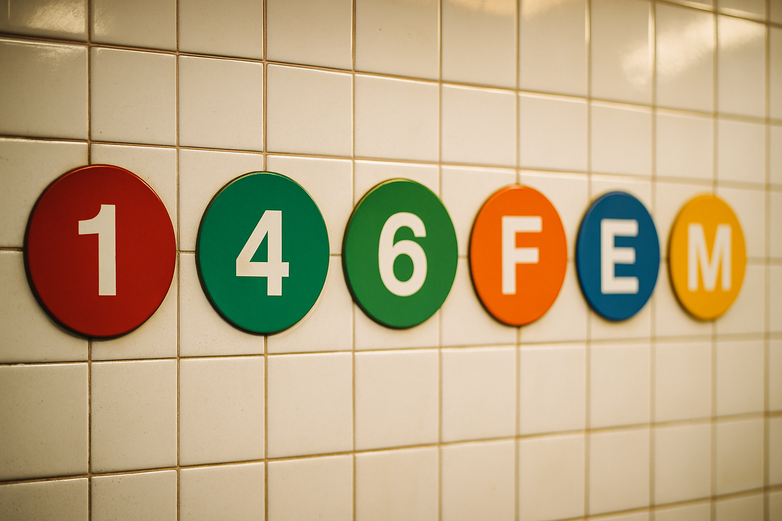
And a small design element became enormous: the colored circle with a white letter or number inside. The "bullet."
This bullet became the atomic unit of New York's transit visual language. It works at any scale, from a four-inch platform sign to a half-inch listing in a newspaper classified ad. It works in any medium: ceramic tile mosaic, LED screen, printed schedule, smartphone app. It requires zero literacy to parse. You see a green circle with a "6" inside, and you know where you are. It is one of the most reproduced graphic elements in American design history.
Over the decades, the specific hues shifted slightly. Vignelli's original purer colors gave way to more muted, print-friendly versions. New challenges arose. Adding the purple 7 (Flushing) line bullet and the gray shuttles required careful calibration to avoid confusion with existing colors. Each addition was a negotiation between visual clarity and system complexity.
Then came the digital stress test. As apps, Google Maps integration, and digital countdown clocks rolled out through the 2010s, the color system faced screens it was never designed for. Small, low-resolution displays. Dark-mode interfaces. Tiny icons on a phone held in a rattling subway car. The colors largely held up. That original perceptual-distance logic, choosing hues that sat far apart on the color wheel, proved remarkably resilient across media that Vignelli could never have anticipated.
The Orange Line Effect: How B/D/F/M Orange Colonized Sixth Avenue
Let's zoom in on one trunk line to see how subway color escapes the map entirely.
The bright orange assigned to the B/D/F/M lines didn't just guide riders along Sixth Avenue. It became an identity marker for the neighborhoods those lines serve. Walk along Sixth Avenue from West 4th Street to 47th–50th Streets, and you'll notice orange creeping into the streetscape. It's in the awnings. It's in the neon. It's subtle, but it's there.
Real estate listings in Herald Square and Midtown West reference "steps from the orange line" as a selling point. The phrasing is informal, never official MTA terminology, but everyone knows what it means. Restaurant and bar branding near West 4th Street and 34th Street–Herald Square has absorbed orange accents, sometimes consciously, sometimes not.
Research in environmental psychology helps explain why. Repeated exposure to a color in a specific spatial context creates strong associative memory. For daily commuters, the orange bullet becomes neurologically linked to their route, their neighborhood, their routine. It's not just a wayfinding tool anymore. It's a piece of personal geography.
Contrast that with the dark green of the 4/5/6 on the Upper East Side. That green bullet has become shorthand for a certain kind of New York life: Upper East Side commuters, Midtown office workers, the express-local calculation at 59th Street. Green means Lexington Avenue. It means the East Side. It means a whole constellation of daily habits and neighborhood identity.
None of this was planned. The MTA never intended its colors to become cultural markers. It's an emergent property of consistent, decades-long color usage in a high-traffic public system. And it may be the most valuable lesson the system offers.
Color Beyond the Map: The MTA Palette in New York's Visual Culture
Walk into any NYC souvenir shop and you'll find subway-bullet keychains, prints, and magnets organized by color. The bullet has become a logo-like mark for neighborhoods. You can buy an "L" bullet tote bag in Williamsburg or a "1" bullet coaster on the Upper West Side. The graphic identity of these circles has transcended transit entirely.
The real estate industry's adoption runs deep. Platforms like StreetEasy display colored subway bullets prominently in every listing. Analysis of listing descriptions shows that color-line references ("near the A/C/E blue line") correlate with perceived transit convenience and higher engagement. The bullet isn't just information. It's a selling point.
Businesses near subway entrances sometimes match their signage to the dominant line color. Orange-accented storefronts cluster near B/D/F/M stations. Blue-themed cafés appear near A/C/E stops in the West Village and Chelsea. Whether this happens by strategic choice or unconscious influence is hard to say, but the pattern is consistent enough to notice.
The system echoes through film, television, and music too. Spike Lee's films use colored subway lines as visual shorthand for neighborhood identity. Jay-Z has referenced specific lines as markers of where you're from and who you are. The MTA color system has become a cultural text that New Yorkers read as fluently as they read street signs.
Accessibility, Equity, and the Limits of Color-Only Wayfinding
Here's the uncomfortable truth: roughly 8% of men and 0.5% of women have some form of color vision deficiency. For a rider who can't distinguish red from green or orange from yellow, the bullet system can fail.
The MTA has layered in safeguards. The letters and numbers inside each bullet serve as a redundant encoding channel, so color is never the sole identifier. High-contrast black-and-white fallback signage exists throughout the system. More recently, the MTA has been adding texture and shape differentiation in digital interfaces, a recognition that color alone isn't enough.
The broader lesson for transit designers working in 2026 is clear: color is an extraordinarily powerful wayfinding channel, but it must never be the only channel. Mexico City's Metro uses unique icons for each station, a silhouette of a grasshopper for Chapultepec, a bell for Bellas Artes. Tokyo assigns numbered station codes. These aren't replacements for color. They're complementary layers.
The best wayfinding systems stack multiple encoding strategies: color, shape, number, name, icon. If any single channel fails, whether because of a visual impairment, a broken screen, or bad lighting, the rider still finds their way. Universal design isn't about designing for the average user. It's about designing so that no single point of failure strands anyone.
Lessons for 2026: What the MTA's Color System Teaches Modern Designers
After more than fifty years in daily use, the MTA's color system offers a set of principles that any designer working on public-facing color systems should internalize:
- Maximize perceptual distance between colors. Don't pick colors that look nice together on a mood board. Pick colors that remain distinguishable under bad lighting, on small screens, and at a glance by a rushing commuter.
- Test under real environmental conditions. Fluorescent tunnel lighting, direct sunlight on a bus shelter, a cracked phone screen at arm's length. Your color system lives in the real world, not in Figma.
- Encode at the system level. Vignelli assigned colors to trunk lines, not individual routes. That higher-level grouping reduced cognitive load and made the system learnable. Think about what your user actually needs to distinguish.
- Design for the smallest reproduction size. If your color mark doesn't work at half an inch, it doesn't work.
- Plan for cultural adoption. A wayfinding color system that persists long enough and consistently enough will be adopted by the surrounding culture. Businesses will borrow it. Artists will riff on it. Residents will internalize it. This is a feature. Design accordingly.
Current transit redesign projects are drawing on these lessons right now. Bangkok's expanded BTS/MRT system is refining its color coding as new lines open. São Paulo's CPTM has rebranded several commuter rail lines with bolder, more distinct hues. Los Angeles Metro's ongoing map revisions have pushed toward greater color differentiation as the system grows. Each project faces the same fundamental challenge Vignelli faced in 1972: pick colors that work underground, on paper, on screens, and in the minds of millions of people.
As augmented reality wayfinding and AI-powered navigation apps become more common, the role of static color systems may shift. But the MTA's experience suggests something important: simple, consistent color remains one of the most resilient communication tools humans have ever devised. Algorithms crash. Batteries die. AR glasses fog up. But a red circle on a white tile wall works every single time.
Back to Times Square
Return to that visitor on the platform at Times Square. The red circle she followed wasn't an accident. It was the product of fifty-plus years of design iteration, bureaucratic negotiation, perceptual science, and sheer cultural repetition.
The MTA's subway color system endures not because it's perfect. It isn't; ask any colorblind rider. It endures because it layered simplicity on top of complexity, gave millions of people a shared visual vocabulary, and then got out of the way.
In a design era obsessed with disruption and reinvention, the subway bullets offer a quieter lesson: sometimes the most powerful design decision is choosing the right color, applying it consistently, and then never changing it.
For the cities redesigning their transit systems in 2026, the message from New York is clear. Your color choices today may outlast every other design decision you make. Choose carefully. Test relentlessly. And trust that if you get it right, the city will make those colors its own.