The Mourning Palette: How Black, White, and Purple Became the Global Language of Grief — and Why It's Quietly Changing
by ColorSift Editorial Team
Somewhere in Silicon Valley, in early 2026, a grief-tech startup launched a memorial app. The interface was gorgeous: deep charcoal backgrounds, muted violet accents, soft transitions. The design team had done everything right, or so they thought. Within 72 hours, their support inbox was on fire. Users in Ghana found the purple palette presumptuous, even offensive, reading it as a claim to royalty. Filipino users associated the dark tones with festivity, not mourning. A user in Lagos wrote, simply: "This looks like a birthday invitation, not a place for my mother."
The team was stunned. They had assumed grief had a universal visual grammar. It doesn't. It never did.
This collision matters more than ever. Digital memorial spaces, virtual funerals, and grief-support platforms have become a multi-billion-dollar industry in 2026. And the designers and institutions building these products keep bumping into a truth that historians and anthropologists have known for centuries: color is a cultural argument, not a biological fact.
So how did a handful of Western mourning colors come to dominate global grief design? And what happens now that the world is pushing back?
Before Black: The Ancient World's Surprising Palette of Loss
The assumption that black equals death is so deeply embedded in Western culture that it feels like a natural law. It isn't. For most of human history, most of the world mourned in other colors entirely.
Ancient Egyptians wrapped their grief in white and yellow-gold. White represented purity and the bleached bones of the afterlife. It was a color of transition, not absence. Gold signaled the divine, the eternal, the sun-god Ra carrying the dead toward immortality. Black, in Egyptian cosmology, was actually associated with fertile soil and rebirth, the opposite of its Western funeral connotation.

In Rome, the bereaved wore the toga pulla, a dark, undyed woolen garment. But calling it "black" is misleading. It was simply unbleached, undyed wool, its darkness more brown than true black. The point wasn't the color. It was the renunciation of civic life, a visible withdrawal from public participation. The meaning was social, not chromatic.
Chinese and broader East Asian traditions of white mourning predate Western black by millennia. Rooted in Taoist and Confucian cosmology, white is linked to the west, to autumn, and to the end of cycles. When a family in Beijing or Taipei wears white at a funeral today, they are participating in a tradition older than most European nations.
And even within medieval Europe, the story isn't as simple as we've been told. French royal funerals used white and blue well into the 15th century. Queens of France wore deuil blanc, white mourning. The blue-and-white tradition is visible in the tomb sculptures at the Basilica of Saint-Denis in Paris. This largely forgotten history complicates any claim that "black has always meant death in the West." It hasn't.
The Victorian Machinery of Black: How One Empire Standardized Grief
If black wasn't always the default, when did it become one? The answer has a name: Queen Victoria.
When Prince Albert died in 1861, Victoria entered a state of mourning she would maintain for 40 years, until her own death in 1901. This was more than personal grief. It was a broadcast, empire-wide performance that set a template for the entire English-speaking world and its colonies.
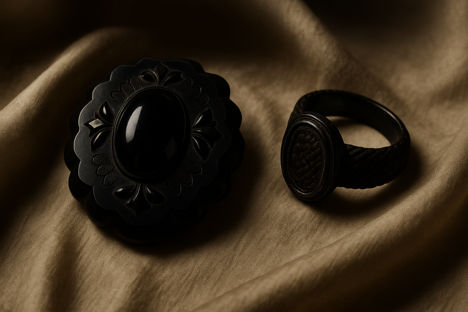
Victoria's mourning created a market. Specialized mourning warehouses sprang up across London. Jay's of Regent Street became the most famous, selling everything from crape veils to jet jewelry carved from Whitby's black fossilized wood. Complex sumptuary rules governed how long a widow should wear full black, when she could transition to half-mourning greys and mauves, and when she could finally return to color. Grief became a consumer product. Black was its brand.
British colonial infrastructure then exported this palette globally. Mourning dress codes traveled to colonial India. State funeral protocols were adopted by newly independent nations across Africa and Asia that had inherited British administrative frameworks. The black funeral suit became a global uniform, not because it was universal, but because an empire made it so.
Here's the paradox: a system marketed as deeply personal and spiritual was commercially manufactured and socially coercive. Women bore the heaviest burden. A Victorian widow was expected to remain in full mourning for two and a half years, at considerable personal expense. The grief was real. The color was politics.
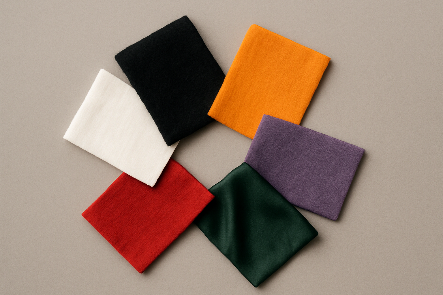
Purple, White, and Beyond: A World Map of Mourning Colors
Step outside the Western frame, and the global palette of grief is staggeringly diverse.
In many Ghanaian communities, red and black are worn to funerals, signaling intense sorrow. In others, white marks a celebration of a life well-lived, particularly for elders who died at a ripe age. This is a direct inversion of both Western and East Asian conventions, and it creates real friction in multicultural funeral homes in London or Houston, where staff must navigate radically different visual expectations in a single week.
South Korea offers a fascinating case of transition. White has long dominated Korean mourning dress, but a blue-grey palette has emerged in contemporary funeral aesthetics. You can see it in the design of modern Korean funeral parlors, in grief-app interfaces, and in death-care marketing materials. It reflects a secularizing society navigating between Confucian tradition and global design trends.
In Latin America, a single culture holds contradictory color grammars for grief. Black Catholic mourning coexists with the vivid marigold oranges and hot pinks of Día de los Muertos. One says sorrow. The other says reunion. Both are true, simultaneously.
Purple's journey is particularly tangled. It began as Roman imperial purple, associated with the death of emperors. It migrated into Catholic liturgical violet for Advent and Lent, seasons of penitence and expectation. Today, it shows up as the default "gentle grief" color in Western hospice branding and bereavement marketing. One color, centuries of shifting meaning.
And in Iran and the broader Shia Muslim world, dark green sits alongside black for mourning, particularly in the context of martyrdom. Even within Islam, mourning color is not monolithic.
When a Grief App Meets a Pluralistic World
Back to the screen. The grief-tech landscape in 2026 is crowded. Platforms like Ever Loved, GatheringUs, and their successors have all navigated the tension between Western design defaults and a global user base. Most of them stumbled before they learned.
The core problem is deceptively simple. When an online obituary or virtual funeral livestream is accessed simultaneously by a grandmother in Seoul, a cousin in Accra, and a college friend in São Paulo, whose color grammar governs the visual frame?
Some designers have responded with user-selectable themes. Others have experimented with geo-located defaults that shift the palette based on the user's region. Neither solution is perfect. Selectable themes place the burden on grieving users to make design decisions during one of the worst moments of their lives. Geo-located defaults assume that geography determines culture, which is reductive at best.
The instinct to go "neutral," to strip color almost entirely and rely on whites, greys, and minimal interfaces, doesn't escape the problem either. That minimalism is itself culturally encoded. It descends from Northern European modernist design traditions, from Dieter Rams and Scandinavian functionalism. To a user from a culture where grief is expressed through visual abundance and saturated color, a stark white interface doesn't feel neutral. It feels cold.
The Funeral Home on the Corner
This isn't just a digital problem. Brick-and-mortar funeral homes in multicultural cities face it every day.
In London, Toronto, Houston, and Singapore, funeral directors serve communities with radically different aesthetic expectations around death. A funeral home in East London might host a South Asian Hindu service on Saturday morning, where white is standard mourning dress but the space should feel warm and sacred, not clinical. That same afternoon, a West African Christian celebration of life fills the room with bold color and exuberant visual energy. The interior has to work for both.
Some funeral homes solve this with modular decor, swappable drapes and lighting schemes. Others don't solve it at all, defaulting to a generic dark palette that satisfies no one deeply but offends no one overtly.
The rise of "celebration of life" ceremonies, an American funeral-industry marketing trend, has inadvertently opened a door here. By decoupling grief from strict solemnity, these services have created space for non-Western color traditions to enter mainstream death-care. Florists, stationery designers, and memorial goods makers are quietly expanding their palettes based on direct client feedback from multicultural communities. The change is happening from the bottom up.
Why Designers Get This Wrong
The default dark palette persists for reasons that go deeper than ignorance.
Designers trained in Western traditions associate dark, desaturated, low-contrast palettes with gravity and dignity. This maps onto broader cultural assumptions: that restraint signals respect, that the suppression of visible emotion equals composure, that muted color is inherently more "serious" than saturated color. These are values, not facts.
Then there's the infrastructure problem. Search "grief" or "memorial" on Shutterstock, Canva, or Adobe Stock, and you'll find thousands of images coded in black, grey, and muted purple. A designer who wants to do something different is swimming upstream against a vast visual library of assumptions baked into the tools they use every day.
There's also an accessibility angle that rarely gets discussed. Dark mourning palettes frequently fail WCAG contrast standards, particularly in low-light conditions or for users with visual impairments. The default palette is not only culturally exclusive. It's practically exclusionary.
The best designers working in sensitive contexts aren't looking for a replacement universal palette. They're building systems of flexibility, treating color as a conversation with the user rather than a statement imposed on them.
Grief's New Visual Language
So what does thoughtful, pluralistic grief design actually look like?
It looks like modular systems rather than fixed palettes. Death-care designers and grief counselors are shifting toward community-responsive visual frameworks that can adapt to the people they serve.
It looks like genuine co-design. Some organizations have run real consultation processes with South Asian, East Asian, African, and Latin American community members before designing memorial spaces or digital products. This isn't focus-group theater. It's structural humility.
And some of the most thoughtful recent memorial design has sidestepped the color question altogether, drawing instead on material texture, light quality, and spatial language. When you enrich the sensory vocabulary of grief beyond hue alone, you find common ground that color can't always provide. Soft light, natural materials, open air: these speak across cultures in ways that a hex code never will.
The fact that grief design is changing is not a sign that meaning is being lost. It's a sign that more people's meanings are finally being counted.
Coming Back to the Room
Return to that Silicon Valley design team. Imagine the story resolved not by a redesign, but by a conversation. The team sits with users from Lagos, Seoul, and Oaxaca. They learn that grief is not a color but a relationship. Their job is not to signal sorrow but to hold space for it.
Black will still be worn at funerals in Manchester. White at funerals in Tokyo. Vivid, joyful color at funerals in Kumasi. None of that is going away, nor should it. What's ending is the assumption that any one of those traditions is the default, the neutral, the universal.
For designers, death-care professionals, and the growing grief-tech industry of 2026, this is not a problem to be solved with a better palette. It is an invitation to design with humility. To build systems flexible enough to hold the full, contradictory, luminous range of how human beings say goodbye.