Terracotta to Titanium: Building a Material-Inspired Color System for Product Pages
by ColorSift Editorial Team
Over the past year, a quiet revolution has reshaped e-commerce design. Leading DTC and luxury brands are walking away from the flat, sterile color palettes that defined the 2010s minimalism era. In their place: palettes drawn from real-world materials. Clay. Stone. Brushed metal. Raw linen. Brands like Aesop, Mejuri, and a wave of newer DTC entrants are grounding their product pages in colors that feel tactile, not digital.
This raises a practical question. How do you systematically extract colors from physical textures and turn them into a functional, accessible design system, rather than just a mood board pinned to a Figma file? This article walks you through a repeatable, step-by-step method. By the end, you'll have the full pipeline and four complete, ready-to-use palettes with hex values, semantic roles, and accessibility notes.
Why Material-Inspired Palettes Are Replacing Abstract Swatches
For nearly a decade, the default product page looked the same: white background, one sans-serif font, a single blue or black accent color. It was clean. It was also completely interchangeable. Consumers started experiencing a kind of brand blindness, scrolling through dozens of shops that felt identical.
The backlash was inevitable. And the direction it took is interesting. Rather than swinging toward maximalism or wild gradients, designers turned to something grounded: the colors of physical materials.
There's real psychology behind this. Colors tied to recognizable textures, warm terracotta, cool slate, soft linen, trigger what researchers call haptic memory. Your brain doesn't just see "muted orange." It recalls the warmth and weight of fired clay. For e-commerce, where customers can't touch products, this sensory shortcut is powerful. Studies from the Baymard Institute and internal A/B tests shared by DTC operators throughout 2025 and early 2026 consistently show that material palettes outperform abstract ones on perceived trustworthiness and premium feel.
One important clarification: this isn't skeuomorphism. Nobody is adding faux leather textures to buttons. The goal is to derive a flat color system from physical source materials, creating warmth and coherence without gimmicks.
Step 1: Extracting Color Values from Physical Textures
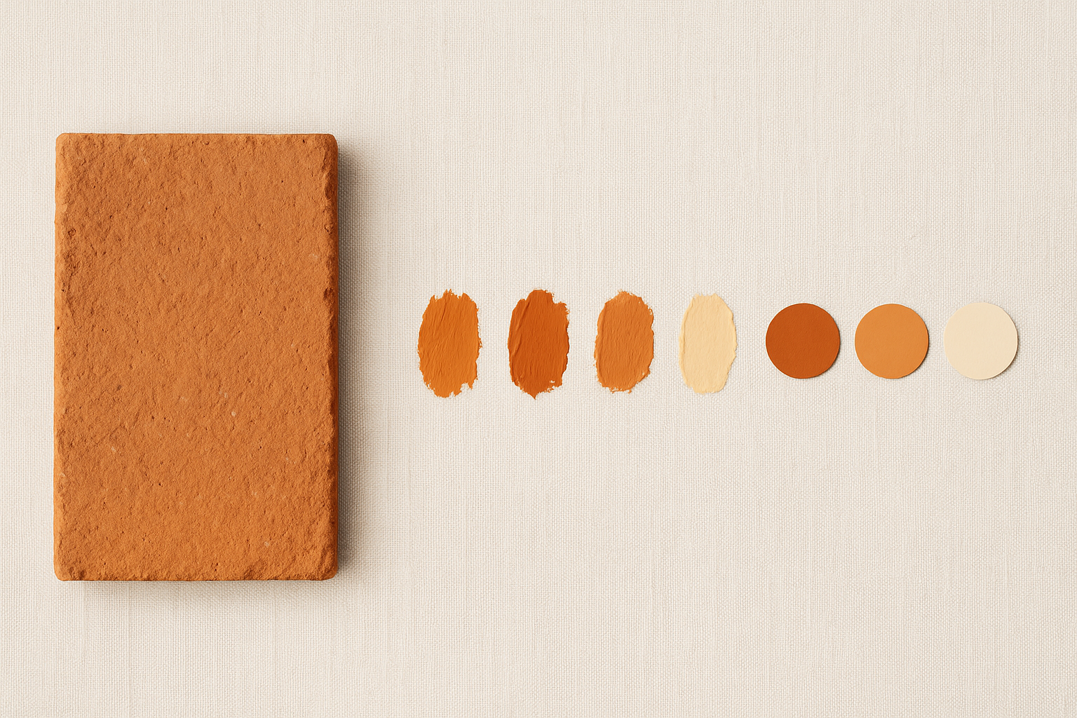
Start by choosing 3 to 5 physical textures that match your brand's positioning. An artisan ceramics brand might pick terracotta, linen, and charred wood. A premium tech brand might choose titanium, concrete, and oxidized copper. Photograph these materials under neutral lighting, or source high-quality texture images from resources like Unsplash or material libraries.
The Extraction Process
Open your texture image in Adobe Color, Coolors, or even just Figma with an eyedropper tool. Pull 5 to 8 candidate colors from each texture. The key mistake people make here: they only sample the dominant, obvious hue. Terracotta isn't just orange. It has cool shadow tones, warm midtones, and pale highlights. Sample across the full range of the texture.
Filtering and Refining
Raw extracted colors are noisy. They'll have inconsistent undertones and unpredictable saturation. The fix is simple: nudge each hex value toward a shared undertone (either warm or cool) to unify the set. In HSL terms, this means pulling all your hues into a narrower range and evening out saturation so no single swatch feels like it belongs to a different palette.
A Naming Convention That Sticks
Name colors after their source material: "Fired Clay," "Wet Slate," "Brushed Nickel." Not "Orange 400" or "Gray 3." Material names preserve design intent across teams and become a genuine brand asset. When a developer sees --color-accent-terracotta, the intent is unmistakable.
Step 2: Building Harmonious Palettes from Raw Extractions
With your refined swatches in hand, you need to organize them into a working palette.
The 60-30-10 Rule, Adapted
Assign your lightest, most neutral material color as the dominant (60%) surface. A mid-tone material color fills the secondary role (30%) for cards, containers, and dividers. Your richest, deepest material color serves as the accent (10%) for CTAs and key interactive elements.
Creating Tonal Ramps
For each material color, generate a 5-step tint/shade scale running from near-white to near-black. This gives you the versatility to handle every UI state: hover, disabled, selected, focus, error. Without tonal ramps, you'll constantly invent ad-hoc colors that erode the system.
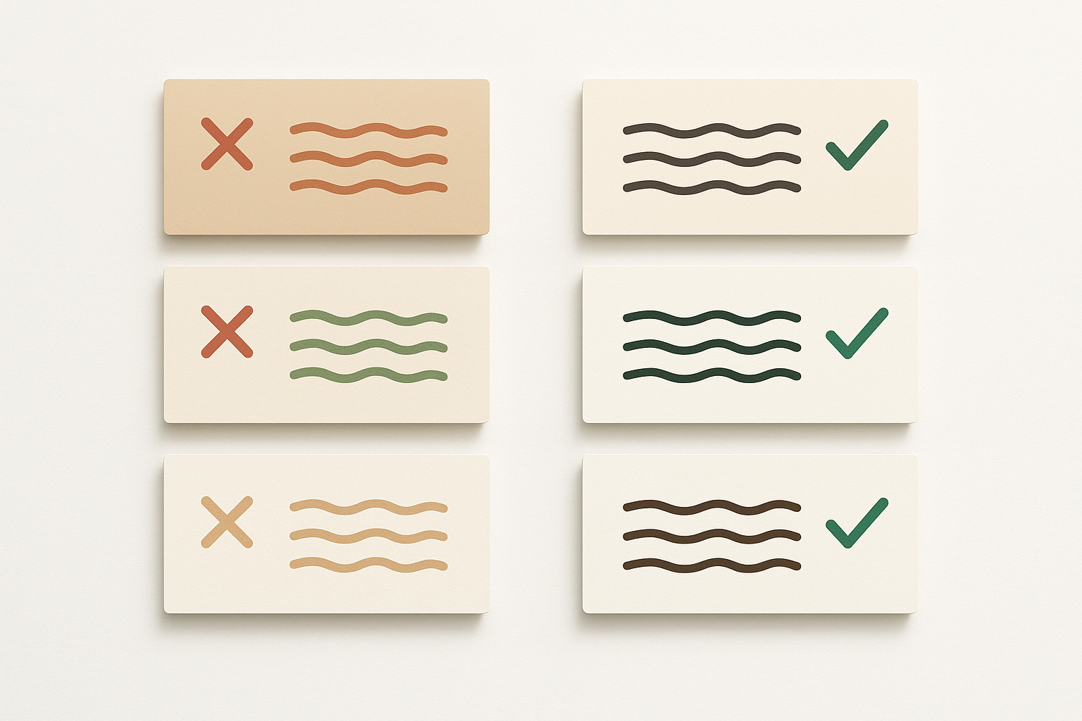
Checking Internal Harmony
Pull up your palette in HSL view. Your hues should cluster within a controlled range, either analogous or split-complementary. Saturation levels should be roughly consistent. If one color screams against its muted neighbors, pull its saturation down until it cooperates.
One concept worth adopting: the "material bridge" color. This is a neutral that naturally appears in multiple source textures. The gray-beige found in both raw linen and limestone, for example. It acts as connective tissue across the entire palette, smoothing transitions between warmer and cooler zones.
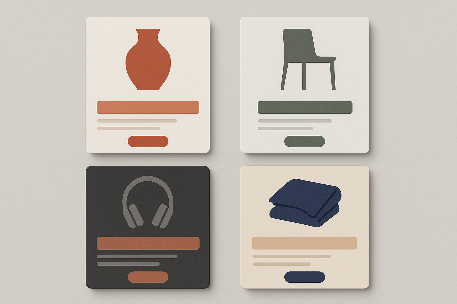
Step 3: Assigning Semantic Roles
Every color in your system needs a job. Map each palette color to a specific semantic role:
- Page background: Your lightest material color (linen, birch, bleached sand)
- Card/surface background: A slightly darker neutral
- Body text: A deep, warm or cool near-black from your darkest material
- Heading text: Same family, slightly lighter for hierarchy
- Primary CTA: Your most vivid material color (terracotta, oxidized copper)
- Secondary CTA: A muted mid-tone version
- Borders and dividers: Your bridge neutral at low opacity
- Feedback colors: Success, error, and warning states
Material Logic
Let the physical properties of your source guide the UI role. Heavy, dark materials like slate and iron anchor as text or footer backgrounds. Light, airy materials like linen and sand become page surfaces. Vibrant materials like terracotta or oxidized copper become call-to-action buttons.
Handling Feedback Colors
Success green, error red, and warning yellow rarely come from your material source. The trick: tint standard feedback hues with your palette's dominant undertone. If your palette runs warm, add a touch of yellow-orange to your greens and reds. They'll feel integrated rather than jarring, like they belong to the same physical world.
Document with Design Tokens
Codify everything as CSS custom properties or JSON tokens for developer handoff:
:root { --color-surface-linen: #F5F0E8; --color-surface-cotton: #E8DFD0; --color-accent-terracotta: #C2663A; --color-text-charcoal: #2C2420; --color-cta-fired-earth: #8B3A1F; --color-feedback-success: #5A7A52; --color-feedback-error: #B04A3A;
}
Ensuring WCAG Compliance Without Losing the Warmth
Here's the uncomfortable truth about material palettes. They skew toward mid-tone, low-contrast, warm hues, which is exactly the range where WCAG AA failures pile up. The AA standard requires a 4.5:1 contrast ratio for normal text and 3:1 for large text and UI components.
The Contrast Audit Workflow
Test every text-on-background combination in your semantic mapping. Use WebAIM's Contrast Checker or the Stark plugin in Figma. Do this early, not after the design is finalized.
Strategic Adjustments
When a combination fails, shift the lightness value (L in HSL) while preserving hue and saturation. A terracotta that reads as the same material can go from L:45 to L:35 and suddenly pass on a linen background. The color still feels like terracotta. It just works harder.
The Accessible Accent Trick
For CTA buttons, pair your material accent with pure white or near-black text and test both directions. Often one passes easily. Reserve your most vivid material color for large interactive elements where the more forgiving 3:1 ratio applies. Small body text gets the high-contrast pairings.
Four Complete Material-Inspired Palettes
Here are four ready-to-use palettes with full hex values, semantic role assignments, and accessibility notes.
Palette 1: Artisan Warmth
Terracotta, linen, and charred wood. Ideal for ceramics, handmade goods, and artisan food brands.
Recommended CTA pairing: Fired Earth (#8B3A1F) with white text (contrast ratio 7.2:1, passes AA). Caveat: Dried Clay on Linen White fails AA for small text. Use it only for decorative borders or large display type.
Palette 2: Nordic Stone
Granite, moss, and birch. A cooler, Scandinavian-inspired system for minimalist furniture and homeware brands.
Recommended CTA pairing: Fjord Slate (#3E4347) with Birch White text (contrast ratio 8.1:1). Caveat: Lichen Green on Birch White fails AA for small text at 3.8:1. Use only for large-text contexts or iconography.
Palette 3: Industrial Luxe
Titanium, concrete, and oxidized copper. High-contrast and modern, built for tech products and premium hardware.
Recommended CTA pairing: Oxidized Copper (#B05E3A) with white text (contrast ratio 4.6:1, passes AA). Caveat: Brushed Titanium on Polished Silver is too low-contrast for text. Reserve it for subtle dividers.
Palette 4: Coastal Craft
Sand, driftwood, and indigo sea. A warm-cool hybrid for lifestyle, resort, and home textile brands.
Recommended CTA pairing: Deep Indigo (#2E4057) with Bleached Sand text (contrast ratio 9.3:1). Caveat: Sea Glass on Bleached Sand sits at 3.2:1. Safe for large text and decorative use only.
Putting It Into Practice
A few final notes to save you from common pitfalls.
Start narrow. Apply one palette to a single product category or brand sub-line. Don't force a single material palette across wildly different product types. A terracotta palette that sings for ceramics may feel wrong next to neon running shoes.
Test on real product photography. Material palettes can clash with product images if the product itself has strong, competing colors. Use your neutral and bridge colors as safe zones around product images. Reserve material accents for UI chrome, buttons, and typography.
Dark mode translates naturally. Material palettes handle dark mode better than abstract ones. Invert your tonal ramp: the deepest material color becomes the background, and the lightest becomes text and surface color. The material associations still hold. Charred Bark as a dark background feels intentional, not arbitrary.
Iterate with real users. A/B test your material palette against the current system on a single product page before a full rollout. Track add-to-cart rate and time-on-page as proxies for engagement and trust. The data will tell you whether the warmth is working.
Closing Thoughts
The shift from abstract swatches to material-inspired color systems is a strategic response to the tactile gap in e-commerce. By grounding your palette in real-world textures, you give customers a sensory anchor that flat, arbitrary colors simply cannot provide.
The method is repeatable: extract colors from physical textures, harmonize them into a structured palette, assign semantic roles, and audit for accessibility. Start by photographing a single material that embodies your brand, then follow the pipeline.
The best color systems don't just look good. They feel like something. And that feeling is what turns a product page into a brand experience.