The Loudest Color Is No Color: How Luxury Fashion's Beige Obsession Became the Ultimate Status Signal
by ColorSift Editorial Team
Walk into a Loro Piana boutique in 2026 and you will struggle to find anything brighter than a winter sky. No crimson. No cobalt. Barely even a navy. Just an immaculate procession of sand, bone, ecru, and warm greige, colors that, on paper, sound like paint chips from a 1990s suburban bathroom. Yet the cheapest item on the rack costs more than most people's monthly rent.
This is the paradox at the heart of contemporary luxury: the brands charging the most are the ones whispering the quietest. When did the absence of color become the loudest possible declaration of wealth? The answer involves a deliberate, strategic, almost conspiratorial journey by which a handful of fashion houses turned chromatic restraint into a coded language that only the right people can read.
The Maximalist Hangover: What Luxury Looked Like Before the Beige
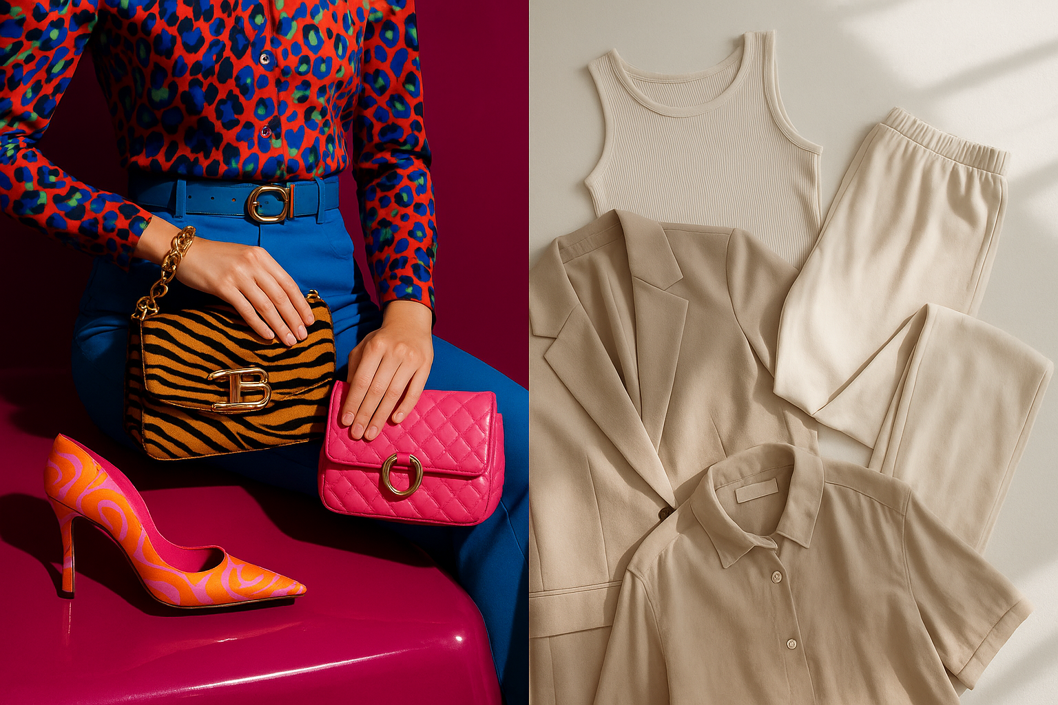
Rewind to the late 1990s and 2000s. Louis Vuitton monogram bags. Gucci's GG canvas. Versace's Baroque prints splashed across everything from shirts to home furnishings. Luxury was loud, and legibility was the entire point.
The social logic was simple: branding as broadcasting. Logos were proof-of-purchase worn on the outside, aimed at the widest possible audience. The goal was recognition at distance. You didn't need to touch the fabric or inspect the stitching. You just needed to see the interlocking letters from across the room.
Then the 2008 financial crisis hit. Conspicuous consumption began to feel vulgar in a new way, particularly among younger ultra-high-net-worth individuals. Flaunting recognizable logos felt tone-deaf when the broader economy was collapsing. That discomfort accelerated through the 2010s, sharpened by social media's democratization of visual culture.
Here's where the tension gets interesting. As logo-heavy branding became accessible through fast fashion knockoffs, it grew associated with aspiration rather than arrival. Zara could approximate a Gucci print. Shein could mimic a Fendi pattern. The signal broke. Truly wealthy consumers needed something new, something that couldn't be faked or mass-produced.
The answer they landed on was, essentially, the opposite of everything that came before.
The Architecture of Restraint: What "Quiet Luxury" Actually Means Chromatically
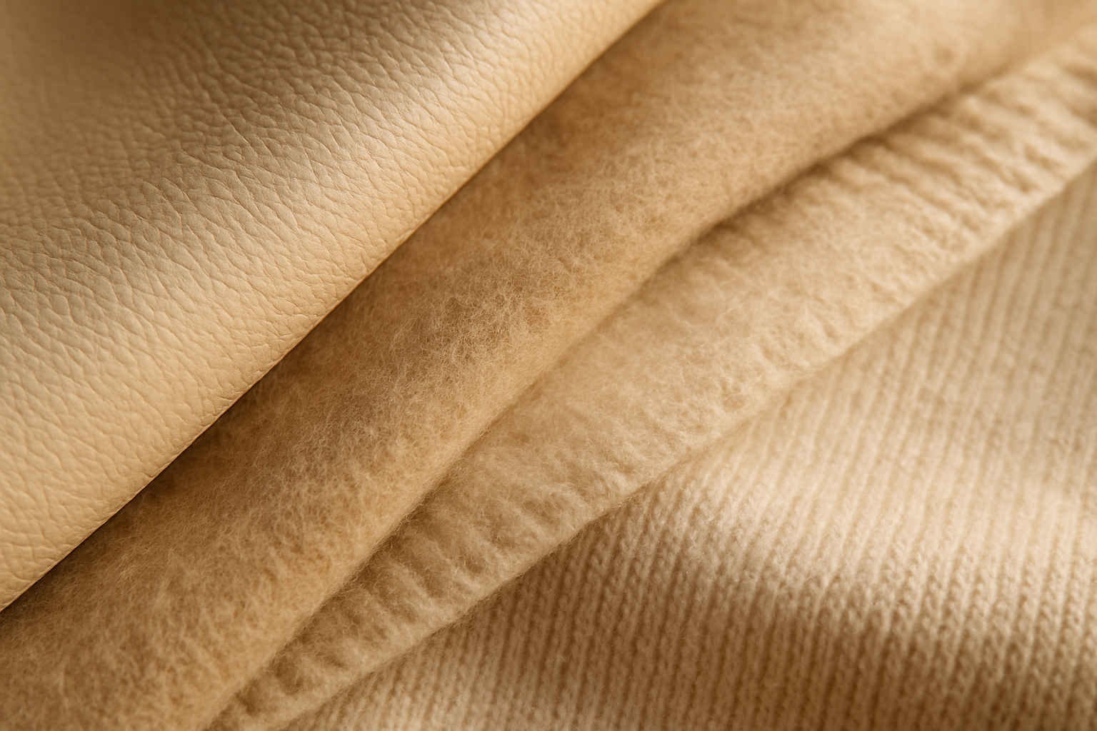
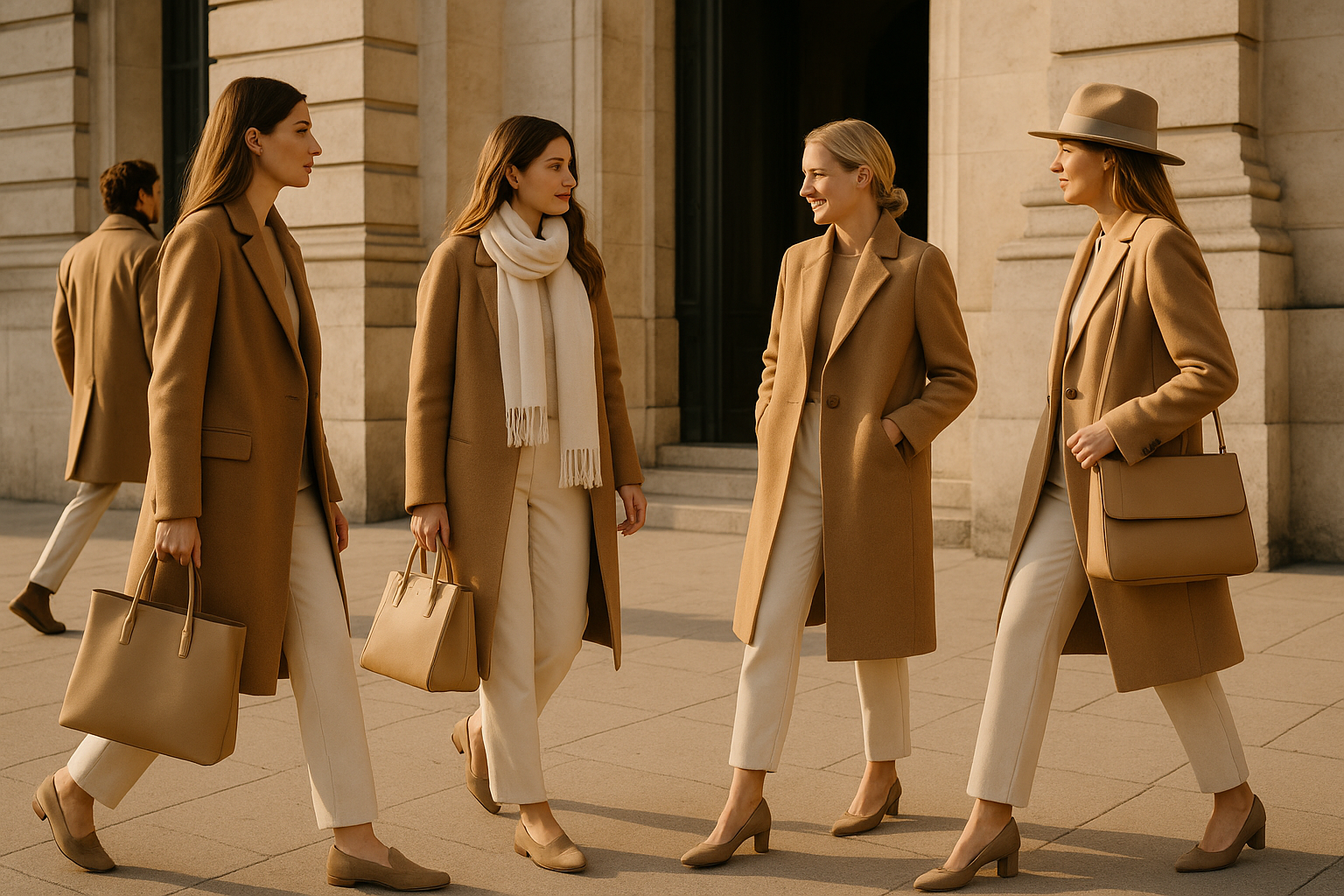
Quiet luxury is not an absence of effort. It is a highly specific chromatic vocabulary: warm whites, deep taupes, camel, pale greige, ivory, oat, mushroom. These are colors that photograph softly, age well on natural fibers, and resist trend cycles with stubborn grace.
It's worth drawing a distinction here. Minimalism is a design philosophy about reduction. Chromatic restraint is a strategic signaling system about exclusion. The palette isn't minimal by accident. It's curated to be unreadable to outsiders.
These specific tones work on a material level, too. They show off texture, drape, and quality in ways that saturated color would mask. A cashmere sweater in deep cobalt reads as "blue sweater." The same cashmere in a warm, undyed oat invites you to notice the softness of the fiber, the weight of the knit, the way light catches the surface. The color steps back so the material can step forward.
And within this seemingly narrow range, the tonal complexity is staggering. A Loro Piana coat in a warm, slightly greenish taupe reads completely differently from one in a cool, gray-inflected sand. Those distinctions are visible only to people spending time inside these spaces. If you can't see the difference, you're not the audience.
Case Study: The Row's Colorless Manifesto
No brand has pushed chromatic restraint further than The Row. Founded by Mary-Kate and Ashley Olsen in 2006, the label has become the purest expression of the quiet-luxury palette in American fashion. By the mid-2020s, it reached a cultural peak that shows no sign of declining.
Consider the signature pieces. The Margaux bag in "Biscuit" leather. The Linton coat in undyed alpaca. Wide-leg trousers in off-white wool. In every case, color is either neutral or barely there. And every piece functions as an insider recognition signal among a very specific demographic.
The Row's near-total absence of advertising and social media presence extends the same logic. The brand communicates through restraint in every channel, chromatic and otherwise. You have to already be inside a certain world to encounter it. There is no billboard pulling you in.
The palette communicates something very specific: "post-wealth." These are the colors of someone who has never needed to prove anything, whose clothes exist for themselves and a small circle of similarly initiated peers. The Row doesn't dress you to be seen. It dresses you to be recognized, and only by people who already know what they're looking at.
Bottega Veneta and Loro Piana: Two Roads to the Same Silence
The Row didn't arrive at chromatic restraint alone. What makes the phenomenon so striking is that multiple brands converged on the same solution from entirely different starting points.
Bottega Veneta under Daniel Lee (2018–2021) and then Matthieu Blazy (2022 onward) built its identity around the Intrecciato woven leather technique. The craft itself is the logo. There is nothing left to advertise. The colors, butter yellow aside, tend toward cognac, cement, espresso, and chalk, tones that make the weave pattern the star. Color serves the texture, never the reverse.
Loro Piana takes a different route entirely, rooted in material provenance. The world's finest vicuña fiber, baby cashmere, lotus flower fabric. The muted palette is inseparable from the natural, undyed origin of the materials. The color is, quite literally, "the color of the animal." This material authenticity functions as its own status signal.
Both brands handle color accents with surgical precision. A single camel-colored Bottega Veneta pouch or a deep forest-green Loro Piana jacket reads as a considered event, not a default. Color is deployed so sparingly that its presence feels like punctuation rather than prose.
The key insight: both brands require the viewer to be educated to decode them. There is no public-facing logo doing the work. The signal is readable only to a specific, self-selected audience. Which is precisely the point.
The Semiotics of Exclusion: Why "Hard to Read" Is the Luxury
Pierre Bourdieu wrote about "cultural capital," the idea that the truly wealthy accumulate knowledge and taste as a form of currency. Quiet luxury is Bourdieu made wearable. Knowing how to read the signal is the signal.
Think about the mechanism of exclusion. A loud logo includes everyone who can see it in its audience. A deliberately muted, context-dependent color signal excludes everyone who doesn't already have the knowledge to decode it. The palette is a velvet rope made of color.
The term "stealth wealth" exploded culturally around 2023 and has since become the mainstream descriptor for this phenomenon. By 2026, the concept is widely understood, which creates a new problem for the brands involved: how do you maintain exclusivity when the code has been published?
There's a fascinating counterfeit dimension here, too. Quiet-luxury pieces are, paradoxically, harder to fake convincingly because the signal lives in the material quality and tonal precision, not in a reproducible logo. A beige coat is easy to make. A beige coat in that particular shade of Loro Piana vicuña with that specific drape? That requires the actual material. The barrier to entry is physical, not graphical.
Contagion: How High Fashion's Beige Infected Everything Else
By 2026, the quiet-luxury palette has fully escaped fashion and colonized adjacent industries. This is no longer a niche conversation about clothing. It is a broad design cultural force.
Interior design got there first. The rise of "warm minimalism" in high-end residential and hospitality spaces brought limewash walls, travertine surfaces, undyed linen, and raw oak into the vocabulary of every serious designer. Axel Vervoordt has practiced this aesthetic for decades, but now luxury hotel brands like Aman and Six Senses have adopted near-colorless palettes as their default visual language. Walk into an Aman resort and you'll feel like you're inside a Loro Piana coat.
Consumer technology followed close behind. Apple's "Natural Titanium" and "Desert Titanium" finishes on premium iPhones, the Sandy and Starlight colorways across product lines, the deliberate move away from the saturated product colors of the 2010s. Beige is now a premium tech color, which would have sounded absurd fifteen years ago.
Automotive design tells the same story. Porsche's "Chalk," Bentley's "White Sand," the growing preference for undramatic, sophisticated neutrals over the aggressive performance reds and yellows that previously signaled wealth on four wheels. "Sand," "dune," "desert," and "savanna" appear in nearly every luxury configurator.
The meta-point is hard to ignore. When the same chromatic logic appears independently across fashion, interiors, tech, and cars, it has become a genuine cultural dominant: a shared visual language of a particular class formation expressing itself across every category of consumption it touches.
The Paradox of 2026: When the Quiet Gets Loud
Here's the central tension. A "secret" signal stops being secret once the mainstream understands it. "Stealth wealth" has been widely dissected in media, on social platforms, and in design discourse since roughly 2022. The code has been, to a meaningful extent, decoded publicly.
The brands themselves have responded in revealing ways. The Row has not changed course at all. If anything, the palette has gotten quieter, suggesting a confidence that the signal remains legible only to the right people regardless of how many articles explain it. Writing about the color of vicuña does not give you vicuña.
Meanwhile, a small cohort of designers has begun using deliberate, aggressive color as a new form of distinction. Schiaparelli's shocking pinks. Certain Marni collections. Parts of the JW Anderson archive. If everyone wealthy is wearing beige, then eccentric, painterly color becomes the next level of the game. The cycle begins to turn.
But here's the design insight worth keeping: quiet luxury's chromatic strategy is not a trend that will simply be replaced. It has revealed something durable about how color functions as a social technology. That lesson is permanent even if the specific palette evolves.
The Frequency Only Tuned Receivers Can Detect
Return to that Loro Piana boutique. What looked like an absence of ambition is revealed as its opposite: a room full of the most carefully calculated color decisions in contemporary design. That beige is not a default. It is a declaration, written in a frequency only tuned receivers can detect.
For designers, the lesson is both specific and generalizable. Color can communicate through its own strategic withdrawal. The most powerful visual signals are sometimes the ones that require an educated audience to perceive. As this palette bleeds further into tech, interiors, and automotive design, understanding the semiotics of chromatic restraint is no longer optional knowledge. It is foundational literacy for designing anything that aims to speak to people who have stopped needing to shout.