Why Every Luxury Brand Is Abandoning Minimalist White for Deep, Saturated Color
by ColorSift Editorial Team
In January 2022, Valentino sent every model down its Fall/Winter runway drenched head-to-toe in a single, blinding shade of fuchsia. PP Pink (Pantone 1837). It wasn't an accent. It wasn't a pop of color. It was 40 consecutive looks in one unrelenting hue. The fashion press called it "aggressive," "maximalist," and "impossible to ignore," which was exactly the point.
This moment crystallized something that had been building for years: luxury's decade-long love affair with minimalist white, neutral palettes, and whisper-quiet branding was over. In its place, a new strategy was emerging, one built on deep, saturated, ownable color.
From Bottega Veneta's signature Parakeet green to Jacquemus's sun-baked terracotta to Tiffany's aggressive reclamation of robin's-egg blue, the most influential luxury houses are no longer trying to blend into a shared aesthetic of tasteful restraint. They're trying to own a color entirely.
This article examines why the shift happened, how the most successful brands are executing it, and what it means for designers working on premium brand identity today.
The White-Out Era: How Luxury Branding Became a Sea of Sameness
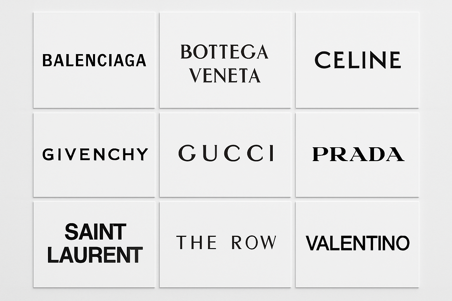
Cast your mind back to the mid-2010s. Burberry dropped its equestrian knight for a flat sans-serif wordmark. Balmain followed. Then Berluti. Then Saint Laurent (which had already shed the "Yves"). Balenciaga went clean and stark. Dozens of others fell in line. Within a few years, the visual identities of the world's most storied fashion houses had converged on a nearly identical formula: sans-serif logotypes, white space, neutral palettes, stripped-down packaging.
The underlying logic was legitimate. Minimalism signaled sophistication. It communicated digital-first thinking. It rejected the logo-heavy excess of the 2000s, when monogram prints and flashy branding dominated the market. After a decade of visual loudness, restraint felt fresh. Clean felt modern.
And for a while, it worked.
But the strategy contained the seed of its own collapse. When every brand adopts the same visual language, the differentiation value of that language drops to zero. A 2019 Bloomberg piece noted that luxury logos had become virtually interchangeable. Place the wordmarks of Burberry, Balmain, and Balenciaga side by side, and you'd struggle to tell them apart at a glance. The very strategy designed to signal exclusivity had become generic.
This is a pattern that repeats throughout branding history. Call it "aesthetic convergence": a dominant style becomes so widespread that it loses its meaning, creating the conditions for a dramatic counter-movement. The minimalist white-out era didn't die because minimalism is bad. It died because it stopped doing the one job branding exists to do, which is to make one thing look different from everything else.
The Color Land Grab: Why Owning a Hue Is the New Luxury Power Move
The shift toward saturated color isn't merely aesthetic. It's strategic. In a post-minimalism landscape, color has become a form of intellectual property, a shorthand that bypasses logos entirely.
The precedent is well established. Tiffany Blue (Pantone 1837), Hermès Orange, and Louboutin Red proved decades ago that a single color could become synonymous with a brand. What's new is that multiple houses are now pursuing this strategy simultaneously and aggressively.
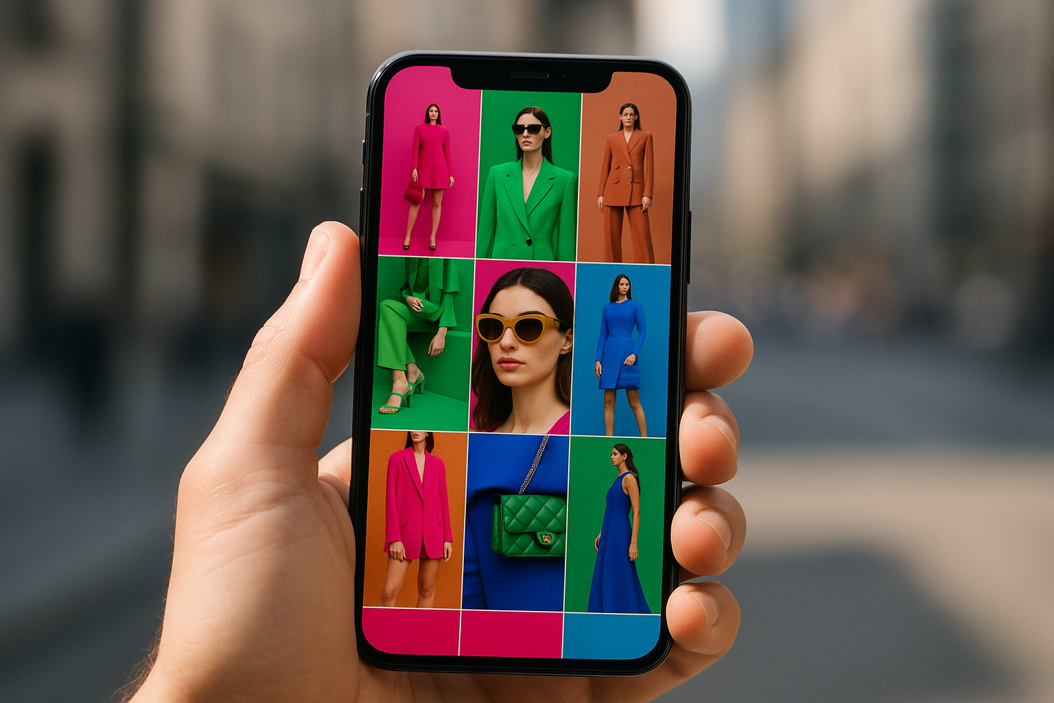
The neuroscience supports the approach. The human brain processes color faster than text or shape. In a scroll-driven, thumbnail-sized digital environment, a distinctive color is the most efficient brand signal available. You register Valentino's fuchsia before you read any text. You recognize Bottega's green before you spot the intrecciato weave.
Social media amplified the urgency. A Valentino PP Pink bag or a Bottega green pouch becomes instantly recognizable in a 1080x1080 Instagram grid, no logo needed. In an ecosystem built on rapid visual scanning, color does the heavy lifting that wordmarks simply cannot.
There's also a legal dimension worth noting. Brands are increasingly filing trademark claims on specific colors. Tiffany has aggressively enforced its blue. Louboutin fought all the way to the European Court of Justice to protect its red sole. Color is no longer just a design choice. It's a defensible competitive asset.
Case Study: Bottega Veneta's Parakeet Green and the Art of Chromatic Identity
No brand illustrates the color-as-identity strategy more clearly than Bottega Veneta.
When Daniel Lee took over as creative director in 2018, the house had no historical association with green. None. Bottega was known for its woven leather, its "When your own initials are enough" ethos, and a palette that leaned toward brown, tan, and muted earth tones. Green was a deliberate, strategic choice.
The rollout was methodical. It began with accessories and packaging, a vivid Parakeet green that showed up on the Pouch clutch, the Cassette bag, and the house's signature woven leather goods. Then it expanded to runway looks, retail environments, and the brand's famously logo-free social media presence. When Bottega made headlines by deleting its Instagram account entirely in early 2021, the green had already done its work. The color was the brand signal. No logo required.
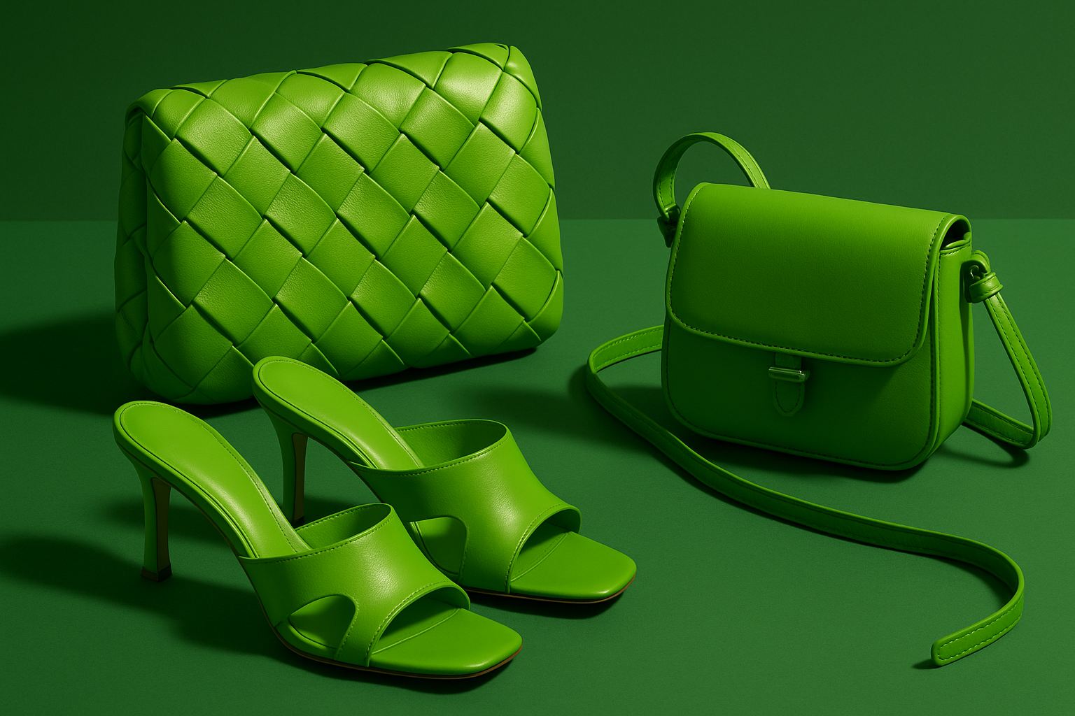
Why does this specific green work? Three reasons. It's saturated enough to be arresting, grabbing attention in any context. It's unusual enough to feel ownable, sitting in a space no other major luxury house had claimed. And it's versatile enough to function across categories, from leather goods to ready-to-wear to retail interiors.
The strategic brilliance here is worth pausing on. Bottega Veneta's entire brand philosophy rejects visible logos. So how do you build recognition without a monogram, a wordmark, or a symbol? You make the color the logo. Under Lee, and later under Matthieu Blazy, that green became as recognizable as any double-G or interlocking-C in the luxury landscape.
Beyond Green and Pink: The Expanding Spectrum of Brand-Owned Color
Bottega and Valentino may be the most visible examples, but they're far from alone. The saturated color strategy is spreading across the luxury market.
Jacquemus has built its entire visual world around earthy terracotta and wheat tones that evoke the sun-baked warmth of Provence. Every campaign, every store design, every Instagram post reinforces a color story rooted in the brand's Mediterranean origin.
Loewe, under Jonathan Anderson, embraces bold and slightly off-kilter color combinations. Think clashing saturated tones that feel artistic rather than commercial, a palette that signals intellectual playfulness.
Prada has returned to assertive color in its campaigns and retail spaces, moving away from the muted nylon-and-black aesthetic that dominated for years.
Tiffany & Co., after its acquisition by LVMH, launched the provocative "Not Your Mother's Tiffany" campaign. There were yellow diamond shock tactics and bold departures. But the endgame was clear: a doubling-down on Tiffany Blue as the core brand asset. The provocations were temporary. The blue is forever.
Even traditionally restrained houses are adding chromatic punch. Gucci's various creative eras under Alessandro Michele and now Sabato De Sarno have each carried distinct color signatures. The palette shifts, but the commitment to color-as-identity remains.
The most successful examples share a common thread. The color isn't random. It connects to a deeper narrative. Bottega's green evokes nature and artisanal craft. Valentino's pink signals romance and audacity. Jacquemus's terracotta tells the story of a boy from the south of France. The hue carries meaning.
What's Really Driving the Shift: Three Forces Behind the Color Revolution
This isn't a passing trend. Three structural forces are pushing luxury branding toward saturated, ownable color.
Force 1: Digital saturation and the thumbnail test. Brands are experienced primarily through screens now. Phones, tablets, social feeds, e-commerce grids. In that environment, the most effective brand signals are chromatic, not typographic. A distinctive color reads at any size, in any context. A sans-serif wordmark at 40 pixels wide is just a blur. A wall of Parakeet green is instantly Bottega.
Force 2: Post-pandemic maximalism and emotional hunger. After years of lockdown austerity, the visual blandness of Zoom backgrounds, and the relentless beige of quarantine sourdough Instagram, consumers and designers craved sensory richness. The cultural mood swung hard toward boldness, pleasure, and visual stimulation. Valentino's PP Pink show in early 2022 landed at exactly the right cultural moment, a world that was starving for color.
Force 3: The differentiation crisis in luxury. As the "accessible luxury" and premium segments grew throughout the 2010s, and as those brands adopted the same minimalist codes that high luxury had pioneered, the visual distance between a $200 handbag and a $2,000 handbag collapsed. True luxury houses needed to re-establish that gap. Ownable color became a tool for re-stratification, a way to signal distinctiveness without reverting to the logo-heavy aesthetics of the early 2000s.
These three forces reinforce each other. The shift to saturated color is a structural response to how brands are consumed, how culture has evolved, and how the luxury market has reorganized itself. That's what makes it durable, not a seasonal mood but a strategic recalibration.
What This Means for Designers: Strategic Lessons for Premium Brand Identity
If you're working on brand identity for premium or luxury clients, the implications are concrete and actionable.
Lesson 1: Color-first thinking. For premium clients, the color system should be treated as the primary brand asset, not a secondary element subordinate to logo and typography. Consider starting the identity process with color strategy rather than logomark exploration. The color may end up doing more brand-building work than anything else in the system.
Lesson 2: Ownability over beauty. The goal isn't to find the prettiest color. It's to find the most defensible one. The best brand colors occupy unclaimed territory in their competitive landscape. Before you choose, audit the category. Map what every competitor owns chromatically. Then find the gap.
Lesson 3: Commitment is the strategy. Valentino didn't use PP Pink as an accent. They saturated everything in it. Bottega didn't sprinkle green occasionally. They made it omnipresent. Half-measures in color branding read as indecision, not sophistication. If you're going to claim a color, commit fully.
Lesson 4: Color needs narrative. Every successful example connects its signature hue to a brand story. Without that narrative anchor, a bold color choice feels arbitrary rather than inevitable. Your job as a designer is to articulate the "why" behind the hue, to make the connection between color and brand meaning feel obvious in hindsight.
Lesson 5: This isn't a rejection of restraint. The lesson here is not "minimalism bad, maximalism good." Plenty of brands still benefit from restrained palettes. The real lesson is that visual distinctiveness is the core job of brand identity. For a decade, much of the luxury industry forgot that. Color is simply the most powerful tool available to reclaim it.
The Future of Luxury Branding Is Saturated
Return to that Valentino runway. Forty looks. One color. A wall of fuchsia so intense it felt almost confrontational.
That wasn't just a creative director's bold vision. It was a declaration that the era of luxury sameness was over.
The brands winning today aren't the ones with the cleanest white space or the most refined sans-serif wordmark. They're the ones that have staked a claim on a color so completely that you can identify them from a blurred thumbnail, a passing glimpse on a street corner, or a single square on an Instagram grid.
For designers, the takeaway is both simple and demanding: color is no longer a supporting player in premium brand identity. It's the lead. And the brands brave enough to commit fully, to choose a hue, build a narrative around it, and deploy it with relentless consistency, are the ones redefining what luxury looks like in the 2020s.
The minimalist white playbook served its purpose. But the future of luxury branding is saturated.