Why Every Luxury Brand Is Abandoning Color Right Now — And the Three That Aren't
by ColorSift Editorial Team
In January 2026, if you lined up the campaign imagery from Balenciaga, Bottega Veneta, Burberry, Celine, and Saint Laurent, you'd struggle to tell them apart. Desaturated tones. Muted grays. Cream-on-cream typography. Near-identical sans-serif wordmarks. Luxury fashion has entered its monochrome era, and the sameness is deafening.
But scroll past those campaigns and you'll hit a Jacquemus billboard drenched in tangerine. A Loewe window display exploding with tomato red. The unmistakable orange of an Hermès box that hasn't changed in decades.
This divergence isn't accidental. It's the most consequential branding debate in luxury right now.
Why is the industry draining color from its identity systems? Why are three brands doing the exact opposite? And what should designers working in luxury-adjacent spaces take from both strategies? Let's break it down, with curated color palettes for each approach.
The Great Desaturation: How Luxury Lost Its Color (2024–2026)
The timeline is remarkably compressed. Burberry's 2023 rebrand under creative director Daniel Lee stripped its heritage check to near-monochrome. The Equestrian Knight returned, but the color palette retreated. By late 2024, Balenciaga's campaigns under Demna had shifted to stark black-and-white photography, leaning into a brutalist visual language that felt more like a political pamphlet than a fashion advertisement. Bottega Veneta's 2025 campaign work leans heavily on tonal greens and grays that, on screen, read as neutral.
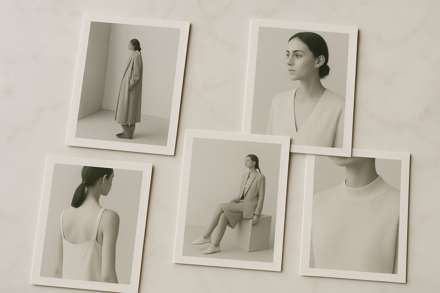
Then there's the typography convergence. Celine (which dropped the accent under Hedi Slimane and kept it dropped), Saint Laurent, Balenciaga, and Burberry all migrated to clean sans-serif or thinned-serif wordmarks. When your logotype is a thin black line on a white background, color becomes secondary. Typographic austerity carries the identity.
The ripple effect extends well beyond fashion. Luxury beauty brands are following suit: La Mer's 2025 packaging refresh softened its already restrained palette further into pale celadon and silver, while Byredo continues to expand its grayscale system across fragrance, makeup, and home. In luxury hospitality, Aman's identity is a study in parchment and stone, and Edition Hotels operates in a world of matte black and warm white.
Here's what the dominant luxury palette looks like in 2025–2026:
Five colors. Four of them are essentially non-colors. The single metallic accent, champagne gold, functions more as a texture than a hue. This is the visual language of luxury right now.
The Strategic Logic: Why Colorless Equals Expensive
This isn't arbitrary. The monochrome migration follows clear strategic logic.
The "stealth wealth" cultural moment. Post-pandemic, post-logo maximalism, high-net-worth consumers signal status through absence rather than presence. A $4,000 cashmere coat in oatmeal says more to its target audience than a $4,000 coat covered in logos. Color restraint mirrors this cultural posture. Quiet luxury isn't just a styling trend; it's a full identity philosophy.
Recession signaling and brand risk aversion. Global luxury spending plateaued in 2025, according to Bain & Company data. When economic headwinds pick up, brands default to "safe" visual identities that feel timeless rather than trendy. Monochrome reads as permanent. Saturated color reads as seasonal, and seasonal reads as risky.
The algorithm problem. Saturated color performs unpredictably across screens, social feeds, and dark-mode interfaces. A vivid coral that looks stunning on a calibrated studio monitor can appear garish on a phone screen in direct sunlight. Monochrome systems are far more controllable in digital-first brand environments. When your entire customer acquisition funnel runs through Instagram and TikTok, visual consistency matters more than visual drama.
Post-logo culture. As logomania fades, brands need identities that work without a hero symbol. Tonal neutrality becomes the identity itself. Call it "vibe branding" over "mark branding." The brand isn't a logo you recognize. It's an atmosphere you feel.
The Cost of Conformity: When Every Brand Looks the Same
Here's the problem. When everyone adopts the same strategy, no one wins.
Design commentators have been documenting this convergence for years. Publications like It's Nice That and the Brand New blog have tracked how luxury houses are shedding their visual distinctiveness at an alarming rate. On social media, independent critics have created side-by-side comparisons showing Celine and Saint Laurent campaigns that are functionally interchangeable. When two brands occupying the same market tier produce imagery that could swap logos without anyone noticing, neither brand owns its visual space.
The data backs this up. A 2025 Vogue Business study found that Gen Z consumers struggle to differentiate luxury houses by visual identity alone when logos are removed. Participants were shown campaign imagery and packaging from five major houses with all wordmarks stripped out. Correct brand identification hovered around 22%, barely above random chance.
The paradox is sharp. Brands strip identity to signal exclusivity, but the uniformity signals conformity instead. The "luxury uniform" becomes its own cliché. If your brand strategy is to look expensive, and every competitor has the same strategy, you don't look expensive. You look generic.
This creates a strategic opening. For brands willing to diverge, the monochrome consensus is actually a gift. The competitive landscape has never been easier to cut through.
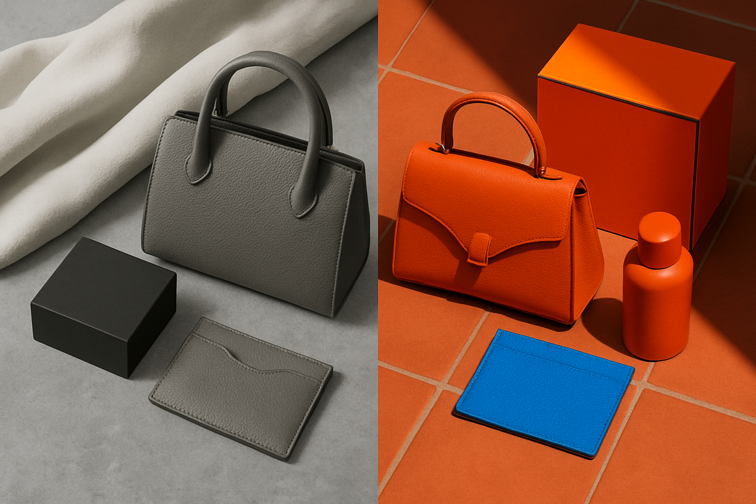
Case Study: Hermès, Jacquemus, and Loewe, the Color Holdouts
Three brands are refusing to join the desaturation trend. Each uses color differently, but all three treat it as structural rather than decorative.
Hermès: The Original Color-as-Identity Brand
Hermès orange (roughly Pantone 1385 C) hasn't shifted in decades. The brand's 2025–2026 campaigns, silk scarf collections, and store environments remain unapologetically saturated. Orange IS the brand. That consistency compounds in value over time, the way a financial asset does. Every year that Hermès stays orange, the association strengthens. Every competitor that abandons color makes Hermès' commitment more distinctive.
The lesson is simple: when you own a color for long enough, the color owns the category.
Jacquemus: Mediterranean Saturation as Emotional Weapon
Simon Porte Jacquemus has leaned harder into saturated color as the rest of luxury pulls away. The brand's 2025 Le Raphia campaign used deep terracotta, azure blue, and sunflower yellow across packaging, pop-ups, and Instagram content. Walking into a Jacquemus pop-up feels like stepping into a sun-drenched courtyard in Provence. In a social feed dominated by gray and cream, that emotional hit is immediate and visceral.
Color functions here as a differentiator, not a decoration. Jacquemus doesn't use color because it's trendy. It uses color because its brand story is about warmth, sensuality, and the South of France. The palette carries the narrative.
Loewe: Bold Color as Intellectual Confidence
Under Jonathan Anderson, Loewe's commitment to a craft-forward, art-adjacent identity uses bold color as a signal of creative authority. The 2025–2026 campaigns feature rich reds, vegetable-dyed leather tones, and gallery-like color blocking that feels deliberate rather than decorative. Anderson's Loewe references ceramics, sculpture, and artisan traditions where color is inseparable from material. A vegetable-tanned leather in deep burgundy isn't just a color choice. It's a statement about process and provenance.
What Unites All Three
Color, for Hermès, Jacquemus, and Loewe, carries meaning. It encodes heritage, geography, or a distinct worldview. None of these brands treat color as trend-dependent. That's the critical distinction. They aren't colorful because colorful is "in." They're colorful because their brand DNA demands it. And that conviction is what makes the color work.
What This Means for Designers: Choosing a Side (Or Not)
So where does this leave you if you're building a brand in the luxury or luxury-adjacent space?
If you're branding an established or heritage-adjacent product, the monochrome approach is lower-risk but demands exceptional execution everywhere else. Without color to carry the identity, you're competing on typography, materials, spatial design, and texture. Your packaging needs to feel extraordinary in the hand. Your retail environment needs to communicate through light and proportion. You're playing the game on hard mode, and the margin for error is thin.
If you're branding a challenger or direct-to-consumer luxury brand, bold color may be the single most effective way to create instant recognition. But it must be ownable and consistent, not seasonal. If you pick terracotta this year and sage green next year, you haven't built a color identity. You've just followed two trends. The Hermès model works because of decades of discipline, not because orange is inherently magical.
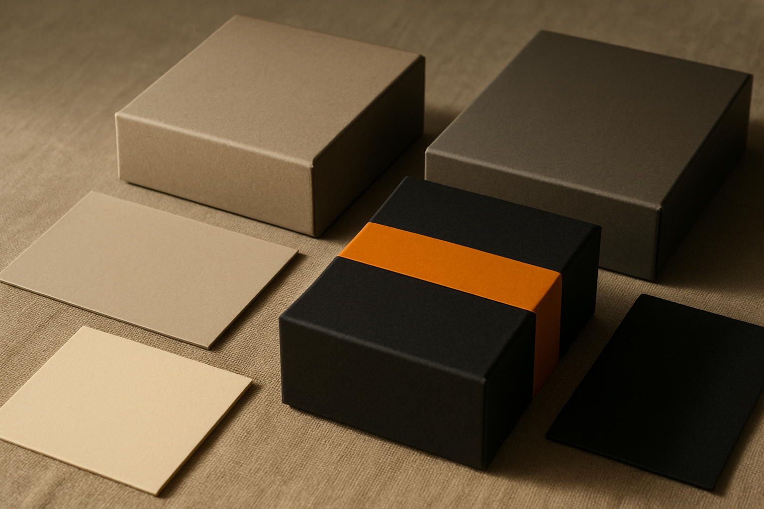
If neither extreme feels right, there's a hybrid approach. Brands like Aesop, Byredo in certain product lines, and Le Labo use a restrained base system with a single accent color or material texture that provides warmth. This middle path is underexplored and full of potential. A system of four neutrals anchored by one deliberate chromatic choice can deliver the sophistication of monochrome with a flash of memorability.
That single saffron accent in a field of neutrals does an enormous amount of work. It gives the eye a place to land. It makes the brand identifiable in a scroll. And it signals intention without shouting.
Building a Luxury Color Strategy That Lasts
Whether you go monochrome, saturated, or hybrid, a few principles hold:
- Commit for decades, not seasons. The most powerful brand color is one that never changes. Hermès proves this. If you're going to claim a hue, you need to be willing to live with it for 20 years. If that thought makes you uncomfortable, you haven't found the right color yet.
- Test across environments. Luxury branding lives across packaging, retail, digital, and editorial. A color must perform in all four to be worth owning. Print it on paper. View it on a phone in sunlight. Wrap a building in it. Project it in a dim retail space. If it doesn't hold up everywhere, it won't hold up anywhere.
- Audit the competitive landscape. Before choosing monochrome by default, map the color usage of every direct competitor. If they're all neutral, a saturated palette may be the most strategic choice you can make. Differentiation is always context-dependent.
- Beware the trend cycle. Today's monochrome luxury will eventually feel as dated as 2010s logomania does now. Brands that anchor to color with genuine meaning will outlast the cycle. Brands that adopted monochrome because everyone else did will scramble when the pendulum swings.
Speaking in Color
The luxury industry's mass migration toward colorlessness is rational. It reflects real cultural, economic, and technological pressures. But Hermès, Jacquemus, and Loewe prove that color, when wielded with conviction and consistency, is one of the most powerful brand assets in existence.
For designers, the takeaway isn't that one approach is right and the other is wrong. It's that the worst strategy is the one chosen by default. Whether you build in monochrome or in full saturation, the decision should be deliberate, defensible, and rooted in what the brand actually means.
In a landscape where everyone whispers, sometimes the boldest move is to speak in color.