The LEGO Color Code: How 40 Approved Shades Built One of the World's Most Recognizable Brands Over 70 Years
by ColorSift Editorial Team
Open a LEGO set today, whether it's a $14 Classic Brick Box or an $850 Millennium Falcon, and you'll immediately know what you're looking at before you even see the logo. That recognition doesn't happen by accident. It's the result of one of the most disciplined, quietly radical color governance systems in the history of product design: a palette so restricted that LEGO engineers have been known to redesign entire elements rather than introduce an unapproved hue.
This post tells the story of how that rigidity, which might sound like a creative straitjacket, became LEGO's most powerful competitive advantage. And what brand designers building systems across physical products, digital platforms, and experiential media can learn from it in 2026.
The Problem With Color: Why Most Brands Get It Wrong
Here's a pattern that plays out across industries. A brand launches with a tight, intentional palette. Then a new product line needs its own identity. A campaign calls for seasonal colors. A platform partner requests specific hues. One by one, new shades creep in. Within a few years, the system collapses into visual noise.
This is the core tension in multi-platform brand design: flexibility versus consistency. Most companies resolve it by leaning toward flexibility. LEGO went the other direction. Hard.
Consider the scale of the challenge LEGO manages in 2026. Physical sets spanning dozens of themes. LEGOLAND parks in 10 countries. A growing streaming universe. Video game franchises like LEGO Fortnite and LEGO Horizon Adventures. Licensed product lines with partners including Disney, Nintendo, Warner Bros., and Universal. Every single one of these touchpoints operates within the same restricted color system.
The central argument here isn't about aesthetics. Controlling color is about cognitive trust, brand memory, and operational efficiency at scale. LEGO proves that a closed palette doesn't limit a brand. It defines one.
The Origin Story: How LEGO's Palette Was Born from Necessity, Not Vision
LEGO's earliest color decisions weren't strategic. In the 1950s and 1960s, the company produced bricks in red, yellow, blue, white, and black. These choices came from manufacturing simplicity and the limits of ABS plastic dyeing at the time. Nobody sat in a boardroom and declared, "These five colors will define our brand for seven decades."
The system began to formalize in the 1970s and 1980s as LEGO expanded into themed sets. Castle needed grey and brown. Space needed transparent neon. Town needed green baseplates. Each new theme required new colors, which forced the company to create internal rules about when and how a new color could enter the system.
Then came the crisis.
By the early 2000s, LEGO had quietly expanded its palette to over 100 colors. Licensed IP partners like Star Wars and Harry Potter demanded specific shades. The result was parts incompatibility, parts obsolescence, and SKU complexity that spiraled into chaos. This color bloat was one of several factors that contributed to LEGO's near-bankruptcy in 2003 and 2004.
The turnaround under CEO Jørgen Vig Knudstorp included a deliberate, sometimes painful color rationalization. The company reduced its palette back to a tightly governed master set. Color discipline became strategic policy, not just a manufacturing preference. It became survival.
The broader lesson here matters: LEGO's palette wasn't designed to be a brand system. It became one through the discipline imposed by constraint.
The Architecture of Constraint: How the LEGO Color System Actually Works
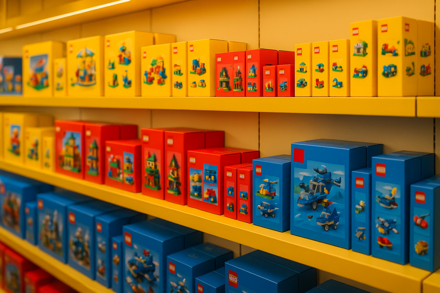
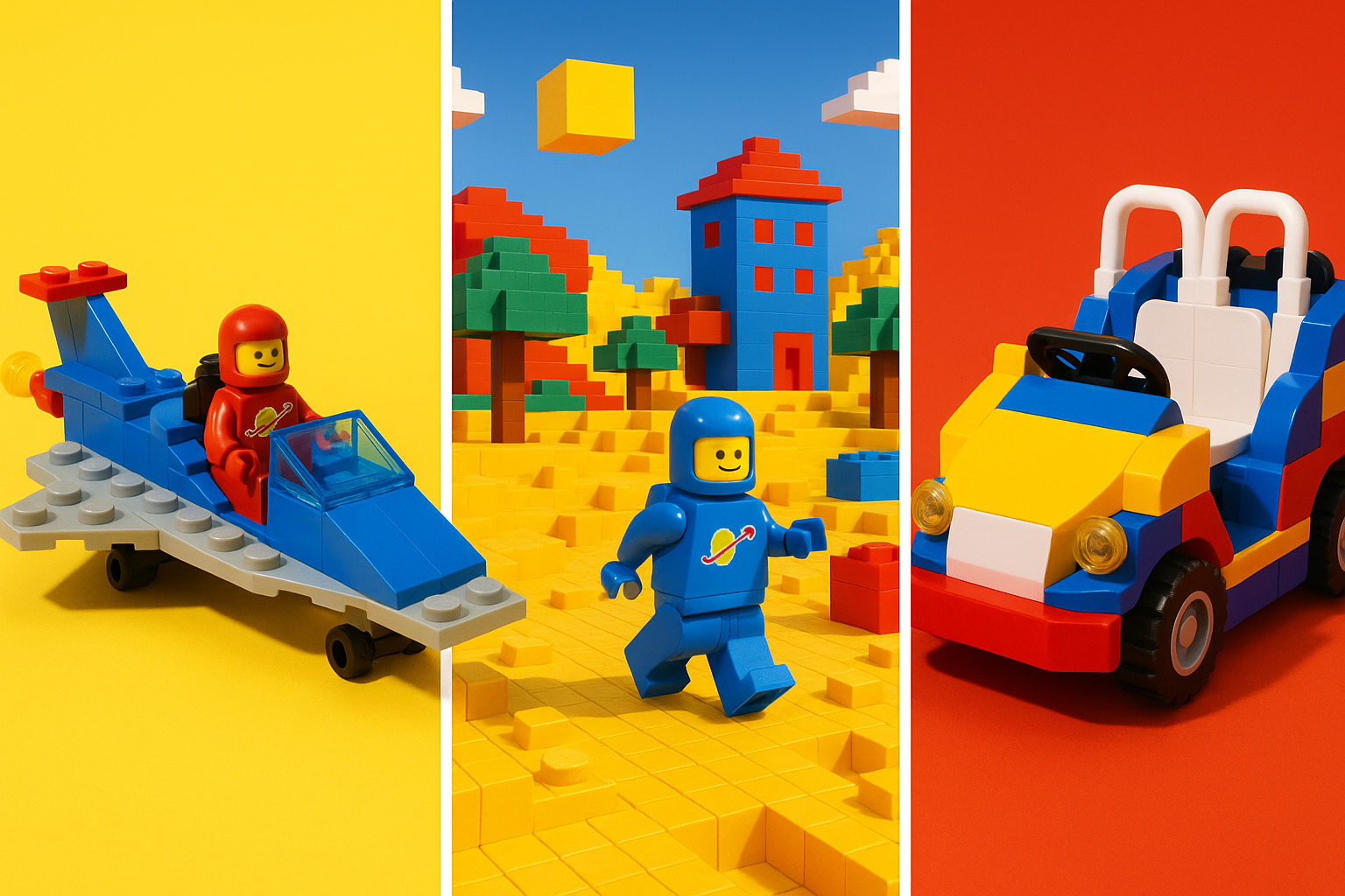
LEGO's current color governance centers on a master palette of approximately 40 approved colors. These are divided into functional categories: structural colors (the greys, blacks, whites, and tans that form the bones of most builds), accent colors (the primaries and secondaries that give sets personality), transparent colors, and special-effect finishes like metallic silver or pearl gold.
Each color carries a proprietary LEGO color code. These don't map directly to Pantone or RAL standards. They're defined by the specific ABS or polycarbonate formulation that produces them.

This is what makes the system unusual. The colors are defined by the physical plastic itself, not by a style guide PDF. A color only "exists" in the LEGO system when it can be reliably reproduced at manufacturing scale across factories in Denmark, Hungary, Mexico, China, and Vietnam. That material reality creates an inherent check against palette creep. You can't casually add a color when adding a color means retooling injection molding machines across five countries.
LEGO's internal Color & Material Design team acts as the gatekeeper. Introducing a new color can take years and requires cross-functional sign-off from engineering, retail, and brand teams. It's a process, not a preference.
The licensing tension is particularly fascinating. IP holders like Disney and Nintendo often push for brand-specific colors. LEGO has largely held the line by demonstrating that "LEGOfication," rendering everything in the existing palette, is actually a feature. When Darth Vader gets a yellow face and blocky proportions, that's not a compromise. That's the product.
Case Study: LEGO Across Every Platform in 2026
The real test of any color system is whether it holds across radically different media. LEGO's does. Here's how.
Physical Sets. Walk through LEGO's 2026 lineup, from the Architecture series to the Botanical Collection, and you'll notice something counterintuitive. The palette constraint forces creative problem-solving. Building organic flower shapes from geometric bricks in a restricted set of greens, pinks, and lavenders produces results that read as distinctly LEGO. Competitor products with more flexible color systems often look generic by comparison. The restriction is what creates the recognizable style.
Packaging. LEGO's box design language is remarkably stable. The red-and-white logo on yellow backgrounds. Primary colors as category signals: blue for City, red-orange for Technic, green for Creator. The packaging translates the product's color story to retail shelves without introducing new hues. Walk through any toy aisle and the LEGO section is identifiable from 20 feet away.
Digital and Gaming. LEGO Fortnite launched in late 2023 and remains a dominant Fortnite mode in 2026. The UI, HUD, and environmental design all operate within a clearly LEGOfied color logic, even in environments that could technically render any color in the spectrum. The digital team made a deliberate choice to honor the physical palette's boundaries. That discipline is why the game feels like LEGO, not like Fortnite with a skin.
Film and Streaming. The LEGO Movie franchise demonstrated something powerful about color as a narrative device. The "real world" scenes were deliberately desaturated. This made the brick world's primary-color vibrancy feel like liberation, like joy. That storytelling choice only works because the palette carries emotional weight. It means something when those saturated reds and yellows fill the screen.
LEGOLAND and Experiences. The theme parks carry the palette into three-dimensional architectural space. Signage, ride vehicles, character costumes, even the food court furniture. Experience designers call this "color coherence": the sensation that you've entered a branded world, not just a themed attraction. In 2026, with LEGOLAND parks on four continents, that coherence is consistent whether you're in Billund, Osaka, or New York.
Why Restriction Is a Competitive Advantage
A restricted palette isn't a creative limitation. It's a recognition system.
Consumers don't need to read the logo if the colors already tell them where they are. Brand theorists call this "color equity," and LEGO has more of it than almost any company outside of Coca-Cola and McDonald's.
There's an interoperability benefit unique to LEGO's situation. Because every brick shares a color language, a child (or a 45-year-old hobbyist) can combine a 1978 Classic set with a 2026 Technic set and it still looks coherent. That cross-generational compatibility is a direct product of color discipline.
The operational efficiency angle deserves attention too. Fewer colors mean simpler inventory, lower tooling costs, easier quality control, and less waste. The creative constraint has a measurable financial return that most brand managers never bother to calculate.
Then there's what I'd call the authenticity effect. In a media landscape saturated with IP-licensed products that often feel like brand dilution, LEGO's insistence on LEGOfying every partner signals creative confidence. Making Hogwarts in tan and dark red, making Mario blocky and bright, these choices say: our system is strong enough to absorb yours.
Compare this with toy brands that chased trend-driven palettes through the 2010s and early 2020s, cycling through pastels, neons, and muted tones to match the moment. Many of those products now look dated. LEGO sets from the same period still look current. That's what color equity buys you: durability.
What Brand Designers Can Steal
Five transferable lessons from the LEGO color system, applicable to any brand operating across multiple platforms.
Define your palette at the material or output level, not just in a style guide. LEGO's colors are "real" because they exist as physical objects. For digital-first brands, the equivalent is defining colors at the component level in your design system. Hex codes in a PDF that nobody opens don't count.
Build a governance process, not just guidelines. LEGO's Color & Material Design team is a structural solution to palette creep. For most brand teams, the equivalent is a clear decision-making authority for color approvals, especially when working with external agencies, licensees, or platform partners who will always push for "just one more color."
Use constraint as a creative brief, not a cage. LEGO designers don't lament the palette. They treat it as the starting condition for every creative problem. Brand teams that internalize this mindset produce more coherent, more inventive work than those who treat the style guide as a ceiling to escape.
Plan for cross-generational coherence. One of LEGO's underappreciated advantages is that their 1990s products don't look embarrassing next to their 2026 products. Ask yourself: will your brand's color decisions still feel right in 10 years? Trend-chasing is the enemy of color equity.
Document the "why" behind every color decision, not just the "what." LEGO's internal color rationale, covering functional categories, manufacturing constraints, and brand tier signals, means that new designers and partners can make good decisions without reinventing the system from scratch each time. Your future team members will thank you.
The Color of Trust
LEGO's color system is, at its core, a story about trust. The trust that comes from showing up the same way, decade after decade, whether you're a plastic brick, a streaming series, a theme park gate, or a video game UI.
The company didn't set out to build one of the world's most powerful color identities. They built a manufacturing constraint, survived a near-collapse when they abandoned it, and then made the radical choice to treat that constraint as a creative philosophy.
The lesson for brand designers in 2026 isn't that you need to reduce your palette to 40 colors. It's that every color in your system should exist for a reason you can articulate. The discipline to say no to the 41st color is often more valuable than the freedom to say yes.
The most recognizable brands in the world aren't the ones with the most colors. They're the ones that made a few colors completely, unambiguously theirs.