Why Japan's Convenience Stores All Look Like Candy: The Color Psychology of Konbini Branding
by ColorSift Editorial Team
It's 3:17 AM in Shinjuku. The streets have quieted to a hum, the neon has thinned, and you're walking alone through a corridor of grey concrete and shuttered storefronts. Then you see it. A glowing beacon of teal, green, and orange, radiating warmth like a nightlight left on for a child. You don't read the sign. You don't need to. Your body already knows: that's a konbini, and it's open, and you're welcome.
Japan's convenience stores, the konbini, are wrapped in some of the most aggressively cheerful, candy-saturated color palettes in global retail. 7-Eleven, FamilyMart, Lawson, Ministop. Each one looks like it was designed by someone who genuinely loves gummy bears. This isn't accidental. It's a carefully evolved design language that transforms a commercial space into social infrastructure, using color to communicate safety, reliability, and belonging in a culture where over 56,000 konbini serve as the connective tissue of daily life.
This article explores why these stores look the way they do, what their colors are really saying, and why Western convenience stores, despite selling similar products, feel like entirely different places.
The Concrete Canvas: Why Konbini Colors Work Because of What Surrounds Them
The dominant visual palette of Japanese cities is concrete grey, asphalt black, utilitarian tile, and glass. Walk through any residential ward in Tokyo or Osaka and you'll notice the architecture is restrained, functional, and almost uniformly neutral. Commercial signage provides bursts of color, but the background canvas stays muted.
Konbini branding is engineered to pop against this backdrop. And it does, spectacularly.
Environmental psychologists call this "figure-ground contrast." A konbini storefront functions as a high-saturation figure against a low-saturation ground, creating instant visual legibility from a distance, around corners, and even in your peripheral vision. You can spot a FamilyMart three blocks away in the dark without consciously looking for it. Your visual system does the work for you.
This is fundamentally different from the problem Western convenience stores are solving. In suburban America, a 7-Eleven sits in a parking lot along a six-lane road. The design challenge is highway-speed signage: big logos, tall poles, bright canopy lighting visible at 60 mph. In Tokyo, the challenge is pedestrian-scale wayfinding through dense, narrow corridors. The entire storefront becomes the sign.
That's why konbini facades often wrap the building in floor-to-ceiling color banding. The brand doesn't live on a sign above the door. It covers everything. At night, the fluorescent interior light passes through glass walls saturated in brand color, creating what designers sometimes call a "lantern effect." The store literally bleeds light and hue onto the sidewalk.
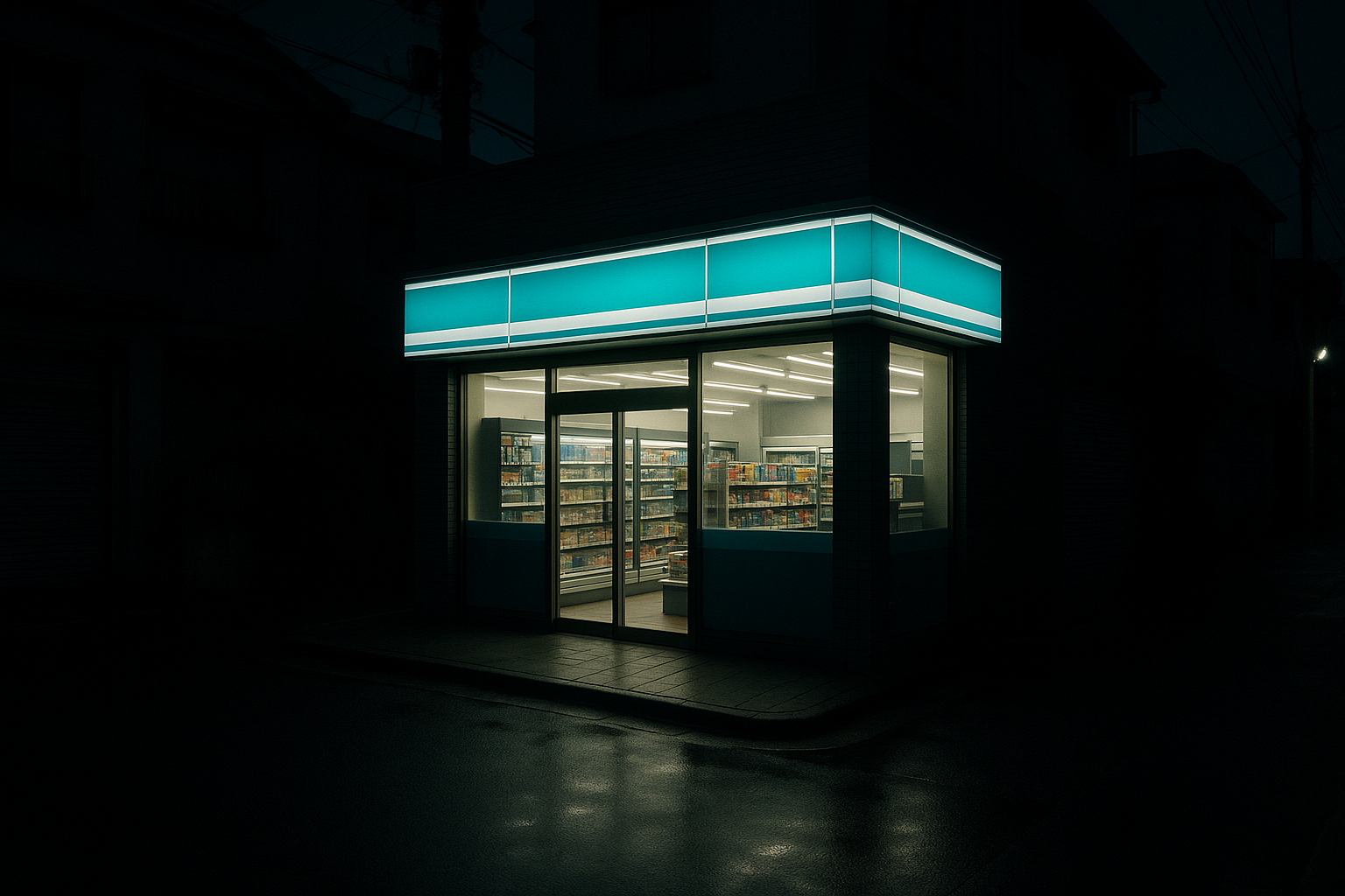
The result is a building that functions less like a shop and more like a lighthouse. And like a lighthouse, its meaning is understood before you read a single word.
Decoding the Big Four: What Each Konbini's Colors Actually Communicate
Each major konbini chain has a distinct palette, and each one is doing something specific.
7-Eleven Japan inherited its tricolor stripe of orange, green, and red from the American parent company, but the Japanese franchise operation (owned by Seven & i Holdings) has refined the application over decades. Orange dominates in-store and on packaging. It's warm, appetizing, high-energy. It signals food quality and freshness, pulling the brand away from the fuel-station convenience vibe it carries in the U.S.
FamilyMart runs a teal-green and blue combination that's unique among major konbini. It reads as cool, clean, and modern. The 2024-2025 store redesigns leaned further into this palette while pairing it with warmer wood tones inside, balancing clinical coolness with domestic comfort. The effect is a store that feels contemporary on the outside and cozy once you step through the door.
Lawson uses a signature milk-blue and white that evokes cleanliness, trust, and, critically, dairy freshness. This is a callback to the brand's origins as an Ohio milk shop in the 1930s. In Japan, this palette has been recontextualized to signal premium quality, especially through the Natural Lawson sub-brand's softer, earthier variation.
Ministop goes boldest of all with a warm yellow-orange and red palette. It's the most explicitly food-coded scheme of the four, deliberately evoking cooked meals and soft-serve ice cream, the chain's signature offering. The warmth positions Ministop as the most "kitchen-like" konbini.
Here's the key insight: despite their differences, all four chains share a commitment to high saturation, high brightness, and full-spectrum visibility. None use muted, dark, or "sophisticated" palettes. This uniformity reveals a shared design logic beneath the brand differentiation. The message across all four is the same: we are bright, we are open, we are here for you.
The 3 AM Test: How Color Reduces the Anxiety of Late-Night Spaces
Psychologists use the term "environmental affordance" to describe how the physical features of a space signal what it's for and whether you belong there. Color is one of the most powerful affordance cues. Research on retail environments has shown that bright, warm, saturated colors lower cortisol responses and increase perceived safety, especially at night.
Konbini are explicitly designed to be welcoming at all hours. Unlike many Western stores that dim lighting or pull security shutters after dark, konbini maintain full illumination and color saturation 24/7. The palette is part of a holistic "always-open" signal system that includes fluorescent interiors bright enough to read by, transparent glass facades that let you see staff inside, and shelves stocked to the edges.
There's also research on color and perceived warmth. Warm-spectrum colors like oranges and yellows literally make spaces feel warmer and more inhabited. This is psychologically significant when you're a lone customer entering a store at 3 AM on a quiet residential street. A cool, dim storefront might register as closed or unwelcoming. A warm, glowing one registers as alive.
In Japanese service design, there's a concept called "anshin" (安心), which translates roughly to peace of mind or a feeling of security. It's a core value in how Japanese companies design customer experiences. Konbini color choices are an expression of anshin. They're not trying to be exciting or edgy. They're trying to be reassuring. The candy-like quality isn't childish. It's deliberately non-threatening. It says: nothing bad happens here.
Case Study: FamilyMart's Glow, and How One Storefront Becomes a Neighborhood Landmark
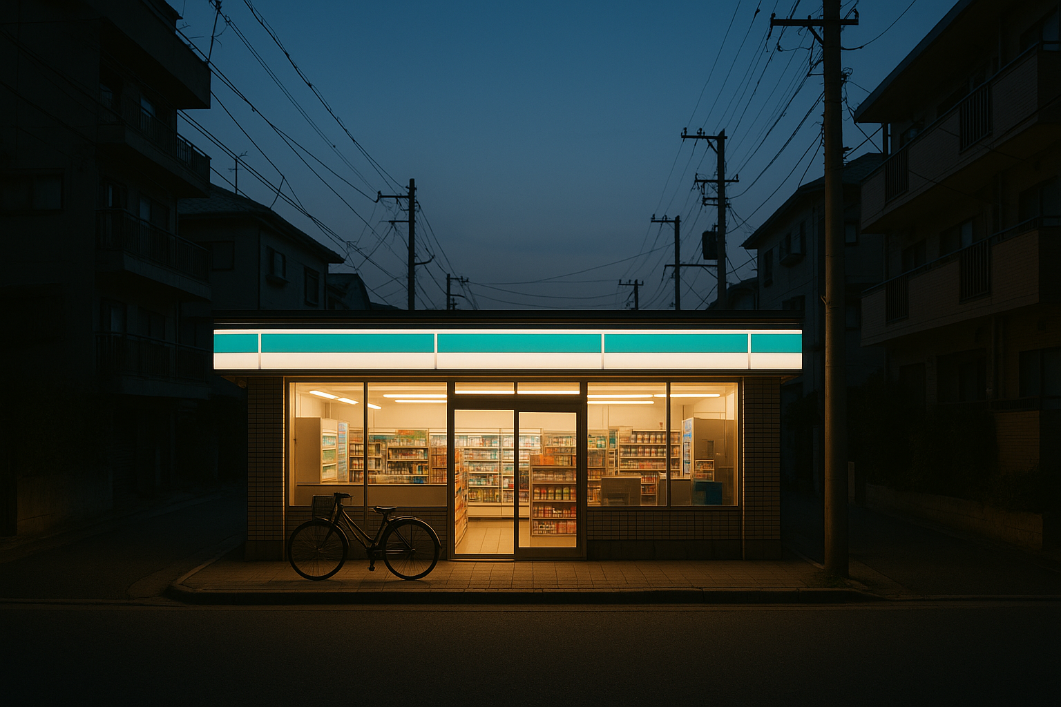
Picture a specific FamilyMart on a quiet residential street in Suginami, a western Tokyo ward of low-rise apartments and narrow lanes. After 10 PM, most businesses close. The izakayas pull their curtains. The tofu shop goes dark. But the FamilyMart stays lit, and its teal-and-white facade becomes the brightest object on the block, a visual anchor point that residents navigate by.
"Turn left at the FamilyMart" is arguably the most common set of directions in Japan.
This isn't just about shopping. Konbini function as social infrastructure that extends far beyond retail. ATMs, bill payment, concert ticket purchasing, package pickup and dropoff, photocopying, public restrooms, disaster supply distribution points. The color branding doesn't just say "shop here." It says "this is a public utility." The brightness of the branding reflects the breadth of the social role.
FamilyMart's 2019 redesign introduced what the company called "FamilyMart-ness," a deliberate effort to make stores feel like extensions of the home. The color strategy split into two layers. Exteriors kept the vibrant teal for wayfinding and recognition. Interiors softened with warm wood accents, lower color temperature lighting, and muted tones that encouraged longer dwell times. The store basically performs a visual handoff: the exterior shouts to get your attention, and the interior whispers to keep you comfortable.
This two-layer approach reveals the broader principle at work. Konbini color strategy operates on two spatial scales simultaneously. At the urban scale, the storefront is a beacon. At the domestic scale, the interior is a living room. Each scale serves a different psychological function, and the transition between them is carefully managed.
Why Western Convenience Stores Feel So Different
Compare konbini branding to the dominant Western convenience store palette. Wawa uses muted red and yellow. Circle K goes red-orange on white. Sheetz runs bold red and black. These palettes skew toward high-contrast, aggressive schemes designed for automotive visibility and impulse stops, not pedestrian comfort.
The difference runs deeper than color choice. Western convenience stores are branded as transactional pit stops. You pull in, grab a coffee, pay, leave. Japanese konbini are branded as destinations and community anchors. You might visit three times a day: morning coffee, lunchtime bento, late-night snack run. The color strategies reflect this fundamental difference in social function.
There's also a cultural perception gap. In many Western markets, convenience stores carry a stigma of low quality, desperation, or even danger. The "late-night gas station" is practically a horror movie setting. Their color palettes often reinforce this: harsh fluorescents inside, minimal exterior color, utilitarian signage that prioritizes price over atmosphere. Japanese konbini color strategy actively works against any such association. Every design choice says quality, safety, welcome.
What's interesting is the emerging influence of konbini aesthetics on Western design. The rise of "konbini-inspired" cafés and retail spaces in London, LA, and New York borrows the saturated, friendly palette and transparent facades. Shops like Konbini in Paris or the wave of Japanese-inspired corner stores in Brooklyn prove that the color logic has cross-cultural power once you decouple it from the gas-station context.
Deeper Than Decoration: Japanese Design Philosophy and the Meaning of "Bright"
In Japanese, the word "akarui" (明るい) means both "bright" and "cheerful" or "optimistic." The linguistic conflation isn't a coincidence. Brightness in Japanese culture carries moral and emotional weight beyond mere visibility. A bright space is a good space. A bright person is a positive person. Konbini lean into this association with total commitment.
This might surprise people who associate Japanese design with minimalism and restraint, the wabi-sabi aesthetic, the Muji store, the zen garden. But konbini branding reveals a parallel tradition: the vibrant, populist, maximalist side of Japanese visual culture. Think manga covers, pachinko parlors, matsuri festival decorations, and dagashi (penny candy) shops. Konbini colors belong to this lineage, not the Muji one.
The dagashi-ya (駄菓子屋, old-fashioned candy shop) connection is more than metaphorical. Konbini literally replaced dagashi-ya as neighborhood gathering points during the 1980s and 1990s, as those small family-run shops closed one by one. It's plausible that konbini inherited some of their visual warmth and approachability. The candy-shop palette migrated to the convenience store because the social role migrated too.
There's one more Japanese concept worth mentioning here: "omotenashi" (おもてなし), the philosophy of wholehearted hospitality. In a traditional context, omotenashi means anticipating a guest's needs before they express them. In an environmental design context, it means the building itself performs a welcoming gesture before any human interaction occurs. The color of the storefront is the first act of hospitality. It greets you from a block away. It tells you what to expect. It makes a promise that the experience inside will keep.
Back to 3 AM
Return with me to that quiet Shinjuku street. The reason that glowing storefront felt like a beacon wasn't just good signage. It was decades of refined color strategy operating on your nervous system, your cultural associations, and your spatial instincts simultaneously.
Japan's konbini look like candy because candy is engineered to be picked up, to feel safe, to promise small pleasures without risk. That's exactly what a konbini offers. And in a culture that has elevated the convenience store into essential public infrastructure, the wrapping has to match the role.
The next time you see that familiar glow on a Tokyo side street, notice what it's doing to you before you even reach for the door. That's color psychology working exactly as intended. Not to sell you something, but to welcome you somewhere.