How Japan's Convenience Stores Won the Color Wars: The Semiotic Brilliance of Lawson, FamilyMart, and 7-Eleven
by ColorSift Editorial Team
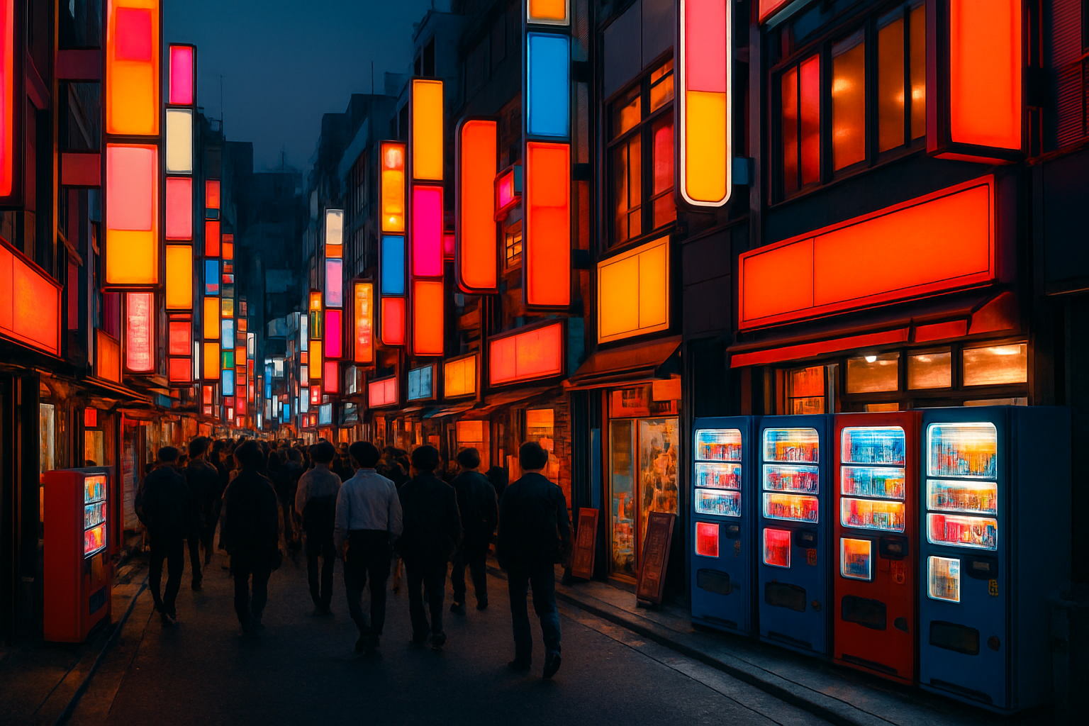
You're standing at the Shibuya crossing at dusk. Thousands of people flood the intersection. Neon competes with LED. Animated billboards cycle through ads for skincare, pop idols, and mobile games. And yet, without reading a single kanji character, you can instantly identify the three convenience stores within your line of sight. A cool blue glow to your left: Lawson. A teal-and-green beacon straight ahead: FamilyMart. The unmistakable warm tricolor stripe to your right: 7-Eleven.
This isn't an accident. It's the result of decades of deliberate chromatic warfare waged across more than 56,000 stores in a country roughly the size of California.
Japan's konbini (convenience store) industry offers what might be the world's most sophisticated case study in color as territorial strategy. And designers working in crowded digital marketplaces have everything to learn from it.
Here's the statistic that sets the stakes: in central Tokyo, the average person is never more than a three-minute walk from a konbini. These brands must achieve instant differentiation at pedestrian speed, in peripheral vision, often from hundreds of meters away. When you strip away the logos, the typography, and the Japanese text, color is what remains. Color is what wins.
The Battlefield: Why Japan's Urban Density Demands Chromatic Precision
Japan has more convenience stores per capita than almost any country on earth. Over 56,000 stores serve a population of 125 million, with roughly 80% of the market split between three dominant chains: 7-Eleven (~21,000 locations), FamilyMart (~16,500), and Lawson (~14,600). In dense commercial districts like Shinjuku or Osaka's Umeda, competing stores can sit literally across the street from each other.
Now layer on the visual environment. Japanese commercial streetscapes rank among the most visually noisy places on the planet. Stacked signage, vending machines glowing on every corner, pachinko parlors pulsing with light, animated billboards cycling through content every few seconds. A convenience store's color identity must cut through this chaos instantly, not after a moment of careful inspection.
This creates a design constraint I'd call "pedestrian-speed branding." Unlike a highway billboard viewed at 100 km/h from a fixed angle, or an app icon viewed in the calm isolation of a home screen, konbini branding must register in the peripheral vision of someone walking at 4-5 km/h on a packed sidewalk. The challenge is closer to wayfinding systems in airports than traditional retail identity design.
The cultural context matters too. Japan's design culture prizes visual order and systematic thinking. The color strategies of these three chains didn't emerge randomly. They were refined through decades of competitive pressure in a market where customer switching costs are essentially zero. All three chains sell nearly identical products at identical prices. The store you choose is, more often than not, the store you see first. And seeing first means owning a color so completely that it registers before conscious thought kicks in.
The Three Palettes: A Chromatic Deep Dive
Let's look at what each chain actually did with color, and why the collective result is so effective.
Lawson: The Blue Fortress
Lawson's identity is built on a single, ownable blue, a mid-tone cobalt that reads as clean, trustworthy, and distinctly cool against the warm chaos of Japanese streetscapes. The milk-can logo and consistent blue awning create a visual shorthand so strong that Lawson stores are recognizable even when the logo itself is partially obscured by pedestrians, utility poles, or neighboring signage.
The restraint here is the real story. Lawson uses white as its only secondary color. No accent hues. No gradients. Just blue and white. This maximizes the blue's signal clarity, turning every Lawson storefront into a single, unmistakable chromatic beacon.
FamilyMart: The Teal Negotiation
FamilyMart's palette is more complex: a combination of green, teal, and blue arranged in horizontal stripes. The current identity evolved after the 2016 merger with Circle K Sunkus, and it threads a careful needle between warmth (the green tones) and professionalism (the blue undertones). The stripe system creates a distinctive horizontal rhythm that differentiates FamilyMart from Lawson's solid blocks of color. Where Lawson is a wall of blue, FamilyMart is a band of stripes. The pattern itself becomes a secondary identifier.
7-Eleven: The Tricolor Advantage
7-Eleven Japan, operated by Seven & i Holdings, uses the globally recognized orange-green-red stripe. But in Japan, the execution is uniquely refined. The warm palette stands in maximum chromatic contrast to both Lawson's cool blue and FamilyMart's teal-green. You might expect three colors to dilute recognition compared to Lawson's single-color discipline. The opposite is true. The tricolor stripe becomes a pattern, not just a color. Your eye learns the sequence, and that sequence is unlike anything else on the street.
The Key Insight: Chromatic Equilibrium
Here's what makes this system remarkable as a whole. These three palettes collectively tile the color wheel with almost no overlap. Cool blue. Teal-green. Warm orange-red. Each brand has maximized its perceptual distance from the other two. This is competitive chromatic equilibrium: a stable state where no brand can shift its palette toward a competitor's territory without losing distinctiveness.
It looks deliberate. It probably started as intuition and became strategy through competitive pressure. Either way, the result is an object lesson in how color differentiation works at scale.
Co-Existence on the Same Block: Color as Territorial Wayfinding
Picture a single city block in Osaka's Namba district. All three chains are visible simultaneously. You're a tourist. You don't read Japanese. Your phone is dead. You need an ATM, and you remember that the blue store had the international ATM last time.
You scan the block. Blue glow on the left. Done.
That entire decision took less than a second. No signage reading. No logo recognition. Pure color wayfinding.
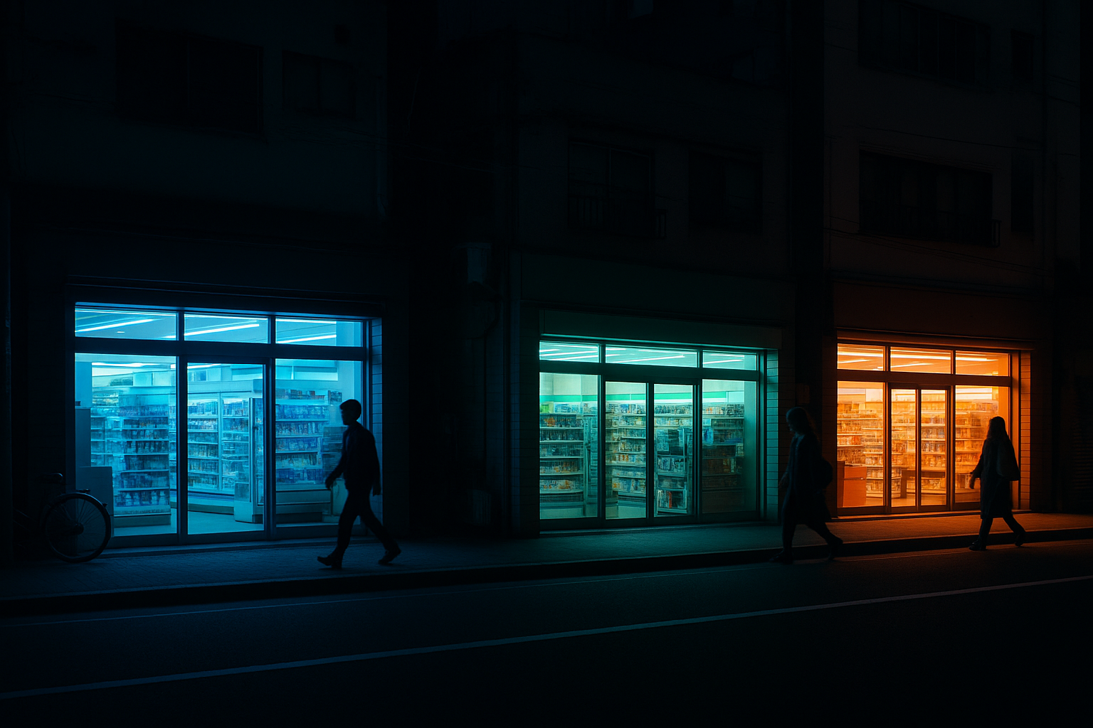
This works because konbini color isn't confined to the sign above the door. Japanese convenience stores are famously bright, often the most luminous storefronts on their block. The interior lighting is calibrated to reinforce the brand palette. Lawson stores feel cooler under their fluorescent wash. 7-Eleven stores radiate warmth. The brand color permeates the entire storefront glow, creating what I'd call a "color aura" that's visible from a full block away, even at night.
Awning and fascia design add another layer. Lawson uses a full-width blue band across the top of the storefront. FamilyMart uses striped horizontal bands. 7-Eleven applies its tricolor stripe as an accent on a predominantly white or neutral fascia. These structural differences in how color is applied (solid vs. striped vs. accent) create a secondary differentiation channel beyond hue alone.
In semiotic terms, each chain has staked out not just a color but a color behavior: how much of the storefront is colored, how the color interacts with white space, and whether the palette leans warm or cool. This multi-dimensional differentiation is far more robust than simple color ownership. It's color ownership plus pattern ownership plus temperature ownership, all working together.
Case Study: Lawson's Blue and the Art of Sub-Brand Stretching
Lawson faces a challenge the other two chains don't share at the same scale. It operates multiple sub-brands: Natural Lawson, Lawson Store 100, and Lawson+. Each must feel distinct while remaining recognizably part of the Lawson family.
Natural Lawson uses an earth-toned, muted palette with brown and green accents. It deliberately breaks from the parent blue to signal a premium, health-conscious positioning. Walk past a Natural Lawson and the feel is closer to a boutique grocery than a convenience store. Yet the store format, logo structure, and typography maintain enough continuity that customers understand the family relationship without effort.
Lawson Store 100, the discount format, retains the blue but shifts it toward a lighter, more utilitarian value. It pairs this lighter blue with bold price signage in red and yellow, borrowing the visual language of discount retail while keeping Lawson's chromatic DNA intact.
This sub-brand architecture demonstrates a principle directly applicable to digital product design. A strong parent color can anchor an entire brand family while sub-brands modulate saturation, value, and accent colors to signal positioning differences. Think of how Google uses its four-color system across Search, Maps, Gmail, and Photos, maintaining coherence while giving each product a slightly different emphasis.
The lesson: if your core color identity is strong enough, you can stretch it across multiple products or tiers without losing the thread. But the parent color must be owned absolutely. Lawson can stretch to brown and green for Natural Lawson because the cobalt blue is so firmly established that the family connection survives the shift.
What Western Retail (and Digital Designers) Get Wrong
Now contrast the konbini system with Western convenience store branding. In the U.S., both CVS and Walgreens use red-on-white as their dominant color scheme. Despite being different types of businesses (pharmacy-first vs. pharmacy-retail hybrid), they create frequent consumer confusion at street level. BP, Shell, and various gas station convenience stores compete in a visual soup of red, yellow, and green with far less chromatic discipline.
The core lesson from Japan is this: the konbini chains treat color as infrastructure. It's as essential to their competitive strategy as store location or supply chain logistics. Color isn't a branding afterthought selected from a mood board in a conference room. It's a strategic asset managed with the same rigor as real estate.
The parallel to crowded digital marketplaces is direct. App store listings, SaaS dashboard ecosystems, and multi-brand e-commerce platforms face the same "same-block" problem as competing konbini. When your product sits directly adjacent to competitors, color differentiation at a glance becomes a survival trait.
Consider this framework: chromatic equilibrium as a competitive design audit. Before choosing a brand color, map the color space already claimed by your direct competitors. The konbini example shows that the most effective color choice isn't the one you personally prefer. It's the one that maximizes perceptual distance from every adjacent competitor.
And note the lesson about restraint. Lawson's single-color discipline is arguably more powerful than 7-Eleven's tricolor because it's easier to own one color completely. For startups and new brands, this suggests a bias toward chromatic simplicity. Pick one color. Own it totally. Let competitors have the rest of the wheel.
The Invisible Design System: Color, Culture, and Trust
Color carries particular weight in Japanese commercial culture. The concept of kanban (signboard) culture means that a store's visual presence is a promise of reliability and permanence. A konbini's color isn't just branding. It's a social contract that signals safety, cleanliness, and 24/7 availability.
This chromatic consistency has trained an entire population to navigate by color. Japanese residents routinely give directions referencing konbini colors: "Turn left at the blue Lawson." "The restaurant is past the green FamilyMart." The brands have become part of the urban wayfinding lexicon, as reliable as street signs and more visible than most.
Seasonal and limited-edition variations reinforce this discipline through contrast. During cherry blossom season or regional festivals, konbini may introduce limited packaging or in-store displays with seasonal colors. But the exterior palette remains inviolate. Always. This separation between "permanent identity color" and "ephemeral campaign color" is a discipline many Western brands lack. How many times have you seen a brand overhaul its social media presence for a seasonal campaign, muddying the very color associations it spent years building?
The most trusted digital products follow the konbini model, whether they know it or not. Google's core four colors don't change for holidays. Stripe's purple doesn't shift for product launches. Notion's black-and-white foundation stays constant while illustrations and secondary elements carry seasonal energy. The boundary between permanent and ephemeral color should be explicit and rigorously maintained.
Back to the Crossing
Return with me to Shibuya at dusk. The crowd surges. The light changes. And those three glowing storefronts, blue, teal-green, warm tricolor, still pulse at the edges of your vision like chromatic lighthouses.
The genius of Japan's konbini color wars isn't in any single brand's palette. It's in the emergent system: the way three competitors, through decades of pressure, partitioned the color wheel to create a stable chromatic ecosystem. Each brand is more recognizable because the others exist. The contrast is mutual. The system is self-reinforcing.
For designers working in any crowded competitive space, from app stores to SaaS marketplaces to multi-brand retail, the lesson is both simple and profound.
Color is not decoration. It is territory.
In a dense environment, the brand that owns its color most completely is the brand you find first. The next time you're choosing a brand color, don't start with your mood board. Start with your competitors' colors. Map the space they've claimed. Then find the open gap on the wheel, plant your flag, and never let go.