The Invention of 'Millennial Pink' — How a Color Got Named, Memed, and Killed in Five Years
by ColorSift Editorial Team
In 1979, researcher Alexander Schauss convinced the Naval Correctional Center in Seattle to paint a holding cell a specific shade of bubblegum pink. The color, later called Baker-Miller pink after the facility's commanding officers, was supposed to reduce aggression. And for a brief, strange moment, it seemed to work. Inmates calmed down. Blood pressure dropped. Then the effect wore off, the study was never reliably replicated, and the color faded into footnote status.
Until, roughly thirty-five years later, it showed up on a Tumblr mood board. Then on a Scandinavian runway. Then on every direct-to-consumer brand's Instagram feed. Then on the walls of every third restaurant in Brooklyn. Suddenly this dusty, salmon-adjacent, not-quite-pastel pink had a new name and a new mythology. It was "Millennial Pink."
This is the story of how a color was discovered, named, universally adopted, and culturally exhausted in roughly five years. And what that lifecycle tells us about how aesthetic meaning is made, accelerated, and destroyed in the age of social media.
Before It Had a Name: The Prehistory of a Muted Pink
The Baker-Miller pink experiment is one of those pop-science stories that refuses to die. Schauss claimed that a specific pink (hex roughly #FF91AF) could suppress aggression on a physiological level, bypassing conscious thought entirely. The Navy painted the cell. Corrections officers reported calmer inmates. The media ran with it.
The problem? Follow-up studies couldn't reproduce the results. Some researchers found that any novel environmental change temporarily altered behavior, and that the pink itself had no special properties. But the story stuck, because we want colors to have power. We want them to mean something beyond wavelength.
Pink, of course, already meant plenty. The 20th century loaded it with gender coding so heavy you could barely see the hue underneath. Pink was for girls. Pink was Barbie. Pink was princess culture and baby showers and everything a certain strand of feminism spent decades pushing back against.
But there were always counter-readings. Elsa Schiaparelli's "Shocking Pink" in the 1930s weaponized the color as high-fashion provocation. The riot grrrl movement of the 1990s reclaimed it with irony and teeth. Each reclamation, though, still operated in conversation with pink's dominant coding. You wore hot pink because it was gendered, as a form of defiance.
The shade that would become Millennial Pink was different. It wasn't one shade at all. It was a range: salmon, nude, blush, dusty rose. What unified it was desaturation. These pinks were warm, muted, and slightly ambiguous. They didn't scream "feminine" the way a Barbie fuchsia did. They whispered something harder to pin down.
The early sightings matter. Wes Anderson's The Grand Budapest Hotel landed in 2014 and aestheticized this exact tonal range for a generation already primed by Tumblr's pastel visual culture. The film's candy-box color palette, centered on a faded pink hotel facade, gave the shade a cinematic legitimacy. It looked like nostalgia for a place that never existed. And that feeling, it turned out, was exactly what a lot of people were looking for.
{{image-1}}
The Naming: How a Hex Code Became an Identity
A color can exist for years without cultural weight. What changes everything is the name.
The phrase "Millennial Pink" entered the lexicon through a 2016 article in The Cut by Véronique Hyland. Hyland didn't invent the trend. She crystallized something people had been noticing but hadn't articulated. The piece gave the shade a label, and that label gave it a story.
The name stuck because it wasn't just a color description. It was a generational claim. The word "millennial" did the heavy lifting, linking the shade to avocado toast discourse, Instagram aesthetics, and a specific cohort's visual identity. Calling it "Millennial Pink" implied that this wasn't just a preference. It was a demographic phenomenon. A collective mood rendered in pigment.
This is worth pausing on, because it reveals something about how color culture actually works. Pantone's "Color of the Year" operates top-down: a committee selects a shade, issues a press release, and the design industry dutifully incorporates it into mood boards. Millennial Pink operated from the bottom up. Nobody appointed it. It spread through Tumblr reblogs, Instagram feeds, and retail copycat cycles. It was a grassroots, meme-driven color movement, and that made it feel authentic in a way that a Pantone announcement never could.
Then there were the gender politics. Millennial Pink was embraced as "post-gender" or "ironic pink" by men and women alike. It felt like a reclamation that was actually progressive: a pink you could wear without performing traditional femininity, a pink that signaled softness without surrendering to the princess industrial complex. Whether that reading was real or just marketing language dressed up as cultural criticism is a question worth holding onto. We'll come back to it.
The Takeover: Glossier, Acne Studios, and the Infrastructure of a Color Trend
If Millennial Pink had a flagship brand, it was Glossier.
Emily Weiss launched the beauty company in 2014 with a visual identity built almost entirely on a muted pink. The pouches. The stickers. The flagship store on Lafayette Street with its pink-carpeted stairs. Glossier didn't just use the color as decoration. It made the color feel like a worldview: approachable, skin-first, "no-makeup makeup." The pink was ideological. It said, "We're not your mother's beauty brand. We're not intimidating. We're the cool girl who just happens to sell moisturizer."
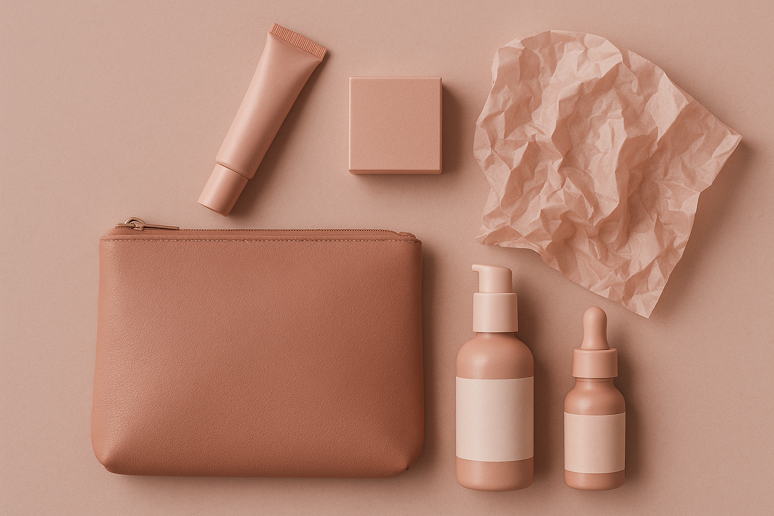
Acne Studios pulled off a similar trick from a different angle. The Swedish fashion house's blush-pink shopping bags became street-style accessories in their own right. People carried them around long after buying their $300 sweaters, because the bag signaled taste. A utilitarian object became a status symbol purely through color choice.
Then came the Instagram feedback loop. Millennial Pink photographed beautifully in natural light. It worked as a background for flat-lay product shots. It harmonized with the platform's early-2010s warm-toned filters. In a very literal sense, the color was optimized for the feed. If your product looked good against pink, and pink backdrops got more engagement, and more engagement meant more visibility, then the algorithm itself was selecting for pink.
The commercial cascade followed predictable logic:
- Fashion and beauty adopted it first (Glossier, Acne, Mansur Gavriel).
- Restaurants followed (Pietro Nolita in NYC painted its entire interior pink and became an Instagram destination).
- Co-working spaces picked it up (The Wing, the women-focused workspace, leaned hard into blush tones).
- Tech branding absorbed it (Casper mattress ads, Away luggage, a dozen DTC startups).
- Real estate staging completed the cycle, with flippers painting accent walls in dusty rose.
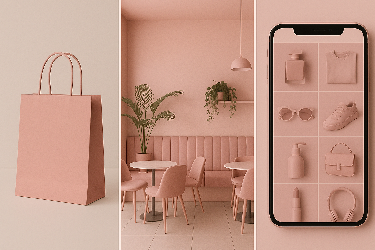
By 2017, the color was everywhere. Not because of coordinated marketing, but because of mimetic spread through visual social media. Each adoption reinforced the next. Each Instagram post was both consumption and advertisement.
Peak Pink: When Ubiquity Becomes Meaning, and Then Meaninglessness
Here's the thing about a trend that spreads through imitation: the very mechanism that makes it popular is the same mechanism that kills it.
By 2017 and 2018, trend pieces were already declaring "Millennial Pink is over." The backlash wasn't against the color itself. It was against what the color had come to signify: a generic, Instagram-optimized, direct-to-consumer sameness. When every new brand launching on Shopify used the same blush-and-white palette, the color stopped communicating "taste" and started communicating "template."
The meme phase sealed it. Millennial Pink became a punchline in "millennial starter pack" images, appearing alongside succulents, marble countertops, and "live laugh love" signage. This is what happens when a cultural signal gets so widely adopted that even its adopters can see the pattern. The joke wasn't "this color is ugly." The joke was "we all fell for the same thing."
The speed of this cycle is the real story. A color going from "this feels fresh and specific" to "this feels like every brand is copying every other brand" used to take a decade or more. Social media compressed it to months. The same platforms that accelerated adoption also accelerated fatigue. You can only scroll past the same shade 10,000 times before your brain flags it as noise.
The design industry bears some responsibility here. When every mood board, every pitch deck, and every new brand identity defaults to the same palette, the palette stops being a choice and starts being a reflex. And reflexes don't signal originality.
The Backlash Machine: How Colors Die in the Algorithm Age
To understand how fast Millennial Pink burned out, compare it to its historical predecessors.
Harvest gold and avocado green dominated the 1970s for a full decade before becoming punchlines. Those colors spread through slower channels: magazine ads, retail catalogs, appliance showrooms. Their saturation point took years to reach because visibility itself was distributed unevenly. You might see avocado green in your neighbor's kitchen, but you didn't see it 200 times a day on a screen in your pocket.
Millennial Pink completed the same lifecycle in roughly five years. From emergence (2013-2014) to naming (2016) to peak saturation (2017) to backlash (2018) to cultural exhaustion (2019-2020). The compression is almost entirely attributable to algorithmic amplification.
Social media doesn't just spread trends faster. It creates a visibility threshold where a trend becomes so omnipresent that even people who genuinely liked it begin to feel exhausted. The algorithm has no "enough" setting. It rewards engagement, and a trending aesthetic generates engagement, so the algorithm serves more of it until the audience's tolerance collapses.
What replaced Millennial Pink? Briefly, "Gen Z Yellow." Then "dopamine dressing" maximalism. Then, as the pandemic settled in, the muted sage greens and earthy neutrals that dominated 2020 and 2021. Each successor defined itself partly in opposition to the pink moment. The greens and browns said, implicitly: We are serious. We are grounded. We are not performing for Instagram.
The most interesting casualty was Glossier itself. The brand had built its entire visual identity around Millennial Pink, and when the color's cultural meaning shifted from "fresh" to "over," the brand faced an impossible choice. Evolve the palette and risk losing the recognition you spent years building? Or keep it and risk looking like a time capsule? Glossier's well-documented struggles between 2019 and 2022, and its partial rebrand in 2023, are at least partly a case study in what happens when you bet your entire visual identity on a trend color that expires.
What a Dead Color Teaches Living Designers
So what do you actually take away from this?
The difference between a color trend and a color identity is scarcity. Tiffany blue has lasted since 1837 because it was proprietary and restricted. You couldn't use Tiffany blue without evoking Tiffany. Millennial Pink was ambient and free. Anyone could use it, so everyone did, and its meaning diluted to zero. Owning a color requires restriction and consistency, not just adoption.
Timing and context are the actual "meaning" of a color. The same muted pink reads as revolutionary in 2014, default in 2017, and dated in 2020. The color didn't change. The cultural frame around it did. If you're choosing a palette for a brand today, you need to ask not just "does this look good?" but "where is this color in its cultural lifecycle?"
Practical lessons for brand designers:
- Use trend colors as accents, not foundations. A Millennial Pink highlight on a neutral base ages better than a Millennial Pink identity system.
- Stress-test your palette against a five-year horizon. If the color is already appearing on competitor mood boards, you're late.
- Study how the color is being discussed online. When a shade starts showing up in memes and starter packs, it's entering its decline phase.
The deeper lesson is simple but easy to forget. Colors don't have inherent cultural meaning. They acquire it through context, repetition, and association. And they lose it the same way. The designers who understand this cycle can ride it. The ones who don't get consumed by it.
The Prison at Both Ends
Millennial Pink was never really about pink. It was about a generation finding a visual shorthand for a set of values: softness without weakness, femininity without frivolity, taste without pretension. And then watching that shorthand get copied so many times it stopped meaning anything at all.
The color's five-year lifecycle is a compressed case study in how all aesthetic meaning works. Something feels new. It gets named. It spreads. It saturates. It curdles. It eventually becomes a nostalgia object. What used to take decades now takes a single presidential term.
For designers and brand builders, the lesson isn't to avoid trend colors. It's to understand that you're not choosing a color. You're choosing a position on a timeline. The question isn't "is this color beautiful?" It's "where is this color in its cultural life, and will my brand still make sense when the color's meaning shifts?"
Baker-Miller pink started in a prison cell. Millennial Pink ended in one too: a perfectly curated, Instagrammable, aesthetically flawless prison of its own ubiquity.