Borrowed Light: How to Build Interior-Inspired Color Systems for Residential App UIs in 2026
by ColorSift Editorial Team
Look at any leading AI home-design app in 2026 and try to tell me where the editorial spread ends and the interface begins. Warm linen backgrounds. Terracotta call-to-action buttons. Aged-brass icon strokes that look like they belong on the cover of Kinfolk. When did our apps start feeling like rooms?
The answer is: gradually, then all at once. Interior-influenced palettes are emotionally resonant and very much on-trend this year, but translating analog warmth into a rigorous, accessible digital color system is genuinely hard. Dusty sage looks gorgeous on a mood board and fails WCAG contrast the moment you drop it into a button. By the end of this guide, you'll have a repeatable framework for building token-based, WCAG-compliant color systems that feel warm, tactile, and unmistakably 2026, without sacrificing a single point of usability.
Why Interior Aesthetics Are Taking Over Home-Adjacent App UIs
The post-pandemic home-nesting wave didn't fade. It matured. By 2026, "home" became a full lifestyle identity, and the apps followed. Houzz evolved its visual language. Zillow warmed up. A new generation of AI-powered tools like Roomvo and Planner 5D AI matched their interfaces to the taste level their users now expect.
The psychology is straightforward. Warm, editorial palettes signal craft, curation, and premium quality. These are the same levers luxury interior brands have pulled for decades, now applied to conversion-focused UI. A linen background says "curated." A terracotta accent says "considered." Together, they say "trust me."
The visual shift is measurable. Across the home and real estate app category in 2026, the cold, high-contrast "tech blue" paradigm is receding. Warm neutrals, earth tones, and organic accent colors have moved in.
But here's the core design challenge. Analog color references, a swatch of linen, a terracotta tile, a sage-painted wall, don't map cleanly to hex values. And even when they do, they often fail contrast and accessibility requirements straight out of the source material. The rest of this article solves that problem.
Sourcing Analog Color: How to Read a Room Like a UI Designer
Extracting digital color seeds from physical references requires deliberate method. Photograph your source material under controlled lighting. Golden hour adds warmth; overcast light is more neutral. Both are useful, but you need to know which one you're working with.
Pull your references into Coolors or Adobe Color and sample directly from interior mood boards. Keep in mind that pigment color behaves differently from screen color. Paint mixes subtractively. Screens mix additively. A color that looks perfect on a tile may look flat or oversaturated on a display.
In 2026 residential app design, four interior archetypes dominate:
- The Linen Modernist: Off-whites, warm grays, barely-there blush. Clean, airy, Scandinavian-adjacent. Maps to brands that want to feel calm and elevated.
- The Terracotta Traditionalist: Burnt oranges, clay, deep ochre. Grounded, confident, Mediterranean-inflected. Maps to brands that want to feel established and warm.
- The Sage Naturalist: Muted greens, stone, raw linen. Organic, trustworthy, sustainability-forward. Maps to brands that want to feel responsible and modern.
- The Aged Brass Maximalist: Deep teal, antique gold, dark walnut. Rich, editorial, high-end. Maps to brands that want to feel luxurious and distinctive.
Once you've sampled your colors, apply what I call the "warmth shift." Most sampled colors need a deliberate hue rotation of 5 to 15 degrees toward yellow/red on the color wheel to survive the cold bias of most display profiles. They also need a saturation trim of 10 to 20 percent to avoid looking garish on screen. This small adjustment is the difference between a palette that looks "inspired by interiors" and one that actually works on a backlit display.
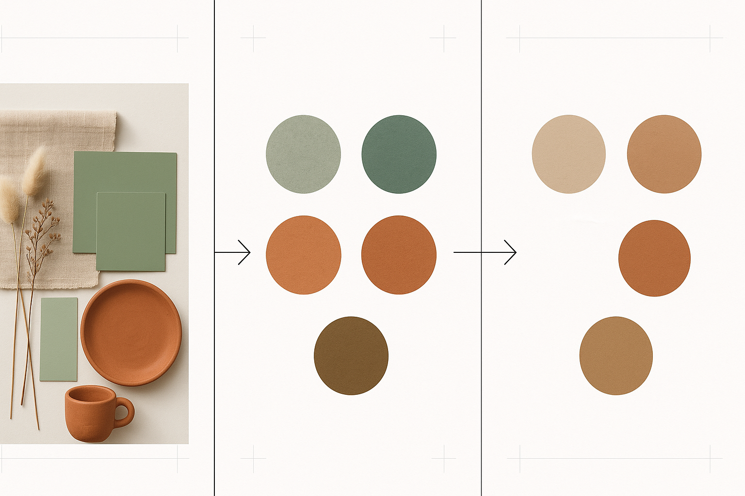
The shift is subtle but critical. Raw samples pulled from a mood board almost always skew too cool and too saturated once they hit a screen. The adjusted palette feels warmer, more cohesive, and closer to the emotion of the original room.
Building the Token Architecture: From Mood Board to Design System
A solid interior-inspired color system runs on two tiers of tokens.
Primitive tokens are your raw color ramp. Think Terracotta-100 through Terracotta-900. These are the full spectrum of a single hue family, organized by lightness.
Semantic tokens are purpose-mapped aliases. color/surface/primary, color/action/default, color/text/on-brand. They point to primitive values but carry meaning. This separation is non-negotiable if you want theming, dark mode, or any future flexibility.
For building the primitive ramp, OKLCH is the color space to use in 2026. It's increasingly standard across design tooling for a good reason: OKLCH produces perceptually even lightness steps that HSL simply cannot. In HSL, a "50% lightness" green looks dramatically different from a "50% lightness" yellow. In OKLCH, equal lightness values actually look equally light to human eyes. This is critical for maintaining warmth across a full ramp without unexpected jumps.
The recommended palette structure for a residential app:
- 1 dominant warm neutral (your background family)
- 1 to 2 brand accent colors (primary action plus secondary highlight)
- 1 semantic color set (success, warning, error)
- 1 neutral gray ramp that is deliberately warm (never pure gray)
The Linen Modernist system anchors on a creamy off-white surface with a warm greige for secondary elements, blush rose for primary actions, and warm slate for text. Every gray in this system carries a hint of warmth.
The Terracotta Traditionalist system centers on clay and earth. The parchment surface keeps things light and readable. Deep ochre provides a secondary accent. Warm charcoal replaces pure black for all text, maintaining the palette's warmth even in the smallest typographic details.
The Contrast Problem: Preserving Warmth Without Failing WCAG
Here's the central accessibility paradox. The colors that feel most warm and analog, dusty sage, faded terracotta, aged brass, are inherently mid-range luminance values. They almost always fail WCAG AA's 4.5:1 contrast requirement against the warm light surfaces they're typically paired with.
The solution is the "anchor dark" strategy. Every warm palette needs at least one deeply saturated, warm-dark token. Think dark espresso brown or deep forest green. This anchor serves as the primary text and interactive element color, providing contrast without resorting to cold black (#000000 or #111111).
Let's work through the math. A terracotta seed color (#C1634F) placed on a linen background (#F5F0E8) produces roughly a 3.1:1 contrast ratio. That fails AA. Now, darken within OKLCH, keeping the hue channel constant, until you reach approximately #8B3A2A. That hits about 5.2:1 contrast. The color still reads as terracotta. It still carries the warmth. It passes.
The "warm gray" substitution pattern makes a dramatic difference with minimal effort. Replace pure #000000 text with a warm-tinted near-black like #1C1714. Replace pure #FFFFFF backgrounds with a warm off-white like #FAF7F2. These tiny shifts increase the perceived warmth of the entire system without affecting contrast ratios at all.
For tooling, Figma's OKLCH contrast checker (released earlier this year) handles the math natively. Polychrome's accessibility audit plugin catches failures across an entire file. And the Accessible Palette generator builds compliant ramps from a single seed, saving hours of manual work.
Case Study: How a Hypothetical AI Home-Design App Builds Its System
Meet Hearthside, a fictional but plausible AI home-staging and interior-design app. Its brand positioning: warm, aspirational, trusted advisor, premium but approachable. This mirrors the real design challenges facing apps like Roomvo or a next-generation Houzz.
Hearthside's team chose the Sage Naturalist archetype. They sourced their seed from a specific Farrow & Ball paint reference, Mizzle No. 266, a complex sage green with gray undertones. After photographing the swatch under controlled overcast light, they sampled the hex value, applied a 10-degree warmth shift toward yellow, and trimmed saturation by 15 percent.
From that adjusted seed, they built a 9-step OKLCH ramp, from near-white sage tint to deep forest. Then they mapped it to semantic tokens: color/surface/primary points to Sage-50, color/action/default points to Sage-700, color/text/on-brand points to Sage-900.
The contrast problem surfaced immediately. The brand sage at its natural mid-range value failed on the light surface. So the team created two critical tokens: a "deep sage" (#2D4A3E) for interactive states and CTA text, and a "sage tint" (#EFF4F1) for surface use. The palette stayed coherent. Every critical touch point passed AA.
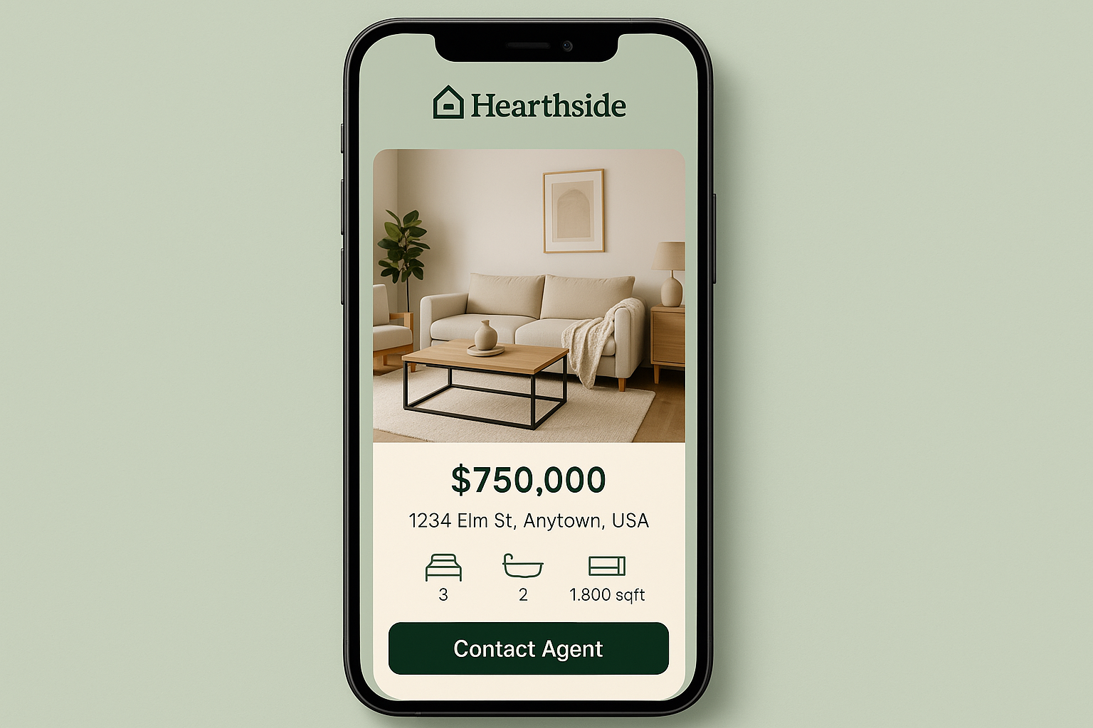
The Hearthside listing screen demonstrates how the system works in practice. The sage tint surface keeps things light and inviting. Deep sage handles all interactive text and buttons. The warm cream background, property photography, and sage accents work together to create something that feels like stepping into a well-appointed room.
Dark Mode in Warm Palettes: The Art of the Moody Interior
Dark mode for warm palettes isn't about inversion. It's about designing a candlelit room. Deep, enveloping backgrounds with warm-lit foreground elements.
The surface strategy: avoid pure black entirely. Instead, use deep warm darks. A deep walnut (#1A1410) or a dark forest (#111A16) as the base surface creates the sensation of a richly furnished room at night. The warmth lives in the background itself.
Token remapping in dark mode is more than swapping lightness values. Semantic tokens like color/surface/primary and color/text/default should point to entirely different primitives, not simply lighter or darker steps of the same ramp. Warmth perception changes under different ambient conditions. A color that reads as "warm neutral" on a light surface might read as "muddy" on a dark one. Test everything in context.
One edge case is unique to real estate and home apps: full-bleed property photography. Warm dark surfaces interact unpredictably with cool-toned architectural photography. The fix is a warm photo overlay scrim token, a semi-transparent warm dark rather than a neutral one, to maintain palette coherence where photos meet the UI.
Handoff and Maintenance: Keeping Your Warm System Alive at Scale
Token documentation needs design intent annotations. Every semantic token should carry a note explaining its purpose. Something like: "This warm-dark anchor is used only for body text and interactive labels. Do not use for decorative elements." Without these annotations, palette drift is inevitable as the team grows.
Interior-inspired palettes are frequently misapplied in "boring" components: data tables, form inputs, toast notifications. These components typically default to neutral gray, and developers reach for #F5F5F5 or #E0E0E0 without thinking. Audit every gray-defaulting component. Replace cool grays with warm-neutral equivalents.
Run a quarterly palette health check. As new components are added and brand photography evolves, warmth coherence can erode. The audit is lightweight: check for unauthorized gray introductions, verify contrast on new text/background pairings, and test the palette against new photography assets.
A well-structured token documentation page makes the difference between a system that stays warm and one that slowly drifts back to cold defaults.
The Room You Walk Into
Remember that app screenshot from the opening, the one indistinguishable from a Kinfolk spread? That visual coherence wasn't an accident or a superficial aesthetic choice. It was the product of a disciplined translation process: sourcing analog warmth, building perceptually even token ramps in OKLCH, solving the contrast paradox with anchor darks and warm grays, and maintaining the system at scale.
The boundary between interior space and digital interface has genuinely blurred in 2026. That creates a real opportunity for designers who speak both languages. Warmth is not at odds with accessibility. It just requires more intention, more testing, and more care with the numbers behind the beauty.
The best home-adjacent apps in 2026 will feel like walking into a well-designed room. This framework is the blueprint for building that experience, pixel by pixel.