The Invisible Palette: How IKEA Uses Color to Make You Stay Longer and Spend More
by ColorSift Editorial Team
You walked in for a lamp. Maybe a specific lamp, even. You had the product name memorized, the aisle number bookmarked on your phone. Two hours later, you're loading a cart with a duvet cover, three scented candles, a set of bamboo cutting boards, and a stuffed shark your kid didn't ask for. The lamp? You forgot it entirely.
This happens to hundreds of millions of people every year. IKEA stores are among the most visited physical retail spaces on the planet, drawing an estimated 775 million store visits annually worldwide. Yet the chromatic engineering behind those visits receives almost no rigorous public analysis.
Compare that silence to the volumes written about Apple's minimalist whites or Coca-Cola's proprietary red. Those are celebrated case studies in color branding. IKEA's color strategy, by contrast, hides in plain sight. It is not accidental. It is not merely a Scandinavian aesthetic preference. And it is not just branding. It is a layered behavioral system that operates at the scale of a city block and the intimacy of a bedroom mock-up.
What follows is a room-by-room, layer-by-layer account of how that system works. And in 2026, as brick-and-mortar retail fights for survival against e-commerce, understanding it matters more than ever.
The Blue and Yellow Paradox: Why IKEA's Brand Colors Never Appear on Your Sofa
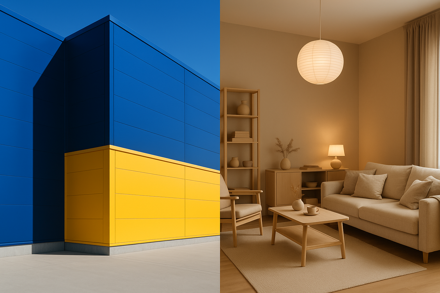
Here's a tension most people never register. IKEA's signature blue and yellow, drawn directly from the Swedish flag, are loud, high-contrast, and internationally recognizable. You can spot that blue box from a highway off-ramp. Yet step inside, and those colors vanish. They are almost entirely absent from the product lines and showroom interiors they house.
This separation is deliberate, and it serves a precise psychological function.
The exterior colors signal familiarity, value, and national identity. Swedish means trustworthy. Well-designed. Affordable. Those associations do their work before you even park the car. But the interior palette must accomplish something entirely different: it must create aspiration and domestic calm.
High-chroma, high-contrast colors like IKEA blue and yellow increase alertness and decision speed. That's useful on a highway sign. It's the opposite of what a store wants when it needs you to slow down, linger, and imagine living with a product.
The exceptions prove the rule. The IKEA restaurant's blue and yellow surfaces? The iconic blue bag? The old catalog cover? These are threshold markers. They signal entry and exit from the selling zone. They are transitions, not interior design.
Once you cross that threshold, you enter a different chromatic world entirely.
The Chromatic Runway: Color Sequencing as You Move Through the Store
IKEA's famous one-way layout, internally called the "long natural way," is well documented. What gets less attention is how the color environment is choreographed to match each stage of your psychological journey through the space.
The sequence works like this. You enter through relatively bright, white-lit, open zones. The lighting is commercial, energizing, slightly institutional. Then, as you move into the showroom floors, everything shifts. The warm, layered, textured color environments of the room vignettes wrap around you. This is a deliberate decompression, a transition from the outside world into a domestic fantasy space.
You slow down. Your shoulders drop. You start touching things.
Then comes the market hall and the self-serve warehouse at the end. Colors here shift abruptly to industrial: exposed concrete, utilitarian yellow shelving, stark overhead lighting. This is a strategic reset. It subconsciously signals "transaction mode." The dreaming is done. Buying begins.
Environmental psychology research on "approach-avoidance" behavior supports this structure. Warm, low-saturation colors in retail settings have been shown to slow foot pace and increase time-on-floor. Cooler, higher-contrast zones accelerate movement toward exits and registers. IKEA's Älmhult flagship, the original Swedish store and its adjacent museum, offers a visible record of how this sequencing has evolved and been formalized over decades.
The colors are not decoration. They are directions.
The Livable Neutral: A Deep Look at the Showroom Vignette as Color Architecture
Let's zoom into one room. Picture a typical IKEA bedroom vignette. Deconstruct it layer by layer.
The wall color is usually a warm greige or dusty sage. The textile palette runs through muted terracotta, oat, and soft navy used sparingly as an accent. Wood tones lean warm: birch, pine, light oak. Nothing has high chroma. Nothing demands attention. Everything coheres.
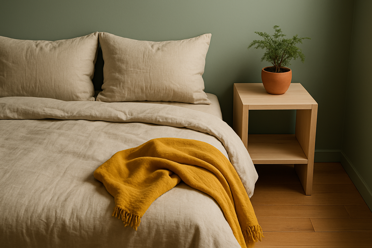
These "livable neutrals" perform a specific psychological function. They reduce what color psychologists call "purchase anxiety," the fear that a color choice will look wrong in your home. A muted, desaturated palette is far easier for a shopper to project onto their own space than a bold one. You don't have to wonder whether that bedframe will clash with your walls. The vignette has already answered the question for you.
Notice how IKEA stages color accents. A single mustard throw. A terracotta pot. A forest green cushion. These are always presented as optional modifiers to a neutral base. They teach the shopper a "safe" color formula they can replicate at home: neutral foundation, one or two warm accents, natural materials for texture.
I'd call this "chromatic hospitality." IKEA's vignettes are colored to feel like a good host's home. Tasteful. Warm. Never overwhelming. The shopper relaxes their critical defenses and stays longer. They stop evaluating furniture and start imagining a life.
The Catalog Effect: How IKEA Quietly Rewrote What 'Normal' Home Color Looks Like
Now zoom out from the store to the cultural scale.
The IKEA catalog, printed for decades before its discontinuation in 2021, reached an estimated 200 million copies per year at its peak. That made it one of the most widely distributed color-design documents in human history, outpacing the Bible in annual print runs for several years.
By consistently presenting a specific chromatic vocabulary across millions of homes and decades, IKEA effectively set a baseline for what "good taste in home color" means to an entire generation. Warm whites. Birch. Grey-beige. Dusty pastels. Carefully controlled accent colors. If your Pinterest board looks like this, you've been influenced whether you know it or not.
This is color normalization in action. Repeated exposure to a particular palette in aspirational contexts, beautifully photographed and idealized, trains the viewer to associate those colors with comfort, success, and belonging.
In 2026, the catalog's influence has given way to Instagram, Pinterest, and AI-generated interior mood boards. The question is whether IKEA's in-store palette remains the silent standard, or whether it's being challenged. Competitors like Zara Home offer a useful contrast: deeper saturation, fashion-forward tones, jewel-colored velvets, and moody earth tones that rotate seasonally. Zara Home treats color like fashion. IKEA treats it like architecture. That deliberate restraint is a strategic choice, not a limitation.
Scarcity of Red: How IKEA Controls Urgency Without Triggering Alarm
Here's a counterintuitive observation. Red is the most common urgency-signaling color in global retail. Sale signs. Clearance banners. Limited-time offers. Red is everywhere in most stores.
In IKEA's showroom environments, it is almost completely absent.
The reason is straightforward. Red accelerates heart rate, increases arousal, and shortens perceived time. All useful traits for a quick-decision retail environment. All destructive to IKEA's goal of prolonged, relaxed browsing and domestic imagination. A red sofa in a vignette would rupture the spell.
So where does red appear? On the price tags. On sale stickers. On occasional IKEA FAMILY member promotion materials. These are isolated, small-scale uses where urgency is appropriate and contained.

This is sophisticated color budgeting. IKEA treats high-stimulus colors as scarce resources to be deployed precisely, not as ambient tools. A red sale sticker on a calm, neutral shelf hits harder precisely because there's no competing red anywhere else in your visual field. Scarcity amplifies impact.
What Retail Can Learn From IKEA's Color Discipline in 2026
For retail designers, spatial designers, and brand strategists fighting for physical relevance, IKEA's approach offers several principles worth studying:
- Brand color and environment color serve different neurological functions. Separate them. Your logo's palette and your selling floor's palette should not be the same.
- Chromatic sequencing can script a customer's emotional journey. Color transitions through a space are as important as the colors themselves.
- Restraint and desaturation in product environments reduce friction. They increase dwell time and lower purchase anxiety.
- A consistent palette, deployed at cultural scale, becomes a taste-defining force. Color strategy is cultural strategy.
There are limits to the IKEA model. It works at a specific scale, with massive stores and massive product volume, and for a specific brand promise: affordable, livable design. A luxury retailer, a tech store, or a specialty boutique would need to adapt these principles rather than copy them wholesale.
And emerging pressures are real. AI-assisted store design tools, hyper-personalized retail environments, and the growing influence of neuroscience on commercial space planning all raise a question: will IKEA's intuitive, evolved color strategy hold up against more data-driven competitors?
Here's the provocation. The most dangerous thing about IKEA's color strategy is that it works precisely because most people, including designers, don't notice it.
The Color of the Air Around It
Let's return to that shopper. The lamp. The two-hour detour. The full cart.
That experience was not a personal failure of willpower. It was the predictable output of an extraordinarily well-engineered color environment. IKEA's color strategy is not decoration. It is behavior design, operating invisibly across every layer of the retail experience. The blue-and-yellow threshold announces arrival. The warm greige vignette dissolves resistance. The red price tag triggers the purchase.
The next time you walk into any retail space, or sit down to design one, look first not at what's on the shelves. Look at the color of the air around it.
That's where the real selling happens.