The Hospital Green Conspiracy: How One Surgeon's Complaint Quietly Repainted the Medical World
by ColorSift Editorial Team
A surgeon stands in an all-white operating theater, circa 1914. White tiles. White drapes. White coat. He looks up from a field of red, and a ghostly green smear blooms across his vision, hovering over everything like a stain that isn't there. He blinks. It persists. For a few critical seconds, he can't clearly see what he's cutting.
This wasn't a rare event. It was a daily reality for early 20th-century surgeons, and most of them simply endured it. But one surgeon, Harry Sherman of San Francisco, decided he'd had enough. His complaint, directed at hospital architects and administrators, would set off a chain reaction so slow and so thorough that it eventually repainted hospitals worldwide, redefined the dress code of an entire profession, and leaked into the logos and packaging of nearly every health brand you encounter today.
How does one person's frustration with eye fatigue in a single operating room reshape the color language of a global institution? That's the story here, and it sits right at the intersection of color science, design history, and the strange inertia of institutions that adopt a solution and then forget why they adopted it in the first place.
White as Gospel: The Sterile Ideal That Defined a Century of Medicine
To understand why Sherman's complaint mattered, you first need to understand how completely white dominated medicine.
The story starts in the 1870s with Joseph Lister and the rise of antiseptic theory. Once germ theory took hold, cleanliness became the organizing principle of hospital design. And white became its visual shorthand. White tiles were easy to inspect for dirt. White coats signaled that a physician had nothing to hide. White walls communicated modernity, rationality, and scientific rigor to a public still learning to trust hospitals over home care.
By the early 1900s, the whiteness was total. Operating theaters were designed as sealed white chambers. Surgical drapes were white. Floors, ceilings, instruments trays, everything. The effect was immersive and deliberate. White meant sterile, sterile meant safe, and safe meant progress.
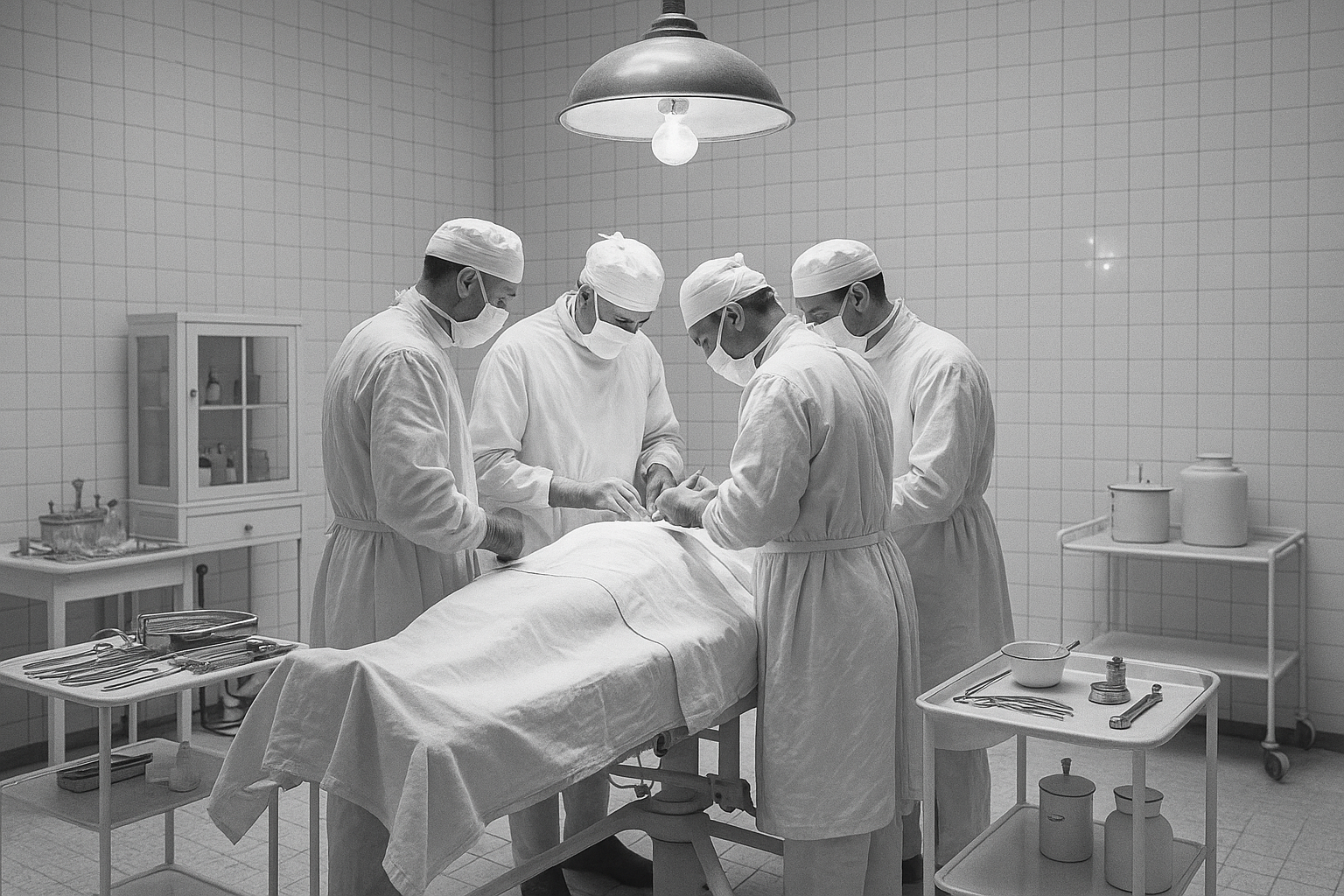
The psychological weight of all that white was enormous. For patients, it communicated trust. For practitioners, it communicated authority. It told everyone in the room: this is a place where science happens.
But here's the irony. The color chosen to signal sterility was quietly creating a physiological hazard for the people who needed visual clarity the most. Surgeons spent hours staring at vivid red against blazing white, and their eyes were paying the price. Nobody talked about it much. White was gospel, and questioning it meant questioning the entire visual framework of modern medicine.
The Surgeon Who Saw Green: Harry Sherman and the Complaint That Changed Everything
Harry Sherman was, by most accounts, not the type to suffer in silence. A San Francisco surgeon active in the early decades of the 1900s, Sherman is credited in design and medical literature as the first figure to formally escalate the white-fatigue problem beyond casual grumbling.
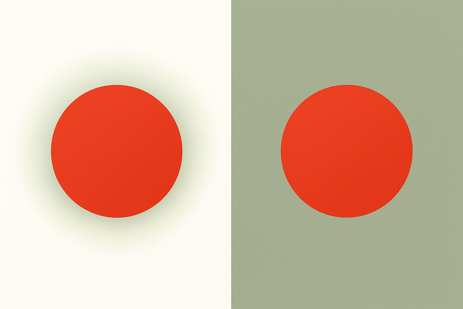
His complaint was specific and physiological. When a surgeon stares at red tissue and blood against a white background for extended periods, the eye's red-sensitive photoreceptors become overstimulated. When the surgeon then glances away, even briefly, the fatigued receptors produce a complementary afterimage: a vivid green ghost that floats across the visual field. Against white surroundings, this phantom is maximally visible and maximally distracting.
During delicate work, that's not a nuisance. It's a safety problem.
Sherman allegedly demanded that his operating room be repainted in a muted blue-green. This wasn't an aesthetic preference. It was a functional intervention. A blue-green surround would absorb the afterimage rather than amplify it, giving fatigued red receptors somewhere to "rest" instead of generating further visual noise.
The timing helped. The early 20th century was a period of hospital reform, surgical professionalization, and growing openness to the idea that the built environment could affect clinical performance. Sherman's complaint landed in an institutional culture that was, for the first time, willing to consider that design choices had medical consequences.
A note of honesty is warranted here. Sherman's role is cited across design histories, but the sourcing is sometimes thin. His story may be partly simplified, a single dramatic figure standing in for what was likely a more gradual, multi-voiced shift. Institutional change rarely traces neatly to one person's demand. But the fact that Sherman's name endures tells us something about how professions remember their turning points: they prefer a protagonist.
The Science Behind the Switch: Simultaneous Contrast and Chromatic Adaptation
Sherman was working from observation, not formal color theory. But the science caught up and validated him thoroughly.
Two phenomena are at work. The first is simultaneous contrast, the optical effect formalized by Michel Eugène Chevreul in the 19th century and later explored by Josef Albers. When two colors sit adjacent, the eye exaggerates their difference. Red against white doesn't just look red. It looks more intensely red, and the resulting afterimage is correspondingly more intense and disruptive.
The second is chromatic adaptation. Your visual system constantly tries to "white-balance" toward the dominant color in a scene. In an all-white environment, this recalibration never settles. The eye stays in a heightened state of adjustment, making any sudden introduction of saturated color, like a field of blood, hit harder than it would in a chromatically varied space.
Blue-green, sitting roughly opposite blood-red on the color wheel, neutralizes both problems at once. The afterimage finds a sympathetic background rather than a contrasting one. The eye's red-fatigued cones get genuine rest. The overall visual environment becomes less taxing to process.
Sherman didn't have this vocabulary. He had the experience of blinking and seeing green ghosts, and the practical sense to demand a fix. Modern environmental psychology has since validated the broader principle: muted chromatic environments reduce cognitive load compared to stark achromatic ones. Hospitals painted in soft greens and blues don't just reduce afterimages. They reduce measurable stress markers in both patients and staff.
From One Operating Room to a Global Uniform: The Institutional Spread of Surgical Green
Sherman's reported operating room repaint happened sometime in the 1910s or 1920s. The idea spread slowly at first, then accelerated.
Through the 1930s and 1940s, more U.S. hospitals adopted blue-green and sage-green palettes for surgical suites. The American Institute of Architects began including color recommendations in healthcare facility guidelines by mid-century. After World War II, American-influenced hospital design standards carried the color worldwide, as new hospitals in Europe, Asia, and the developing world were built or renovated along U.S. models.
Then the color jumped from walls to bodies. White surgical gowns gave way to green ones. The logic was identical: green fabric reduced visual fatigue and hid blood stains better than white. Over subsequent decades, the palette expanded. You now see scrubs in ceil blue, burgundy, navy, and even pink. But surgical green remains the archetype, the color that says "operating room" without explanation.
Television cemented this. Mid-century medical dramas like "Ben Casey" and later "M*A*S*H" dressed their surgeons in green, broadcasting the association into living rooms worldwide. The visual vocabulary became self-reinforcing: hospitals used green because it worked, TV showed green because hospitals used it, and audiences learned to read green as "medical" because TV taught them to. A feedback loop, running for over seventy years and still going.
Case Study: How 'Surgical Green' Escaped the Hospital and Colonized Health Branding
At some point, the color stopped belonging to hospitals and started belonging to health itself.
The specific hue range is a family of desaturated blue-greens. Designers call them teal, sage, hospital green, or sometimes just "medical green." They sit roughly between hex #5F9EA0 and #6B9E8A, though the range is wide. What unites them is a quality of muted, serious calm.
Look at the visual identities of major health institutions and you'll see the pattern everywhere. Pharmacy chains like Walgreens and CVS lean into blue-green signage. The U.K.'s National Health Service uses a deep teal as its primary brand color. The U.S. Centers for Disease Control and Prevention's visual materials consistently feature desaturated blue-greens. Health insurance companies, wellness apps, telehealth platforms, hospital networks: the same color family dominates.
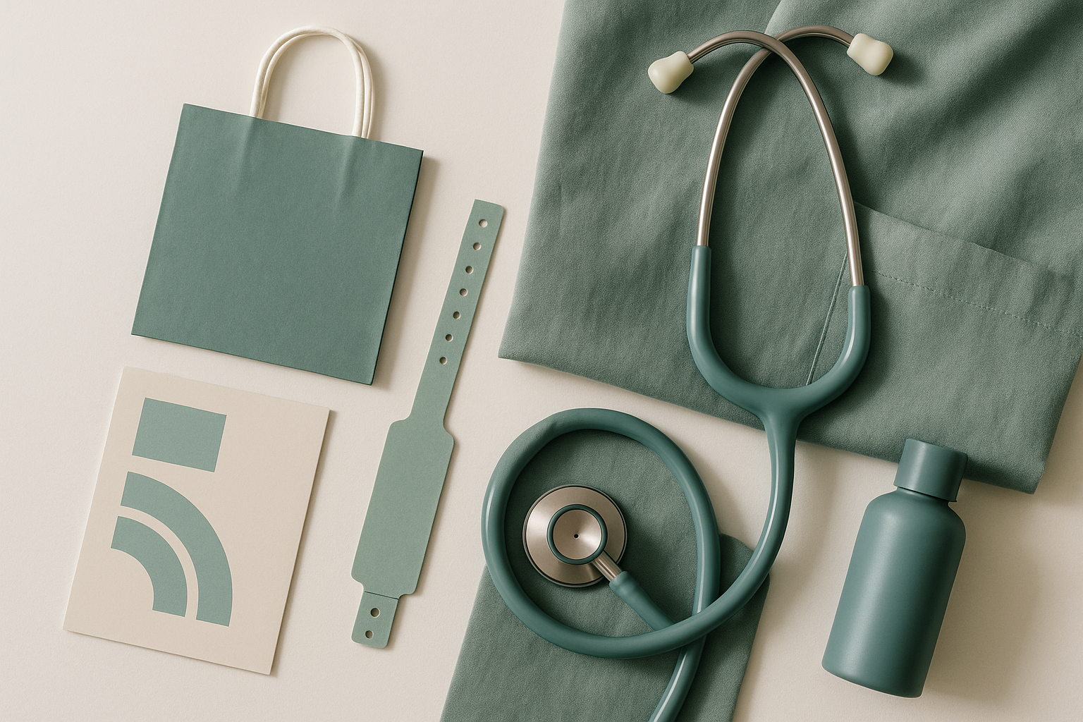
Why? Because the color carries a century of accumulated trust. It says "clinical authority" without saying "cold" or "threatening." It signals competence, care, and a subliminal "this is good for you" that no amount of brand strategy could build from scratch. The association is inherited, not invented.
Here's the paradox worth sitting with. A color chosen to solve a specific optical problem in one surgeon's field of vision became, through decades of institutional repetition and cultural osmosis, one of the most powerful trust signals in consumer health marketing. The original function, reducing afterimages, is completely irrelevant to a pharmacy logo. But the meaning built on top of that function is worth billions in brand equity.
2026 and the Reconsideration: Are Hospitals Ready to Move Past Green?
As of 2026, surgical green's dominance is facing its first serious challenge in decades.
A wave of hospital renovation projects, accelerated by post-pandemic infrastructure investment, has put institutional color under active design scrutiny. New telehealth platforms, freed from physical walls entirely, are making deliberate color choices that don't default to the blue-green orthodoxy. The field of evidence-based design in healthcare has matured considerably, with researchers formally studying how color, light, and spatial design affect patient outcomes, staff burnout, and anxiety levels.
The debates are real and unresolved. Some designers argue that abandoning surgical green risks dissolving the trust signals patients have internalized over a lifetime. When you walk into a hospital and see those familiar muted greens, you feel, on some preverbal level, that you're in competent hands. Strip that away and you're asking patients to rebuild trust from zero.
Others push back hard. They argue that surgical green's associations have curdled. For many patients, especially those with chronic conditions or hospital-related trauma, the color triggers anxiety, not comfort. The clinical coldness that once signaled rigor now signals indifference. These designers point to healthcare systems and clinics that have deliberately broken from tradition, using warm neutrals, soft terracotta, deep indigo, and even muted coral to create environments that feel restorative rather than institutional.
The deeper question is whether surgical green's century-long dominance was ever truly about science or whether it became self-perpetuating habit decades ago. The original eye-fatigue rationale applies only to operating rooms. It has no bearing on waiting rooms, patient wards, clinic lobbies, or brand logos. Yet the color spread to all of those contexts and stayed there, unchallenged, for generations.
A Century-Old Ghost Image, Still Floating
Return, for a moment, to that surgeon in the 1910s. The green ghost floating across white. The frustrated blink. The demand for change.
Harry Sherman's complaint was small and specific: fix my visual environment so I can do my job. But under the right institutional conditions, that small complaint permanently reshaped a global visual language. The color moved from one operating room wall to every hospital on earth, then to every health brand, then into the reflexive design vocabulary of an entire industry.
The story of surgical green is a story about how design decisions made for functional, evidence-backed reasons accumulate cultural meaning over time, until the meaning eclipses the original function entirely. The color that solved an afterimage problem became a trust signal, then a brand asset, then an unexamined default.
If you're a designer or healthcare communicator working in 2026, the challenge is straightforward. Before you reach for teal and muted blue-green because it "feels medical," ask yourself a question. Are you solving a design problem, or are you inheriting a surgeon's century-old eye complaint?
There's no wrong answer. But there is a wrong way to arrive at one, and that's by never asking.