Why Red Means 'Stop' Everywhere — Except Where It Doesn't: The Tangled History of Signal Colors
by ColorSift Editorial Team
On the evening of December 2, 1868, a gas-powered traffic semaphore installed outside the Houses of Parliament in London exploded. The blast injured the police officer operating it. The device had used red and green gas lamps, borrowed directly from railway signaling, to manage horse-drawn carriages through a busy intersection. It lasted about a month before it tried to kill someone.
Here's the strange part: we still use the same two colors. Over 150 years later, red and green appear on every screen, dashboard, notification badge, and status indicator on the planet. That's either a sign of brilliant design or a spectacular accident of history. Probably both.
But there's a tension at the heart of this story. The color that means "stop, danger, do not proceed" in a traffic context means "luck, prosperity, and celebration" to roughly 1.4 billion people in China. Red envelopes at Lunar New Year aren't warning you of anything. So how did red become the universal color of danger, and what happens when that "universal" meaning collides with deeply rooted cultural ones?
This is the tangled, surprising history of signal colors, and why it matters to anyone designing for a global audience.
Blood, Fire, and Wavelengths: Why Red Was Always Going to Win
Start with physics. Red has the longest wavelength of any visible light, which means it's the last color to scatter in fog, rain, and smoke. For early Victorian-era railway signals, this was everything. Trains running through industrial haze needed a color that could punch through murky air and remain visible at distance. Red did that better than any alternative.
Now add biology. Humans evolved a heightened sensitivity to red, likely tied to detecting ripe fruit against green foliage, spotting blood (signaling injury or threat), and reading flushed skin (signaling aggression or arousal). Your brain registers red before conscious thought kicks in. It's an attention hijacker wired into your visual cortex.
And the cultural record was already there long before railways. Red flags served as maritime danger signals for centuries. Roman armies marched under red banners. The connection between red and "pay attention" predates any modern signaling system by a thousand years.
The key insight is this: red wasn't arbitrarily chosen for danger. It was overdetermined. Physics, biology, and cultural history all converged on the same answer, which is why the association feels so "natural" even though it was, in fact, engineered.
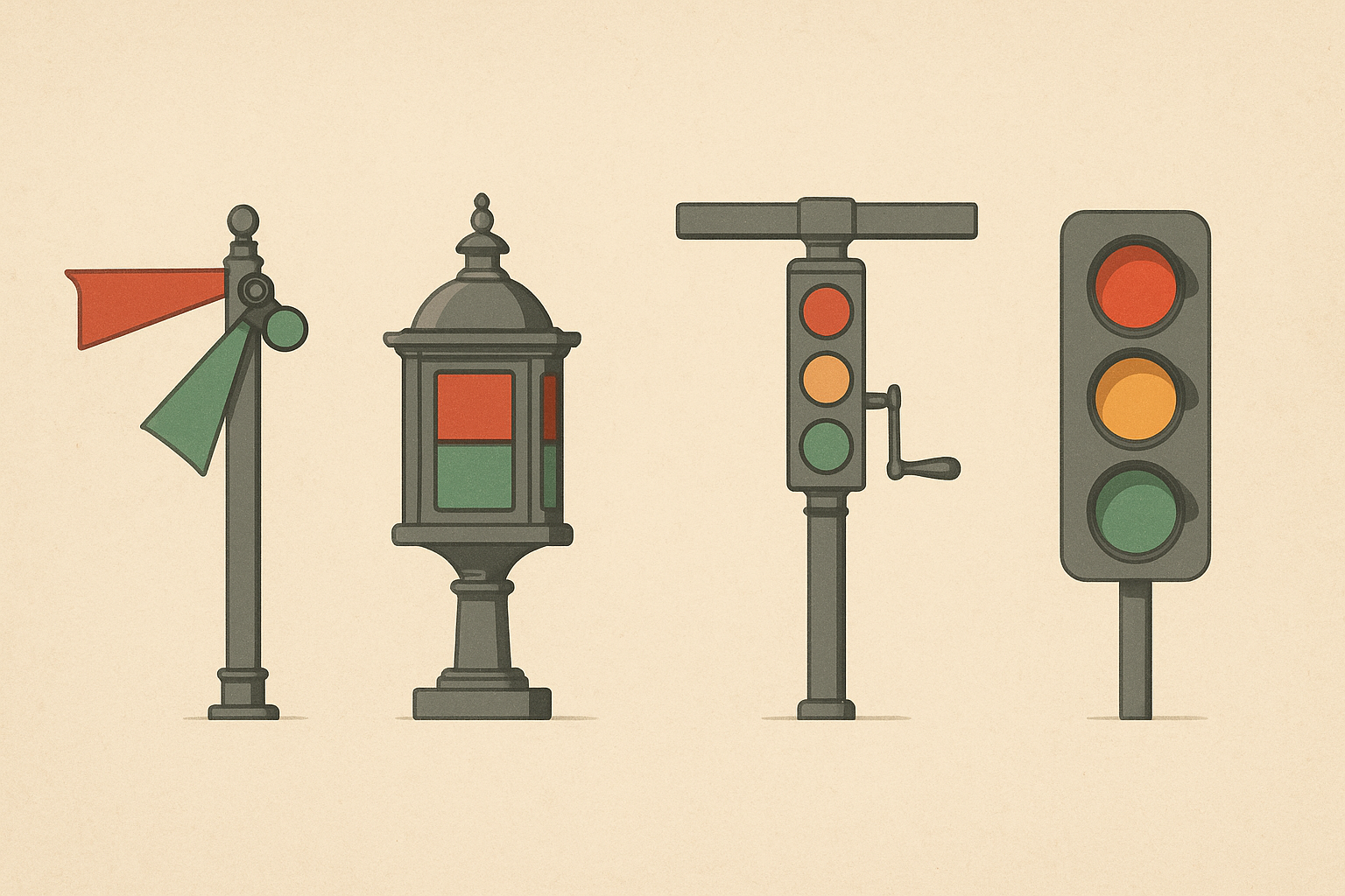
From Railway Semaphores to City Streets: How Three Colors Became a System
The first British railway signals in the 1830s and 1840s used a three-color scheme that would look strange to modern eyes: red for stop, green for caution, and clear white for go.
The flaw was catastrophic. In at least one recorded incident, a red lens fell out of its housing, leaving a bare white light that an engineer read as "all clear." The resulting crash forced a complete redesign. White was too ambiguous, too easily confused with starlight or distant house lamps.
The fix reshuffled everything. Green was promoted from "caution" to "go." A new color was needed for the middle position. Yellow and amber, highly visible and already associated with caution in nature (think wasps, poison dart frogs, warning coloration across species), filled the gap. The modern red-yellow-green triad was born.
In 1923, Garrett Morgan, a Black inventor and son of formerly enslaved parents, patented a hand-cranked T-shaped traffic signal with a third "warning" position. His design addressed the chaos of two-state intersections where vehicles had no transition between stop and go. Morgan eventually sold the patent to General Electric for $40,000.
International standardization followed. The 1968 Vienna Convention on Road Signs and Signals codified the red-yellow-green system for signatory nations, cementing it as a global standard. By that point, the colors had already transcended transportation. They were becoming a visual language.
Screens Inherit the Street: Signal Colors in Digital Design
When early software interfaces needed to communicate system states, errors, warnings, and success, designers reached for the most widely understood color code available. The traffic light.
There was almost no debate. Red error banners, yellow warning dialogs, green success confirmations became the default palette of digital feedback. Jakob Nielsen's usability heuristics in the 1990s reinforced this pattern. "Visibility of system status" meant using color as a primary feedback channel, and the traffic light palette carried pre-learned meaning that required zero explanation.
Then Bootstrap happened. The most widely used front-end framework on the web codified traffic-light semantics into CSS classes that millions of developers copy-paste every day:
- .alert-danger is red
- .alert-warning is yellow
- .alert-success is green
This single framework decision propagated the convention across millions of websites and applications. It became infrastructure.
The metaphor spread far beyond alert boxes. Dashboard KPI indicators. Form validation (red outlines on errors, green checkmarks on valid fields). Health monitors. Status dots in Slack and Teams. Even emoji: red circle for urgent or recording, green circle for available.
The traffic light metaphor is now the substrate of digital communication. And buried inside all of it is a massive assumption: that every user on the planet reads red as danger and green as safe.
This assumption works. Until it doesn't.
Red Envelopes and White Funerals: When Cultural Color Meaning Contradicts Signal Color
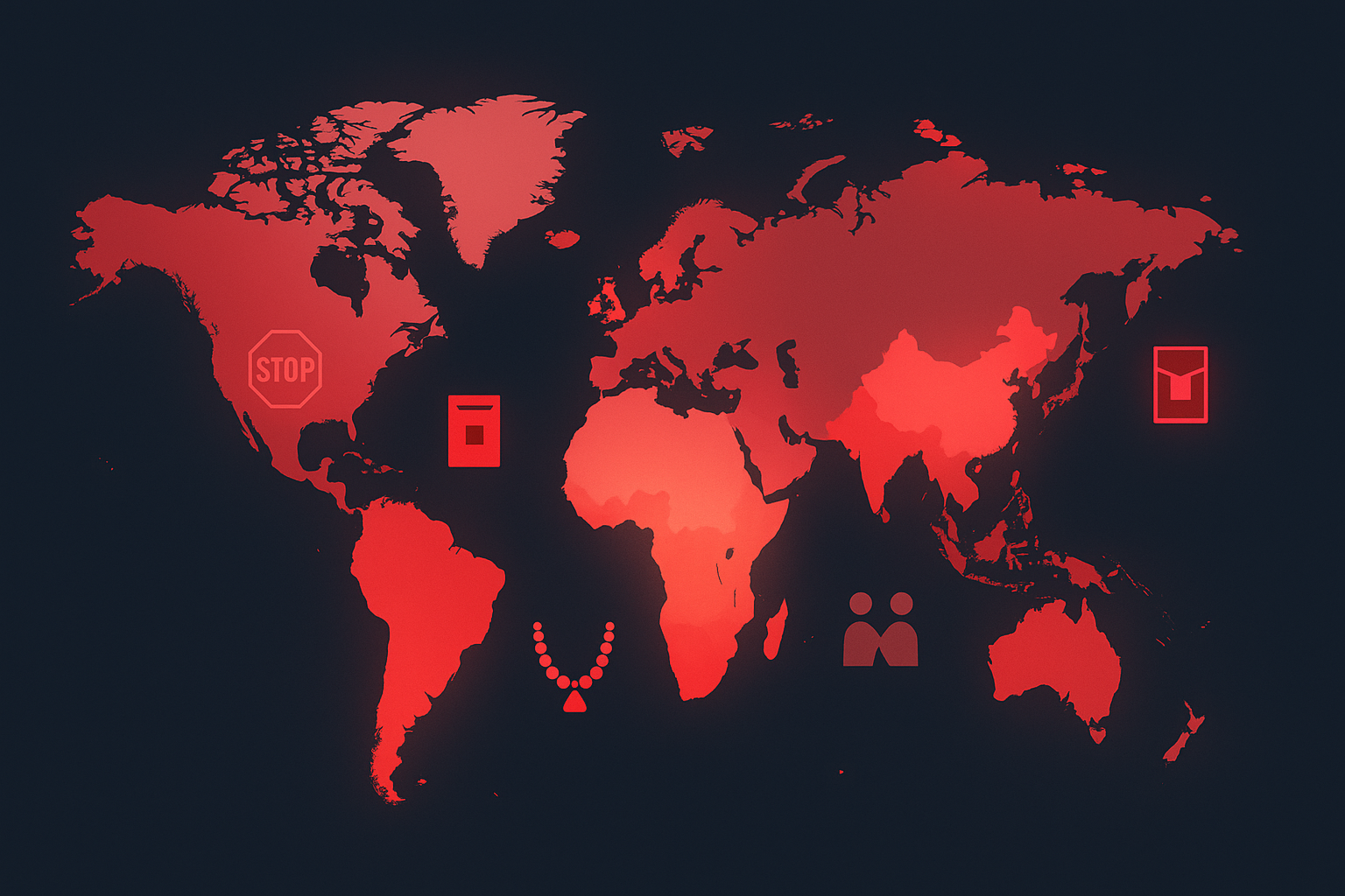
In China, red is the color of luck, prosperity, happiness, and celebration. Red dominates weddings, Lunar New Year, and business openings. It is, by a wide margin, the most positive color in Chinese culture.
This isn't abstract. It has concrete design consequences. The Chinese stock market uses red to indicate gains (stocks going up) and green for losses. The exact inverse of Western financial displays. This isn't a quirk or a novelty. It reflects a deeply embedded cultural logic where red equals positive.

In India, red sindoor powder marks a married woman's hair part. Red is auspicious, sacred, and tied to the goddess Durga. Brides wear red. The association is so strong that deploying red as a "danger" color in Indian consumer apps can feel tonally off, like hearing a wedding song at a funeral.
In parts of South Africa, red is associated with mourning and sacrifice, carrying weight that complicates its casual use as an "error state" in a banking app.
And then there's white. In Japan, white, not black, is the traditional color of mourning and death. This is a reminder that even the "neutral" colors in Western design systems carry cultural baggage. Your clean white background isn't culturally inert everywhere.
These aren't edge cases. They aren't footnotes in a localization document. They represent billions of people for whom the Western signal-color framework is, at best, a learned second language and, at worst, actively misleading.
Designing Red for 1.4 Billion People: How Global Products Navigate the Contradiction
Chinese tech giants like Alibaba and WeChat lean hard into red as a positive, celebratory color. Red "hongbao" (lucky money) features, red promotional banners, red as the dominant accent color throughout the interface. Yet these same apps also use red for error states in form validation. The context, celebration versus system feedback, does the disambiguating work. But it requires careful information architecture to keep those two meanings from colliding on the same screen.
Google's Material Design uses red (#B00020) as its global error color. Their documentation acknowledges that color meaning varies by culture, but the system doesn't fundamentally restructure itself for different regions. Instead, it relies on icons, text labels, and animation to supplement color meaning. Color carries the signal; everything else carries the safety net.
This "belt and suspenders" approach is now considered essential for global products. The most robust design systems never rely on color alone. They pair red error states with warning icons, explicit text labels ("Error: payment failed"), and spatial or layout cues. This isn't only an accessibility consideration for colorblind users. It's a cultural necessity.
The stock market problem is perhaps the clearest case study. Bloomberg and Reuters had to build configurable color systems so that traders in Shanghai and traders in New York could both read financial data correctly. Red up or red down? The answer depends on which continent you're sitting on, and the software has to accommodate both. This is one of the most concrete examples of cultural color meaning directly shaping product architecture.
No global product has fully solved this. Every design system makes trade-offs between consistency (one color system everywhere) and localization (adapting to local meaning). The compromise is always imperfect.
Beyond Red: The Full Spectrum of Cultural Color Collision
Red gets most of the attention, but every signal color carries contradictions.
Green means "go" and "safe" in traffic contexts. It's also the sacred color of Islam, carries specific political meaning in Ireland and across environmental movements, and in some South American cultures is associated with death. A green "success" banner may read very differently in Jakarta than in Johannesburg.
Yellow means caution in Western signal systems, but it was the imperial color in China (reserved for the emperor), a sacred color in Hinduism (associated with knowledge and learning), and in some Western contexts, a symbol of cowardice. Its meaning is perhaps the least stable of all three signal colors.
Purple and orange occupy interesting "empty" slots, carrying relatively less signal-color baggage in most contexts. This may explain why brands like Twitch chose purple and why apps like Headspace lean on orange. These hues sidestep the traffic-light framework entirely, giving designers room to build fresh associations.
The practical takeaway for anyone building interfaces: audit your color assumptions. If your design relies on color alone to communicate meaning, especially in red/green binary states, you have a localization vulnerability, an accessibility gap, and a cultural blind spot stacked on top of each other.
Pair color with shape. Pair color with text. Pair color with position. Redundancy isn't wasteful here. It's the only responsible approach.
The Exploding Lamp and Its Long Shadow
Let's return to that exploding gas lamp outside Parliament in 1868. The police officer injured that night couldn't have imagined that the red-and-green system he was operating would outlast the British Empire, survive two world wars, migrate from iron semaphore arms to LED pixels, and end up on 6.8 billion smartphones.
The durability of signal colors speaks to the power of convention. Once enough people agree that red means stop, the meaning becomes self-reinforcing. Each new traffic light, each new error banner, each new Bootstrap alert class adds another layer of consensus.
But convention is not nature. The "universality" of signal colors is a Western export, not a human constant. Every time a designer drops a red error banner into a global product without a text label, an icon, or a moment of cultural consideration, they're betting that 150 years of railway history outweighs thousands of years of cultural meaning.
Sometimes it does. Sometimes it doesn't. The best designers, like the best historians, hold both truths at once.