The Helmholtz–Kohlrausch Effect: Why Your Saturated UI Colors Look Brighter Than They Should
by ColorSift Editorial Team
Open any contrast-checking tool and punch in a vivid, fully saturated red, say hsl(0, 100%, 50%), against a dark gray background. The tool greenlights it: the luminance ratio clears WCAG AA with room to spare. Now squint at the actual screen. That red button doesn't just sit on the background. It glows. It vibrates. It looks luminously, almost radioactively bright, far brighter than a neutral gray that shares its exact measured lightness.
You're not imagining things. You're seeing the Helmholtz–Kohlrausch effect, a 19th-century perceptual phenomenon that is quietly breaking 21st-century accessibility math.
Named after Hermann von Helmholtz and Friedrich Kohlrausch, this effect describes how highly chromatic (saturated) colors appear perceptually brighter than achromatic colors of identical luminance. It's not a bug in your eyes. It's a feature of human vision that our contrast-ratio formulas were never designed to handle. As design systems increasingly lean on programmatic contrast checking and automated accessibility audits, this gap between measured lightness and perceived brightness is causing real failures that slip past every tool in the pipeline.
What follows is a thorough look at the science, the practical consequences for UI design, and the emerging strategies for compensating.
A 19th-Century Discovery With 21st-Century Consequences
Helmholtz first observed in the 1860s that spectral colors appeared brighter than white light of equal luminance. It was a curious finding, one that didn't fit neatly into the physics of the era. Decades later, in the 1930s, Friedrich Kohlrausch quantified the phenomenon through rigorous psychophysical experiments, establishing that the "brightness bonus" varied systematically with wavelength and saturation.
The core mechanism works like this: the human visual system processes chromatic and achromatic signals through separate neural channels. This is the opponent-process theory of color vision. Highly saturated colors stimulate both the luminance channel and the chromatic channels simultaneously. Your brain effectively adds these signals together, producing a perception of extra brightness that has no physical basis in the light's measured intensity.
The effect is wavelength-dependent. Reds and blues trigger the strongest H-K boost, with perceived brightness increasing by up to a factor of 2x compared to an equiluminant gray. Yellows and greens, which sit closer to the luminance peak of human vision (around 555 nm), show a much smaller effect. A vivid cerulean blue can look twice as bright as the photometer says it should. A saturated gold barely budges.
Here's the critical part for anyone building interfaces: this perceptual boost is completely invisible to any formula based solely on photometric luminance (cd/m²). Luminance only measures the achromatic channel. The chromatic "bonus brightness" lives entirely in the perceptual domain, and no amount of pixel math will catch it.
How Contrast Formulas Get It Wrong
WCAG 2.x contrast ratios are computed from relative luminance, derived from a linear-light weighted sum of R, G, and B. The sRGB luminance formula looks like this:
Y = 0.2126R + 0.7152G + 0.0722B
Notice what's missing. There's no saturation term. This formula cannot distinguish a vivid red from a desaturated pink of equal luminance. To the algorithm, they're the same brightness.
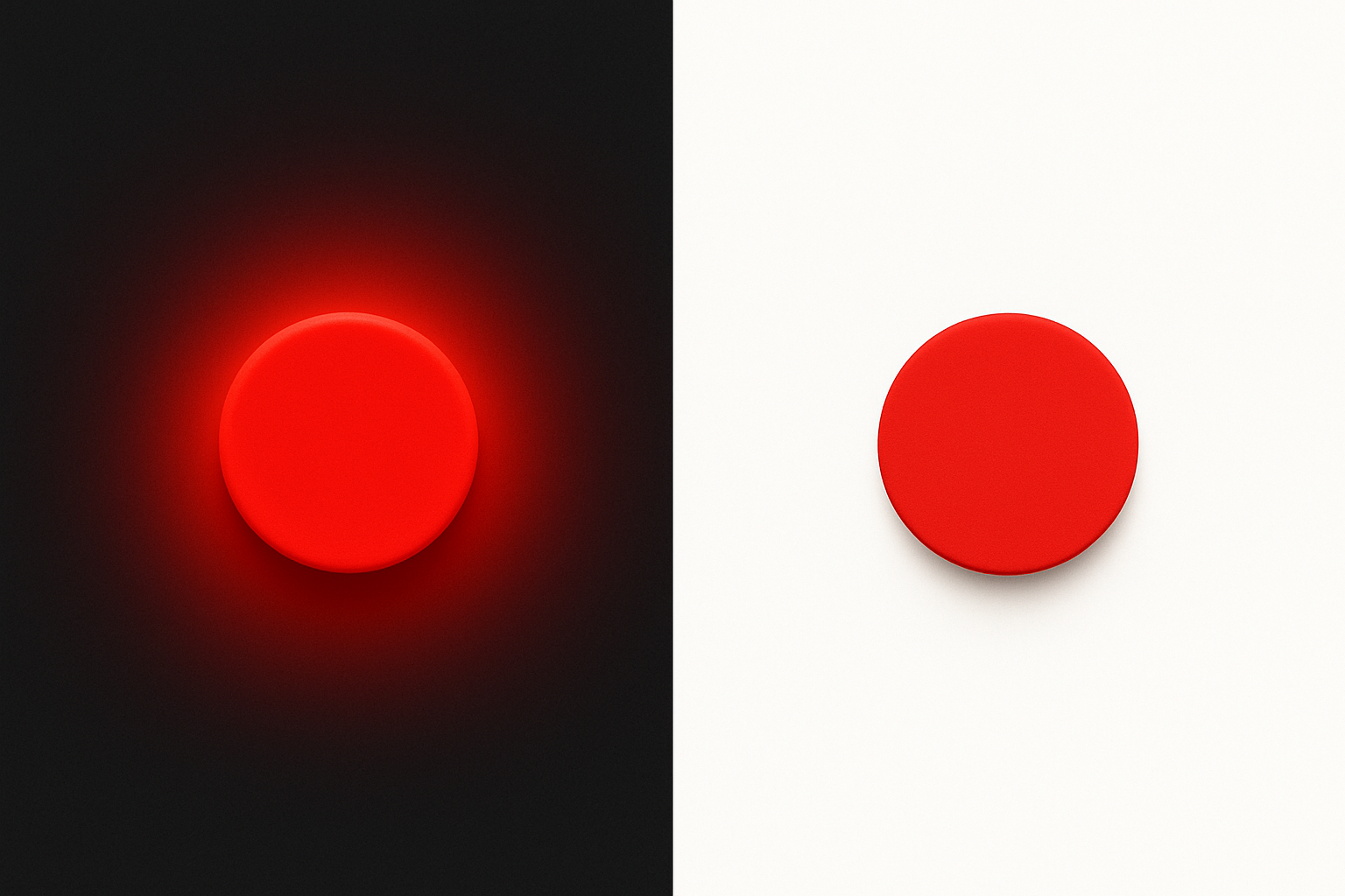
Let's walk through a concrete example. A saturated red (#FF0000) and a medium gray (#7C7C7C) both yield a relative luminance near 0.21. Place both against a #1A1A1A dark background, and they produce contrast ratios around 4.8:1. By the numbers, they're identical. But perceptually, the red screams while the gray whispers. The H-K effect creates a perceived brightness gap the formula completely misses.
What about APCA, the Accessible Perceptual Contrast Algorithm and candidate metric for WCAG 3.0? APCA improves on many fronts: polarity sensitivity, spatial frequency awareness, and better modeling of the human contrast sensitivity function. But as of its 2026 specification drafts, APCA still derives its lightness contrast from luminance without a chromatic correction factor. The H-K gap persists.
The practical result cuts both ways. Automated accessibility checks can approve color pairings that produce visual "glowing" text, elements that are genuinely harder to read for some users. They can also flag perfectly legible high-saturation pairings as failing. The formula is confidently wrong in both directions.
The Glowing Red Button: A Visual Case Study
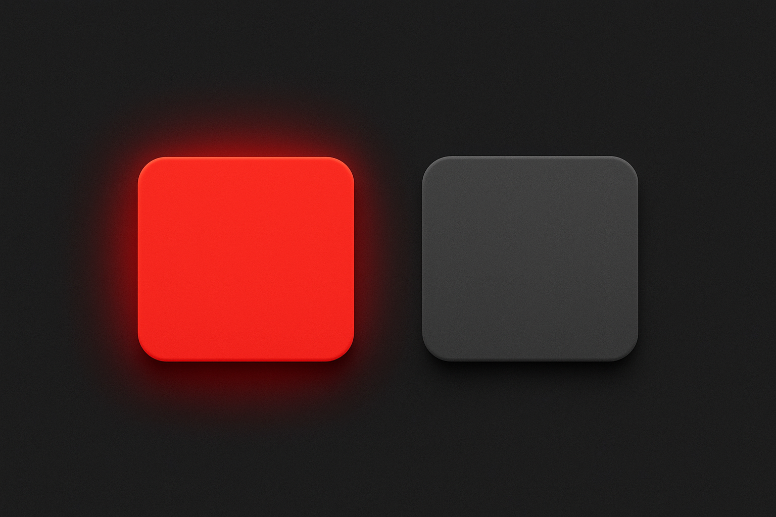
The easiest way to see the H-K effect in action is a side-by-side comparison. Place a call-to-action button in saturated red (#FF0000) next to an identical button in equiluminant gray (#7C7C7C), both on a dark charcoal background (#1A1A1A). Despite sharing the same luminance value, the red button appears to float above the surface, almost self-illuminated.
This isn't limited to red. A saturated electric blue (#0055FF) on dark gray produces the same uncanny glow, sometimes even more intensely. Meanwhile, a saturated yellow (#FFD700) on the same background exhibits a much subtler H-K boost. This wavelength dependency is consistent and predictable, which means it's also something you can design around.
Real-world design contexts where this causes problems are everywhere:
- Error states in form fields: Vivid red on dark mode backgrounds can make error messages look like they're pulsing, drawing disproportionate attention and increasing visual stress.
- Notification badges: A bright red badge counter on a dark nav bar appears to hover in front of the surface, creating an unintended depth cue.
- Accent-colored links in dark-themed reading apps: Saturated blue links in a dark reading mode can shimmer against the text, pulling focus away from content.
- Data visualization: Saturated hues on a dark chart appear to "pop" unevenly, making some data series look more prominent than others for reasons that have nothing to do with the data.
Here's another wrinkle. The effect reverses expectations on light backgrounds. The same saturated red on white doesn't glow in the same way, because the surround luminance is high and the contrast dynamic changes entirely. The H-K effect is most disruptive in dark mode UIs, precisely the context where modern design systems are investing the most energy.
Quantifying the Invisible: Fairchild and Pirrotta's H-K Correction
If the problem is quantifiable, is there a formula to fix it? Sort of.
The most widely cited compensation model comes from Mark Fairchild and Erwin Pirrotta, published in 1991. Their model adjusts perceived lightness based on a color's CIE chromaticity coordinates. The correction factor can increase a color's effective lightness by 20% to 100% depending on saturation and hue angle. A fully saturated blue might need its apparent lightness nearly doubled to match what your eyes actually see.
Conceptually, the formula works in three steps. First, it takes a color's position in CIE u'v' chromaticity space. Second, it calculates the color's distance from the achromatic point, which serves as a proxy for saturation. Third, it weights that distance by a hue-dependent function that peaks around blue and red, producing a multiplier on the luminance factor Y. The result is an adjusted lightness value that better predicts what humans actually perceive.
Yoshinobu Nayatani proposed an alternative model in 1997 that integrates more directly with CIECAM color appearance models. This approach offers a more natural path toward corrections that could theoretically be built into future contrast algorithms, since CIECAM-based systems already model viewing conditions, adaptation, and surround effects.
Both models have real limitations, though. They were derived from laboratory experiments with uniform color patches, not complex UI layouts with varying text sizes, anti-aliased edges, surrounding color contexts, and subpixel rendering. Spatial frequency matters enormously: a thin saturated red line triggers a different perceptual response than a large saturated red button. The models give you a direction, not a GPS coordinate.
Practical Strategies for Designers and Engineers
Understanding the science is useful. Knowing what to do about it is essential. Here are five strategies you can apply right now.
1. Desaturate accent colors in dark mode
Instead of using a pure hue at full saturation, pull chroma down 20–40% for high-H-K hues like reds, blues, and magentas. This reduces the perceptual brightness boost without killing the color's identity. Google's Material Design 3 tonal palette system inherently nudges designers in this direction: its dark-mode tokens favor less saturated variants of each primary and secondary color. There's a reason for that.
2. Adjust lightness targets asymmetrically
When defining your design system's contrast targets, build in a "saturation penalty" for vivid accent colors. If your neutral text passes at L*=60, a saturated red text might need to target L*=50 or lower to produce equivalent perceived contrast against the same background. This asymmetry feels counterintuitive, but it maps to how your users actually experience the interface.
3. Trust the squint test alongside the algorithm
Develop a manual QA step where reviewers evaluate high-saturation pairings on actual screens, not just in Figma or browser DevTools. Squinting reduces spatial detail and emphasizes luminance perception, making H-K distortions more obvious. If a color element appears to "jump off the page" when you squint, the H-K effect is probably in play, regardless of what the contrast checker says.
4. Advocate for H-K-aware tooling
A few experimental tools and libraries are beginning to incorporate chroma-adjusted lightness. The Color.js library, maintained by Lea Verou and Chris Lilley, provides hooks into CIECAM02/16-based color spaces where an H-K correction could be applied. Some prototype Figma plugins have started experimenting with saturation-aware contrast warnings. Push your tool vendors toward incorporating these corrections. The more designers ask for it, the faster it arrives.
5. Be especially cautious with saturated text on dark backgrounds
The H-K effect makes saturated colored text appear to "bleed" or shimmer, reducing legibility even when contrast ratios pass. This is particularly acute for thin fonts at small sizes. For body text, always prefer desaturated or near-neutral tones. Reserve full saturation for large decorative elements, hero banners, or icon fills where legibility of fine detail isn't the primary concern.
The Bigger Picture: Why Perception-First Design Matters
The H-K effect is just one member of a family of perceptual phenomena that luminance-only metrics fail to capture. The Bezold-Brücke shift causes hue to change with intensity. The Hunt effect causes colorfulness to increase with luminance. Chromatic adaptation causes your visual system to recalibrate its white point based on the ambient environment. Together, these effects represent a systemic gap between "color as numbers" and "color as experience."
The broader trajectory of accessibility standards is moving toward perceptual models. APCA is a step forward. CIECAM-based appearance models represent another. But full integration of chromatic appearance effects into automated tools is likely still years away. The research exists; the standardization and tooling don't, yet.
This creates a professional responsibility. Designers and front-end engineers cannot outsource perceptual judgment entirely to algorithms. Understanding the science behind effects like H-K is what separates a technically compliant interface from a genuinely accessible one. Compliance is a floor, not a ceiling. The ceiling is whether a real person, on a real screen, in a real room, can comfortably use what you built.
Closing Thoughts
The Helmholtz–Kohlrausch effect is a reminder that human vision is not a photometer. Our eyes and brains do not passively measure light. They interpret it through layered neural processes that no single formula has yet fully captured.
For designers building dark-mode interfaces, vibrant brand systems, or accessible data visualizations, this means that the numbers on screen are necessary but not sufficient. A saturated red that "passes" contrast checks can still glow, vibrate, and undermine readability in ways the math never predicted.
The fix isn't to abandon automated tools. It's to understand their blind spots. By learning to see what the algorithms can't, compensating with desaturation and lightness adjustments, and advocating for perception-aware tooling, you can close the gap between measured compliance and real-world legibility.
The next time a vivid accent color looks suspiciously bright on your dark canvas, don't dismiss it. Your eyes are telling you something the formula missed.