The Helmholtz-Kohlrausch Effect: Why Saturated Colors Look Brighter Than They Actually Are
by ColorSift Editorial Team
You've built a UI with a vivid red call-to-action button on a medium-gray card. The WCAG contrast checker gives it a green pass at 4.5:1. You ship it. Then the bug reports trickle in: "I can barely read that button text." You double-check the hex values, re-run the tool, and everything still passes. So what went wrong?
The answer is a perceptual phenomenon catalogued over 150 years ago by Hermann von Helmholtz and, later, Friedrich Kohlrausch. Most modern contrast-checking algorithms completely ignore it. The Helmholtz-Kohlrausch (H-K) effect describes how highly saturated colors appear significantly more luminous to the human eye than neutral grays of identical measured brightness. Your instruments say two colors are equally bright. Your eyes violently disagree.
This article unpacks exactly how that illusion works, why it matters more than ever in an era of automated accessibility tooling, and what you can practically do about it when building color systems for interfaces.
What Is the Helmholtz-Kohlrausch Effect, Exactly?
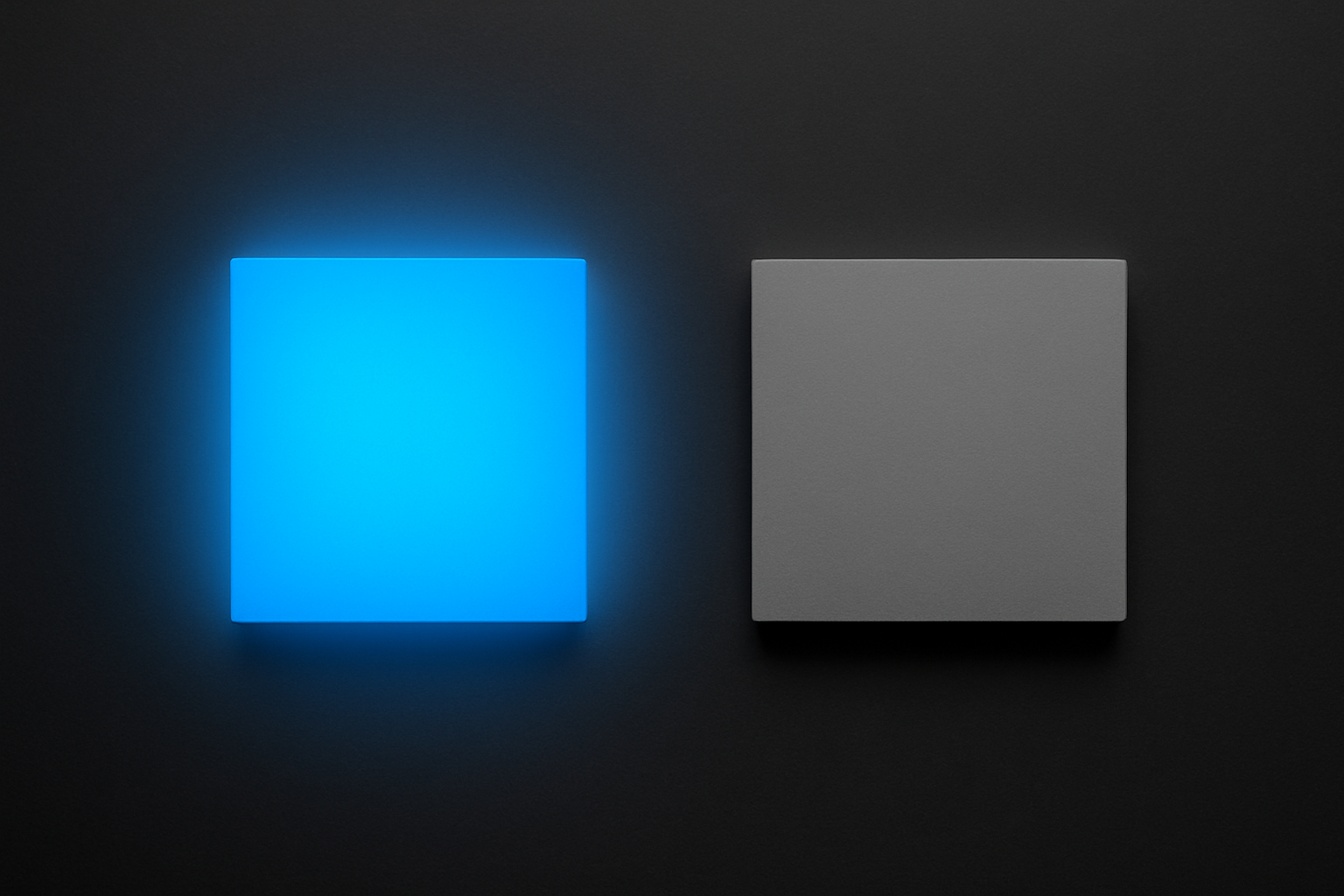
In plain terms: saturated chromatic colors are perceived as brighter than achromatic colors (grays) of the same measured luminance. Place a vivid electric blue next to a mid-gray. Give them identical luminance values on a spectrophotometer. The blue will look noticeably "lighter" or more glowing to a human observer, every single time.
The history runs deep. Helmholtz first described the phenomenon in the 1860s in his Handbuch der physiologischen Optik. Decades later, Kohlrausch quantified the relationship between saturation and perceived brightness in the early 20th century. Since then, psychophysical studies have confirmed and refined the finding repeatedly.
The key variable is chroma, or saturation. The effect is strongest at high chroma and is wavelength-dependent. Reds and blues trigger it far more dramatically than yellows and greens. A saturated magenta can appear up to twice as bright as a gray with the same luminance. That's not a subtle difference. That's a factor of two.
A quick clarification on what the H-K effect is not. It's not the Bezold-Brücke hue shift, where perceived hue changes with intensity. It's not general chromatic adaptation, where your eyes adjust to ambient color temperature. It is specifically about the brightness dimension being distorted by saturation. Nothing else.
And here's the core tension for anyone designing screens: most digital color models and accessibility formulas, including sRGB-based relative luminance and the WCAG 2.x contrast ratio, operate on measured luminance. Not perceived brightness. This creates a blind spot large enough to ship broken buttons through.
The Science Under the Hood: Why Your Eyes Lie About Brightness
Your retina contains three types of cone cells: L (long wavelength, roughly red), M (medium, roughly green), and S (short wavelength, roughly blue). The luminance channel, what we traditionally call "brightness," is derived mostly from L and M cones. Standard luminance formulas reflect this weighting. The CIE 1931 luminous efficiency function, which underpins most digital color math, assigns almost zero weight to S-cones.
But S-cones still contribute to your subjective sense of brightness. When a color is highly saturated, especially in the blue or red range, those S-cones fire strongly. The standard formula ignores that signal. Your brain does not.
This isn't purely a retinal story, either. Perceived brightness is computed at higher levels of visual processing, where chromatic signals get integrated into the brightness percept. A strong chromatic signal "leaks" into brightness perception, inflating it. The more saturated the color, the bigger the leak.
Yoshinobu Nayatani formalized a predictive model for the H-K effect in 1997, and the CIE has referenced it in subsequent publications. The color appearance models CIECAM02 and its successor CAM16 attempt to account for this interaction between chroma and perceived lightness. But adoption in everyday design tooling? Still minimal.
Here's an analogy that might help. Think about loudness perception in audio. Two sounds at the same decibel level can feel different in loudness depending on their frequency content. A piercing whistle at 3 kHz feels louder than a low hum at 100 Hz, even at the same SPL. Your ear's sensitivity varies with frequency. The H-K effect is the visual equivalent: chromatic "frequency content" inflates perceived "volume." Your color instruments measure the decibels. Your eyes hear the whistle.
Where Contrast Checkers Fall Short
WCAG 2.x contrast ratio works like this: take the relative luminance of two colors, derived from linearized sRGB values, and compute (L1 + 0.05) / (L2 + 0.05). The result is a simple ratio. 4.5:1 for normal text, 3:1 for large text. The formula is purely photometric. It contains no saturation term. No hue term. Just luminance.
Now walk through a concrete example. Take saturated hot pink, #FF0066, as text on a dark gray background, #595959. Run the WCAG calculation. It passes AA for large text. Ship it.
But the saturated pink appears to glow against the gray. It pulses. The perceived brightness difference between the two colors is actually smaller than the measured one, because the pink's saturation inflates its apparent brightness toward the gray's level. The text doesn't sit crisply on the background. It vibrates. Users squint. Bug reports arrive.
The inverse problem exists too. A deeply saturated dark navy, say #001166, on a near-black background might technically fail WCAG. But the chromatic signal from that saturation makes the navy appear brighter than the numbers suggest. Some users can distinguish it more easily than predicted. The formula is wrong in both directions.
APCA (Accessible Perceptual Contrast Algorithm) represents a step forward. It incorporates more perceptual modeling than WCAG 2.x, including polarity sensitivity (dark text on light vs. light text on dark). But it still doesn't fully model the H-K effect. Andrew Somers, APCA's creator, has publicly acknowledged H-K as an area needing further integration.
The takeaway is clear: automated tools are necessary but not sufficient. The H-K effect is one of several perceptual phenomena that can open a gap between "technically compliant" and "actually readable."
The Vibrating Button Problem in Real Product Design
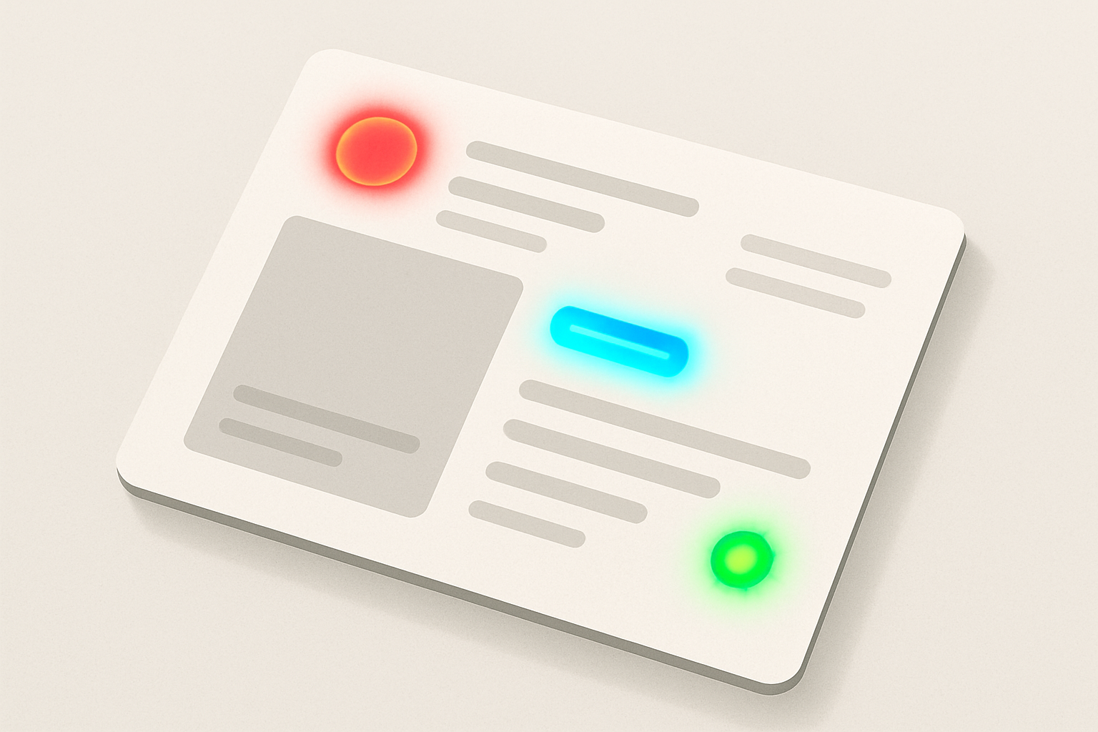
Here's a scenario that plays out in product teams constantly. A design team builds a dashboard with a muted, neutral color scheme: grays, off-whites, subtle shadows. Clean and professional. Then they layer in saturated accent colors. A bright coral (#FF6B6B) for alert badges. A vivid cyan (#00BCD4) for links. A hot green (#00E676) for success states. Each accent technically passes contrast requirements against the neutral backgrounds.
What do users actually experience? The saturated accents seem to hover above the surface, pulsing with extra luminosity. Alert badges feel almost fluorescent. Small text set in these vivid colors becomes harder to read than the contrast ratio predicts, especially at body-text sizes. The H-K brightness inflation narrows the apparent lightness gap between text and background.
There's a compounding optical effect worth mentioning: halation, sometimes called "bloom." When a highly saturated color sits on a lighter background, it can appear to bleed outward slightly, softening the edges of letterforms and reducing perceived sharpness. This isn't the H-K effect itself, but it rides alongside it, making the legibility problem worse.
Major design systems have dealt with this implicitly, even when they don't name the H-K effect directly. Google's Material Design recommends tonal variants rather than fully saturated primaries for text and large surfaces. Apple shifted toward more desaturated system colors in later iOS versions. These decisions aren't arbitrary aesthetic choices. They're practical responses to the perceptual reality that saturated colors misbehave at functional sizes.
Practical Strategies: Working With Saturated Colors Without Getting Burned
Strategy 1: Desaturate functional text colors. Reserve full saturation for large decorative surfaces, illustrations, or non-text indicators where letterform legibility isn't critical. When a saturated color absolutely must appear as text, increase the contrast ratio well beyond the minimum threshold. If the minimum is 4.5:1, aim for 6:1 or higher to compensate for H-K inflation.
Strategy 2: Trust your eyes over the numbers, but do it systematically. After passing the automated check, try the "squint test." Squinting reduces your visual acuity and simulates low-contrast conditions, revealing whether a perceived brightness match undermines legibility. If the text vanishes or starts to vibrate when you squint, the H-K effect is likely at play. Make this part of your review checklist, not a random impulse.
Strategy 3: Use perceptually uniform color spaces. When building your palette, work in OKLCH, CIELAB, or CAM16-UCS rather than HSL or HSB. These spaces more accurately represent human brightness perception. A saturation change in OKLCH will surface H-K-like issues more readily than the same shift in HSL. If two colors share the same L value in OKLCH but have wildly different chroma, be suspicious of their apparent brightness match. They probably don't look equally bright to a real human.
Strategy 4: Test on real screens with real content. The H-K effect is more pronounced on high-gamut displays (P3 and wider) because they can reproduce more saturated colors than sRGB monitors. A color that behaved well on a calibrated sRGB monitor may become problematically vivid on a modern MacBook or iPhone screen. Test your color pairings on the actual devices your users carry.
Strategy 5: When in doubt, add a neutral buffer. Instead of placing saturated text directly on a contrasting surface, use a neutral-toned container, outline, or background chip to isolate the saturated element. This gives the eye a local reference point and reduces brightness confusion. A white or near-white pill behind a vivid coral label, for example, anchors the color and tames the perceptual glow.
Beyond Compliance: Building Color Intuition for Edge Cases
The H-K effect is just one example of a broader principle: human vision is not a photometer. Designers who learn the major perceptual phenomena, simultaneous contrast, chromatic adaptation, the Bezold-Brücke shift, the Abney effect, and H-K, develop an intuition that catches problems no automated tool currently flags.
This knowledge changes the design review process. Instead of treating the contrast checker as the final verdict, teams can use it as a first pass and then apply perceptual judgment as a second pass. Specifically, flag any saturated color pairing for manual review. Ask: does this color combination feel as readable as the numbers claim?
Several emerging tools and standards are closing the gap. APCA continues to evolve. The oklch() function in CSS Color Level 4 brings perceptually uniform color into the browser natively. Researchers are working on display-adaptive contrast metrics that account for the actual gamut and luminance range of the viewer's screen.
And here's the forward-looking reality: as displays get wider-gamut and HDR becomes common on the web, the H-K effect will grow more pronounced, not less. Colors that were impossible to display five years ago are now routine on consumer hardware. P3 and Rec. 2020 gamuts push saturation levels that sRGB never reached. Designers who understand perceived brightness will be better equipped for this shift than those who rely solely on numerical compliance.
Bringing It Home
That "broken" red button from the opening wasn't a bug in your contrast checker. It was a feature of your visual cortex. The Helmholtz-Kohlrausch effect has been documented for over a century, yet it remains a blind spot in most design workflows and toolchains.
Understanding it won't make you abandon your contrast-checking tools. It will make you a sharper, more skeptical user of them.
The practical takeaway is simple. Saturated colors carry hidden perceptual brightness that the numbers don't capture. Account for it by desaturating functional text colors, testing beyond the checklist, and building fluency in perceptually uniform color spaces. In a field that increasingly automates color decisions, the designers who understand why their eyes disagree with the algorithm will be the ones who build interfaces that actually feel right.