Designing for the Golden Hour: Building UI Color Systems That Feel Warm Without Feeling Dated
by ColorSift Editorial Team
For nearly a decade, the default UI palette was "trust-gray and tech-blue." Then, almost overnight, it wasn't.
In 2026, amber navigation bars, terracotta illustration systems, and golden-toned dark modes are showing up across product dashboards, AI assistants, and consumer apps. But for every interface that pulls this off beautifully, three others look like a burnt-orange PowerPoint from 2009.
That's the central tension. Warmth is powerful. It feels human and approachable. It's also the easiest palette direction to get catastrophically wrong.
This guide walks through a practical, system-level framework for building warm UI color systems that hold up. We'll cover anchor hue selection, luminance calibration, pairing strategy, and multi-surface application, all illustrated with three fully worked palette directions. No "just pick a nice amber." Real rules, real systems.
Why Warmth Is Having Its Moment (and Why It's Harder Than It Looks)
Cool grays dominated enterprise and consumer SaaS for years. Slack's aubergine was the quirky exception that proved the rule. Then AI product branding started changing the conversation. Conversational interfaces, ambient computing, generative tools. These products needed to signal approachability and humanity rather than cold efficiency. Warm tones became the answer.
But warm hues sit in a perceptual danger zone. Small missteps in saturation or lightness trigger what you might call "temporal color associations," where certain hue-saturation combinations are strongly coded to specific eras. Push your amber a few degrees too yellow and you're in 1970s harvest gold territory. Desaturate it carelessly and you land in muddy, overcooked territory that screams low-quality.
Understanding this is essential before picking any warm anchor.
The three palette directions we'll build out represent three very different solutions to the same problem:
- Sun-Bleached Minimalism — editorial calm, Apple-adjacent but warmer
- Rich Harvest — tactile, artisanal, terracotta-leaning confidence
- Neon-Adjacent Warm — high-energy, creator-focused, modern contrast
Each fits distinct use cases. And all three follow the same systematic approach, because this isn't about picking a hex code. It's about building a color system with rules that hold across components, surfaces, and themes.
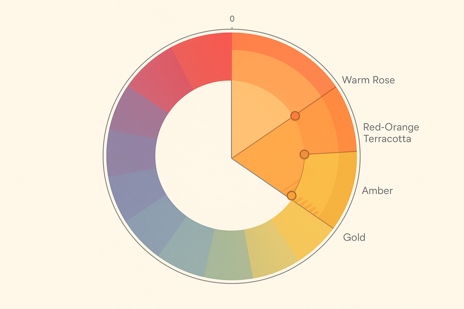
Choosing Your Warm Anchor Hue: The 15-Degree Decision
On the HSL hue wheel, "warm" for UI purposes lives roughly between H20° and H55°, covering amber, gold, and yellow-orange. Drop below H20° and you enter red-orange and terracotta. Push past H340° on the other end and you're in warm rose territory. Each sub-range carries different connotations and different pairing constraints.
Here's where it gets interesting. Nudging your anchor hue just 10 to 15 degrees on the wheel dramatically changes its era-coding and pairing options.
- H35° (golden amber) feels contemporary and tech-adjacent
- H40° pushed toward H45° starts reading as "harvest gold"
- H28° reads as terracotta, feeling artisanal and editorial
That 15-degree decision matters more than almost any other color choice you'll make.
Saturation is the other critical lever. High saturation (above 75%) at warm hues reads as retro or aggressive. Modern warm palettes tend to live between S 40% and S 65% for anchor tones. Accent pops can go higher, but only for interactive elements that need to stand out.
A practical exercise: Pick three candidate anchor hues. Place each one on a neutral white (#F5F5F5) and a dark surface (#1A1A1A). Evaluate whether they feel current. This simple test surfaces luminance and saturation problems before they contaminate your entire system.
Starting-point recommendations for each palette direction:
- Sun-Bleached Minimalism: ~H38° S50% L55%
- Rich Harvest: ~H30° S60% L48%
- Neon-Adjacent Warm: ~H42° S85% L52%
Luminance Calibration: Making Warm Tones Work for Accessibility
Warm hues are uniquely tricky for accessibility. The human eye perceives yellows and ambers as intrinsically brighter than blues at the same mathematical lightness value. This is the Helmholtz-Kohlrausch effect, and it means a warm color that passes a contrast checker can still feel visually washed out to users.
The APCA (Advanced Perceptual Contrast Algorithm) handles this better than WCAG 2.1 because it accounts for perceptual lightness more accurately. For body text on warm backgrounds, target Lc 60 or higher.
Build what I call a "luminance ladder" for each warm palette. Generate at least 9 lightness steps (050 through 950 on a standard scale) and identify which steps are safe for:
- Backgrounds only (lightest steps, 050–100)
- UI surfaces (150–300)
- Interactive states (400–600, used carefully)
- Text on light backgrounds (700–950)
- Text on dark backgrounds (050–200)
Watch out for the "muddy middle." The L40–L60 range in warm hues is a trap. Too dark for backgrounds. Too light for readable text. Perceptually ambiguous. Successful warm systems often skip this range entirely or reserve it for disabled and decorative states.
One firm rule: never place warm-toned text on a warm-toned background unless you have at least a 4-step luminance difference AND a hue shift. Warm-on-warm fails both perceptually and for accessibility almost every time.
Three Palette Directions, Built Out
Palette 1: Sun-Bleached Minimalism
Anchor: ~H38° S45% L55%. Paired with warm whites (H40° S8% L96%), stone grays (H30° S12% L82%), and a single cool-blue accent for interactive elements. The character is editorial, calm, and warm without being heavy.
This palette shines on navigation bars, where the warm tint replaces sterile gray with quiet confidence. It most commonly fails on data-dense tables, where the subtle warmth can make rows feel indistinct.
Best for: productivity tools, content platforms, AI assistants.
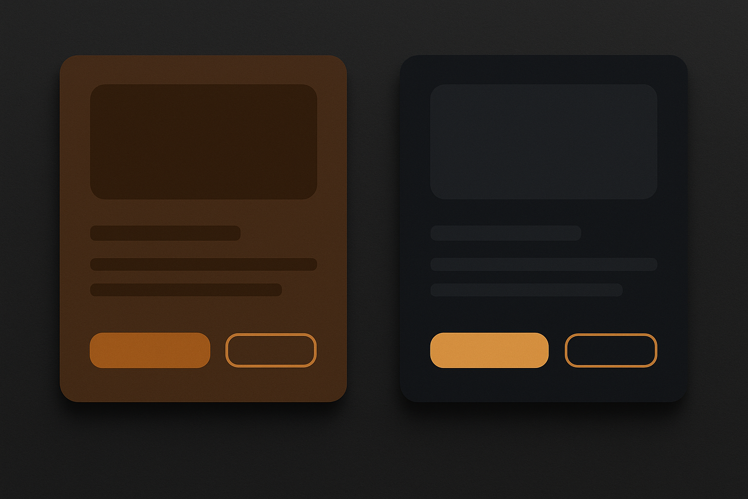
Palette 2: Rich Harvest
Anchor: ~H28° S62% L48%, terracotta-leaning. Paired with deep espresso neutrals (H25° S20% L14%) and warm cream highlights. Tactile, artisanal, confident.
The risk zone here is real: this can read as "earthy startup circa 2019" if you don't balance it with modern typography and sharp geometry. The palette shines on card surfaces, where the terracotta creates a sense of material depth. It fails most often on form inputs, where the warm tints can make placeholder text nearly invisible.
Best for: consumer apps, food and lifestyle brands, fintech products that want a human touch.
Palette 3: Neon-Adjacent Warm
Anchor: ~H42° S85% L52%. This one behaves more like an accent color than a surface tone. Use it primarily for interactive states, highlights, and data visualization. Pair it with near-black cool-gray surfaces (H220° S10% L10%) for high-energy contrast.
This palette shines on CTAs and progress indicators, where the electric amber creates urgency. It fails on background surfaces, where the high saturation becomes overwhelming within seconds.
Best for: gaming platforms, creator tools, dashboards that need visual energy.
A note on an emerging direction: Some 2026 design systems are exploring a "warm-cool bridge" approach, pairing a muted warm primary with a cool violet secondary. This hybrid gives warmth without full commitment, and it's worth watching.
The Pairing Playbook: Cool Neutrals as the Antidote to Visual Fatigue
A UI that is 100% warm reads as oppressive after extended use. Think of cool neutrals as shadow in a painting. They don't fight the warmth. They give the eye places to rest.
Three cool-neutral archetypes pair well with warm palettes:
- Blue-gray (H210°–H230°) — the "cloud" neutral, versatile and receding
- Green-gray (H160°–H180°) — the "sage" neutral, organic and complementary
- True cool gray (H0° S0%) — safe only in near-white or near-black ranges to avoid muddiness
For surface ratios, follow this rule: warm tones should occupy no more than 30–40% of total surface area on any given screen. The remaining 60–70% stays neutral, with warm hues reserved for accent, brand, and interaction affordances.
Dark mode is where most warm systems collapse. Designers darken the warm anchor directly and end up with a muddy, low-contrast surface. The correct approach: shift the dark surface to a cool-tinted near-black and introduce warm tones only through accent layers.
One more consideration: typography. Warm palettes pair best with humanist sans-serifs like Instrument Sans, Plus Jakarta Sans, or DM Sans. Editorial serifs also work well. Geometric sans-serifs can clash, feeling too cold and breaking the tonal coherence of the palette.
Applying a Warm System Across a Real Product Surface
Let's walk through a specific product: a personal finance dashboard using the sun-bleached minimalism palette.
Decision hierarchy: Brand accent warm comes first. Then surface neutrals. Then semantic colors. Even the semantic palette shifts to stay coherent. A slightly warmer success green. A less saturated error red. Harmony across the system.
Across the product surface:
- Top navigation: Sun-bleached amber at the 200 step, creating a warm header that separates from the neutral content area below
- Spending chart: Warm amber for primary data series, cool-blue accent for comparison data, stone gray for axes and gridlines
- Card surfaces: Warm white (050 step) on a true-white page background, creating subtle lift without borders
- Buttons and form states: Amber 500 for primary CTAs, with hover states shifting hue slightly cooler (H+8°) rather than just lightening, which produces an unwanted yellow shift
- Empty and loading states: Stone gray illustrations with amber spot color, keeping the warmth present but subdued
That hover-state trick deserves emphasis. Lightening amber just produces yellow, which looks broken. Instead, shift the hue 8 degrees cooler on hover and use opacity-based focus rings rather than color-shift rings.
For icons, warm color systems create an expectation of softness. Sharp geometric icons feel jarring. Icon sets with slightly rounded terminals, like Phosphor Icons or Lucide with adjusted stroke weight, maintain coherence. Use warm-tinted shadows in illustrations rather than cool gray.

Common Failure Modes and How to Avoid Them
Failure Mode 1 — The Harvest Trap. Your amber has too much green-yellow (H48° or higher) and reads as dated mustard. Fix: test your anchor hue isolated on both white and black backgrounds. Compare it to reference palettes from pre-2010 design. If it rhymes, shift warmer (lower hue value) or desaturate by 10%.
Failure Mode 2 — Warm Soup. Warm tones on backgrounds, text, icons, borders, AND accents simultaneously. The palette loses contrast hierarchy and everything competes. Fix: enforce the 30–40% warm surface cap. Assign the warmest, most saturated steps exclusively to interactive and brand moments.
Failure Mode 3 — The Contrast Cliff. Passing WCAG AA with warm text on light warm backgrounds that still feel low-contrast perceptually. Fix: target APCA Lc 65+ for warm-on-warm pairings. Always validate with a grayscale preview.
Failure Mode 4 — Semantic Color Collision. Using your warm amber as both a brand accent AND the system warning color. These roles will inevitably conflict. A warning state that looks like a CTA, or a CTA that reads as a warning. Fix: dedicate the warm anchor to brand and interactive roles. Use a distinct warm-yellow (H52°–H58°) for warnings only, kept visually separate by context and iconography.
The quickest heuristic? The squint test. Squint at your UI. You should see one warm focal point, a receding neutral field, and identifiable interactive elements. If everything glows at the same temperature, the system needs rebalancing.
Building the Muscle Now
The shift toward warm UI palettes in 2026 isn't a trend to chase. It's a design language that, done well, creates interfaces that feel genuinely human and emotionally legible in ways that cool-gray systems never could.
But warmth is not a vibe. It is a system.
The difference between a UI that radiates golden-hour confidence and one that looks like a thrift-store Halloween decoration comes down to the disciplined decisions covered here: a precisely chosen anchor hue, a luminance ladder that accounts for perceptual brightness, cool-neutral breathing room, and consistent hierarchy rules applied across every surface.
Start with one of the three palette directions. Apply the contrast and pairing rules rigorously. Treat the first version as a living system, because warm color responds dramatically to real-screen testing under different ambient light conditions. What looks perfect on your calibrated monitor might glow uncomfortably on a phone in direct sunlight.
As interfaces move toward more ambient, embodied contexts, from wearables to spatial computing to always-on displays, warmth will only become a more important design signal. The designers who build this muscle now will lead that transition.