Why Gen Z Loves 'Ugly' Color: How Clashing Palettes Became a Status Signal in 2026 Branding
by ColorSift Editorial Team
It's early 2026, and a senior creative director at a top branding agency is presenting a new fintech identity to stakeholders. The palette: lime green, hot magenta, and acid yellow slammed together with zero transitional neutrals. Five years ago, this combination would have been flagged as a production error. Maybe the work of an untrained intern who never opened a color theory textbook. Today, the client leans forward and asks if it can be "more chaotic."
This scene, composited from real industry conversations, frames a question that's been building for the past two years: How did visual discomfort become the most coveted brand signal for reaching Gen Z consumers?
This isn't a think piece lamenting the death of good taste. It's a serious analysis of why clashing color works, what it communicates, and how designers can wield it with intention rather than randomness. We'll move from cultural diagnosis to practical application, with palettes you can actually use along the way.
The Death of "Good Taste": How We Got Here
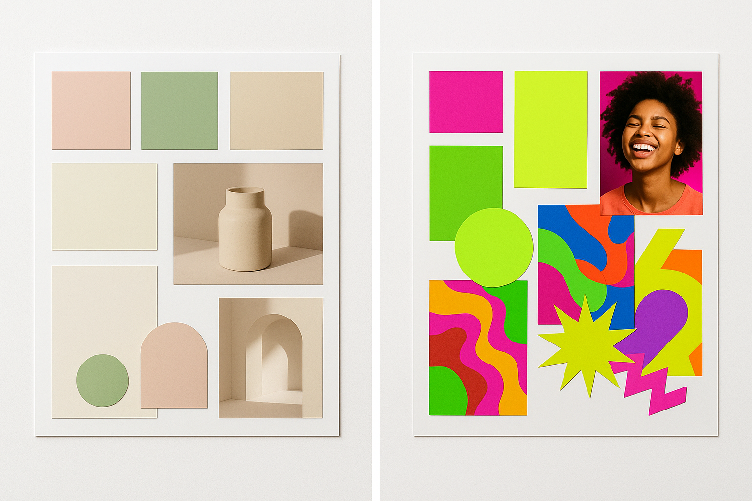
Remember the blanding era? From roughly 2016 to 2021, every direct-to-consumer brand seemed to converge on the same visual language: soft pastels, geometric sans-serifs, muted earth tones, and plenty of white space. Glossier. Casper. Everlane. Away. If you squinted, they were all the same brand. The palette was a uniform. It communicated "millennial, premium, trustworthy" so efficiently that it stopped communicating anything at all.
The backlash started building around 2023. But the real accelerant was AI.
When tools like Midjourney and generative branding suites began producing flawless, harmonious palettes in seconds, visual polish lost its signal value. Polished started reading as "machine-made." Effortless in a bad way. If anyone with an AI subscription could generate a pitch-perfect color scheme in thirty seconds, then pitch-perfect color schemes stopped meaning anything.
Gen Z's cultural logic made the rest inevitable. This is a generation that grew up in an algorithmically curated world. They've been served "recommended for you" content since childhood. Anything that feels friction-free feels suspicious to them. Clashing color is a form of visual friction. It demands attention. It signals that a human made deliberate, opinionated choices. It says: someone was here, and they had something to say.
The cultural threads are everywhere if you look. The "anti-aesthetic" discourse on Are.na. Virgil Abloh's legacy of quotation-mark irony applied to color and form. Y2K nostalgia cycles. Rave revival graphics. These aren't disconnected phenomena. They're all expressions of the same impulse: a desire for visual experiences that resist easy consumption.
The Brands Leading the Charge: Case Studies from 2026
This trend isn't theoretical. It's showing up in boardrooms and on billboards across industries.
Fast food goes acidic. Quick-service restaurant brands have been early movers. Taco Bell's ongoing visual evolution has leaned further into saturated, unexpected color pairings across packaging, app UI, and social content. The palette performs differently in each context, bright and confrontational on Instagram, slightly tamed in the ordering interface, but always recognizably aggressive. Newer QSR entrants targeting Gen Z have followed suit, treating the menu board like a rave flyer.
Streetwear makes the palette the logo. Brands like Corteiz and Broken Planet aren't using color collision as a seasonal campaign choice. The clash IS the identity. When your color palette is so distinctive that people recognize the brand from a thumbnail on a resale app, color is doing the work that logos used to do. Emerging labels in 2026 are building entire brand systems around palettes that would have been rejected by any design school professor a decade ago.
Fintech signals disruption through discomfort. Financial apps targeting young users have learned from Cash App's neon green playbook and pushed further. Newer 2026 launches use anti-aesthetic color to differentiate from the navy-and-white trust palette of legacy banking. The message is clear: we're not your parents' bank, and we don't look like it either.
The cross-industry pattern is consistent. In all three cases, the clashing palette serves dual purposes. It stops the scroll on social feeds. And it functions as a tribal marker, signaling "this brand is for people like me."
It's worth noting that major agencies like Collins, Koto, and Dinamo have publicly showcased work in this register in early 2026, legitimizing the trend beyond indie brands. When the establishment adopts the rebellion, you know the shift is structural.
The Psychology of Discomfort: Why Clashing Color Actually Works
Let's get specific about the mechanics. Why does lime green next to hot magenta create such a strong reaction?
These colors sit in adversarial positions on the color wheel. They have competing warm/cool temperatures. Their saturation levels fight for dominance in your visual field. Your brain can't easily resolve them into a hierarchy, so it keeps processing.
That processing is the point.
Neurological research on visual salience shows that clashing high-saturation palettes trigger a stronger orienting response than harmonious ones. Your eyes literally can't look away as quickly. In a marketing context where attention is the scarcest resource, this matters enormously.
Think of it as the "uncanny valley" of color. Harmonious palettes feel resolved. Your brain processes them, categorizes them, and moves on. Clashing palettes create low-level cognitive dissonance. The viewer lingers, trying to resolve the tension. That lingering increases brand recall.
For Gen Z specifically, the emotional coding runs deeper. This generation associates visual discomfort with honesty, imperfection, and anti-corporate energy. A polished, harmonious palette reads as "trying to sell me something." A clashing palette reads as "being real." The palette is doing emotional labor that copywriting alone cannot achieve.
An important caveat. There is a line between "intentionally discordant" and "genuinely inaccessible." WCAG contrast requirements still matter. If your electric blue text on a hot magenta background fails AA contrast ratios, you haven't made a bold brand statement. You've made an unusable product. The chaos should be visual, not functional.
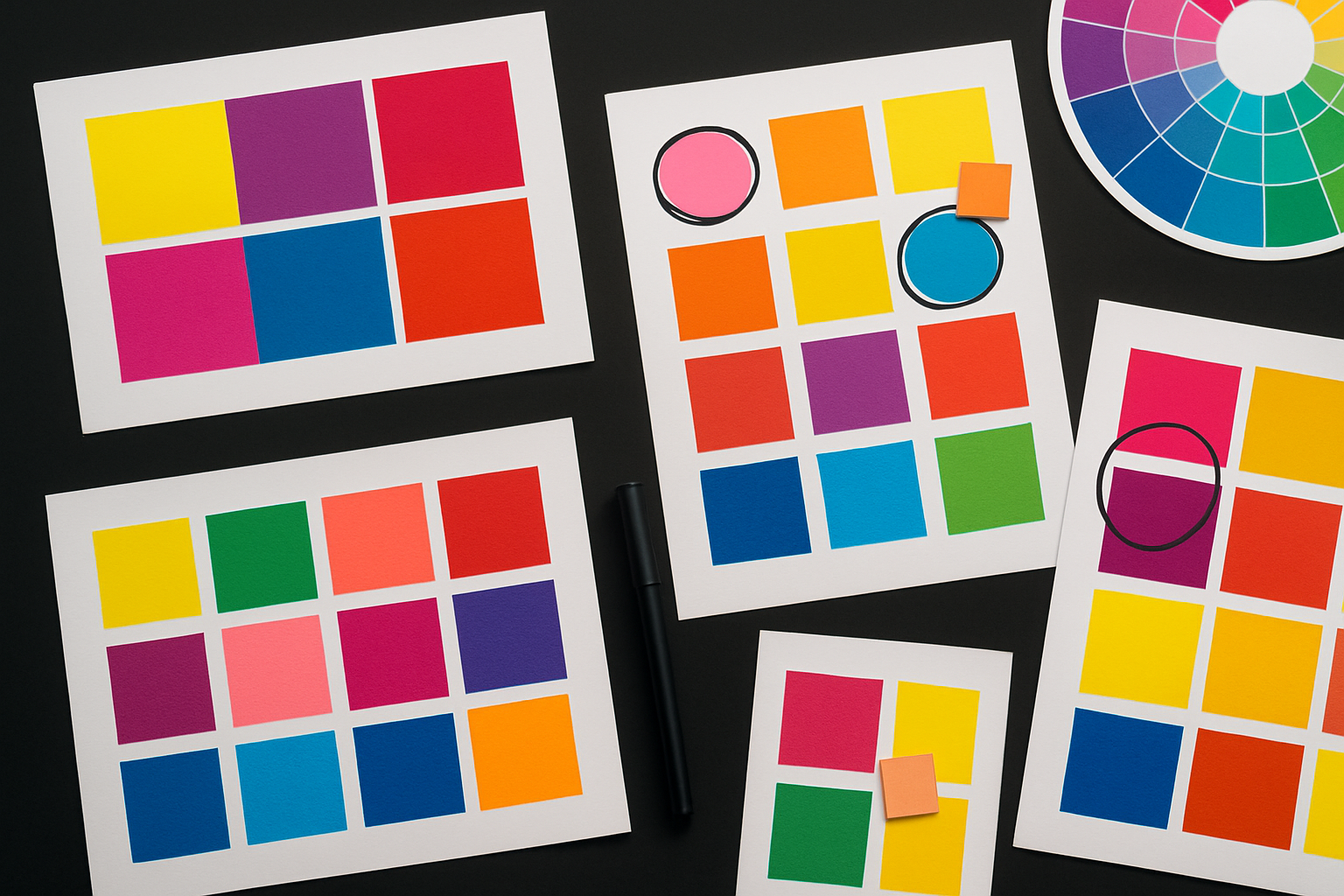
Palette Showcase: From "Mildly Chaotic" to "Fully Unhinged"
Here's a practical framework: four palettes capturing this trend at different intensity levels. Each one follows a structural principle that makes it feel intentional rather than random.
Palette 1: Controlled Tension
This palette uses one dominant clash, electric blue against warm coral, grounded by a near-black and a cream. The organizing principle is a shared high saturation between the two lead colors, with the neutrals providing visual rest. It's suitable for fintech, health-tech, or food brands seeking a "young but trustworthy" feel. You get the energy of the trend without alienating broader audiences. The single point of tension is enough to signal awareness without screaming.
Palette 2: Confident Chaos
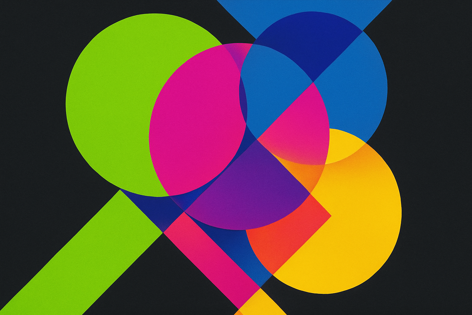
Three saturated hues in open conflict: lime green, hot magenta, and cobalt. The only breathing room is a stark white. No pastels, no earth tones, no apologies. The structural principle here is that all three chromatic colors share a similar saturation level, creating a strange internal consistency even as they clash. This works for streetwear, event branding, and social-first campaigns where maximum scroll-stopping power is the goal.
Palette 3: Fully Unhinged
Acid yellow, UV purple, neon orange, and electric teal all coexisting with a near-black anchor. Every color fights for dominance. The anchor is the only thing keeping this from disintegrating into noise. Temperature contrast is the organizing logic: the palette alternates warm and cool, creating a rhythm even in the chaos. Use cases: music festivals, Gen Z media brands, limited-edition drops, and meme-native brands that need to feel like the visual equivalent of a sugar rush.
Palette 4: Nostalgic Clash
A Y2K and rave-inflected palette: chrome silver, cyber lavender, slime green, and bubblegum pink. This roots the clashing tendency in a specific cultural reference point, giving it narrative depth beyond pure visual aggression. The shared cool undertone across all four colors provides cohesion. It works beautifully for fashion, beauty, and gaming-adjacent brands that want to feel both futuristic and retro at once.
Making It Intentional: A Framework for Designing with Clash
Random chaos is easy. Intentional chaos is a skill. Here's how to approach it.
The "one rule to break" principle. Effective clashing palettes typically obey most color theory rules and violate one specific rule dramatically. Maybe you break complementary harmony but maintain saturation consistency. Maybe you violate temperature expectations but keep a clear value hierarchy. Identify which rule you're breaking and commit fully to that violation. Half-measures read as mistakes.
Every palette needs an anchor. Almost every successful clashing palette includes one neutral or near-neutral tone: black, off-white, charcoal. This provides visual rest and prevents the palette from becoming pure noise. Removing the anchor is what separates "fully unhinged" from "broken." Even the most chaotic palettes in the wild almost always have a dark or light anchor doing quiet structural work.
Hierarchy still matters. Even in chaotic palettes, consider the 60/30/10 framework. One color dominates at roughly 60%, one supports at 30%, and the clashing accent appears at around 10%. Unless, of course, the brand deliberately inverts this ratio for maximum impact. But that inversion should be a choice, not an accident.
Context changes everything. A palette can go fully unhinged on a billboard or social post but needs restraint in app UI, long-form reading, or wayfinding. Build systematic rules for when to deploy full chaos versus restrained versions. The same five colors can feel wildly different depending on their proportions and context.
The swap test. Here's a quick gut check for intentionality: if you can swap any color in your palette for another random saturated hue and it feels the same, your clash isn't intentional enough. Each color should be doing specific, defensible work. You should be able to explain why it's that green and not a different green.
Will It Last? The Lifecycle of Anti-Aesthetic Trends
History offers useful parallels. Punk's DIY aesthetic in the late 1970s. Grunge's anti-fashion moment in the early 1990s. The "ugly sneaker" trend of 2017 to 2020. Each was born from genuine cultural friction. Each was absorbed by the mainstream and eventually neutralized. But each also left a permanent mark on the design vocabulary.
The clashing palette trend will follow a similar arc.
Signs of mainstreaming are already appearing. When legacy brands, think insurance companies and automotive manufacturers, start tentatively adopting clashing palettes in their sub-brand campaigns, the trend is entering its "late adoption" phase. Watch for this in late 2026 and into 2027.
The likely evolution is a fork. One branch becomes codified and "safe," the way pastels became safe DTC shorthand. Agencies will offer "controlled tension" palettes as a menu item. The other branch pushes further into illegibility and discomfort, staying ahead of the mainstream by becoming even more aggressive.
The advice for designers is simple but important: don't adopt this trend as a style to copy. Adopt the underlying principle. Color should do cultural work, not just aesthetic work. The specific hues will change. Lime green will eventually feel as dated as millennial pink. But the idea that palettes can signal values, audiences, and stances? That endures.
Color Regains Its Power
Let's return to that creative director presenting the clashing fintech palette. Reframe the scene. This isn't a story about declining taste. It's a story about color regaining its power as a meaning-making tool after years of being flattened into safe, algorithmic harmony.
The "ugly" palette isn't ugly at all. It's doing more semiotic work than a thousand Pantone-of-the-year selections. It says: we see you, we're not afraid to be specific, and we'd rather be remembered than merely approved of.
For designers, the takeaway is both liberating and demanding. You have permission to clash. But you need a reason for every collision. Every hue in your palette should earn its place through cultural resonance, psychological impact, or strategic differentiation.
Here's the forward-looking question worth sitting with: in a world where AI can generate any palette instantly, the most valuable design skill isn't knowing which colors look good together. It's knowing which ones feel true together. That's a judgment call no algorithm can make for you. And in 2026, it's the judgment call that separates forgettable brands from unforgettable ones.