Chasing Dopamine: How Gen Z Beauty Brands Are Using Chromatic Maximalism to Rewrite the Color Rulebook in 2026
by ColorSift Editorial Team
Open any beauty haul on TikTok right now and you'll notice something jarring, in the best possible way. The products aren't whispering in sand, sage, or blush. They're screaming in acid green, ultraviolet purple, and chrome silver. Somewhere between 2024's quiet luxury hangover and today's full-blown chromatic rebellion, a new generation of beauty brands decided that restraint was the enemy.
This piece maps exactly how, and why, Gen Z beauty has become the most visually confrontational it's been in decades. We're tracing the specific palette signatures driving the movement, the cultural forces behind them, and what it all means for designers watching color trends in real time.
From Blush to Blast: The Death of Millennial Minimalism in Beauty
For nearly a decade, millennial beauty branding lived inside a narrow tonal corridor. Glossier's pink milk. NARS nude lips. The Ordinary's clinical white bottles. Sophistication meant restraint. The message was clear: serious skincare whispers, it doesn't shout.
That visual language reached its ceiling somewhere around 2023 to 2024, during the peak of "quiet luxury." Glossier You, Rare Beauty's mauve tones, and a sea of greige packaging all signaled taste through what they withheld. It worked beautifully. And then it became wallpaper.
The counter-movement arrived fast. Starting in late 2024 and accelerating through 2025 into this year, a wave of indie labels, Substack-born brands, and challenger cosmetics lines began launching with brand identities defined by deliberate chromatic aggression. These weren't legacy brands testing a "bold" limited edition. These were companies whose founding visual DNA was built on color conflict.
Here's the important thing: this isn't randomness or shock value. It's a coherent aesthetic philosophy with identifiable palette logic, cultural roots, and a sharp commercial strategy.
The visual gap between these two eras is staggering. What was once considered "too much" is now the baseline.
Mapping the Palette Signatures: The Four Color Systems Defining the Movement
Chromatic maximalism in 2026 beauty isn't one look. It's at least four distinct palette systems, each carrying its own cultural frequency.
Acid Brights + Hot Clash. This is the most ubiquitous signature. Acid greens in the #AAFF00 range paired with hot corals and electric tangerines. You'll find it dominating Sephora's "Fresh Faces" shelf and all over TikTok Shop. The combination is aggressive, cheerful, and almost impossible to scroll past.
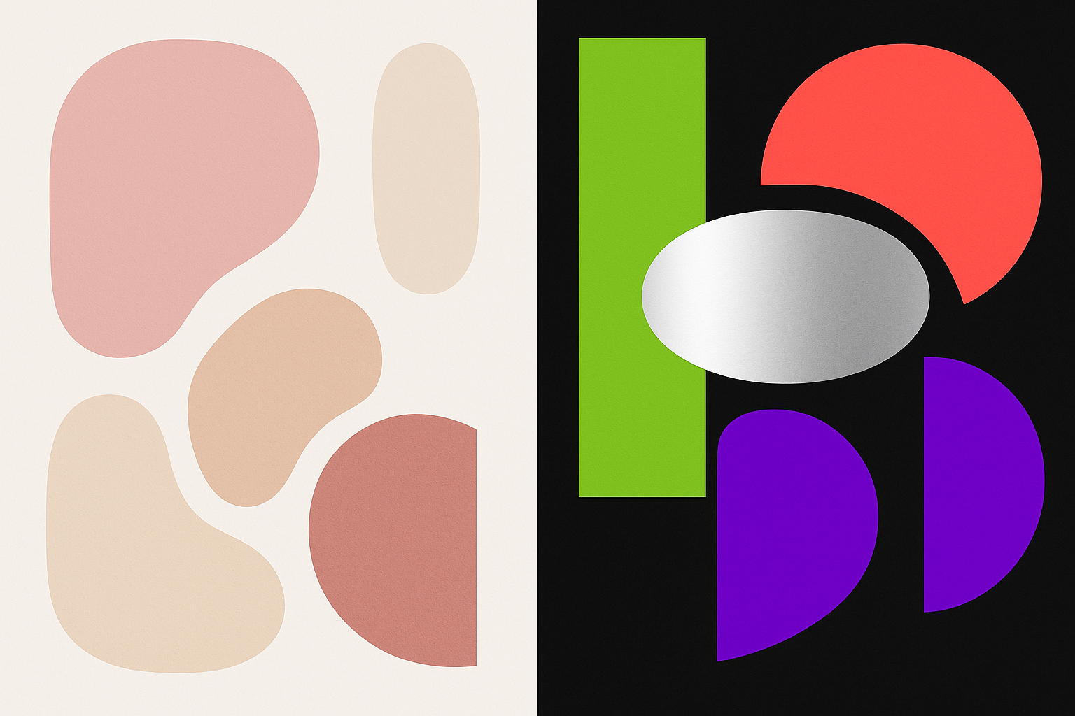
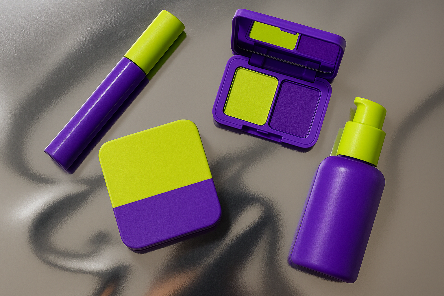
Ultraviolet + Chrome. Deep UV purples set against cold chrome silvers and aluminum whites. This palette reads simultaneously futuristic and rave-coded, and it's especially popular in eye and lip product branding. It borrows from Y2K nostalgia while pushing further into digital-native territory.
Hyperpop Pastels. These aren't your soft-girl lavenders and baby blues. They're neon-washed versions of traditional pastels: radioactive lavender, electric cerulean, saturated peach pushed three stops past comfortable. The subversion is subtle but effective. The shapes say "gentle." The saturation says "absolutely not."
Anti-Neutral Darks. This sub-trend replaces conventional "nude" with confrontational near-blacks, petroleum teals, and bruised magentas. Call it dark maximalism. It rejects the entire concept of a safe neutral and asks why a base shade can't also be the loudest thing in the room.
The Cultural Engine: Post-Irony, Dopamine Dressing, and the "More Is More" Backlash
Palette choices don't happen in a vacuum. The chromatic maximalism wave is powered by several cultural currents converging at once.
The most obvious is dopamine dressing, the psychology of using saturated, clashing color as a mood-regulation tool. This concept migrated from fashion into beauty over the past two years, and Gen Z has internalized it as a philosophy, not just a styling trick. The idea that what you put on your body should make you feel something chemically is now a design brief.
Then there's what critics call post-irony aesthetics. Gen Z's maximalism isn't the ironic kitsch of early-2010s "so bad it's good" culture. It's sincere. Unironic. They genuinely believe more is more, and they don't need a wink or a disclaimer to justify it.
The quiet luxury backlash plays a role too. The Bottega Veneta and Loro Piana aesthetic, while gorgeous, felt exclusionary and aspirationally hollow to younger consumers. Loud color became a democratizing act. You can't "quiet luxury" your way into belonging if you're rejecting the premise entirely. A $14 lip gloss in electric tangerine packaging carries as much visual conviction as a $400 moisturizer in taupe.
There's also a technical dimension that gets overlooked. Gen Z grew up designing in Canva, playing games with HDR color palettes, and consuming content on OLED screens. Their color intuition is literally calibrated to higher saturation than any previous generation. What looks "too much" to a millennial eye looks normal, even understated, to someone whose visual baseline was set by Fortnite and Instagram filters.
Case Study: How One Challenger Brand Built an Entire Identity Around a Single Clashing Palette
To see the strategy in action, consider a composite brand archetype that represents dozens of real launches from the past eighteen months. Picture a Gen Z-founded indie cosmetics label that launched via Substack and TikTok in 2025, built its visual identity around a signature UV purple and acid lime palette, and secured Sephora shelf placement by mid-2026.
The design decisions are precise. The clashing palette extends from product packaging to social assets, email templates, and even the founders' personal brand aesthetics on their own channels. This total chromatic consistency works as a trust signal. When everything matches, even if what matches is visually aggressive, it reads as intentional. Intentional reads as professional. Professional reads as trustworthy.
The commercial logic is straightforward. A confrontational palette creates instant shelf differentiation. Designers call it the "billboard effect": in a retail environment, the product that breaks the visual pattern gets picked up first. And because the packaging is visually striking enough to photograph well, it drives organic user-generated content without any prompting. Every customer who posts a shelfie becomes a brand ambassador.
But what about palette fatigue? When does maximalism become noise? The brands doing this well have a secret weapon: restraint in everything except color. Typography stays clean. Layouts use generous negative space. The chrome silver or deep black acts as a pressure valve, giving the eye a place to rest. The system stays legible because color does the heavy lifting while every other element stays disciplined.
Packaging as Provocation: Why the Outside of the Bottle Is the Product
For Gen Z beauty brands, packaging color IS the primary product experience. Before formula. Before influencer endorsement. Before any review. Discovery happens visually on TikTok and Instagram Reels, which means the first impression isn't a swatch or a testimonial. It's the color of the tube.
This reality has produced what creative directors now call "scroll arrest," the visual interruption that stops a thumb mid-swipe. Scroll arrest has become the primary KPI for beauty brand design teams in 2026, and chromatic maximalism is the most reliable way to achieve it.
Compare this to millennial-era packaging strategy, where clean lines, sans-serif type, and muted tones signaled quality. Gen Z brands have inverted the equation entirely. Visual complexity and color aggression now signal authenticity and cultural fluency. A brand that looks "too polished" in the old sense risks reading as out of touch.
The materials dimension pushes this even further. Chrome finishes, holographic substrates, and color-shifting inks make the maximalism three-dimensional and tactile. The palette extends beyond color into material vocabulary. A hot magenta isn't just printed. It's foil-stamped onto a matte black substrate with spot UV gloss, so it shifts and catches light differently depending on how you hold it.
Designing With (Not Against) Chromatic Maximalism: Lessons for Color Practitioners
If you're a designer watching this movement and wondering how to apply its energy without losing control, here are four principles that the best Gen Z beauty brands are using, whether they'd articulate them this way or not.
The Anchor Rule. Even the most chaotic-looking palettes have one anchor color that grounds the system. Identify it first. Let everything else clash around it. In the Acid Rush palette, that anchor is the white-chrome neutral. In the UV Rave system, it's the deep space black. Without the anchor, you don't have maximalism. You have a mess.
Clash by Design, Not Accident. Successful chromatic maximalism involves deliberate color theory knowledge. The palettes that work use split-complementary or triadic relationships rather than random saturation stacking. The difference between "exciting" and "headache-inducing" is usually about 15 degrees on the color wheel.
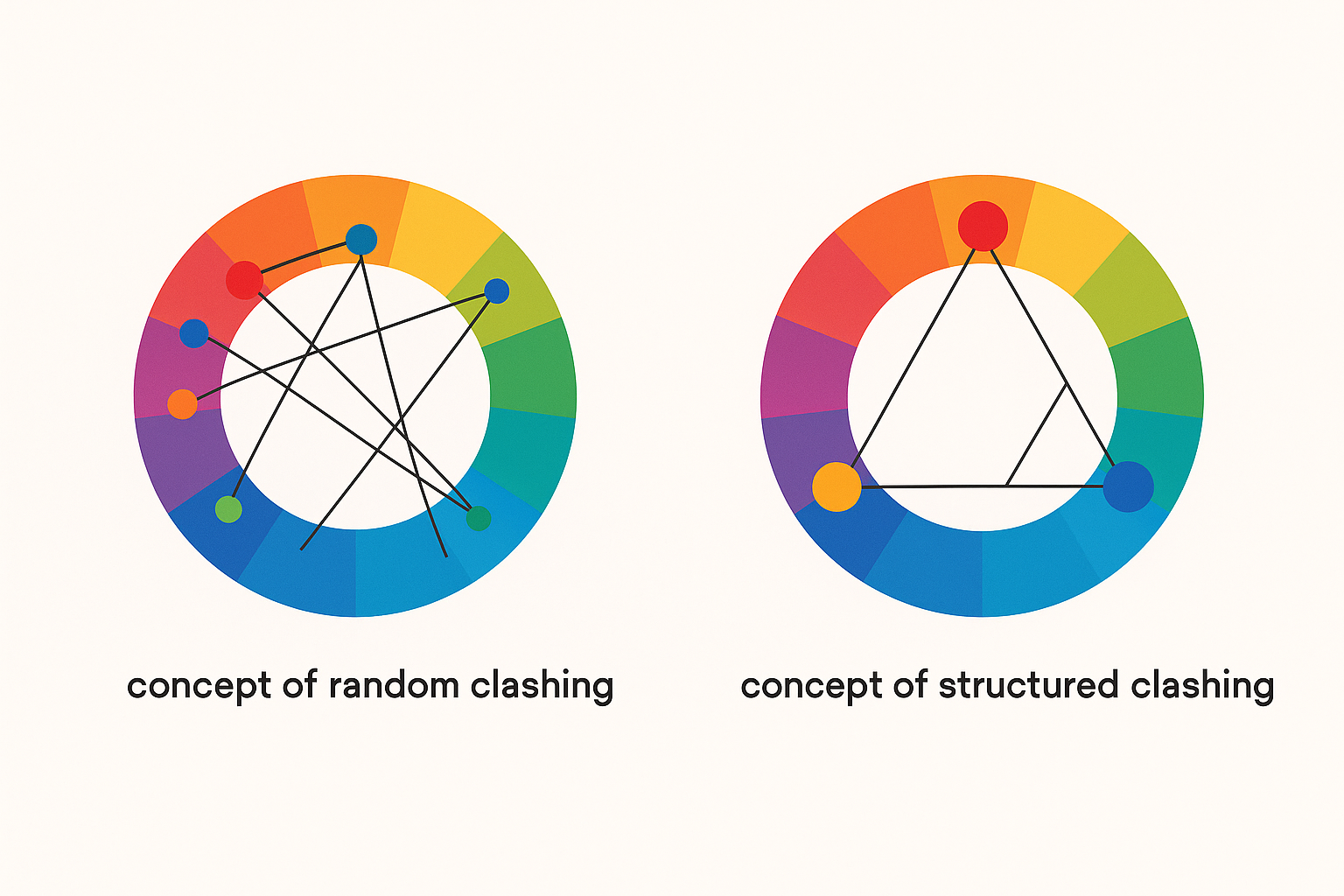
Saturation Consistency as a Harmony Principle. Notice how Gen Z beauty palettes often work because all hues are pulled from the same saturation register. All neon. All chrome. All hyperpop. Mixing saturation levels, say a neon green next to a dusty rose, creates visual confusion. Keeping saturation consistent across the palette lets hues clash while maintaining an underlying coherence.
Negative Space as Breathing Room. The brands that sustain maximalism without exhausting the viewer use generous white, black, or chrome neutrals to create visual rest stops. Think of negative space as the silence between notes. Without it, even the best melody becomes noise.
What Comes After the Dopamine Rush? Reading the Movement's Trajectory
Every aesthetic movement has an arc. Chromatic maximalism in Gen Z beauty is currently at or near its peak cultural visibility in mid-2026. The early-adopter window for brands wanting to ride this wave is closing.
Some designers and brand founders are already experimenting with what you might call "maximalist restraint," single-color saturation bombs rather than multi-color clashes. A product drenched entirely in radioactive lavender, with no secondary color at all, still reads as bold but signals a potential evolution toward monochromatic intensity.
There's also the luxury absorption question. As legacy beauty houses begin adopting chromatic signals (and they will, because they always do), Gen Z brands will face a choice: escalate further or retreat into something new. History suggests they'll find a third option nobody predicted.
But here's the enduring design lesson, regardless of where the trend goes. Chromatic maximalism has permanently expanded the acceptable color vocabulary in beauty branding. The Overton window of palette boldness has shifted, and it won't fully close. Five years from now, even "restrained" beauty brands will be working with a wider, more saturated range than they would have considered in 2022.
The Design Intelligence Behind the Dopamine
Chromatic maximalism in Gen Z beauty isn't a trend in the frivolous sense. It's a coherent visual argument. It argues that color can be confrontational and joyful at once, that clashing palettes can be rigorously designed rather than accidentally chaotic, and that restraint is a choice, not a virtue.
For color practitioners and designers, this movement offers something rare: a live, commercially active laboratory for pushing palette boundaries, understanding how cultural psychology drives color preference, and seeing what happens when an entire generation recalibrates its visual baseline toward saturation, intensity, and deliberate discord.
The dopamine rush is real. And so is the design intelligence behind it.