The Grief Industry's Color Reckoning: Why Funeral Brands Are Abandoning Black
by ColorSift Editorial Team
A grieving family sits down at a kitchen table in 2026, opens a laptop, and navigates to the homepage of a funeral planning startup. They brace themselves for what they expect: dark backgrounds, somber greys, formal serif fonts. Instead, they find warm cream tones, a sprig of dried botanicals in the hero image, and language that sounds more like a wellness brand than a mortuary. The contrast is jarring. Then oddly comforting.
This small moment captures one of the most quietly radical visual rebranding shifts in recent memory. The funeral and end-of-life industry is retreating from black, and doing so deliberately, strategically, and with enormous cultural weight behind the decision.
The numbers tell part of the story. The global death-care market is projected to exceed $130 billion by 2030. Millennials, a generation that mainstreamed therapy-speak, self-care aesthetics, and "good death" podcasts, are now the primary demographic making end-of-life decisions. They're planning funerals for aging parents, purchasing life insurance, writing wills through apps, and, in increasing numbers, pre-planning their own arrangements.
When an industry abandons its defining color, what is it really saying about how a culture has decided to face mortality?
The Long Reign of Black: A Color Steeped in Western Mourning History
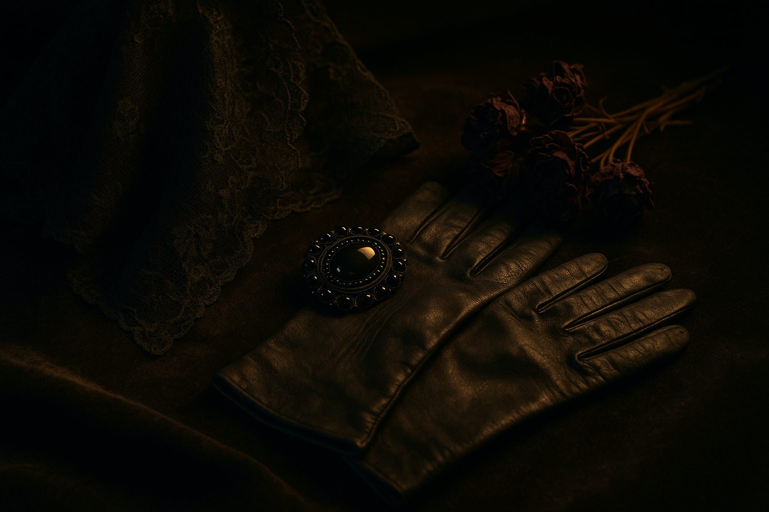
Black and death have been intertwined in Western culture for millennia. In ancient Rome, mourners donned dark togas called the toga pulla to signal grief publicly. The color carried through medieval Europe and reached its apex during the Victorian era, when Queen Victoria's forty-year mourning period for Prince Albert codified an elaborate system of black mourning dress. Widow's weeds, jet jewelry, black-bordered stationery, strict timelines dictating when a woman could transition to "half-mourning" greys and lavender: grief became a visual performance with rigid rules.
The 20th-century funeral industry inherited and institutionalized this vocabulary. Black hearses. Black suits for funeral directors. Black-bordered obituary notices in the newspaper. The entire visual language of professional grief was built on formal sobriety. Black meant seriousness, respect, and the gravitas that death demands.
But even within the West, black was never truly universal. White was the color of royal mourning in medieval France. Quaker traditions favored unadorned simplicity over dramatic color signaling. The association between black and death, while dominant, was always a cultural choice rather than a natural law.
Here's the key tension worth sitting with: black in mourning was always a performance of grief for others. It was a social signal, a public declaration of loss. This matters because the move away from black, as we'll see, is tightly connected to a broader cultural shift from performative grief to personal grief.
Death in Color: How Non-Western Traditions Have Always Seen Mourning Differently
While the West draped itself in black, most of the world mourned in other colors entirely.
In China, Japan, and parts of Hindu India, white is the traditional color of mourning. It symbolizes purity and the passage of the soul rather than the darkness of absence. The philosophy is fundamentally different: death as transition, not termination.
Mexico's Día de los Muertos offers perhaps the most vivid counterpoint. Vibrant marigold yellows, hot pinks, deep purples, and elaborately decorated sugar skulls treat death as cyclical and celebratory. It's a tradition rooted in the idea that the dead return, that the boundary between life and death is permeable. And its aesthetic has increasingly entered mainstream American visual culture through films like Coco, art installations, and community celebrations.
In Ghana, the Ga people commission "fantasy coffins," elaborate custom caskets shaped like fish, airplanes, or cocoa pods, that celebrate how a person lived. West African and South African funeral traditions often feature bold, printed kente cloth and bright colors worn to honor a life fully lived. Death becomes personal, joyful narrative rather than somber institutional ritual.
As Western societies have become more multicultural, and as digital media has made these global traditions more visible, the monopoly of black on death-signaling has quietly eroded. Instagram and Pinterest accelerated this exposure dramatically. Scroll through "celebration of life" hashtags and you'll find flower walls, colorful programs, and memorial tables that look more like wedding décor than funeral arrangements.
Consumers now have visual references for a different kind of grief aesthetic. And that changes everything.
The Death Positivity Movement: When Grief Got a Rebrand
The cultural groundwork for this color shift was laid years before any startup redesigned a homepage.
Mortician and author Caitlin Doughty founded the Order of the Good Death in 2011, sparking a broader movement that challenged Americans to confront their deep discomfort with mortality. Death cafes spread across the U.S. and U.K., offering casual community conversations about dying over tea and cake. End-of-life doulas emerged as a profession. Advance care directives were reframed as acts of self-care rather than morbid paperwork.
This movement mapped neatly onto millennial and Gen X sensibilities. These are generations that normalized talking about mental health, dismantled taboos around therapy and medication, and are now applying the same destigmatizing logic to death. If anxiety can be discussed openly over brunch, why can't dying?
Death positivity reframed grief as a natural, even beautiful process. And that language almost inevitably has visual consequences. If death is natural, its visual environment should feel organic, warm, and human. Not cold, institutional, and formal.
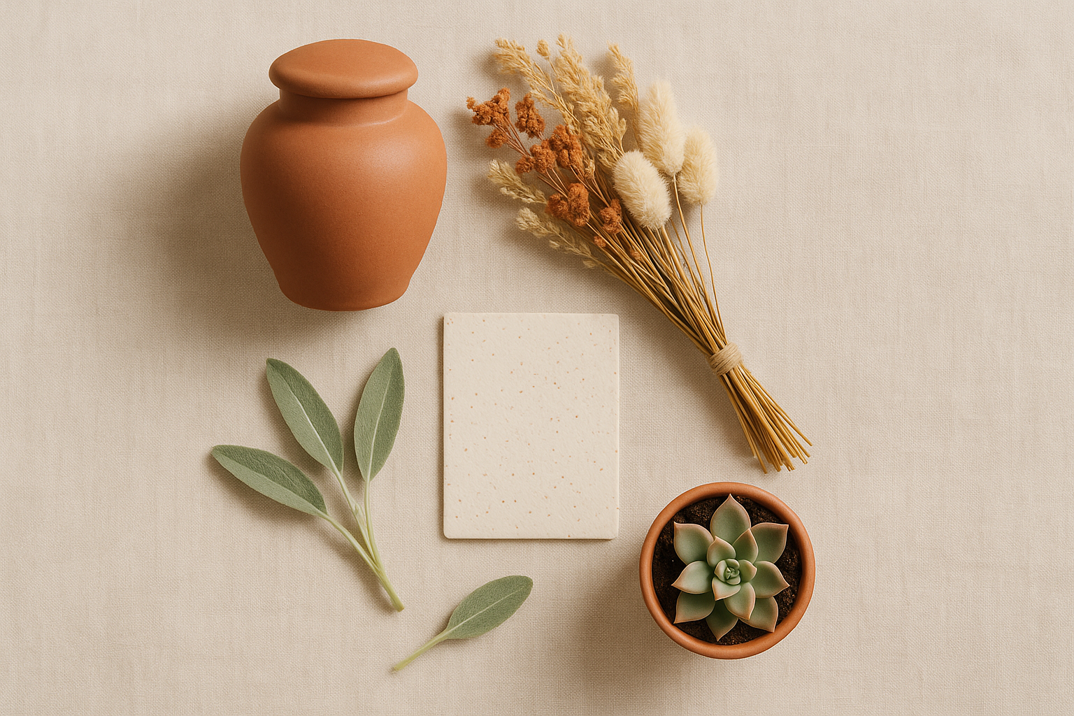
The surge in green burial and natural death movements reinforced this. By 2026, human composting has been legalized in a growing number of U.S. states, including Washington, Colorado, Oregon, Vermont, California, and New York. These movements brought an entirely new visual aesthetic: earthy tones, botanical imagery, cycles of nature rather than finality. Mushroom burial suits. Wildflower seed urns. Living memorial trees.
This cultural shift created both the demand and the permission for a new generation of funeral startups to redesign the visual experience of death-planning from the ground up.
Branding Death Like a Wellness Startup
Farewill, the UK-based end-of-life services company founded in 2015, became one of the most visible examples of this new approach. Its brand identity featured warm sans-serif typography, muted terracotta and off-white tones, and conversational copy that read like a thoughtful friend rather than a solicitor. The color palette was a deliberate rejection of traditional funeral home visual codes. Farewill positioned itself as a "kinder" alternative, and color was central to communicating that approachability.
Ever Loved, a U.S.-based memorial and funeral marketplace, took a similar path. Soft, warm neutrals. Botanical photography. A user experience that draws more from consumer lifestyle apps than from funeral industry conventions. Navigating grief planning on Ever Loved feels closer to browsing a curated home goods site than filling out institutional paperwork.
Solace and similar end-of-life planning platforms adopted sage green, dusty rose, and warm beige. These are colors with strong resonance in the wellness, therapy, and mindfulness app ecosystem. Think Headspace's orange. Calm's deep blue gradient. Noom's traffic-light palette. These startups built a deliberate visual bridge between self-care and death-care.
The design philosophy underlying all of them could be described as "destigmatization through domestication": using colors and aesthetics that feel familiar, safe, and human rather than institutional and othering. When death-planning looks like booking a yoga retreat, the psychological barrier to engaging with it drops significantly.
The Psychology of Color in Grief: What the Research Actually Says
Is there real science behind these choices, or is it just trend-chasing?
Color psychology research supports the intuition. Warm neutrals, sage greens, and soft blush tones carry strong associations with safety, nature, softness, and renewal in emotionally charged contexts. These associations make them powerful choices for grief-adjacent spaces where the goal is to reduce anxiety and encourage engagement.
Black, by contrast, carries associations with formality, authority, and emotional distance. These qualities served a purpose when grief required social ritual and professional mediation. They become counterproductive when the goal is intimacy, personal reflection, and approachable planning tools.
Palliative care and hospice design anticipated this shift by decades. Hospitals and care facilities have been moving away from clinical white and institutional grey toward warmer, more home-like palettes since the 1990s. Research on environmental color in healthcare settings consistently shows that warm, natural tones reduce patient stress and improve perceptions of care quality. What's happening now in funeral branding follows the same logic.
An emerging concept in design psychology discourse, sometimes called "color grief," suggests that the visual environment of mourning can either amplify or soften the experience of loss. Brands are beginning to treat this as a design responsibility rather than a purely aesthetic choice.
But there's an important counterargument. Some grief counselors and death-care professionals warn that over-aestheticizing death risks "wellness-washing" grief. Making loss look manageable and beautiful may not reflect the messy, dark, difficult reality of bereavement for many people. A sage-green homepage can't hold the weight of a parent burying a child. Soft typography doesn't soften that kind of pain.
Who Gets Left Behind When Death Turns Blush?
The warm-palette funeral rebrand has drawn pointed criticism from communities for whom black mourning traditions carry deep cultural and religious significance.
Orthodox Jewish mourning practices, with their structured periods of shiva and shloshim, carry visual traditions rooted in solemnity and communal obligation. Traditional Catholic funeral rites, with their specific liturgical colors, follow centuries of theological reasoning. Black American funeral church traditions, where formal and somber dress is an expression of dignity, respect, and collective witness, are not waiting for a startup to tell them how grief should look.
There's also a class and accessibility critique that deserves direct attention. The "celebration of life" aesthetic and its associated consumer experience, bespoke urns, digital memorial platforms, green burials with custom wildflower seed packets, is predominantly a product marketed to affluent, educated, urban consumers. It is not a universal shift in how death is experienced.
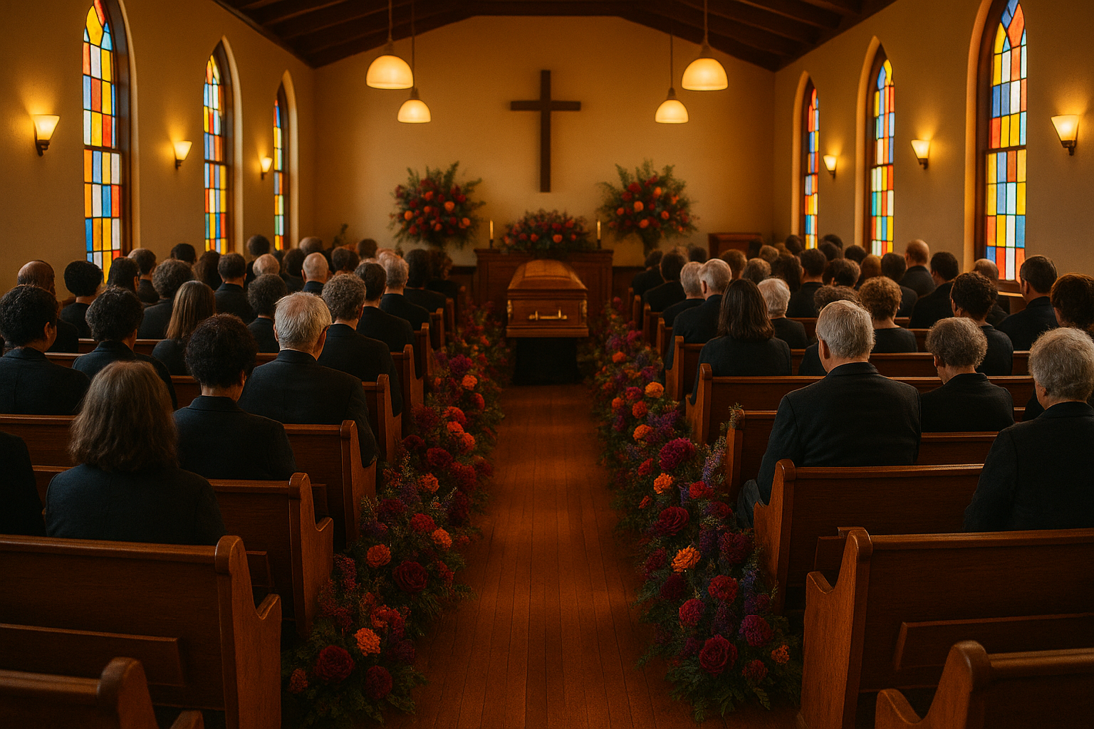
Traditional funeral homes serving working-class and rural communities, or specific ethnic and religious enclaves, have largely not adopted these new aesthetics. The industry's "color reckoning" may be a niche cultural moment being reported as a seismic shift. The families who use community funeral homes, who hold services in church basements, who wear black because it means something to them, haven't disappeared. They just don't have venture capital behind their grief.
The most honest framing isn't old versus new. It's a multiplicity of valid grief aesthetics existing simultaneously. The real story may be the fragmentation of death's visual language rather than the replacement of one dominant palette with another.
What Color Says About What Comes After
Return to that grieving family on the warm-toned startup homepage. With everything this conversation has built, the picture looks different now. That cream background and botanical sprig are not neutral design choices. They are a statement about who grief belongs to, what death means culturally, and whose comfort is being centered.
The retreat from black is real, measurable, and driven by genuine shifts in how a significant segment of Western society conceptualizes mortality in 2026. Millennials planning funerals for their parents bring different expectations, different visual fluencies, and different relationships with institutional authority than the generations before them.
But black is not obsolete. It persists in communities where it carries weight, meaning, and dignity. It persists because some grief is dark, and some mourners want their visual environment to acknowledge that darkness rather than soften it.
The most honest reading of the industry's color reckoning is this: death's visual language is finally becoming as plural, contested, and human as death itself. The funeral brands abandoning black are not erasing history. They are adding to a conversation that, for the first time in centuries, has more than one voice.
The colors we choose to surround grief with reveal, quietly and completely, what we most deeply believe about what comes after.