The Forbidden Colors: The Shades Your Eyes Can See But Your Brain Refuses to Process
by ColorSift Editorial Team
Open your eyes right now and look around. Every color you see, the blue of your screen, the warm tone of your desk lamp, the green of a plant on your windowsill, is a lie your brain tells with absolute confidence. Not a rough approximation. A full-blown construction, assembled from electrical impulses and neural shortcuts that evolved to keep you alive, not to show you the truth.
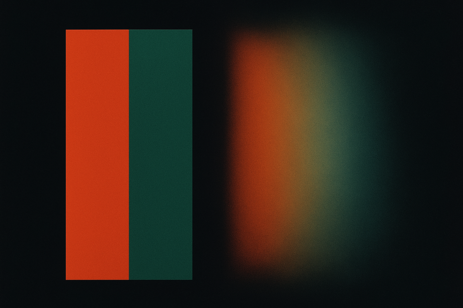
And here's the part that should unsettle you: there are colors that physically exist within the range your retina can detect, but that your brain has decided you are not allowed to see. They're called "impossible colors," hues like reddish-green and yellowish-blue that violate the fundamental rules your visual cortex enforces. They aren't theoretical. In 1983, two researchers found a way to force human subjects to perceive them, and what those subjects reported seeing was a color they had never experienced before and couldn't describe afterward.
This article is about the locked doors inside your own perception: why they exist, what's behind them, and what happens when modern display technology starts knocking.
The Color Your Brain Won't Let You See
Let's get the categories straight, because "impossible color" sounds like it could mean a lot of things.
It doesn't mean colors outside the visible spectrum, like ultraviolet or infrared. Your retina genuinely can't detect those. It also doesn't mean "imaginary colors," which are mathematical constructs that appear in the CIE color space but correspond to no real light stimulus. And it's different from non-spectral colors like magenta. Magenta has no single wavelength, sure, but your brain perceives it without complaint every time you look at a sunset.
Impossible colors are a third, stranger category. They are combinations of wavelengths that your retina can absolutely detect, wavelengths that sit squarely within the visible range, but that your brain's wiring actively suppresses. Reddish-green. Yellowish-blue. Your visual system treats these combinations the way a computer treats a divide-by-zero error: it refuses to render the result.
The central question is obvious. If the hardware works, why does the software say no?
The answer traces back to an 1892 theory about how color perception is built from opposition, not addition. To understand forbidden colors, we first need to understand how your brain constructs color at all. And it's not the way most designers think.
Opponent-Process Theory: Color Built from Conflict
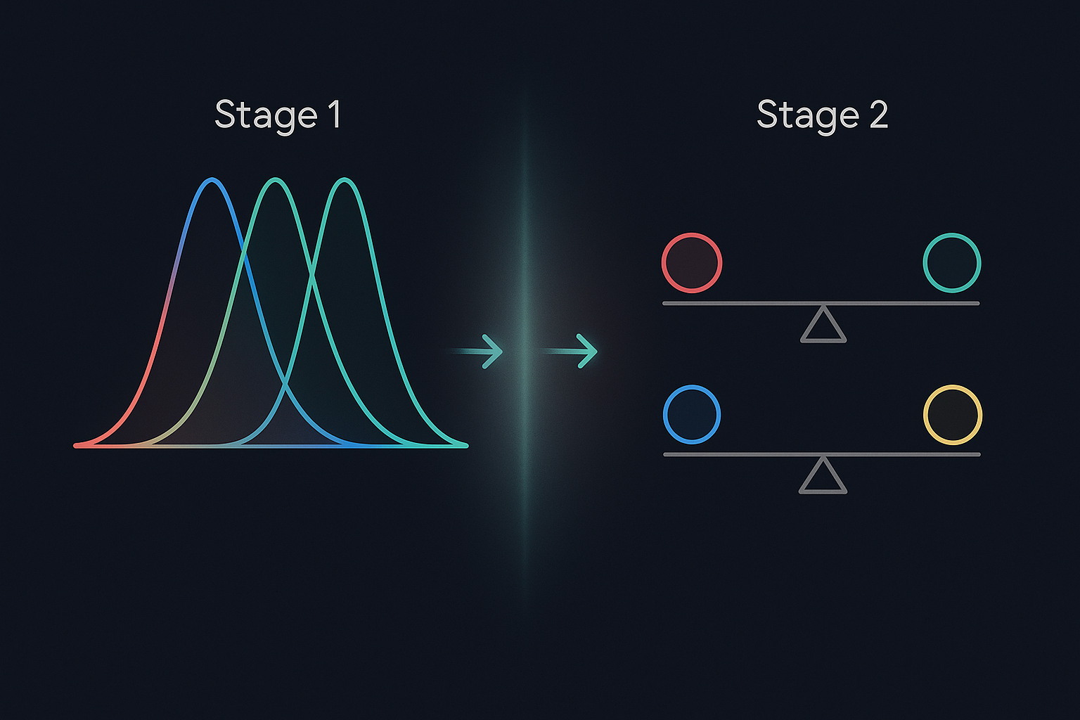
Most people who work with color know the trichromatic model. You have three types of cone cells in your retina: L-cones (sensitive to long wavelengths, roughly red), M-cones (medium, roughly green), and S-cones (short, roughly blue). This is the Young-Helmholtz theory, and it maps neatly onto RGB color mixing. Three inputs, infinite blends. Simple enough.
But it's incomplete.
In 1892, the German physiologist Ewald Hering proposed something different. He noticed that certain color combinations never appear together in perception. You can see reddish-yellow (orange) and bluish-green (teal), but you never see reddish-green or yellowish-blue. Hering argued that the brain doesn't just blend cone signals. It processes them through three antagonistic channels:
Here's how it works at the neural level. A single neuron in this system can signal "red" by increasing its firing rate, or "green" by decreasing it. But it cannot fire faster and slower at the same time. This is a hard constraint, baked into the physics of the neuron itself. Think of a seesaw. The red-green channel can tilt toward red. It can tilt toward green. But it cannot tilt both ways at once. That's why "reddish-green" isn't just unusual. It's neurologically prohibited.
Modern neuroscience has validated Hering's model with impressive specificity. Opponent processing happens in the lateral geniculate nucleus (LGN) of the thalamus, where raw cone signals are recombined into opponent channels before they ever reach the visual cortex. The suppression of impossible colors isn't a high-level cognitive decision. It's a low-level signal processing constraint, happening before you're even consciously aware of seeing anything.
This two-stage architecture, trichromatic input followed by opponent-process encoding, is the reason your perception has locked doors. The cones can receive the light. But the opponent channels refuse to pass both signals through at once.
Cracking the Lock: The Crane and Piantanida Experiments
In 1983, at SRI International in Menlo Park, California, two researchers decided to pick that lock.
Hewitt Crane and Thomas Piantanida designed an elegantly devious experiment. They showed subjects adjacent stripes of red and green (or blue and yellow) through an eye tracker that stabilized the image on the retina. This is the critical detail. Normally, your eyes make tiny involuntary movements called microsaccades, dozens per second, that constantly refresh the image on your retina. These movements maintain the sharp boundaries between colors. Crane and Piantanida eliminated them.
With the boundary stabilized, something extraordinary happened. The visual system could no longer maintain a hard edge between the two colors. The border dissolved. The two hues bled into each other, creating a field of color that subjects described as simultaneously red and green.
Not brown. Not olive. Not the muddy mix you'd get from stirring paint. Something they had never seen before.
Some subjects called it a "forbidden" color. Others simply said it was unlike anything they had ever encountered. They struggled to name it because no word exists for it. No pigment produces it. No screen displays it. It occupies a space in perception that is normally walled off.
The results were published in Science, but they remained contentious. Critics argued the subjects were experiencing binocular rivalry, a well-known phenomenon where the brain alternates between two conflicting inputs rather than merging them. Others suggested simple color averaging. But in 2001, Vincent Billock, Gerald Gleason, and Brian Tsou at the Air Force Research Laboratory ran a careful replication that largely supported the original findings. Their subjects reported perceiving "colors that are not in the normal gamut." The locked door, it seemed, could be forced open.
Why Your Brain Builds Walls: The Evolutionary Logic of Color Suppression
If the brain can technically process these signals when forced, why does it suppress them by default?
Because opponent processing isn't a bug. It's an optimization.
Your L-cones and M-cones have heavily overlapping sensitivity curves. They respond to many of the same wavelengths. If the brain simply blended their raw outputs, you'd get a flood of redundant information clogging the optic nerve, which has limited bandwidth (roughly 1.2 million nerve fibers carrying data from about 130 million photoreceptors). Opponent coding compresses the signal. It encodes differences between cone channels rather than absolute values, stripping out redundancy and maximizing the information that actually travels to the cortex.
This compression is tuned for survival. The red-green channel excels at detecting ripe fruit against green foliage and reading subtle shifts in skin tone: blushing, pallor, signs of illness or emotion. These were life-or-death signals on the savanna. A perception of "reddish-green" would be noise in that system, not signal. Evolution didn't just fail to build the pathway. It actively blocked it because blocking it made the useful signals cleaner.
There's a parallel in hearing. Your auditory system suppresses certain simultaneous frequencies to help you parse speech from background noise. The visual system does the same thing with color. It sacrifices completeness for clarity, because a clear, actionable model of the world keeps you alive better than a complete one.
But here's the catch. Evolution optimized this system for dappled forest light, open grasslands, and firelit caves. It did not optimize it for a 4,000-nit OLED panel rendering DCI-P3 color at 120 frames per second.
When Displays Push Past the Perceptual Boundary
Modern display technology is bumping into the walls that evolution built.
When a wide-gamut display, something calibrated to Rec. 2020 or the full DCI-P3 space, renders colors at the extreme edges of human perception, the rendering pipeline must make hard decisions. Colors that fall outside the perceivable gamut need to be compressed into colors the viewer can actually resolve. This process, called perceptual gamut mapping, directly engages the same opponent-process constraints Hering described over a century ago.
HDR content makes this even more pronounced. High Dynamic Range pushes simultaneous contrast ratios far beyond what standard content achieves. When a bright, heavily saturated red sits immediately adjacent to a bright, heavily saturated green at high luminance, the viewer's visual system gets shoved toward opponent-process conflict zones. The result is edge artifacts, shimmer, and visual discomfort that aren't bugs in the display. They're features of the brain.
You may have noticed this yourself. Some viewers report a "laser speckle" shimmer on OLED displays showing highly saturated adjacent complementary colors. It's not a panel defect. It's your opponent-process channels struggling with a stimulus they were never designed to handle.
Color scientists at Dolby, Apple, and Samsung now model these limits explicitly. Dolby Vision's perceptual quantizer (PQ) curve, for example, includes careful gamut-boundary handling that respects the nonlinearities of human color perception. The engineers aren't just asking "what can the display emit?" They're asking "what can a human visual system comfortably resolve?"
For designers working in wide-gamut color spaces, this is practical knowledge. If you've ever placed two highly saturated complementary colors side by side and felt that something was "off," that the pairing caused eye strain or felt visually aggressive even though both colors were technically valid, you've run into opponent-process limits. Understanding why it happens gives you better tools to fix it: desaturate one color, introduce a neutral buffer, shift one hue off the direct opponent axis.
The Philosophy of the Unseen: What Impossible Colors Tell Us About Perception
Impossible colors are more than a neuroscience curiosity. They're a window into a deeper truth about perception itself.
Your brain does not show you reality. It shows you a curated model, edited for action. Impossible colors belong to a family of phenomena that expose the seams in that model: change blindness, where you fail to notice large alterations in a scene; inattentional blindness, where you miss a gorilla walking through a basketball game; the blind spot in each eye that you never notice because your brain fills it in with a plausible guess.
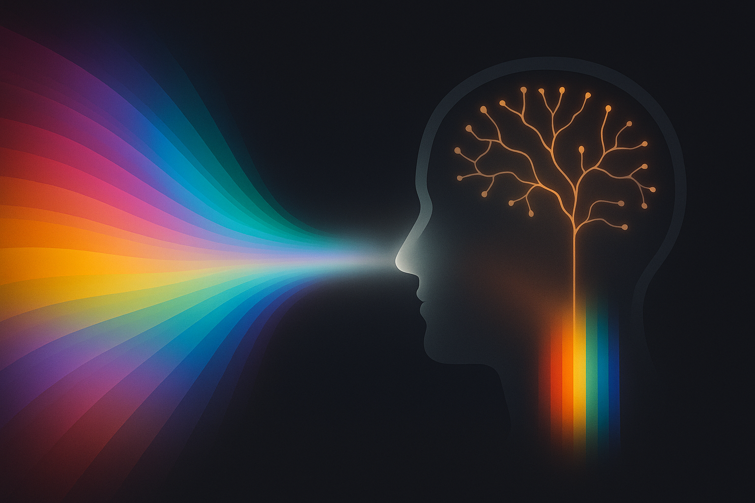
In each case, the sensory data is there. The brain simply chooses not to pass it along.
This raises a genuine philosophical question. If the retina detects a stimulus and the brain actively suppresses it, is the resulting "forbidden" color real? It has a physical cause. It produces a neural response in the retina. But it never reaches conscious experience under normal conditions. This sits right at the heart of ongoing debates about qualia, the subjective character of experience. What is the color of a signal that your own nervous system intercepts before you can perceive it?
There's no clean answer. But the question itself is useful for anyone who works with color professionally. Every color choice you make, every palette you build, every gradient you render, is filtered through a system that was built to survive the Pleistocene savanna, not to admire a 10-bit HDR display. Understanding those filters is the deepest form of color literacy there is.
The Final Bottleneck
The forbidden colors are not a curiosity. They're a crack in the wall, a glimpse of the gap between what the world sends to your eyes and what your brain permits you to experience.
Opponent-process theory, confirmed and refined over more than a century, tells us that our visual system is an editor, not a camera. It makes decisions on our behalf, suppressing combinations that would clutter its model of the world. Crane and Piantanida found a way to slip past that editor, and what their subjects saw was a color that shouldn't exist, a shade that falls in the blind spot of the mind.
For designers, display engineers, and anyone who works with color professionally, this is more than a fascinating footnote. As our displays grow wider in gamut and higher in dynamic range, we are building tools that can emit light combinations our ancestors never encountered. The final bottleneck is no longer the screen. It's the 600-million-year-old visual system staring at it.
The most important color space to understand isn't Rec. 2020 or DCI-P3. It's the one between your retina and your consciousness.