Designing for Appetite: The Unwritten Color Rules of Food Delivery Apps in 2026
by ColorSift Editorial Team
Open five food delivery apps right now and count how many still lead with urgent, saturated red. Two years ago, the answer would have been nearly all of them. Today, you might be surprised, and that surprise is the story.
For over a decade, the food delivery industry ran on a single unspoken design assumption: red sells hunger. It was borrowed from fast-food giants, validated by early conversion data, and copy-pasted across competitors until the entire category felt like one long, shouted advertisement. But something quietly shifted between 2025 and 2026. The red-and-black duopoly of food delivery UI is fracturing, replaced by warmer neutrals, muted ochres, dusty sage, and off-whites that feel less like a drive-through and more like a neighborhood bistro's chalkboard menu.
This piece maps that fragmentation: why it's happening, which brands are leading it, and what the palette choices reveal about where the entire industry is heading.
The Red Era: How One Color Came to Own an Entire Industry
The origin story starts in fast-food research labs of the 1990s and 2000s. Researchers observed that red and yellow, sometimes called the "Ketchup and Mustard theory," triggered hunger responses and drew the eye faster than cooler tones. McDonald's, Wendy's, KFC, and Pizza Hut had already proved the hypothesis at scale. When the first wave of food delivery startups launched in the 2010s, they inherited those assumptions wholesale. Nobody questioned them. Why would you? The data seemed clear.
By the early 2020s, the uniformity was almost comical. DoorDash ran on Alizarin red. Uber Eats shifted toward black-and-red. Deliveroo leaned into coral-red. GrubHub pushed orange-red. The entire spectrum was narrow enough to feel like a single brand family. If you blurred your eyes, you couldn't tell which app was which.
The psychological logic seemed airtight. Red raises heart rate. It signals urgency. It triggers impulsive decisions. All of that is theoretically ideal for a platform monetized on order frequency. Every conversion metric pointed the same direction: make it red, make it bold, make it now.
But the consumer-side consequence was predictable. Category blindness. When every app looks identical in your app drawer, color stops being a differentiator and starts being noise. Users began choosing based on habit, pricing, or restaurant availability, because the visual branding offered zero reason to prefer one app over another.
The Fracture Point: What Triggered the Palette Pivot?
The shift didn't come from a design conference keynote. It came from a collision of cultural pressures.
Between 2024 and 2025, consumer trust in food delivery eroded. Delivery fee controversies made headlines. Driver labor disputes drew regulatory scrutiny. A growing "junk food guilt" narrative, fueled by post-pandemic wellness consciousness, made aggressive red feel increasingly misaligned with what these brands wanted to say about themselves. The color that once meant "eat now" started to feel like it meant "regret later."
Simultaneously, the market expanded vertically. The rise of artisanal and premium grocery delivery created internal pressure to look different. Gopuff's upmarket pivot, Instacart's 2025 rebrand direction, and a wave of independent courier apps targeting restaurant-quality meals all needed to visually distinguish premium tiers from bargain-bin urgency. You can't charge $8.99 for delivery while looking like a coupon circular.
Then there was simple competitive saturation. When red stopped differentiating, brands were compelled to explore the rest of the spectrum. It wasn't a creative epiphany. It was a design forcing function.
The broader aesthetic climate helped too. The "warm minimalism" trend sweeping fintech and wellness apps in 2025 and 2026 created ambient pressure. Food delivery absorbed that adjacent energy. When your banking app looks calmer than your dinner app, something feels off.
Mapping the New Color Territories: A 2026 Palette Breakdown
To understand the shift, it helps to see the before and after side by side.
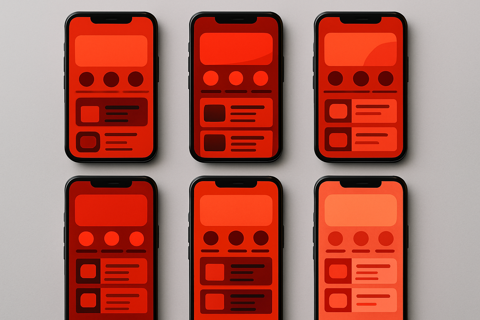
Here's the palette that dominated food delivery UI for nearly a decade. Think of it as the "Fast Urgency" archetype.
Every color had a function. Alizarin red powered CTAs. Near-black created dramatic backgrounds. White carried trust and cleanliness. Warning amber lit up promotional banners. Flat gray filled secondary UI elements. It was effective. It was also exhausting.
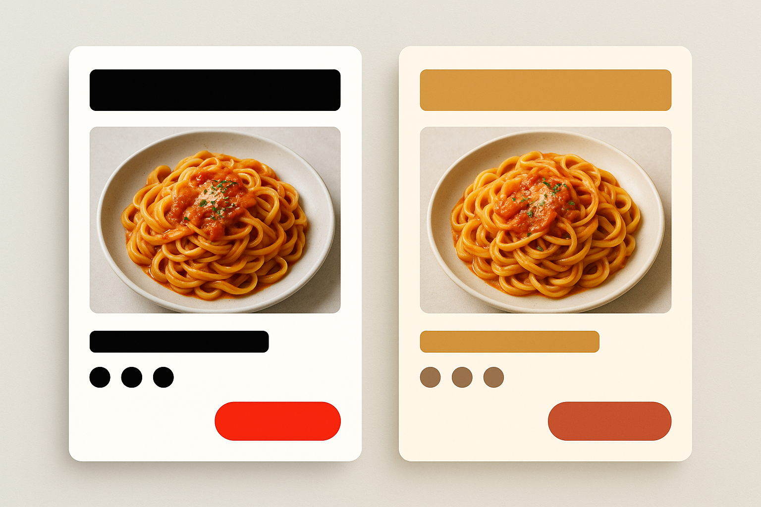
Now look at the emerging counter-palette. Call it the "Slow Food" archetype, evocative of kraft paper, ceramic plates, and farmers market signage.
The difference is visceral. This palette suggests a Saturday morning, not a Friday midnight.
Specific 2025 and 2026 redesign examples bear this out. Deliveroo's updated brand guidelines have moved toward warmer coral and cream tones. Newer European entrants are leaning into earth tones paired with serif typography to signal craft and care. Regional apps in markets like Berlin, Melbourne, and Seoul are building entire brand identities around palettes that wouldn't look out of place on a specialty coffee bag.
The functional UI implications matter too. Warm neutrals reduce eye fatigue during extended browsing sessions. Off-whites perform better in dark-mode adjacent environments. And critically, muted background tones make food photography pop more naturally than competing red backgrounds that fight the image for attention.
Case Study: Uber Eats and the Calculated De-Reddening
Uber Eats offers the clearest large-scale case study of this evolution in action.
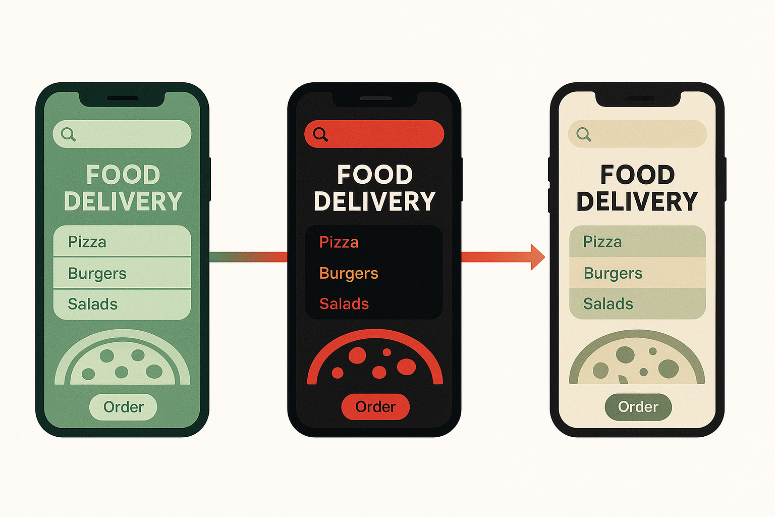
Trace the timeline. The app launched inheriting Uber's original green. Around 2020, it adopted an aggressive black-and-red phase, chasing the same urgency signals as every competitor. By 2025 and into 2026, the interface direction shifted again: warm blacks, muted greens, and cream whites crept back in. The visual temperature dropped measurably.
This wasn't accidental. Uber Eats is positioning against fast-food association and toward lifestyle utility. The brand wants to own date-night restaurant orders and office catering, not only late-night pizza impulse buys. That requires a visual language that says "worth it" rather than "cheap and fast."
The color shift mirrors the pricing strategy evolution. Premium delivery fees, Uber One membership tiers, and restaurant partner quality tiers all demand a design language that communicates value rather than volume. You can't sell a $45 prix fixe delivery inside an interface that screams discount.
Behind the scenes, the technical execution is its own story. Color tokens in modern design systems allowed Uber Eats to implement palette shifts at scale across iOS, Android, and web without full UI overhauls. A centralized token change cascades through every component. This infrastructure makes brand pivots possible without the multi-year redesign cycles of the past.
The Psychology Behind the Pivot: What Warm Neutrals Are Actually Selling
Here's the core argument, reframed: the shift from red to warm neutrals isn't about aesthetics. It's about trust architecture.
Red optimizes for the first order. Warm neutrals optimize for the fifth, the tenth, the subscription renewal. In a market where customer acquisition costs have skyrocketed, retention is the game that matters. And retention requires a different emotional register.
Color psychology research on ochre, terracotta, and warm whites consistently links these tones with handcraft, naturalness, and honesty. Those associations map neatly onto the narratives food delivery brands need in 2026: local restaurant support, fresh ingredients, transparent pricing. The palette does brand-repair work that no banner ad can accomplish.
There's a concept worth naming here: "appetite authenticity." Consumers are increasingly skeptical of hyper-stimulated hunger cues. They respond better to interfaces that feel curated and considered rather than algorithmically urgent. A muted ochre background whispers "we chose this restaurant for you." A screaming red banner shouts "ORDER NOW BEFORE THE DEAL EXPIRES."
That said, red still converts. For late-night orders, value-seeking users, and promotion-driven purchases, high-contrast urgency works. This is why hybrid palette strategies are emerging. Apps use warm neutrals for browse states, then inject red or amber selectively for promotional moments. The palette becomes contextual, shifting emotional registers within a single user session.
The Challengers: How New Entrants Are Weaponizing Color Differentiation
A new wave of food delivery apps in 2026 are building brand identity around non-red palettes from day one. Apps targeting premium meal kits, hyper-local restaurant networks, or specific dietary communities (vegan, halal-certified, allergy-aware) are using color as an immediate values signal.
Consider what a "Premium Local" challenger palette might look like:
Not a single shade of fast-food red. The palette communicates sustainability, locality, and premium positioning through color alone. A user seeing this for the first time already has expectations about price point, restaurant quality, and delivery packaging, before reading a single word.
Some challengers are going further, using deliberate color "wrongness" as a disruptive signal. Pastel blues, lavenders, and deep teals feel jarring in a market conditioned to expect warm tones. That jarring quality is the point. It makes the color itself a brand statement.
There's a real risk embedded in the warm neutral approach, though. These palettes require stronger typography, better food photography, and more sophisticated layout to work. They don't hide weak content the way high-contrast red-and-black does. Challengers banking on muted tones are making a bet on content quality. If the photography is mediocre, the whole interface collapses into blandness.
What This Means for UX Designers and Brand Strategists
For designers working in or adjacent to food and delivery, the takeaway is structural. Color strategy is no longer a decoration decision. It's a positioning decision that must align with pricing strategy, target demographic, and long-term retention goals.
A useful framework for 2026: map the tension between "acquisition color" (high contrast, urgent, impulsive) and "retention color" (warm, trustworthy, browse-friendly). The best systems use both intentionally, deploying them at different moments in the user journey rather than defaulting to one register for every screen.
The accessibility dimension deserves a flag here. Warm off-whites and muted ochres can create contrast-ratio challenges that aggressive red-on-white simply doesn't have. The "slow food" trend carries technical debt in accessible design. Studios need to account for WCAG compliance from the start, not retrofit it after launch.
Looking ahead, if warm neutrals become the new red monoculture by 2027 or 2028, the next differentiation move will likely be unexpected. Perhaps radical color abstraction, AI-personalized palette skins per user, or even a return to something more primary and bold as a counter-counter-trend. The pendulum always swings.
The Signal in the Palette
The story of food delivery color in 2026 is ultimately a story about what brands think trust looks like. For a decade, the industry bet that trust looked like red: urgent, confident, impossible to miss. That bet paid off in user acquisition but left a category visually indistinguishable from itself, training consumers to filter out the very signals meant to guide them.
The quiet revolution underway, in ochres and off-whites, in espresso browns and dusty sages, is an attempt to rebuild that signal from the ground up. It says: we're not here for your impulsive 11pm order alone. We're here for your Tuesday lunch ritual and your Saturday dinner party.
Whether the "slow food" palette trend represents a genuine shift in how food delivery apps think about their users, or merely the next aesthetic cycle before another industry-wide reset, it's already changing what millions of people feel when they open their most-used apps. And in a business where the difference between a $30 order and a closed app is measured in seconds of friction and milliseconds of trust, color is never just color.