Designing Trust From Scratch: A Color System Playbook for Fintech Startups That Need to Look Credible on Day One
by ColorSift Editorial Team
Every fintech founder has a version of this story. You build the product. The onboarding flow is smooth, the security is airtight, and the features solve a real problem. Then you put it in front of a focus group, and something strange happens: users love the concept but hesitate to link their bank accounts. The friction isn't technical. It's visual. In one memorable case, the culprit was a lime-green primary color the founder had chosen because it "felt fresh."
This isn't an edge case. Research from the Baymard Institute and multiple fintech onboarding studies consistently rank color and visual credibility among the top three drop-off triggers during financial app sign-up flows. That places it above confusing copy and even fee anxiety. People will tolerate unclear pricing before they'll hand their bank credentials to an app that looks like a children's game.
Here's the tension every fintech designer faces: clone the legacy bank aesthetic and your product looks stale, indistinguishable from the institutions you're trying to replace. Swing too far toward visual disruption and you trigger subconscious alarm bells. Both are failure modes.
This guide walks you through a structured framework for resolving that tension, complete with three fully generated palettes for three distinct fintech personas. No "blue means trust" folklore required.
Why Legacy Banks Chose Navy and Forest Green (And Why It Worked)
Bank branding didn't emerge from focus groups. It inherited its visual language from institutional heraldry, print media, and physical architecture. The colors of early bank facades and stationery were chosen to evoke permanence, stone, and government authority. Think marble columns and brass fixtures. The palette followed.
Navy blue signals depth and competence. It's more specific than the generic "trust" label people slap on it. Forest green, meanwhile, historically coded wealth as something tied to land ownership and stability. You can trace this connection from 19th-century ledger design through to the modern identities of Chase, Lloyds, and TD Bank.
These palettes worked for decades because consumers operated in low-information environments. Color was a primary credibility shortcut. You couldn't pull up a bank's app store rating or read a Reddit thread about its security practices. You walked into a branch, and the mahogany paneling and deep blue logo told you everything you needed to feel.
The shelf-life problem arrived around 2015. The navy-and-serif combination had become so saturated that it started signaling "generic" rather than "trustworthy." The very ubiquity that made it safe made it invisible.
Legacy palettes weren't wrong. They were a specific solution to a specific era's problem. Understanding why they worked is the key to knowing which elements to keep.
The Challenger Bank Disruption: How Coral and Ultraviolet Rewrote the Rules
Monzo's Hot Coral card, launched in 2016, was a deliberate act of anti-camouflage. The coral wasn't a random pick from a mood board. It was engineered to be visible in wallets, to provoke conversation at restaurant tables, to function as a word-of-mouth growth mechanism. Color as distribution strategy.
What made it work was restraint everywhere else. Monzo paired that loud coral with clean white UI surfaces and understated typography. The app experience was calm even when the brand was screaming.
Revolut took a different path. It started with dark navy, consciously borrowing legacy credibility, then introduced gradient ultraviolet and space-dark palettes as it expanded into crypto and premium tiers. Each color evolution signaled a product evolution. That's color as a growth signal, not just decoration.
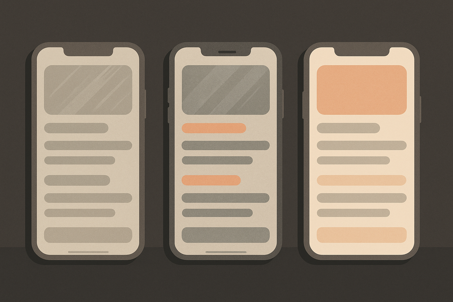
The critical pattern both brands followed: radical hero colors anchored by deeply conservative functional UI colors. The surprise lived in the brand layer. It never touched the trust layer. Form fields, error states, confirmation screens, and transaction receipts all stayed neutral. Users felt excitement when browsing features and felt safety when entering card details. That emotional separation was deliberate.
The lesson is clean. Disruption in fintech color works when it follows the "loud brand, quiet function" principle. It fails when startups apply disruptive color to the functional UI layer, triggering anxiety at exactly the moments users are making decisions about their money.
The Architecture of a Fintech Color System: What You're Actually Building
A fintech color system isn't a palette. It's a four-layer architecture.
Layer 1: Brand Color. This is your personality signal, used in marketing, hero moments, and the elements users associate with your identity. It's the Monzo coral, the Revolut violet.
Layer 2: Functional Color. Semantic colors for actions, states, and data. Success green, error red, warning amber. These are nearly universal and should almost never be disrupted. Users bring expectations to these colors from every other app they've ever used.
Layer 3: Surface Colors. Backgrounds, cards, containers, and dividers. These define perceived "cleanliness" and "professionalism." They're invisible when they work and deeply unsettling when they don't.
Layer 4: Data Visualization Colors. Often forgotten by early-stage teams, these are critical for dashboards, charts, spending breakdowns, and portfolio views. A fintech app without a considered data palette is building on sand.
The "trust gradient" concept ties these layers together. Credibility flows from the outermost brand layer inward. The closer a color gets to a user's money or personal data, the more conservative it should become.
Accessibility is non-negotiable here. WCAG AA contrast ratios (4.5:1 for normal text, 3:1 for large text and UI components) aren't just compliance checkboxes. Failing them reads as amateur to design-literate users, and design-literate users are disproportionately the early adopters of fintech products. Your first thousand users will notice.
In 2026, a fintech app without a considered dark mode palette is a credibility gap. Surface color relationships must be rebuilt from scratch for dark mode. Inverting your light theme creates murky, unreadable interfaces. Dark mode is a separate design problem that shares your brand colors but rethinks everything else.
One more factor: color systems don't exist in isolation from typography. A bold sans-serif paired with a warm neutral palette reads very differently than the same palette paired with a geometric serif. Account for this compounding effect.
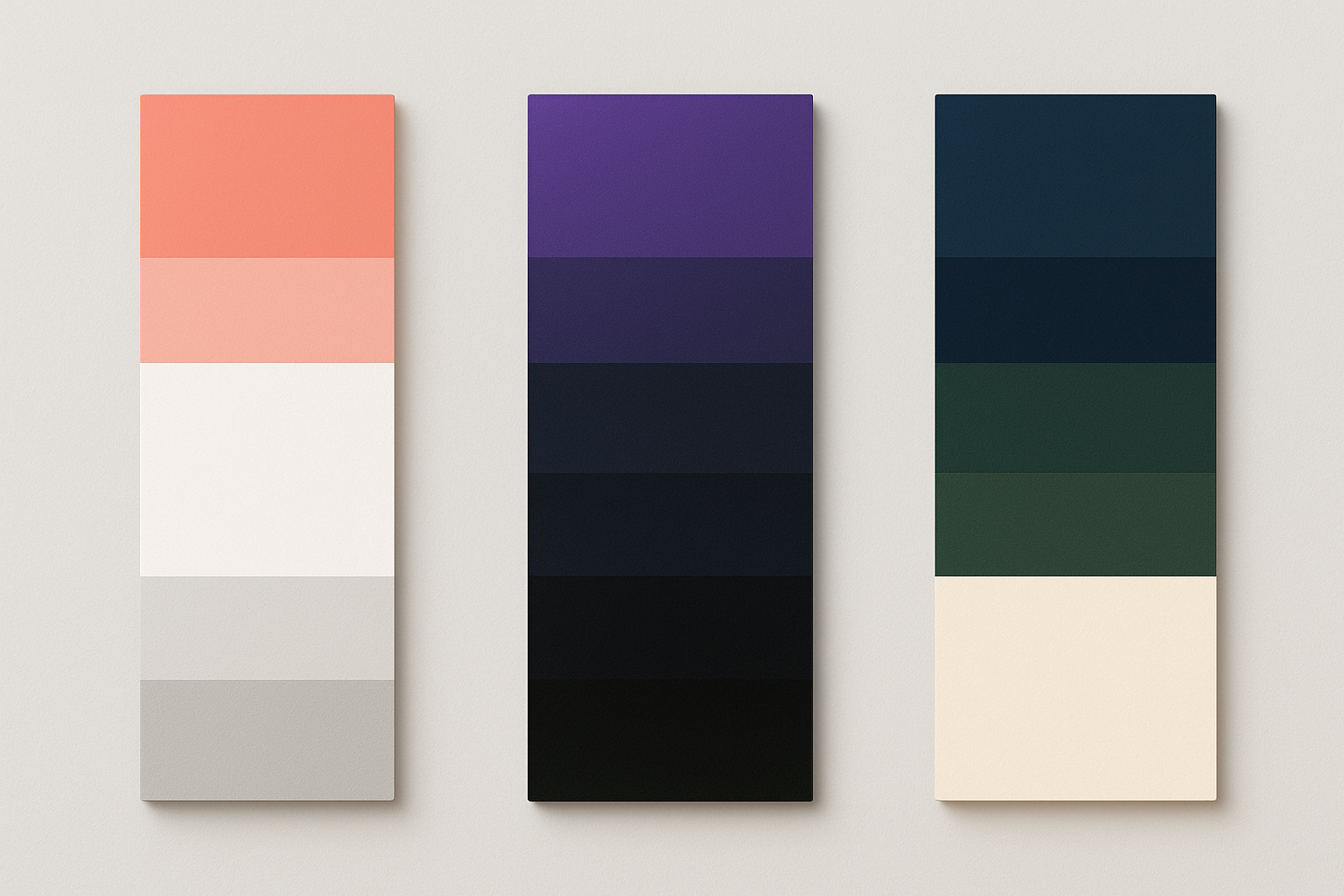
Three Fintech Personas, Three Generated Palettes
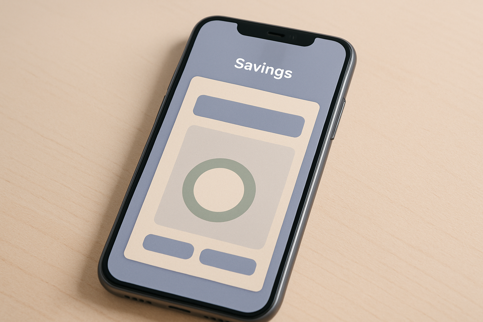
Persona 1: The Safety-First Savings App
Think round-up savings tools targeting first-time savers aged 22 to 35. These users need to feel safe, encouraged, and never overwhelmed.
The muted periwinkle-blue primary reads as modern without being threatening. It borrows blue's competence signal while softening it enough to feel approachable. Warm off-white surfaces avoid the clinical sterility of pure white. The soft sage accent codes for growth without the aggression of saturated green, and slate gray keeps data legible without adding emotional weight.
Persona 2: The Bold Crypto-Adjacent Platform
A multi-asset trading app targeting crypto-curious retail investors. These users want to feel like insiders accessing a sophisticated system.
Deep space navy anchors the experience in stability while electric indigo brings energy to interactive elements. Near-black surfaces create a "terminal" aesthetic that signals sophistication and insider knowledge. Vibrant teal marks positive data states and creates clear contrast against dark backgrounds. Contrast ratios are especially critical here given the dark surface stack.
Persona 3: The Understated Wealth Management Tool
A high-net-worth portfolio tracker targeting users with $100K or more in investable assets. These users expect quiet confidence, never flash.
Warm charcoal and deep espresso tones deliver gravitas without coldness. Ivory and warm linen surfaces evoke luxury tactility, the visual equivalent of heavy card stock. A restrained gold accent signals prosperity with a light touch, used sparingly on key data points and premium features. Cool slate handles data visualization without competing with the warmth of the brand. This palette deliberately avoids both bright colors and cold grays, because both feel wrong to this user.
What All Three Share
Look across the palettes and a pattern emerges. The functional colors (success greens, error reds, warning ambers) are nearly identical. Contrast ratios are consistently high. Surface color variance is restrained. The personality lives entirely in the primary and accent colors. The trust lives in the shared functional layer.
This bridge palette shows how the Safety-First system might evolve as a startup grows toward a broader audience. Deeper tones enter the primary range, a richer accent adds sophistication, and surface colors shift slightly cooler. Monzo followed a similar trajectory, introducing darker tones for its premium tiers while keeping the coral identity intact. Evolution without identity crisis.
How to Test Whether Your Palette Is Actually Working
Having a palette is step one. Knowing whether it performs is where most teams stop too early.
The 5-second blur test. Blur your key screens to about 10% clarity and check whether the hierarchy still reads. If color is doing its job, the primary CTA and key data points should still be visually dominant even as blurred shapes.
Desaturation audit. Convert your screens to grayscale. Does the UI still function? Fintech UIs that rely solely on color to communicate state (red/green for portfolio performance, for instance) are both inaccessible and legally risky in markets with color-blindness accessibility requirements.
Context contamination test. Show your palette swatches to users without any product context and ask what industry they think it belongs to. If fewer than 60% guess "finance" or "tech," you may be creating category confusion, which is a real conversion risk.
Emotional valence surveys. Use semantic differential scales (safe/risky, modern/dated, warm/cold) with your target persona. Map responses against your intended positioning. Pay close attention to gaps between how founders perceive the palette and how first-time users do.
Competitive landscape mapping. Plot your primary brand color against the ten closest competitors in your specific vertical on a hue wheel. Identify underrepresented hues. Monzo's coral succeeded partly because no UK challenger bank had touched the warm spectrum.
The Most Common Fintech Color Mistakes (And How to Avoid Them)
Mistake 1: Applying brand color to the functional layer. Using your signature purple for form field borders, primary buttons, and the logo creates visual noise and muddies the trust signal. Set a strict rule: brand color touches no more than 20% of any functional screen's color area.
Mistake 2: Choosing a primary color without a complete system. Founders fall in love with a single hex code but never build the tints, shades, and semantic variants needed for a real product. A color choice is only as good as the full 9-step scale built from it.
Mistake 3: Ignoring the loading state palette. Fintech apps have inherently data-heavy loading states, including skeleton screens, shimmer effects, and progress indicators. If these aren't designed within the color system, they feel off-brand and erode trust at high-latency moments. That's exactly when users are most anxious about whether their transaction went through.
Mistake 4: Treating dark mode as an afterthought. A warm primary color that reads as "cozy" on white surfaces can become "murky" or even "suspicious" on dark surfaces if surface color relationships aren't rebuilt. Dark mode requires its own design pass.
Mistake 5: Borrowing a palette from a non-financial brand. The temptation to draw inspiration from a beloved consumer app (a certain social-commerce platform's signature gradient, for instance) can fatally miscommunicate your product's category to users in the critical first seven seconds of onboarding. Finance is a category where looking like you belong matters more than looking novel.
Back to That Lime-Green App
Remember the founder from the opening? They don't need a different favorite color. They need a framework. The goal of a fintech color system isn't to look trustworthy in the abstract. It's to look trustworthy to a specific user, in a specific moment, within a specific competitive context.
Navy worked for Barclays in 1985 for the same reason coral worked for Monzo in 2016, and the same reason the right palette will work for your startup in 2026. Not because of universal psychology, but because of deliberate contrast with what already exists and deliberate alignment with what your user already believes.
Use the three persona palettes as a starting framework, not a finish line. Run the testing protocol before you ship. The best color system is the one users never consciously notice, because it has already answered every subconscious question about whether to trust you with their money.