How Figma's Variable Color Tokens Are Quietly Rewriting the Rules of Design Handoff
by ColorSift Editorial Team
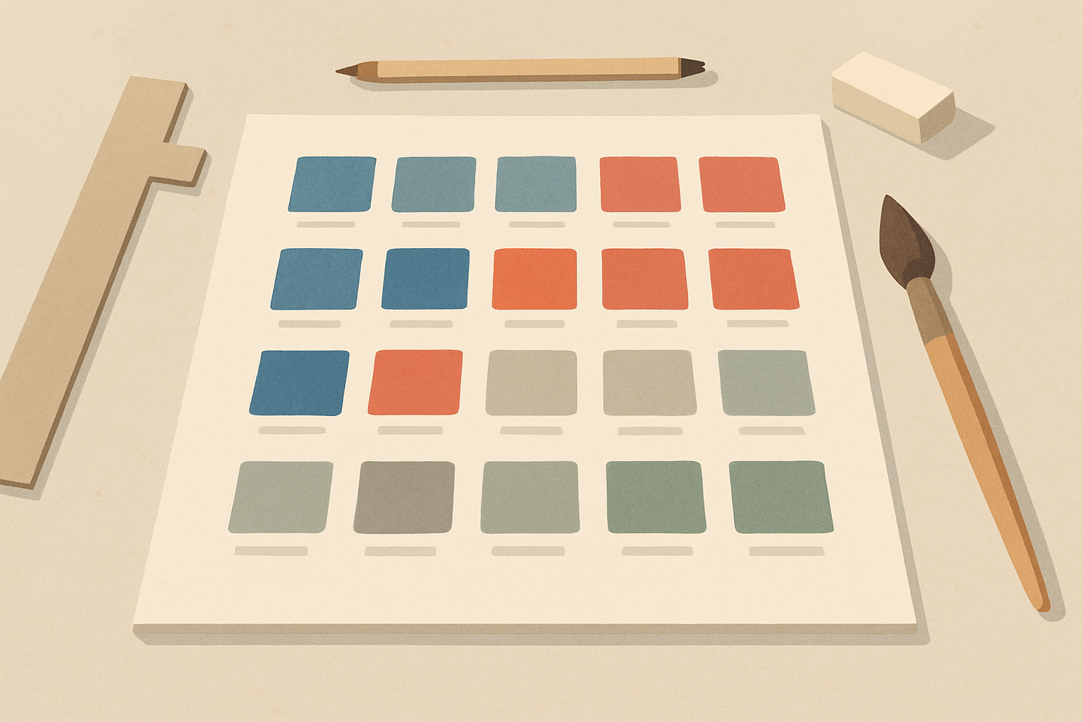
Open any design file from 2022 and you'll likely find a familiar artifact: a neatly organized page called "🎨 Color Styles" with rows of swatches, each labeled with a hex code and a name like "Primary/Blue/500." It was the lingua franca of design handoff, a static rosetta stone that developers would reference, screenshot, or (let's be honest) squint at in the sidebar panel.
Now open a design file from a team that fully adopted Figma's variable system in 2025 or 2026, and that page is gone. Not moved. Gone. In its place is something that feels less like a style guide and more like a living, breathing contract between design intent and code execution.
This isn't a minor tooling update. Figma's maturation of color variables and token systems, from the initial Variables launch in mid-2023 through the sweeping collection and scoping improvements shipping through 2025 and into 2026, has quietly triggered a fundamental restructuring of how design teams think about, organize, and communicate color. Teams at companies like Linear, Vercel, and Notion aren't just adopting new features. They're dismantling years of color architecture and rebuilding it around a paradigm where color is contextual, responsive, and semantic by default.
This article examines how that shift is playing out in practice, what it means for the design-to-development handoff, and why the old world of static hex codes is never coming back.
The Old World: Color as a Fixed Address
Design handoff traditionally treated color as a lookup table. A finite list of hex codes mapped to names, exported as a PDF, a Notion doc, or a Confluence page that developers bookmarked and gradually stopped checking. The process worked well enough when products shipped in a single theme with a single brand palette. It fell apart the moment complexity arrived.
The "style guide" model created a fundamental translation gap. Designers thought in terms of intent: "this is a destructive action." Developers received an output: "this is #EF4444." Both sides maintained a mental mapping that lived nowhere in the actual system. It existed in Slack threads, in verbal explanations during sprint planning, and in the institutional memory of whoever set up the original color tokens.
Even Figma's own Color Styles, introduced years ago, reinforced this static model. They were global, flat, and context-unaware. "Primary/500" meant the same thing whether it appeared on a light card, a dark modal, or a high-contrast accessibility mode. The style had no idea where it lived or how it should behave.
This architecture led to predictable failures. Dark mode bugs shipped because the style guide only documented light mode values. Brand refreshes required manual find-and-replace across codebases. Design tokens lived in spreadsheets maintained by one person who was always on vacation. Every team has a version of this story. Most teams have several.
The Variable Shift: From Values to Intent
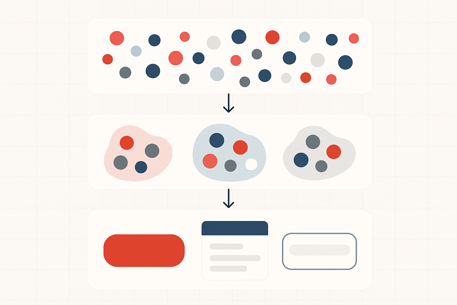
Figma's Variables, first introduced at Config 2023 and substantially expanded through 2025, introduced a fundamentally different mental model. Instead of a color being a fixed value, it became a reference that could resolve differently depending on mode, theme, viewport, or any other contextual axis.
The key conceptual leap is aliasing. A semantic token like color/surface/danger can point to red/100 in light mode and red/900 in dark mode. The design intent is encoded directly into the variable. No separate document needed to explain the relationship. No spreadsheet mapping "light danger background" to one hex and "dark danger background" to another.
Variable collections and scoping, refined significantly in Figma's 2025 updates, allowed teams to restrict where tokens could be applied. "Background" tokens only appear when you're filling a frame. "Text" tokens only show up when you're styling type. This eliminates an entire category of misapplication errors that used to surface only in code review, when a developer noticed someone had used a background color on text and the contrast ratio was unusable.
This isn't just a Figma feature. It mirrors the design token specification from the W3C Design Tokens Community Group, which has been gaining adoption across the industry. But Figma's implementation made the concept tangible for designers who never would have opened a JSON file. It turned an engineering abstraction into a visual, interactive workflow.
The result: the Figma file itself became the source of truth. Not a representation of the source of truth. The actual, living system that both designers and developers reference.
Case Study: How Linear, Vercel, and Notion Rebuilt Their Color Architectures
The theory sounds clean. The practice is messier, but three companies offer useful blueprints.
Linear's design team has been vocal about their adoption of Figma variables to manage their famously restrained, multi-theme interface. Their approach layers three tiers of tokens:
- Primitive tokens: raw color values like gray/900 or red/400
- Semantic tokens: contextual meanings like surface/danger or text/secondary
- Component tokens: specific bindings like button/danger/background
Figma variables handle the semantic-to-primitive mapping. Their codebase consumes the semantic layer directly via token export pipelines. The three tiers create a clean separation of concerns that makes theme switching trivial rather than terrifying.
Vercel's design system, Geist, restructured its color architecture around variable collections that map directly to their CSS custom property system. The result is a near-1:1 relationship between what designers see in Figma's variable panel and what developers see in their stylesheets. When a designer applies --ds-gray-900, the developer sees the same token name in their code. The handoff barely qualifies as a "handoff" anymore. It's closer to a shared vocabulary.
Notion's approach is notable for scale. With a product that supports light mode, dark mode, and dozens of contextual color schemes (page covers, database views, callout blocks), they leveraged variable modes to manage what was previously an unwieldy matrix of color assignments. Before variables, they needed custom tooling just to keep the system synchronized. Now, the variable structure handles the combinatorics natively.
The common pattern across all three: the design system team's role shifted from "maintaining documentation" to "maintaining the variable architecture." The color page in Figma went from a reference sheet to an interactive, mode-switchable system that developers can inspect directly.
The Death of the Static Style Guide
The most visible casualty of the variable revolution is the static style guide. The carefully maintained Notion page. The exported PDF. The Storybook color documentation page that was always three sprints out of date. These artifacts are disappearing, and few people miss them.
When color relationships are encoded directly in Figma's variable system and can be inspected in Dev Mode, the need for a separate document explaining those relationships evaporates. The design file doesn't describe the system. It is the system.
This has downstream effects on onboarding. New designers joining a team no longer need to read a 40-page color guide. They open the file, see what tokens are available for a given property, and the scoping system prevents them from making invalid choices. The guardrails are built into the tool, not into a PDF that nobody reads past page 12.
It also changes the nature of design review. Instead of checking whether someone used the right hex code, reviewers check whether the correct semantic token was applied. That's a much higher-fidelity question. It catches systemic issues ("you used a surface token for an interactive element") rather than superficial ones ("you used #0065FF instead of #0066FF").
Teams that have made this transition report a counterintuitive effect: despite having fewer documentation pages, new team members ramp up faster. The system is self-describing and guardrailed. It teaches you what's valid as you work, rather than asking you to memorize an encyclopedia before you start.
The Ripple Effects on Design-to-Code Workflows
The variable shift doesn't stop at design. It has compressed the entire handoff pipeline.
Token export pipelines, via tools like Tokens Studio, Specify, or Figma's own REST API and forthcoming token export features, now translate Figma variable collections directly into platform-specific code. CSS custom properties. Swift asset catalogs. Kotlin Compose theme objects. Minimal manual mapping required.
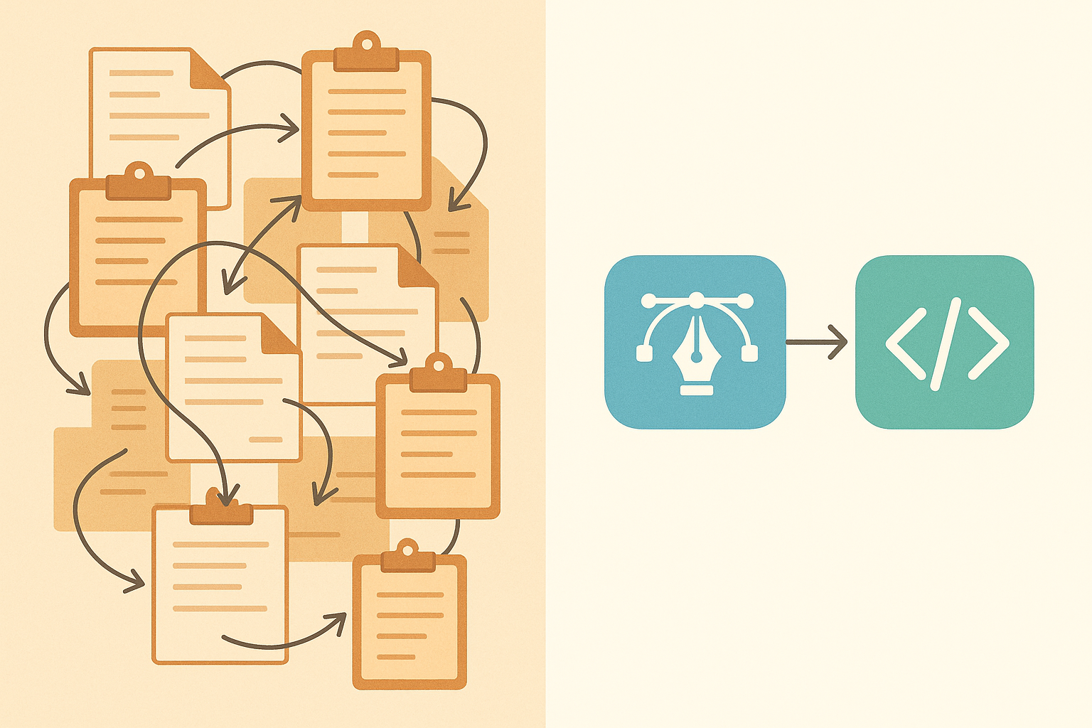
Consider how the old workflow looked:
- Designer documents a color in the style guide
- Designer writes a specification for a component
- Developer interprets the specification
- Developer creates a variable in code
- Developer maps the variable to a component
Now consider the new workflow:
- Designer applies a variable in Figma
- Pipeline exports the code-ready token
Five steps collapsed to two. That's not incremental improvement. That's a different process entirely.
The role of the "design technologist" or "design engineer" has evolved accordingly. Less time spent translating between Figma and code. More time spent designing the variable architecture itself and ensuring the token taxonomy scales across platforms, from web to iOS to Android.
Figma's Dev Mode, enhanced through 2025, now surfaces variable references rather than raw values in the inspect panel. A developer inspecting a button sees color/interactive/primary rather than #0066FF. Intent is preserved all the way to implementation. The semantic meaning survives the journey from designer's brain to production CSS.
What's Next: Color as a Living, Contextual System
The trajectory is clear. Color in design systems is moving from a flat palette to a responsive, context-aware graph of relationships. "Danger" doesn't mean a specific red. It means a position in a semantic network that resolves based on theme, accessibility preferences, brand context, and potentially user personalization.
Figma's 2026 roadmap, based on community previews and beta features, hints at deeper integration between variables and conditional logic. Tokens that respond to accessibility settings or viewport conditions directly within the design tool. If that ships, it means a designer could preview how their color system behaves for a user with low-vision preferences, without leaving Figma.
The convergence of Figma's variable system with the W3C Design Tokens specification, which is nearing maturity in 2026, promises genuine interoperability. Tokens defined in Figma could become a universal interchange format, consumable by any platform or framework without proprietary translation layers. One source of truth, many consumers.
This future challenges designers to think architecturally about color in ways that were previously the domain of front-end engineers. Understanding inheritance. Understanding cascading overrides. Understanding scope. These skills are rapidly becoming table stakes for senior design system practitioners.
The teams that thrive will be those that treat their Figma variable architecture not as a feature to adopt but as a language to master. One that finally lets designers speak to developers in terms of intent, not artifacts.
The Style Guide Page Is Gone. What Replaced It Is Better.
The shift from static color styles to contextual variable tokens isn't a Figma feature update. It's a paradigm change in how design intent travels from a designer's mind to a user's screen.
The old handoff was a game of telephone. Intent was encoded as a hex code, documented in a style guide, interpreted by a developer, and re-encoded as a CSS value. Fidelity was lost at every step. The new model, as practiced by teams at Linear, Vercel, Notion, and an accelerating number of design-forward organizations, collapses that chain.
Color is no longer a value you hand off. It's a relationship you define once and let the system resolve everywhere.
The style guide page in your Figma file might already be gone. The question is whether you've noticed what replaced it, and whether you're ready to design in a world where color is finally as fluid, contextual, and intelligent as the products it serves.