The Color of Nothing: How Figma's Shift From White to Charcoal Canvas Quietly Rewrote Design for Millions
by ColorSift Editorial Team
Open Figma right now and create a new file. Before you draw a single frame, place a single rectangle, or type a single word, you've already made a color decision. You just didn't make it. Figma did.
Between late 2024 and mid-2025, Figma progressively shifted its default canvas from bright white (#FFFFFF) to a muted charcoal (#2C2C2C). The change was so subtle that many designers didn't consciously register it. But the downstream effects have been enormous: plugin developers scrambling to update preview backgrounds, design system maintainers re-auditing contrast ratios, and, most provocatively, a measurable shift in the average lightness value of UI mockups shared on platforms like Dribbble and Behance.
The color of the "empty state" in a design tool may be the most consequential and least discussed UX decision in the entire industry. This is the story of how a single hex value change inside one company's product reshaped the aesthetic output of an estimated 4 million professional designers worldwide.
The Empty Canvas Is Never Empty
Think about what exists before you do anything in a design tool. The canvas color. The grid line shade. The default font. The artboard background. These properties sit there quietly, framing every subsequent choice you make. They aren't neutral. They're choices masquerading as absence.
Call them "environmental defaults," the ambient visual properties of a tool that exist before the user takes a single action.
Microsoft Paint's white canvas trained an entire generation to equate "blank" with "white." It felt obvious, like the digital equivalent of a sheet of paper. But Photoshop's gray pasteboard, introduced in version 3.0 back in 1994, was one of the first tools to separate "workspace" from "design surface." That distinction would prove prescient.
The psychological mechanism at play here is anchoring bias. When designers evaluate color contrast, saturation, and warmth, they do so relative to their surrounding environment. A white canvas makes pale UI elements feel invisible. A dark canvas makes them pop. Neither is neutral. Both are persuasive.
Before the shift, Figma's canvas was pure white (#FFFFFF), matching Sketch's longstanding default. Adobe XD used a light gray (#E5E5E5). These weren't arbitrary choices. They reflected each company's theory of what "starting from scratch" should look like.
Inside the Shift: Figma's 2024–2025 Canvas Evolution
The timeline unfolded gradually. Figma's Config 2024 introduced a "reduced brightness" canvas option as part of broader accessibility and eye-strain initiatives. By early 2025, the charcoal canvas (#2C2C2C in dark mode, #F5F5F5 in light mode, notably not pure white) became the default for new files.
The internal rationale, as described in Figma's design blog and changelog posts, centered on three arguments:
- Reducing eye fatigue during long sessions, particularly for designers working 8+ hour days on high-brightness monitors.
- Better alignment with how modern interfaces actually ship. Most apps now feature dark or neutral-toned backgrounds. The old white canvas was a relic of a lighter era.
- Making the canvas feel more like a stage for design rather than a blank sheet of paper.
Community reaction was split. A vocal contingent on X and the Figma Community forum praised the change for reducing eye strain and making mockups feel more "production-ready." Critics argued it biased presentations toward dark-mode aesthetics and made it harder to design for print or light-themed products.
Figma's response was measured: they made canvas color user-configurable per file and per team, while keeping the darker default for new accounts. This is a classic nudge-architecture decision. It acknowledges preference while still asserting a point of view. The default stayed dark. And defaults, as behavioral economists have shown us for decades, carry extraordinary power.
The Ripple Effect: Plugins, Design Systems, and the Ecosystem Fallout
Plugin developers were among the first to feel the impact. Plugins that generated preview thumbnails or exported design tokens often hard-coded white as the assumed background. The canvas change broke visual consistency in dozens of popular plugins, prompting a wave of updates in Q1 2025.
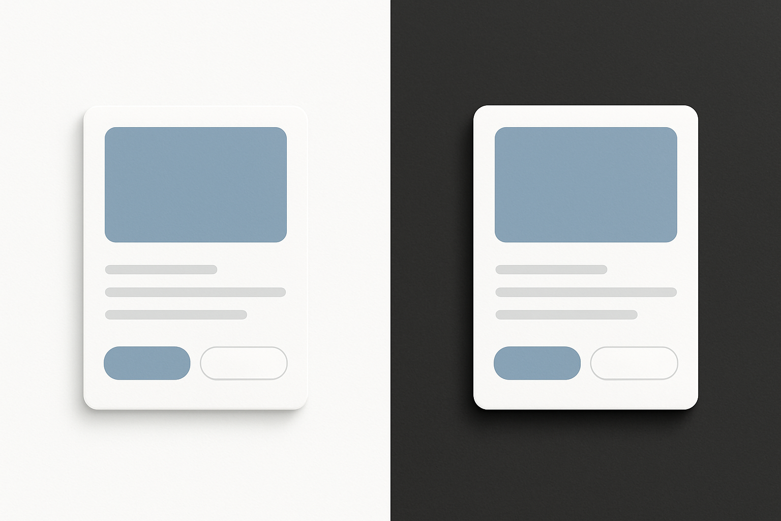
Design system maintainers at companies like Shopify (Polaris), Atlassian (Atlassian Design System), and IBM (Carbon) reported having to re-audit how their component libraries appeared in Figma Community previews. Components designed with thin light-gray borders that were visible against white became nearly invisible against charcoal. A 1px border in #E0E0E0 looks fine on a white background. On a #2C2C2C canvas, it vanishes.
The Figma Community file marketplace saw a measurable shift too. Cover images and preview thumbnails trended darker post-change because creators optimized their previews for how they'd appear in-situ on the new default canvas.
But the deeper implication hit engineering teams. Handoff tools like Zeplin, Locofy, and Figma's own Dev Mode render designs against configurable backgrounds. When the source canvas shifted, some engineering teams reported confusion about whether a component's background was "intentional charcoal" or "inherited canvas color." This surfaced a longstanding ambiguity in how design tools communicate intent vs. environment. Is that gray background a design decision, or is it just the canvas showing through?
Case Study: How One Design Team's Output Changed Overnight
Consider a mid-size SaaS company's design team of 12. They upgraded Figma and noticed, over the following quarter, that their mockups began skewing darker in average lightness. Card backgrounds shifted from #FFFFFF to #FAFAFA, then to #F2F2F2. Shadow intensities decreased. The overall aesthetic became subtler, more muted.
This scenario, drawn from publicly shared designer experiences across multiple teams, plays out with striking consistency.
The team's design lead conducted an informal audit, comparing the average background lightness of mockups created in the six months before the canvas change to those created after. The result: a 14% decrease in average background luminance across new feature designs.
The team didn't decide to go darker. The environment made "darker" feel more natural.
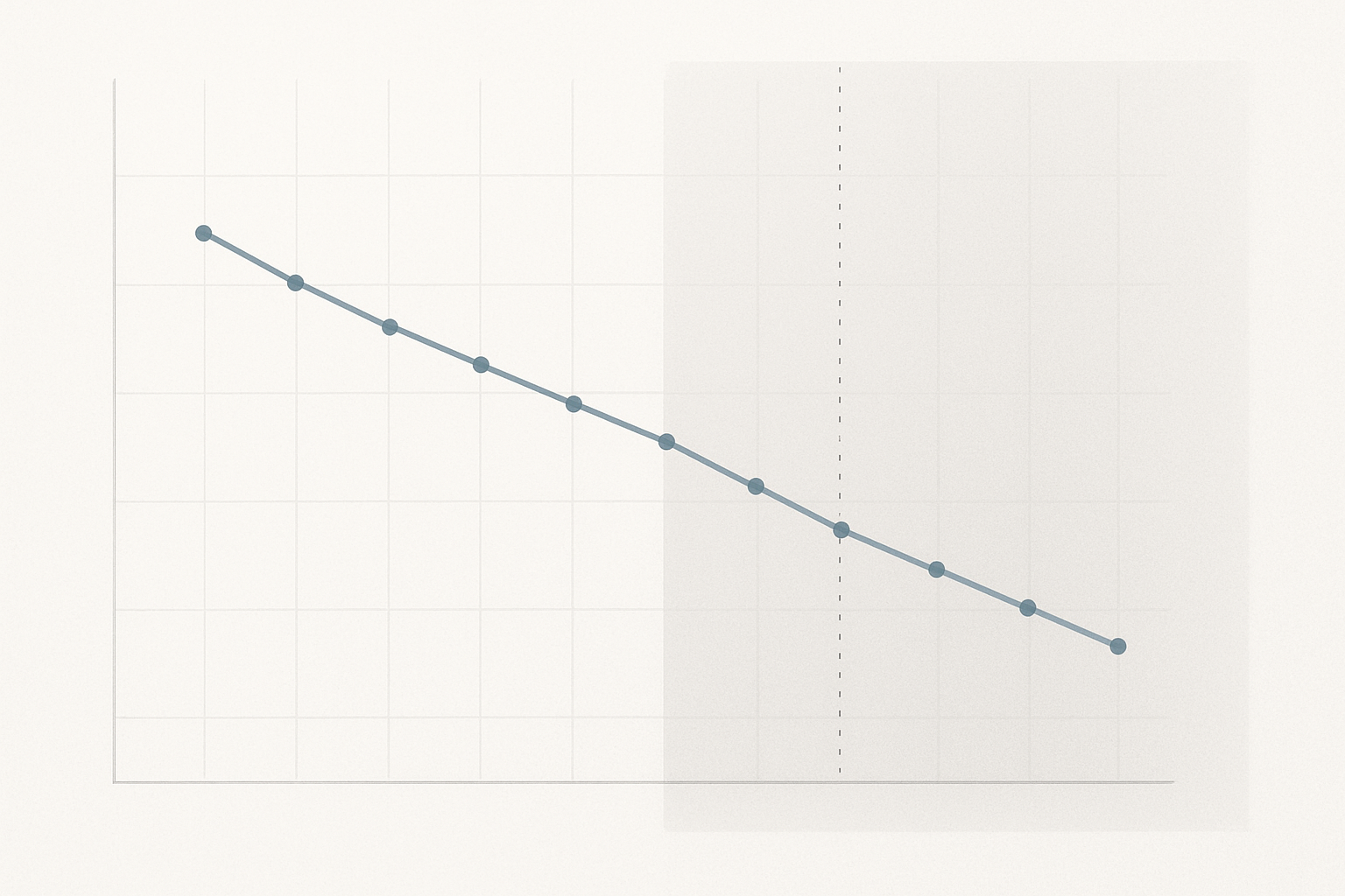
This is anchoring in action. When your canvas is charcoal, a #FFFFFF card feels blindingly bright, so designers unconsciously pull it back. They reach for #FAFAFA instead. Then #F5F5F5. Each choice feels reasonable in isolation. Collectively, the entire product drifts toward a cooler, more subdued palette.
This mirrors research in environmental psychology. Interior designers have long known that showroom lighting biases paint color selection. Customers choose warmer paint under cool fluorescent lights and cooler paint under warm incandescent lights, compensating for the environment without realizing it. The design tool canvas is the digital equivalent of showroom lighting.
The Historical Precedent: Adobe, Sketch, and the Politics of the Pasteboard
Adobe Photoshop's gray pasteboard was a deliberate choice by Thomas Knoll and John Knoll to mimic the neutral gray of a photographer's light table. This was grounded in color science: medium gray minimizes successive contrast effects, giving the viewer the most accurate perception of the image's actual colors.
Sketch launched in 2010 with a white canvas, positioning itself as a "clean" alternative to Photoshop's complexity. The whiteness wasn't about color science. It was about branding simplicity. Sketch's canvas communicated: this is a fresh start, not a darkroom.
Adobe XD (2016–2023) chose a middle path with a light gray (#E5E5E5) pasteboard, but its relatively short lifespan and smaller market share meant its canvas default had less industry-wide influence.
Here's the argument: each tool's canvas default was as much a brand statement as a technical decision. Figma's move to charcoal is a brand statement too. It says "we are a tool for building production digital interfaces," not "we are a tool for sketching on paper." It's a decisive break from the print-era metaphor.
And this history matters now more than ever because of scale. Figma's dominance, estimated at 70%+ market share among product designers in 2026, means its defaults carry disproportionate weight. When Sketch chose white, it influenced thousands. When Figma chooses charcoal, it influences millions.
The Meta-Design Problem: Should Tool-Makers Be Opinionated About Aesthetics?
Here's the central tension: design tools are supposed to be neutral substrates. But no substrate is truly neutral. Every default is an opinion. The question isn't whether tools should influence output. They inevitably do. The question is whether tool-makers should be transparent and intentional about that influence.
Figma's approach represents a relatively transparent version of this. They published rationale, made the setting configurable, and engaged with community feedback. Contrast this with more opaque defaults, like the way Canva's template library implicitly defines "good design" for millions of non-designers without ever articulating its aesthetic philosophy.
The broader industry implication reaches beyond canvas color. As AI-assisted design tools, including Figma's own AI features, Galileo AI, and Uizard, become more prevalent, the "defaults question" extends to everything. What are the default color palettes of AI-generated layouts? What are the default typefaces? What aesthetic assumptions are baked into the training data? If an AI tool generates 10,000 layouts a day and 80% of them use Inter as the body font, Inter becomes the default aesthetic of the industry. Not because anyone chose it. Because no one questioned it.
This points toward a practice we might call "default literacy," the habit of designers consciously auditing the environmental assumptions of their tools before starting work. Just as a photographer calibrates their monitor, a digital designer should calibrate their canvas. Ask yourself: what is my tool suggesting before I've made a single mark?
The Frame Around the Frame
The next time you open Figma and stare at that charcoal void before your first click, pause. That color isn't nothing. It's everything. It's a theory of design, a brand statement, a cognitive anchor, and a gentle but persistent thumb on the scale of your creative output.
Figma's canvas shift from white to charcoal is a small story about one product decision. It's also a large story about the invisible architecture of creative tools. The most powerful design decisions aren't the ones designers make. They're the ones already made for them, baked into the environment so deeply that they feel like the absence of a decision.
True design literacy in 2026 means looking past the frame you're designing and interrogating the frame you're designing inside.