Why Fast Food Chains Are Abandoning Red and Yellow: The Great Palette Reset of 2025–2026
by ColorSift Editorial Team
You walk into a newly renovated McDonald's in 2026 and barely recognize it. The screaming red and yellow are gone. In their place: sage green walls, warm oak paneling, and packaging in matte olive and cream. The lighting is softer. The furniture feels like it belongs in a coffee shop, not a burger joint. If it weren't for the faint smell of fries, you might think you'd wandered into a Sweetgreen.
Here's the striking part: by early 2026, seven of the ten largest fast food chains in the U.S. have undergone or announced major color rebrandings. And they're all moving in the same direction, away from the high-energy primaries that defined the industry for decades.
So why is an entire industry abandoning the color psychology playbook that made it billions?
The answer sits at the intersection of shifting consumer values, sustainability signaling, and a generational reckoning with what "fast food" even means. In the sections ahead, we'll trace where this trend came from, examine the new palettes replacing the old ones, and explore what it means for designers working in food branding right now.
The Red-and-Yellow Playbook: Why It Worked for 70 Years
The theory is simple and well-documented. Red stimulates appetite and creates urgency. Yellow grabs attention and triggers feelings of happiness. Together, they form a one-two punch that's been the fast food industry's not-so-secret weapon since the mid-20th century.
Researchers have long called it the "ketchup and mustard" theory, and brands like McDonald's, In-N-Out, and Wendy's weaponized it with surgical precision. Those colors weren't chosen because someone liked the way they looked on a napkin. They were engineered to maximize impulse purchases and speed up decision-making at the drive-thru window.
The red-yellow-orange cluster showed up everywhere. Signage. Interiors. Packaging. Uniforms. Even the trays. Every touchpoint was calibrated to create a sensory ecosystem of urgency and craving. Walk in, order fast, eat fast, leave. The colors practically yelled at you to keep moving.
And it worked. For roughly 70 years, this approach printed money.
So what changed? The very consumer behaviors these colors were designed to exploit have shifted dramatically, especially since 2023.
The Catalyst: How Consumer Values Flipped the Script
Several forces converged at once.
Health-conscious dining entered the mainstream. By 2025, plant-based and "better-for-you" menu items account for a growing share of QSR revenue. When you're selling cauliflower wraps and oat milk lattes, a screaming red interior sends a contradictory message. Brands need their environments to match what's on the menu.
Gen Z and younger Millennials actively distrust overtly manipulative design. Research from 2024 and 2025 shows these consumers associate red-and-yellow branding with "cheap," "unhealthy," and "outdated." They grew up with information about color psychology readily available on TikTok and YouTube. The trick doesn't work when the audience knows it's a trick.
The sustainability imperative is real. Brands face pressure from investors, regulators, and customers to signal environmental responsibility. Earthy, muted palettes visually align with eco-conscious values. Neon primaries do not. It's that straightforward.
The fast casual effect sealed the deal. The massive success of chains like Sweetgreen, CAVA, and Chipotle, all built on muted, natural color palettes, proved something important: a calmer aesthetic doesn't hurt sales. It attracts a higher-spending customer. Traditional fast food chains took notice.
With these forces in play, the dominoes started falling. Let's look at the biggest one first.
Case Study: McDonald's "Fresh Forward 2.0" and the New Golden Arches
McDonald's has been inching toward this moment for over a decade. European locations started swapping red backgrounds for green as early as the 2010s. But the "Fresh Forward 2.0" interior redesign rolling out across North America in 2025 and 2026 represents something far more ambitious.
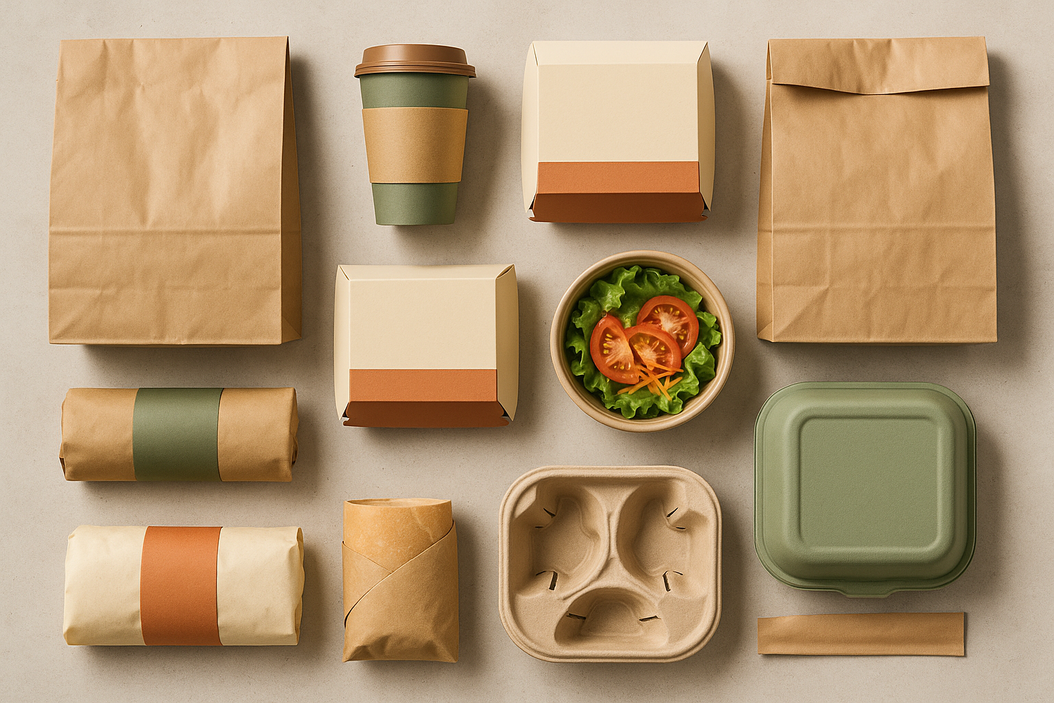
The changes are specific and deliberate. Interiors now feature warm greige walls, living plant installations, and matte sage and forest green accent panels. Packaging is shifting from glossy red to kraft brown with olive and cream accents. The furniture is wood-toned and rounded. The lighting is warm but restrained.
The Golden Arches themselves remain yellow. But they're now frequently rendered in a desaturated, almost amber tone against dark green or charcoal backgrounds. It's the same logo, yet it feels fundamentally different. The visual temperature has dropped by at least 20 degrees.
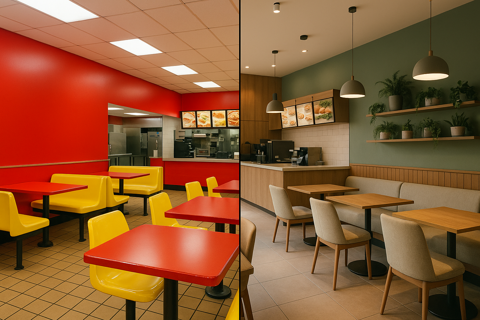
McDonald's has framed this as "evolving with our guests." Analysts are more blunt: it's a direct response to the brand being perceived as the poster child of unhealthy eating. The color shift is, in part, a reputation management exercise conducted through interior design.
The results so far? Early data from renovated locations suggests higher dwell times and increased average ticket sizes. People linger. They order more. The calm is paying for itself.
The New Fast Food Palette: What's Replacing Red and Yellow
Across the industry, four dominant color families are emerging: sage and olive greens, warm neutrals like cream and sand and greige, earthy terracottas, and deep botanical tones. Let's look at the specific palettes showing up in redesigned locations and new packaging.
The New Drive-Thru
This palette represents the mainstream QSR shift. It communicates freshness, warmth, and approachability without the aggressive energy of the old playbook. You'll see versions of this in suburban McDonald's, renovated Burger Kings, and new-build Wendy's locations nationwide.
Notice the desaturated gold standing in for yellow. It maintains a thread of familiarity while feeling entirely contemporary. The soft terracotta adds warmth without screaming "BUY NOW."
Farm-to-Counter
Inspired by the fast casual influence bleeding into traditional fast food, this palette bridges the gap between "fast" and "thoughtful." It's showing up in menu boards, mobile app interfaces, and limited-edition packaging across several major chains.
The muted mustard here is key. It's the ghost of yellow past, evolved into something that reads as artisanal rather than artificial.
Urban Botanical
This is the premium, metro-market approach you'll find in flagship and concept stores. It targets the urban consumer who sees fast food as a guilty pleasure and needs visual permission to walk through the door.
The whisper of blush in this palette is subtle but strategic. It softens the forest green and warm black, making the space feel welcoming rather than austere. Brass and amber accents add a touch of sophistication that would have been unthinkable in a fast food restaurant five years ago.
A note on texture: Color is only half the story. Matte finishes are replacing gloss across the board. Kraft and recycled-look packaging has become the default. Wood and stone are pushing out plastic laminates. The industry's color shift is really a color-plus-texture shift, and the two are inseparable.
Beyond the Big Three: Industry-Wide Ripple Effects
McDonald's gets the headlines, but the change is happening everywhere.
Burger King has been dialing back the flame-grilled orange in its interiors throughout 2025 and 2026, replacing it with warm browns and deep rusts. Packaging increasingly uses unbleached cardboard tones. The crown logo remains, but its context has changed completely.
Wendy's is making subtler but telling shifts. The red stays in the logo, but new store concepts feature teal-green interiors, lighter wood tones, and reduced visual intensity overall. It's a quieter Wendy's, literally and chromatically.
Taco Bell, Popeyes, and KFC are each navigating the tension between heritage colors and new aesthetic expectations. Rather than full abandonment, many of these brands are leaning into what designers call "heritage reinterpretation," taking their signature hues and deepening, darkening, and desaturating them into more sophisticated versions.
Internationally, the trend plays out unevenly. European locations, as usual, led the charge by two to three years. Asian markets are moving more cautiously, with heritage colors holding stronger cultural significance. North American locations sit in the middle, adapting quickly but still testing regional variations.
The Designer's Playbook: What This Means for You
If you work in branding, packaging, or environmental design for food clients, here are four practical takeaways.
1. The appetite appeal rules haven't been thrown out. They've been rewritten.
Warm tones still dominate the new palettes. But the temperature has dropped from "hot" to "warm," and saturation has plummeted. You can still create appetite appeal with muted colors. The mechanism is different, though. Instead of triggering urgency, these palettes create comfort and trust. Study how Chipotle and CAVA handle this. They make food look appealing through contrast with their muted environments rather than through color saturation in the environment itself.
2. Materiality is now inseparable from color.
A sage green on glossy plastic reads completely differently than the same sage on kraft paper. The industry's shift is a color-plus-texture shift, and you need to think in terms of material palettes, not just swatches. Spec the substrate alongside the color. Present concepts on the actual materials they'll appear on. A Pantone chip on a screen won't tell the full story anymore.
3. Beware the homogeneity trap.
As every QSR brand converges on the same earthy-green-neutral palette, differentiation becomes the critical challenge. Right now, a renovated Burger King interior could pass for a renovated McDonald's interior at a glance. That's a problem. The next wave of innovation will come from brands that find distinctive, ownable colors within this muted space. Maybe it's a specific shade of terracotta. Maybe it's an unexpected accent color. The opportunity is there for designers who look for it.
4. This is not permanent.
Color trends in food branding move in cycles. The earthy palette feels inevitable right now, but so did red and yellow for decades. Smart designers will build flexible brand systems that can evolve over time, rather than locking any client into a single palette positioned as "timeless." Nothing in branding is timeless. Build for adaptability.

The Real Story Behind the Palette Reset
The Great Palette Reset of 2025 and 2026 is more than an aesthetic trend. It's a visual manifestation of the fast food industry's identity crisis. These brands are using color to tell consumers a new story: that fast food can be fresh, responsible, and worth respecting.
Whether that story is authentic or performative is a fair debate. Many of these brands still sell the same burgers in the same quantities. The sage green walls didn't change the fryer oil. But the design implications are real and far-reaching regardless of motive.
For designers, the lesson is clear. Color in food branding has never been "just color." It's a values statement. And right now, the industry's values are being rewritten in sage, cream, and olive.
The brands that win this transition won't simply be the ones adopting the new palette. They'll be the ones who find a way to be distinctive within it. The red-and-yellow era rewarded conformity. Every chain looked like every other chain, and that was fine because the colors themselves did the selling.
The earthy-toned era will reward something different. It will reward the designers who can make muted feel memorable. That's the creative challenge ahead, and it's a good one.