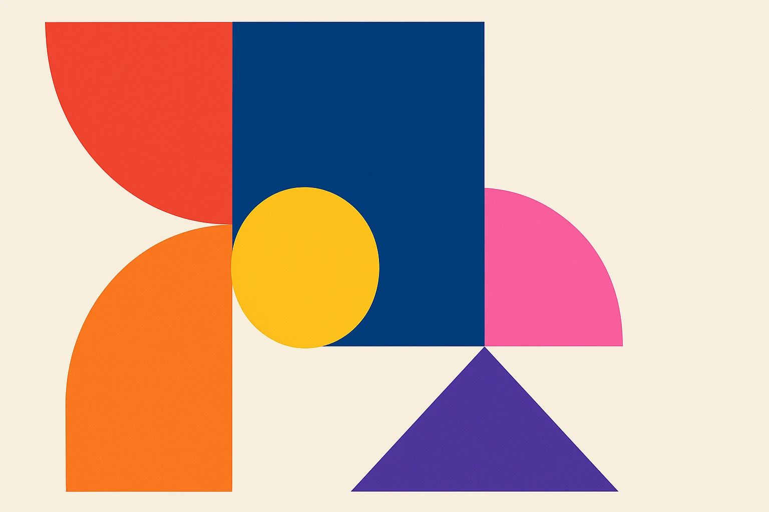
The Bold Spectrum: Embracing Vibrant Colors in Modern Design
by ColorSift Editorial Team
In a world bursting with creativity, colors are the unsung heroes of design. They speak volumes without uttering a word, turning monotony into magic. Ever wondered why some visuals grip your attention while others fade into the background? The answer often lies in the bold spectrum of colors.
The Psychology of Color in Design
Colors aren't just decoration; they speak to our emotions and influence our perceptions. What comes to mind when you see a vibrant red? Passion? Energy? Maybe a warning? Colors have this innate ability to evoke feelings.
Take cultural context for instance. In Western cultures, white might signify purity. Meanwhile, in some Eastern traditions, it represents mourning. This shows how understanding your audience's cultural backdrop is crucial.
Why do vibrant colors invigorate us? They radiate energy and excitement. Imagine the thrill of a bright carnival—it's all about harnessing lively hues to captivate and energize.
Trending Color Schemes for Modern Design
Bold is beautiful. Drifting away from muted tones, designers embrace striking palettes that scream personality.
Pantone’s annual Color of the Year often sets the pace. Recall "Viva Magenta"? Brands like Spotify and Instagram have successfully capitalized on such trends, capturing youthful exuberance and modernity.
Just look at this color scheme from a recent design project:
The seamless blend of colors lends vibrancy without overwhelming the viewer, a testament to their strategic selection.
Balancing Bold Colors: Tips and Techniques
All fired up to use those vibrant shades? Hold your horses! Too much boldness, and you risk chaos. Here’s how to balance it:
- Color Wheels: These show complementary colors, helping you create harmony.
- Contrast: Use it wisely to ensure elements stand out—think of it like seasoning, too much ruins the dish.
Neutrals are your best friends here. They provide a subtle backdrop, letting bold colors take the spotlight without hogging it. Layering colors can also add depth, ensuring a dynamic visual experience.
Effective Color Palettes for Various Design Types
Different designs call for different palettes. Web design thrives on engaging colors to enhance user experience. Think of vibrant buttons that entice clicks.
In interior design, bold accents transform spaces, infusing life into a room with otherwise muted colors.
Have a peek at a web design color palette:
This combination uses pops of color to guide users through a digital journey.
Graphic design loves striking visuals. It's about making an impact that stays etched in the viewer's memory. Bright, illustrative designs are powerful tools.
Tools and Resources for Choosing Color Combinations
Choosing the right combination is easier today with tools like Adobe Color and Coolors. These platforms offer endless inspiration and help ensure your colors don't clash.
Browse online resources to discover trending palettes. Design Seed often pairs photography with color schemes—perfect for visual learners.
For on-the-go creativity, mobile apps such as ColorSnap can help you create palettes from your surroundings.
Real-World Applications of Vibrant Colors
From fashion runways to tech gadgets, vibrant colors are everywhere. They help brands stand out in cluttered markets. But let’s face it, it's a double-edged sword. Overuse risks overwhelming consumers, leading to a visual overload rather than appeal.
Fashion icons, tech giants, and advertisers use color to narrate their unique story. The key? Knowing when to pull back and let simplicity shine.
Conclusion
Vibrant colors, when used thoughtfully, have the power to make designs more engaging and aesthetically pleasing. By understanding color psychology and leveraging modern palettes, designers can evoke emotions and create unforgettable experiences. So go ahead—paint your projects with a bold spectrum and watch them come alive!