How Duolingo's Green Owl Hijacked Your Dopamine: A Color Case Study in Gamified Learning
by ColorSift Editorial Team
You see a flash of neon green on your phone screen, and something fires in your brain before you can name it. Guilt. Urgency. A strange, almost affectionate dread. Millions of people share this Pavlovian twitch, and it's not an accident. Duolingo's signature Feather Green (#58CC02) is arguably the most psychologically weaponized brand color in consumer tech. Since crossing 100 million monthly active users in 2025, Duolingo has become the gold standard for product-led growth. Designers routinely dissect its streak mechanics, notification copy, and mascot antics. But one dimension remains underexplored: color.
Specifically, how Duolingo built an entire behavioral nudge engine out of a single shade of green. And how it orchestrates that green against a precise cast of accent colors to create a dopamine feedback loop that keeps you coming back, lesson after lesson, day after day.
This is the story of how a cartoon owl's color scheme became one of the most effective retention tools in modern UX.
Feather Green Isn't Just a Brand Color. It's a Signal.
Pull up your home screen and look at your app icons. You'll find blues (Facebook, Twitter/X, Zoom), reds (YouTube, Netflix), and the occasional purple (Instagram's gradient). Now find Duolingo. That screaming neon green doesn't just sit among your other apps. It vibrates.
Feather Green (#58CC02) breaks nearly every rule in the traditional brand-color playbook. It's far more saturated and luminous than what most guidelines would recommend, sitting closer to a highlighter marker than a "trustworthy" corporate green. And that's entirely the point.
Here's the psychophysics: human eyes contain more photoreceptors sensitive to green wavelengths than to any other part of the visible spectrum. This is an evolutionary inheritance from our forest-dwelling ancestors, for whom detecting subtle variations in green meant spotting food, predators, or shelter. The practical result? Feather Green registers faster than competing app icons in a crowded dock. Your eye lands on it before it lands on Gmail.
Compare Duolingo's green to the greens used by wellness and finance apps. Calm uses a muted sage that whispers "relax." Robinhood employs a restrained emerald that says "your money is safe." Duolingo's green doesn't soothe. It activates. It borrows from the visual language of video game HUDs and traffic "go" signals, two contexts where green means move, act, proceed.
This single color choice telegraphs Duolingo's core philosophy: learning should feel like play, not study. The color is the first UX decision a user encounters, and it pre-frames the entire experience as energetic and rewarding before you've tapped a single lesson.
The Dopamine Palette: How Green, Orange, and Purple Work as a System
The owl gets all the credit, but the real behavioral engine is a three-color system working in concert. Each color maps to a distinct psychological lever.
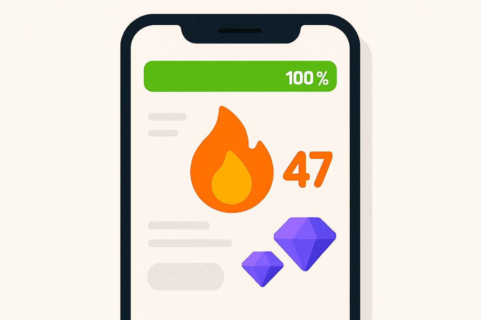
- Feather Green (#58CC02): Positive reinforcement and competence. This is the color of correct answers, progress bars filling up, and forward motion. It tells your brain, "You're doing great."
- Streak-Flame Orange (#FF9600): Urgency and loss aversion. This is the color of your streak counter, the daily reminder that you have something to protect. It tells your brain, "Don't lose this."
- Gem Blue-Purple (#CE82FF / #1CB0F6): Variable reward and aspiration. This is the color of gems, leaderboards, and Super Duolingo features. It tells your brain, "There's more to earn."
Walk through a single lesson, and you'll experience these colors as a narrative arc. The screen starts dominated by calming white and neutral gray, a blank canvas. Then, with each correct answer, green flashes punctuate the experience, each one a tiny dopamine hit. The progress bar inches forward in green. When you finish, the orange streak flame appears at the completion screen, a commitment device reminding you that tomorrow matters. Purple gems accumulate in the corner, a secondary reward layer promising future spending power.
If you've read Nir Eyal's Hooked, you'll recognize the pattern. Duolingo's color transitions map almost perfectly to the trigger-action-variable reward-investment cycle. The green flash after a correct answer is the variable reward. The orange streak counter is the investment. The push notification (green owl face on your lock screen) is the external trigger. These color shifts aren't decorative. They are the emotional pacing of the loop.
The 2023 Redesign: How a Flatter Owl Made the Green Louder
In 2023, Duolingo shipped a major mascot and UI overhaul. Duo went from a 3D-shaded, friendly owl with soft gradients to a flat, bold, almost aggressive character with exaggerated expressions. The green became even more saturated and unshaded, filling more visual real estate on every screen.
The design rationale, confirmed by Duolingo's own design team, was ruthlessly practical. The flatter aesthetic was optimized for small screens and social media thumbnails. Removing gradients and shadows let the green punch harder at tiny sizes. This matters enormously for two contexts that drive Duolingo's growth: push notifications (where the owl's face is maybe 40 pixels wide) and TikTok frames (where you have roughly 300 milliseconds to stop a thumb from scrolling).
The redesign also expanded the owl's emotional range dramatically. Passive-aggressive guilt. Unhinged joy. Existential dread (a meme favorite). But through every emotional permutation, the green stayed constant. It became the anchor that makes every expression instantly recognizable, regardless of context. You could put Duo in a wedding dress, a hazmat suit, or a courtroom, and the green would still scream "Duolingo" within a fraction of a second.
This connects to a broader design movement sometimes called "brand maximalism." Companies like Duolingo, Figma, and Notion have moved away from minimalist restraint toward characters and colors that are deliberately loud, memeable, and impossible to scroll past. In a feed economy where attention is the scarcest resource, subtlety is a liability.
Weaponized Green: Duolingo's Social Media Color Strategy
Duolingo's social media team, particularly on TikTok and Instagram, has turned the neon green owl suit into one of the most effective scroll-stopping devices on the internet. The reason is simple color theory applied to feed dynamics.
Most social feeds are dominated by warm skin tones, beige lifestyle aesthetics, and blue UI chrome. Feather Green is a visual intruder in that environment. It doesn't belong, so you look. Your eye catches on it the way it catches on a fluorescent vest in a crowd.
Consider the specific viral moments. The Duo owl stalking people at real-world events. The "unhinged Duolingo" TikTok persona that turned the brand into a chaotic internet personality. The 2025 April Fools campaigns. In every case, the green does heavy brand-attribution work. You know it's Duolingo before you read a single word of caption text.
There's a concept worth naming here: chromatic distinctiveness. Most educational brands default to blues and whites (trust, authority), which makes them functionally invisible in a social context where every other brand is also blue and white. Duolingo's green occupies a color space that virtually no other major app claims. It's competitive real estate, and Duolingo owns it.
The strategy extends beyond social feeds. Push notifications pair the owl's green face with guilt-trip copy ("These reminders don't seem to be working. We'll stop sending them."). The app icon badge creates a color-emotion association that follows you far beyond the app itself. Every time you see that particular shade of green, anywhere, a little Duo lives rent-free in your visual cortex.
The Competitor Contrast: What Babbel's Orange and Rosetta Stone's Gold Tell You
Color choices in the language-learning market aren't random, and comparing them reveals fundamentally different theories of motivation.
Babbel's warm orange communicates approachability, social warmth, and conversation. Orange is the color of friendliness and informal connection. Babbel positions itself as a practical tool for adult learners who want real-world speaking skills, and its color reflects maturity without gamification. The UI uses muted, warm tones with minimal reward animations. It says, "Let's have a conversation," not "Let's play a game."
Rosetta Stone's legacy gold/yellow carries connotations of prestige, tradition, and premium pricing. Gold says "investment," not "play." This is consistent with its history of $200+ course packages and institutional sales to corporations and government agencies. The app leans on photography and neutral layouts. It says, "This is serious education."
Duolingo's neon green is the only one in the trio that uses color as an active behavioral mechanism rather than passive branding. The green doesn't just represent the brand. It does something in the product, firing with every correct answer, filling every progress bar, staring at you from every notification.
These differences reflect competing theories of what makes people learn. Duolingo bets on extrinsic, game-like reward loops and colors them vividly. Babbel bets on intrinsic, conversational motivation and colors it warmly. Rosetta Stone bets on aspirational identity and colors it with prestige.
Newer competitors are getting more deliberate about this. Busuu uses teal and turquoise, signaling community and connection. Memrise leans on yellow-green, nodding to memory science and cognitive energy. The language-learning color space is becoming a strategic map, and every shade is a positioning statement.
The Shadow Side: When the Green Becomes Coercive
No honest analysis of Duolingo's color strategy can skip the criticism. Some users and UX researchers argue that Duolingo's color-driven dopamine loop crosses the line from "engaging" to "manipulative," particularly for younger users.
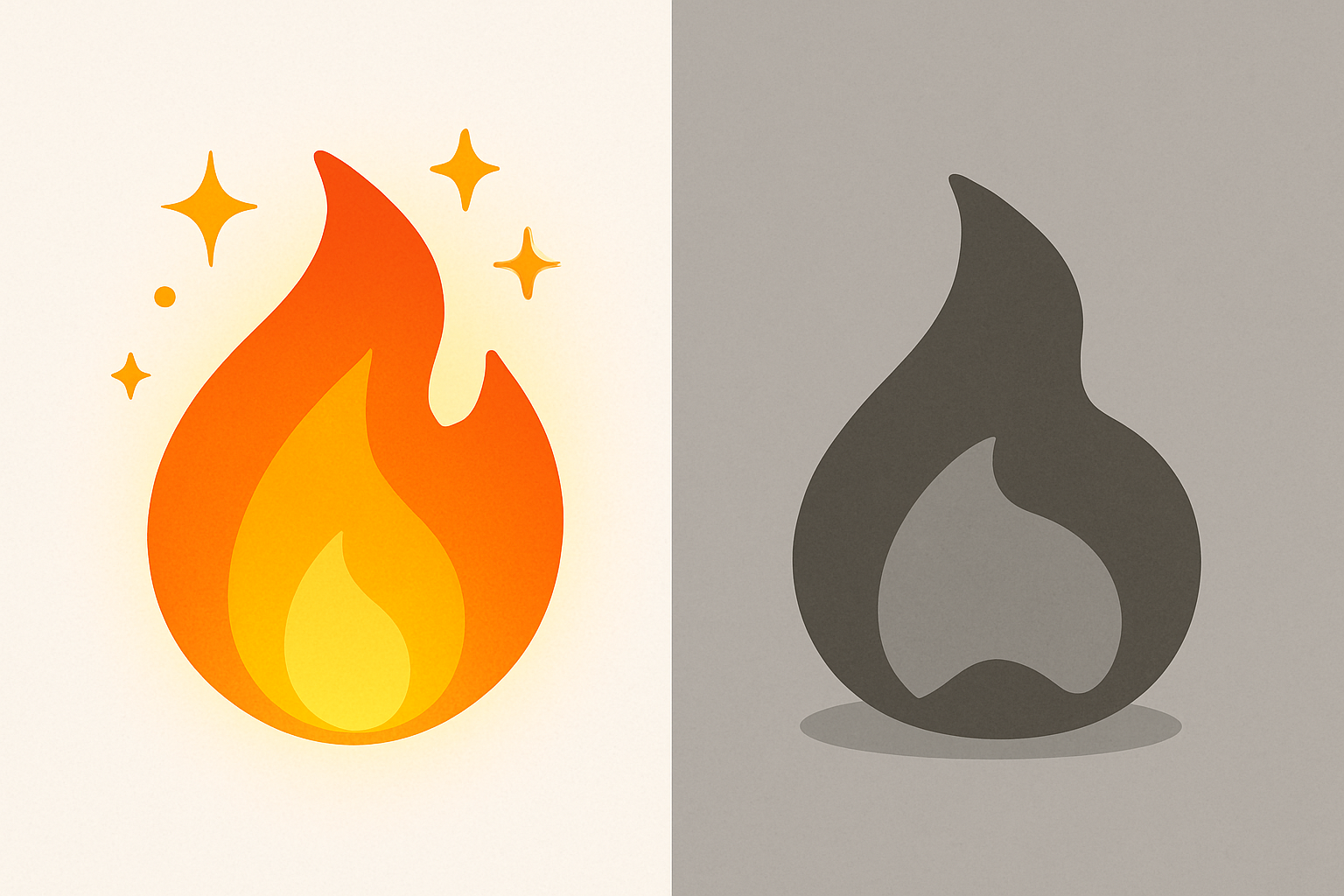
The guilt-inducing push notifications, paired with the owl's now-iconic sad green face, weaponize loss aversion with surgical precision. The growing discourse in 2025 and 2026 around dark patterns in gamification frequently cites Duolingo's streak mechanics as exhibit A. The visual anchor is telling: when you break a streak, the orange flame turns gray. That color transition from vibrant to desaturated is itself a punishment signal. Your brain reads it as loss before your conscious mind processes the number.
Duolingo has responded with pressure-relief valves. Streak freezes let you miss a day without losing your count. "Friendly reminders" settings give users control over notification tone. The company has publicly acknowledged the tension between retention mechanics and user well-being.
But the design ethics question persists for practitioners: when you build a color system this effective at driving behavior, where is the line between delight and dependence? When does a cheerful green progress bar become a compulsion mechanism? These are questions without clean answers, and they'll only grow louder as more apps adopt gamification playbooks inspired by Duolingo's success.
The Green That Does Something
Let's return to where we started: that flash of neon green on your screen that makes you feel something before you think anything.
Duolingo's Feather Green is a masterclass in what happens when color stops being a branding exercise and starts being a product mechanic. It's the green that says "correct." The green that says "keep going." The green that guilt-trips you from your notification tray. Whether you find that brilliant or unsettling, or both, it's undeniable that no other consumer app has turned a single hex code into such a powerful engine of daily habit formation.
For designers and product teams, the lesson isn't to copy Duolingo's green. It's to ask a harder question: does your color system merely look good, or does it actually do something?
Because in 2026, the most effective brand colors aren't chosen for aesthetics. They're engineered for behavior.