Coloring Outside the Brand: How Duolingo's Unhinged Green Built a New Playbook for Mascot-Led Color Identity
by ColorSift Editorial Team
You remember the moment even if you weren't there. A quiet Tuesday in 2022. Duolingo's TikTok account posts a video of Duo the owl, rendered in that unmistakable, almost radioactive green, silently staring at the camera for 30 seconds. The caption reads: "you haven't practiced today." It gets 4 million views. No product feature. No discount. No call to action. Just green, a bird, and existential dread.
This is a language-learning app. Its color strategy somehow became more culturally influential than its curriculum. And that raises a question worth sitting with: how does a single color become the carrier of an entire emotional personality, and what happens when a brand deliberately engineers that personality around chaos instead of consistency?
In 2026, personality-driven branding is the dominant mode. Duolingo remains its most instructive, and most unsettling, case study. For designers and strategists watching from the sidelines, it's also the most important one to understand.
The Color That Shouldn't Work (But Absolutely Does)
Let's talk about Duolingo's signature green. The hex code is #58CC02. Say it out loud and it sounds clinical. Look at it on screen and it hits you like a tennis ball to the forehead.
This is not the sage of wellness brands. It is not the forest green of financial services. It is the green of a neon sign in a rainstorm, aggressive and slightly wrong in the best possible way. It vibrates. It demands attention. It feels like it's been turned up a few notches past where polite design would have stopped.
Context matters here. Between 2014 and 2018, the edtech category defaulted to blues, purples, and muted primaries. Khan Academy chose teal. Coursera went with navy. Udemy settled on a restrained purple. These were colors that signaled trust, credibility, and seriousness. They whispered "we are a legitimate educational institution" to users who needed convincing that online learning was real learning.
Duolingo's green was a deliberate departure from all of that. Early brand decisions positioned the app as game-like and low-stakes. The color needed to feel like play, not obligation. It needed to say "this will be fun" before a single line of copy ever appeared on screen.
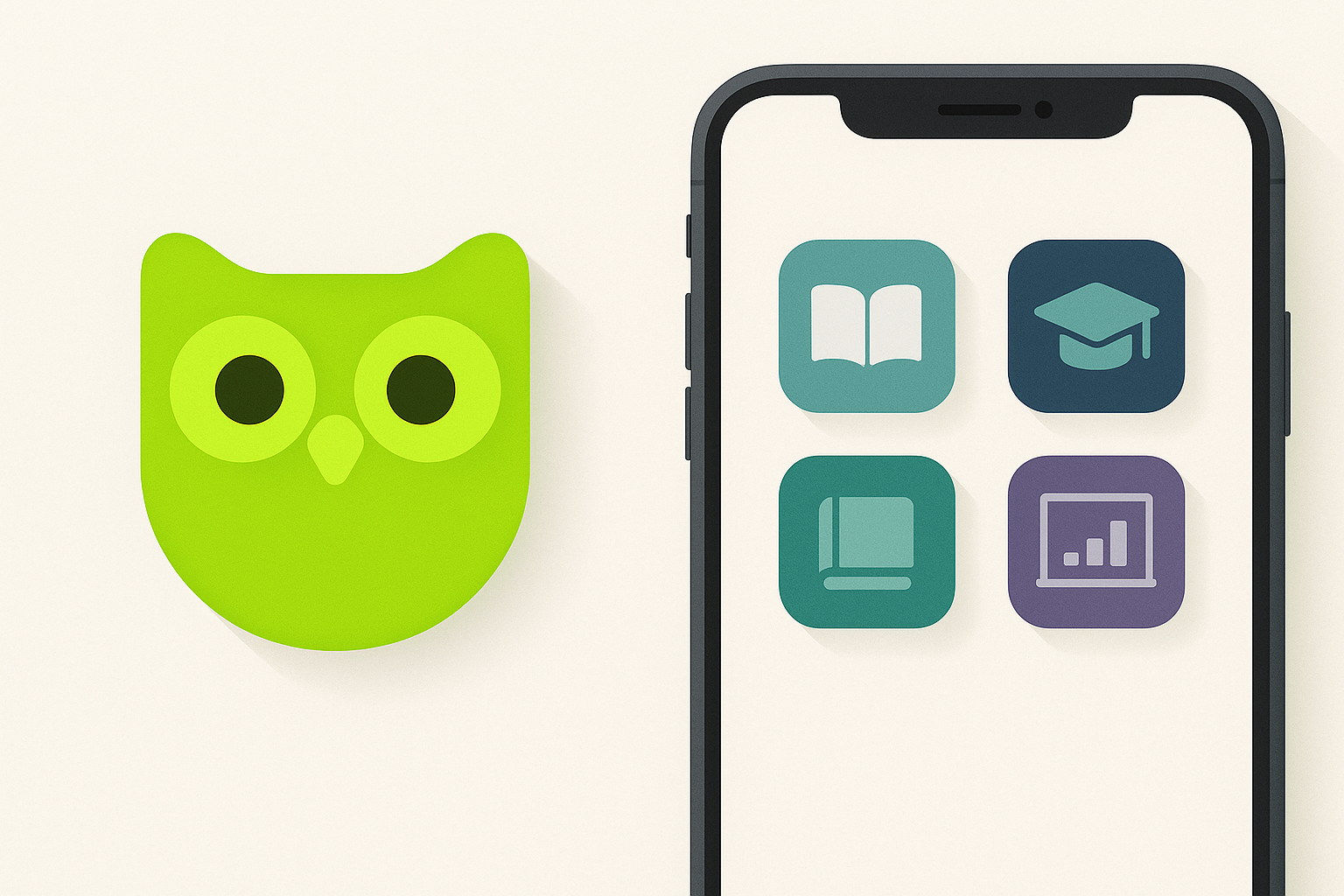
Think of it as a permission slip. That green visually tells users the experience won't feel like homework. It sets an emotional expectation at the icon level, sitting on your home screen between your banking app and your email, looking like the one thing that might actually be enjoyable to open.
Duo the Owl: When the Mascot Becomes the Color Strategy
Duo started life as a cheerful, rounded brand asset. In the 2012 to 2018 era, he was friendly, approachable, and forgettable in the way most app mascots are. A nice owl. A green owl. Fine.
Then something shifted.
By the early 2020s, Duo had become a deadpan, mildly threatening cultural figure. His eyes got larger. His expression flattened. His presence on social media turned from helpful to haunting. And this evolution was completely inseparable from his green rendering.
Here's the argument worth making: Duo is not just a mascot who happens to be green. He IS the color's personality. His unsettling stare, his passive-aggressive notifications, his viral funeral in February 2025 (following the brief removal of streak-guilt messaging) all derive their emotional power from being encoded in that specific shade. Swap him to blue and he's just a cartoon bird. In that neon green, he's a cultural phenomenon.
The mascot's design maps perfectly onto internet meme aesthetics. Large eyes, flat affect, saturated color. The "liminal" and "uncanny" visual language that meme culture thrives on made Duo's green feel simultaneously friendly and slightly off-kilter. He lives in the uncanny valley between a children's cartoon and a sleep paralysis demon, and the green is what holds both readings together.
When Duolingo killed off the mascot as a marketing stunt in early 2025, social media responses treated it as a genuine cultural moment. The color itself became a mourning symbol. Green hearts flooded Twitter/X replies. Fans posted tributes. News outlets covered it. A fictional owl's fictional death, and the green carried the grief.
That's the bridge worth noticing. The mascot connects two very different environments where this green lives: the structured in-app experience and the anarchic TikTok presence.
Two Greens, One Brand: In-App Calm vs. TikTok Chaos
Inside the app, green is a reward signal. It marks correct answers, completed streaks, earned XP. It is dopamine-coded, Pavlovian, and carefully measured against generous white space. The in-app green is your friend. It celebrates you. It gives you little bursts of accomplishment that keep you coming back.
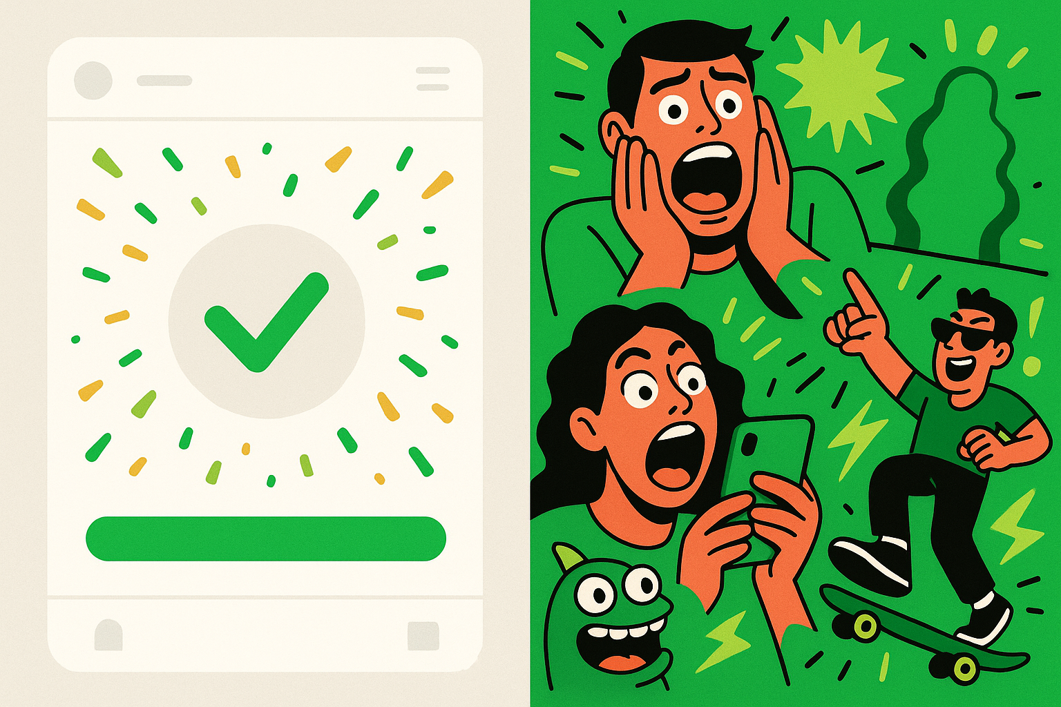
On TikTok, the same green is a visual weapon of disruption. Duo appears in unrelated trending sounds. Green-screen effects place him in absurdist scenarios. The brand's account consistently uses the color as a punchline or a threat. The "Duo watching you sleep" posts. The collaborations where Duo photobombs lifestyle creators mid-routine. The brand's self-aware engagement with "Duolingo notifications are terrifying" discourse.
These feel like two completely different strategies. They're not.
Both uses reinforce the same core message: learning a language is something you do because Duo makes you, and you kind of love it. The in-app green rewards compliance. The TikTok green punishes defection. Together, they create a closed emotional loop where the color functions as both carrot and stick.
That coherence is what makes the strategy work. The chaos on TikTok never feels random because it's always anchored to the same visual identity. You could mute any Duolingo TikTok video and still know exactly whose content you were watching. The green does that work.
The Streak Notification as Color-Coded Psychological Drama
Let's zoom in on one specific touchpoint: the streak loss notification. It's one of Duolingo's most analyzed brand moments, and for good reason.
When you break your streak, Duo appears in a darker, more desaturated green-grey. His posture shifts. His expression flattens further. The background mood changes. The color itself is modulated to signal disappointment rather than celebration.
This is sophisticated color psychology deployed in miniature. The same hue, slightly desaturated and darkened, becomes emotionally legible as "Duo is not happy with you" without any explicit messaging needing to say so. Your brain reads the shift before your conscious mind processes the words.
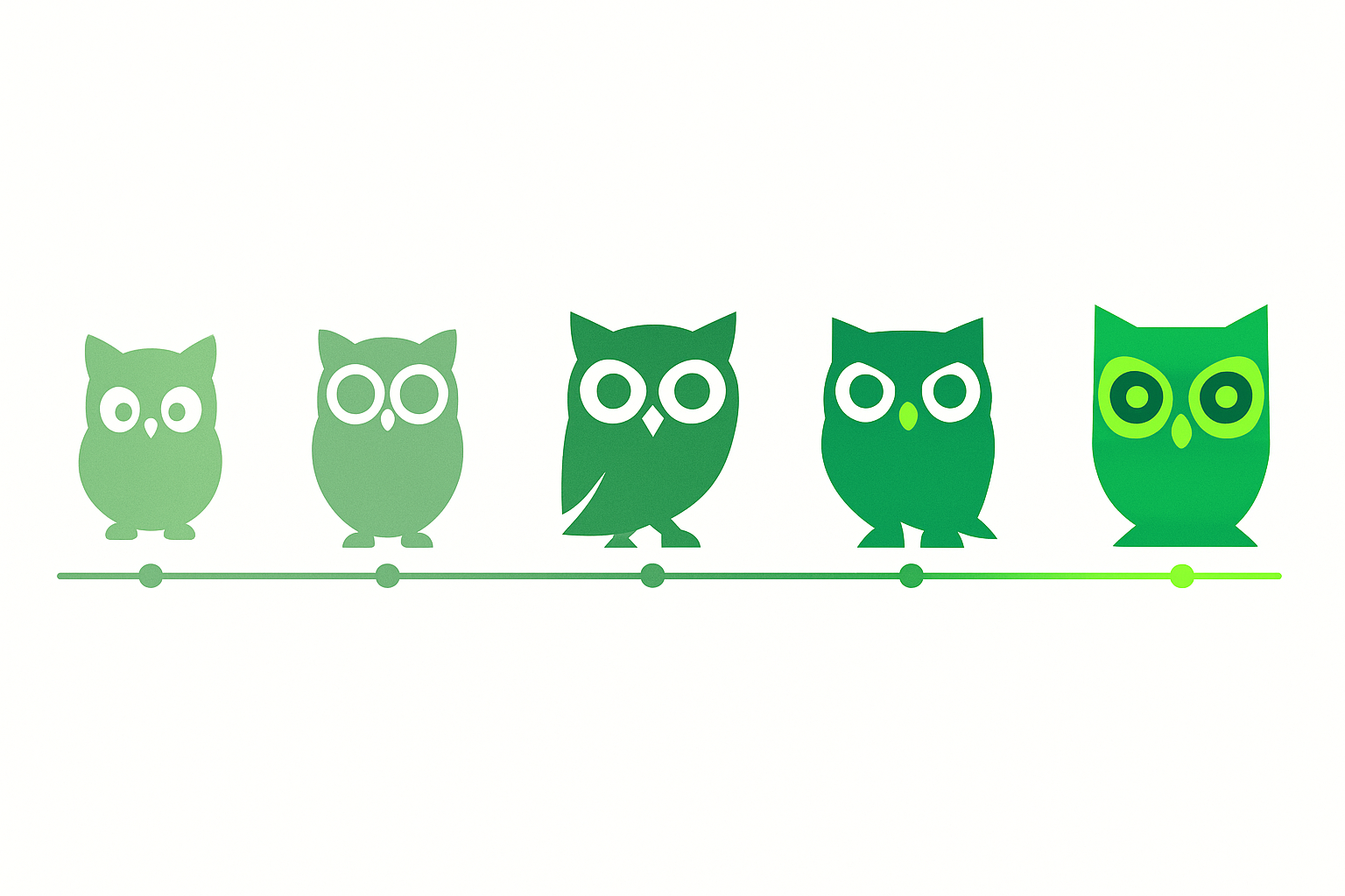
Most brands never think about how their signature color should morph across emotional states. They have one green, one blue, one red, and it stays the same whether the brand is celebrating, apologizing, or warning. Duolingo has built a color emotional range. Not just a color.
The streak notification became a meme in its own right. Reddit threads catalogued the various stages of Duo's disappointment. Twitter complaints about feeling genuinely guilty went viral. Mainstream press covered the phenomenon. All of which kept the green in active cultural circulation, working for the brand even when users were technically complaining about it.
The lesson for brand strategists is clear: a color used only in its positive state is a missed opportunity. Designing for the full emotional spectrum of a brand's relationship with its user, the joy, the guilt, the humor, the mild menace, is where mascot-led color identity becomes genuinely powerful.
What Duolingo Got Away With (That Most Brands Can't)
Let's acknowledge the elephant in the room. This strategy is extremely hard to replicate.
Duolingo's "unhinged" green works because it was earned over years of consistent, if unconventional, brand behavior. The company spent nearly a decade building trust through a genuinely useful free product before it let its mascot go feral on social media. Brands that attempt chaos marketing cold, without that foundation, rarely land it. They just look confused.
The color survived the chaos because the in-app experience remained clean, usable, and emotionally coherent. The TikTok wildness was always tethered to a product that actually delivered on the green's implicit promise of fun-not-homework. Strip away the social media antics and you still have one of the best-designed consumer apps on the market.
The 2025 to 2026 landscape tells an interesting story. As more brands attempt personality-led marketing, the space has gotten crowded. Babbel refreshed its visual identity in 2025 with warmer tones and more playful illustrations. Rosetta Stone has leaned into bolder creative. Neither has achieved the same cultural penetration, because neither has a color that carries independent meaning the way Duolingo's green does.
There's a real risk factor here, too. Duolingo's approach required giving its social media team unusual creative autonomy. It meant trusting a mascot to carry meaning that traditional brand guidelines would have constrained into a style guide PDF no one reads. Not every organization can attempt this. Not every organization should.
The Lesson for Designers: Color as Character, Not Just Consistency
Here's the reframe that matters. Traditional brand guidelines treat color as a rule to be enforced. Duolingo's playbook treats color as a character to be expressed, with a personality, moods, and a relationship to the audience.
If you're thinking about mascot-led color identity, or even just about giving your brand's color more life, consider a three-part framework:
- Anchor the color in a clear emotional permission. What does this color allow the user to feel? Duolingo's green grants permission to be playful about something (language learning) that traditionally feels intimidating.
- Design the color's emotional range. Map how the color should look and feel across positive, neutral, and negative brand states. What does your green look like when it's celebrating? When it's disappointed? When it's joking?
- Allow the color to behave differently across contexts without losing its core identity. The in-app green and the TikTok green are visually identical but emotionally distinct. That's not inconsistency. That's range.
Other brands have gestured in this direction. Spotify's ever-shifting gradient campaigns use green as a base for infinite variation. Coca-Cola's red operates differently in holiday campaigns versus everyday packaging. But Duolingo has gone further by letting the color carry menace alongside warmth, humor alongside utility.
Here's what "brand consistency" actually means in practice: you always know it's Duo's green. Always. But the emotional register of that green shifts radically depending on whether you're completing a lesson, watching a TikTok, or reading a notification that says "these reminders don't seem to be working." That's consistency of identity with flexibility of expression.
The most memorable brand colors in 2026 are not the ones that follow guidelines most faithfully. They're the ones that have been trusted to have a personality.
Back to the Owl
Return to that opening image. A silent, staring owl, green and slightly ominous on a phone screen. By now you understand why it works. It is not a failure of brand discipline. It is its highest expression.
Duolingo proved that a single color could function as a promise, a punchline, a threat, and a reward, sometimes within the same 24-hour content cycle. In a branding era obsessed with authenticity and personality, Duolingo's green is a masterclass in giving a color a genuine character arc, not just a Pantone code.
So here's the challenge for designers and strategists reading this: the question is no longer "what color represents your brand?" It's "what does your color feel like when it's happy, when it's disappointed, and when it's watching you from the corner of the room?"
If you don't know the answer, you might not know your color as well as you think.