How Duolingo Weaponized Green: The Color Strategy Behind the World's Most Addictive Education App
by ColorSift Editorial Team
Open your phone's home screen right now. Scroll through the grid of icons. The blues of social media, the whites of productivity tools, the reds of entertainment. Now find Duolingo. You didn't have to look hard, did you? That electric, almost confrontational green (#58CC02) doesn't just sit on your screen. It vibrates. It demands attention. And that's not an accident. It's a weapon.
In 2023, Duolingo hit 500 million total users and saw daily active users surge by 65%. The company's stock price tripled. Its TikTok presence became a cultural phenomenon. And underpinning all of it, the unhinged owl memes, the guilt-trip push notifications, the streak obsession, is a meticulously engineered color system that most users never consciously notice but absolutely feel.
This is the story of how a language-learning app turned a single shade of green into one of the most powerful color strategies in consumer tech, and what designers can steal from it.
Before the Glow-Up: Duolingo's Forgettable First Palette
Duolingo launched in 2012 with a muted, friendly, and frankly generic color palette. Soft greens. Gentle gradients. A mascot (Duo the owl) rendered in a darker, flatter green that blended in with the era's skeuomorphic design trends. If you squint at early screenshots, you can barely distinguish it from a dozen other edtech apps of the period.
The early palette was "education-coded": safe, approachable, and utterly forgettable. It communicated "we're a learning tool" the same way every other edtech app did, with the visual energy of a public library poster. Think rounded corners, drop shadows, and that slightly dated iOS 6 gloss.
Compare early Duolingo screenshots from 2012-2016 with the current interface and the transformation is staggering. The original green was closer to a muted forest tone. Today's #58CC02 is a fully saturated, almost neon hue that feels more akin to a mobile game than a classroom.
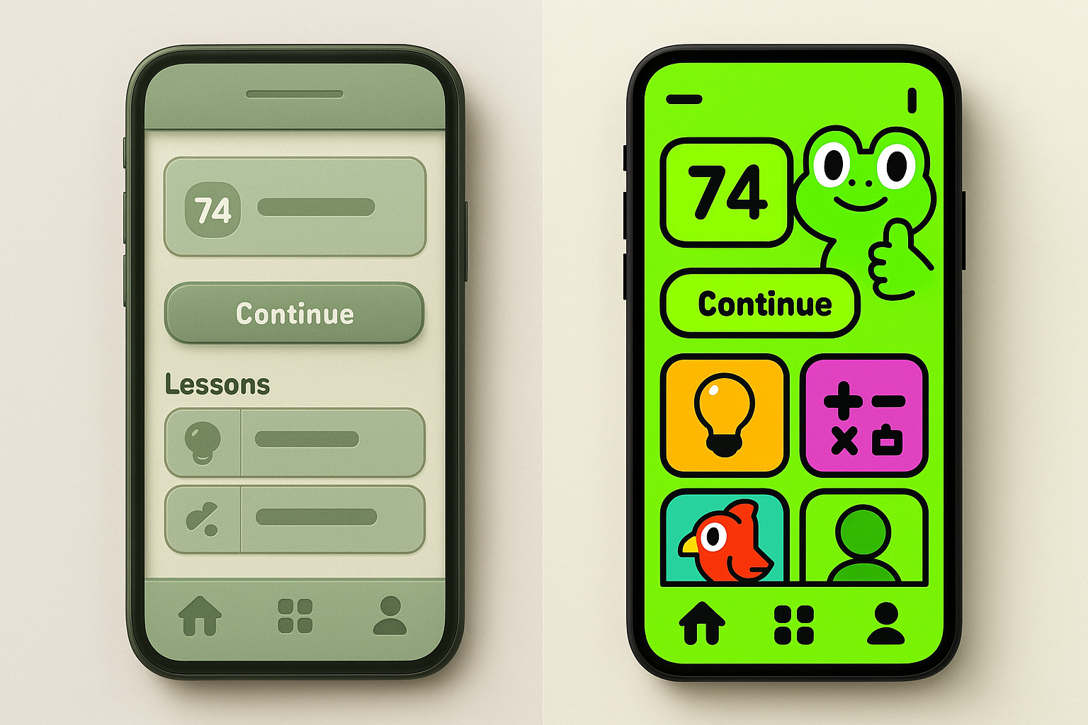
This evolution wasn't gradual. It was strategic. As Duolingo shifted its product philosophy from "free education tool" to "addictive learning game," the color system had to follow. The palette became a declaration of intent. Every saturation bump, every shift toward brighter hues, mapped directly to a business decision about what kind of product Duolingo wanted to be.
The Psychology of Duolingo Green: Why #58CC02 Hijacks Your Attention
Green is traditionally associated with growth, progress, and "go." All perfectly aligned with a learning app's core promise. But Duolingo's specific green goes far beyond generic associations. At full saturation, #58CC02 sits at the extreme edge of what the human eye perceives as "natural" green, pushing it into artificial, hyper-stimulating territory.
Research in color psychology shows that highly saturated colors trigger stronger emotional arousal and faster visual processing. A 2017 study published in Frontiers in Psychology found that saturated colors increased participants' attentional engagement by up to 20% compared to desaturated equivalents. Duolingo's green doesn't whisper "learning is pleasant." It shouts "PAY ATTENTION TO ME," functioning more like a video game power-up than an educational interface.
The green also benefits from competitive differentiation at the OS level. On both iOS and Android home screens, Duolingo's icon is an outlier. Most apps cluster around blue (Facebook, Twitter/X, LinkedIn, Zoom) or red (YouTube, Netflix, Gmail). Duolingo's green occupies a near-empty perceptual niche, making it one of the most findable icons on any phone. You could bury it in a folder three layers deep and your eye would still snap to it.
There's a Pavlovian dimension at play, too. Over time, that specific green becomes neurologically linked to the dopamine hit of completing a lesson, maintaining a streak, or hearing the triumphant chime. The color itself becomes a trigger in the habit loop, cue, routine, reward, that behavioral designers like Nir Eyal have described as the engine of product stickiness. You see the green. You feel the pull. You open the app.
The 2023 Rebrand: When Duolingo Turned the Saturation Up to 11
In mid-2023, Duolingo rolled out a significant visual overhaul that designer communities immediately noticed. Bolder colors. Thicker outlines. Simplified 3D character designs. And, critically, an even more aggressive use of their signature green across the entire product surface.
The rebrand introduced what Duolingo's design team calls a "hyper-saturated" color system. Every color in the palette was pushed to maximum vibrancy. The supporting purples, oranges, and blues all received the same treatment. The effect is a UI that feels like a children's cartoon crossed with a slot machine. And that's the point.
This wasn't just an aesthetic choice. It was a growth strategy. The timing aligned with Duolingo's push into new markets, particularly in Asia and Latin America, where bolder, more expressive visual styles tend to outperform the minimalist restraint favored by Western SaaS design. The color system was being optimized for global attention capture.
The redesign also leaned into what some designers have called "Cluttercore UI," a deliberate rejection of the clean, airy, white-space-heavy interfaces that dominated the 2010s. By filling the screen with color and character, Duolingo made its app feel less like a tool and more like a world you inhabit. The green isn't a brand accent anymore. It's the atmosphere.
The results speak for themselves. Duolingo reported record engagement metrics in every quarter following the rebrand. Daily active users grew 65% year-over-year. The visual overhaul didn't just look different. It performed different.
Duo the Owl: How A/B Testing Forged an Icon
Duo the owl is arguably the most recognizable mascot in tech since the Twitter bird. And his specific shade of green was not a designer's gut instinct but the product of rigorous A/B testing and iteration over years.
Early versions of Duo were rendered in darker, more "realistic" greens with detailed feather textures. Through successive redesigns (2018 and 2023 being the most dramatic), the mascot was simplified and his green was pushed brighter with each iteration. Always in the direction of higher engagement metrics.
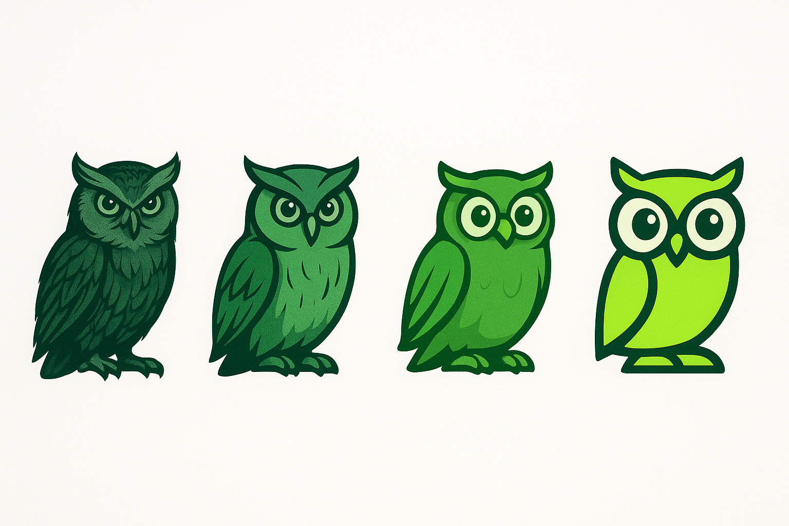
The 2023 Duo redesign is particularly instructive. The owl was flattened into a near-geometric shape. His expression was made more exaggerated and emotionally readable. His green was locked to the exact brand green (#58CC02) with thick dark outlines that make him pop on any background. The design borrows heavily from the visual language of emoji and animated stickers, formats optimized for instant recognition at tiny sizes.
Duo's green serves a dual function in the product. As a mascot, he's the emotional face of the brand. As a UI element, he's a persistent visual anchor that grounds users in the Duolingo ecosystem. His color is the thread that ties the icon, the in-app experience, the push notifications (those guilt-trip messages hit different when they come from a neon-green owl), and the social media presence into a single, inescapable identity.
The Color System as Game Engine: Tokens, Streaks, and Dopamine Design
Duolingo's design system uses color as a core game mechanic, not decoration. Green means progress, correct, and "keep going." Red means wrong, hearts lost, and danger. Gold means completion and mastery. Each color carries precise emotional weight that users internalize without conscious effort.
The streak counter, Duolingo's most powerful retention mechanic, is rendered in a flame-orange that deliberately contrasts with the green. This pairing creates a visual tension: green is your baseline (you're in the app, you're safe), orange is your goal (protect the streak, don't break the chain). The interplay between these two colors generates a low-grade anxiety that keeps users coming back daily.
Duolingo's design tokens, the systematized color values used across the product, are structured around emotional states rather than traditional UI categories. Rather than "primary," "secondary," and "accent," the system is built around:
This means every color decision maps directly to a feeling the product wants to evoke at that moment. The XP (experience point) animations burst in green and gold particles, colors associated with wealth, achievement, and nature's abundance. Lesson completion screens flood the viewport with green. Even the premium tier (Super Duolingo) uses a purple calibrated to feel like a "leveled-up" version of the green, a color reward for paying customers.
Every pixel of color is doing psychological work.
The Competition Looks Washed: Why Babbel and Rosetta Stone Can't Compete Visually
Place Duolingo's app store listing next to Babbel's muted orange or Rosetta Stone's corporate blue and the difference is visceral. Duolingo looks alive. Its competitors look like enterprise software. This isn't a subjective aesthetic judgment. It's a measurable competitive advantage in the attention economy of app store browsing.
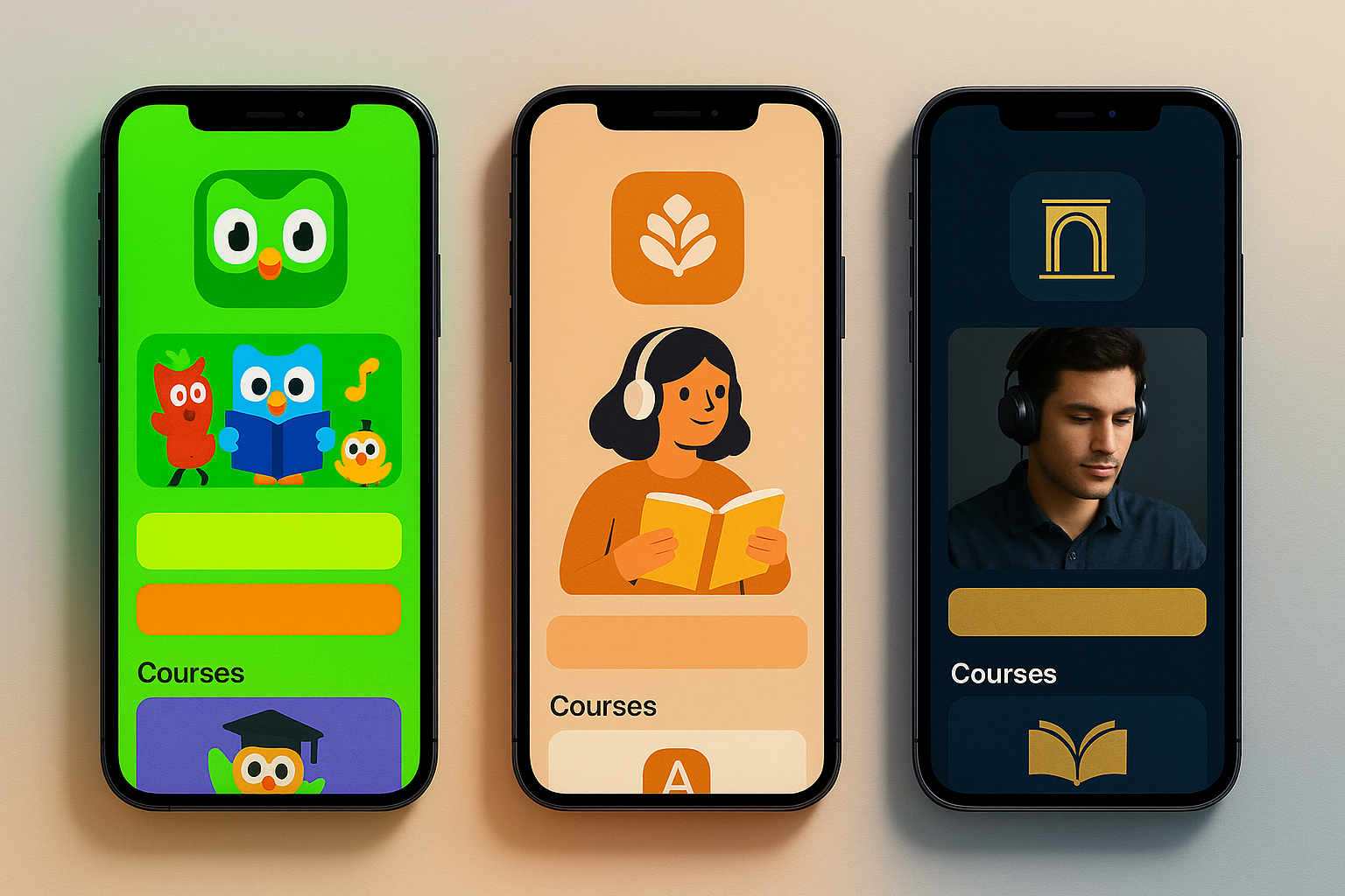
Babbel uses a warm but restrained orange palette that communicates "professional" and "serious." Rosetta Stone leans on dark blues and golds that signal "premium" and "established." Both are perfectly competent brand systems. And both are invisible next to Duolingo's visual assault.
The distinction maps to fundamentally different product philosophies. Babbel and Rosetta Stone are selling education. Duolingo is selling a game that happens to teach you Spanish. The color systems are honest expressions of these different value propositions. And in a mobile-first world where users have three seconds to decide what to tap, the game wins every time.
There's a deeper lesson here for designers: restraint is not always sophistication. The design community's bias toward muted palettes, generous white space, and "tasteful" color use can actually work against products that need to compete for daily attention in a user's app drawer. Duolingo understood that in the context of a phone screen, subtlety is a liability.
What Designers Should Actually Take From This
Duolingo didn't become a $9 billion company by teaching better conjugation tables. It became one by understanding something most education companies ignore: feelings drive behavior, and color drives feelings.
Their journey from a muted, forgettable edtech palette to the most aggressive color system in consumer apps is a masterclass in aligning visual identity with product strategy. Every shade in their system, the electric green, the anxiety-inducing orange streak flame, the rewarding gold of completion, is a carefully calibrated instrument in a behavioral design orchestra.
For designers, the takeaway isn't "use bright green." It's this: your color system isn't a style guide. It's a product mechanic. Treat it with the same rigor you'd give your onboarding flow or your notification strategy. Map every color to a user emotion. Test every hue against engagement data. Question whether your muted, "sophisticated" palette is serving your users or just serving your taste.
Because somewhere on your user's home screen, a neon-green owl is proving that color, wielded with intention, is one of the most powerful tools in design.